How to create stylised characters in ZBrush
Character artist Michael Ingrassia shows how you can develop your sculpting skills and find your artistic direction.

As a 3D game artist, I have always preferred to work on stylised art projects rather than realistic ones. Stylising allows for creative freedom and extending belief of subject matter over realism.
There are many tools within ZBrush that artists can use to achieve stylised sculpting effects, from massing out the form using DynaMesh to a wide variety of sculpting brushes and techniques. However, many of these tools and techniques can seem overwhelming or intimidating to artists who are just starting out. My tried and tested methods will help you streamline and simplify sculpting and stylising, using a few easy methods and tools you'll learn to master quickly.
01. Massing the base mesh
One method I have used quite successfully in my years of sculpting characters is creating a very simple base mesh, doing some basic sculpting on the mesh (which I call 'massing'), then reimporting the mesh at one or two division levels higher.
It's a really quick way to get your character modelled efficiently, and the new mesh will only require a small amount of re-topping instead of having to re-top the entire character. This method is similar to ZBrush's new DynaMesh tool but with more control over the topology. I'm able to quickly add any necessary topology and edge loops in my 3D program then import the mesh back into ZBrush.
Game artists will find this process works really well because the new base mesh is game-ready and will handle the final decimated mesh when backing out normals and ambient occlusion maps in programs like TopoGun.
Try massing the head sculpt. Look in the Source folder in the files accompanying this video, where you'll find base_meshHead.obj, a low-poly base mesh to experiment with. Keep base meshes very simple, evenly spaced quads with the minimum vertices possible. In minutes, you'll have a good detailed base mesh that only requires simple re-topping.
02. Chiselling and polished edges
The main brushes I will be demonstrating in this tutorial include Standard, ClayTubes, MAHcut Mech A, Orb Cracks, Polish B and Rake. Once I have the character's form massed out, I will begin working with several of my favourite sculpting brushes like Polish B and MAHcut Mech A to begin chiselling, carving and refining the edges, giving the character a nice clean and polished look.
Get the Creative Bloq Newsletter
Daily design news, reviews, how-tos and more, as picked by the editors.
03. Hair sculpting techniques
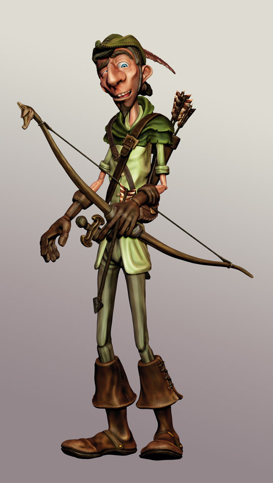
To create a manicured looking beard, mask out a section of Sir Robin's chin to sculpt some added mass, and define the shape of the beard further using the ClayTubes and Move brushes. Then mask out the character's head to inflate the mesh uniformly before you begin sculpting a lovely head of flowing hair.
Start sculpting by selecting the ClayTubes brush again, but this time disable the square alpha map to achieve smooth, thick, liquid strokes. It's important to sculpt the lower lying hair first, then swiping upper hair strokes in alternating 'C' and 'S' shapes. Repeat some strokes using a reduced brush draw size and add final top layer strokes where you want the main hair peaks to be.
Soften the strokes you've made using the Smooth brush and then switch to the MAHcut Mech A brush. Holding down Alt, outline the shape of each hair tuft first to establish the main individual shapes, then on a second pass come back through each strand's centre to enhance the primary curvature.
04. Stitching brushing tips
Before jumping into adding stitches on your sculpt, it's usually wise to prepare the different brushes' stroke and intensity settings. Whether using ZBrush's default stitch brushes or custom alpha maps, each stitch will react differently, so you'll want to practise each of the stitches on a curved shape, such as a sphere.
To give a unique look and feel on some parts of the character, I recommend sculpting some stitches directly rather than using a Stitch brush or alpha map. In the video I demonstrate how easy it can be to create a simple stitch with rivet and clothing stress pull. Paying special attention to little details like this will set your work apart from others.
If you're curious about creating your own Stitch Alpha map, take a look at MIstitch.psd, my custom stitch alpha in the scene files accompanying this tutorial.
05. Sculpting Sir Robin's cap
The first part of the cap sculpt will address the need for adding in some basic cloth folds. These simple folds will help to make the cap look more organic and less rigid. I'll then add a noise texture pass using a Spray setting with a Cracked Rock alpha. This gives the cap a nice felt cloth look quickly. It's important to do this texture pass first before adding details such as stitches.
Getting the stitching pattern to step and repeat smoothly and flow along the model's contour can take some trial and error - especially when pulling a seam around a mesh that needs to be turned in order to finish the stroke. One method that works best is to gently smooth the last stitch of the stroke so you can continue pulling the stitches to the end. At the end of the stitches, slowing down will give more control when ending the stroke.
06. Cloth folds
When modelling fabric there are some key factors to consider: gravity and weight. Gravity affects cloth as it flows down and sags or drapes around the torso. Sweeping alternating curves help to provide a feeling of fabric weight due to gravity.
Another factor is stress, and the tightness caused by the pulling effect on areas such as the armpits and crotch. This type of fold tends to fan outward from the primary point of tension. It's important to vary fold width and distance from one another - as well as varying thickness and length - to look more realistic.
Creases in areas such as inner elbows and behind the knee also need to be considered. Cloth tends to fold in a criss-cross or accordion shape; creating a series of alternating inward and outward strokes using the Orb Cracks brush helps to get nice results quickly.
Finally, don't forget the body wearing the fabric - the underlying anatomy. Some areas such as the shoulders, elbows and kneecaps cause a stress that displays the muscle or bone beneath the cloth. The folds near these areas tend to be small stress pulls, but it is important to pay attention to creating these subtle folds.
07. Dark-to-light Polypainting techniques
Polypainting can be difficult at times, especially when you're first learning the ropes. One method I personally prefer and which works well with stylised characters is painting 'dark to light'. It's an old traditional method used by the masters in oil painting that also works well in texturing: it helps simulate cavity painting without the pain of setting adjustments.
On skin textures such as the face I'll also use a heat intensity technique where I use a Colour Spray pattern and spray alpha to apply cool blues to colder areas of head and neck, and red/orange shades to the warmer areas of the face like the eyes, nose and mouth areas.
I'll then do a final build-up of highlight tints - lighter flesh, pale yellow and finally a warm, off-white colour. I also change my alpha pattern to a scratched texture, which gives the appearance of burnished surfaces and hints of skin reflection.
If you want to try Polypainting Sir Robin yourself, look for decimated_ headSculpt.obj in the scene files accompanying this tutorial.
08. Polypainting Robin's sword
Working on the sword texture incorporates many of the same Polypaint techniques but with stronger colour shifts and highlight effects. Begin by colouring the entire object with black, followed by a spray pattern with dark olive green. I use olive because it's a neutral earth tone shade that works well with many materials, from worn leather to shiny brass.
As I begin building up the colour layers, I'll also hit many of the different materials with the same shade of colour just to keep them in unison with each other. As I begin to fine-tune each material, I add highlights and burnishing effects.
One final trick I'll add is a gentle overspray of a complementary colour. For example, if a leather is greenish in colour, I'll gently run over some areas with a deep reddish brown shade to tone down the green and give it a more natural, realistic feel. On shiny brass or gold material, I'll add some soft desaturated purple or blue hues, which helps give a pleasant fill light effect.
In the accompanying scene files, you'll find swordPolypaint.ztl, the full sword .ZTL file with all division levels and Polypaint details.
Michael Ingrassia is a character artist and instructor, specialising in modelling and sculpture for games and film.
This article orginally appeared in 3D World issue 171
Liked this? Read these!
- ZBrush tutorials: ways to paint and sculpt in 3D
- Top free 3D models
- Best 3D movies of 2013

Thank you for reading 5 articles this month* Join now for unlimited access
Enjoy your first month for just £1 / $1 / €1
*Read 5 free articles per month without a subscription

Join now for unlimited access
Try first month for just £1 / $1 / €1

The Creative Bloq team is made up of a group of design fans, and has changed and evolved since Creative Bloq began back in 2012. The current website team consists of eight full-time members of staff: Editor Georgia Coggan, Deputy Editor Rosie Hilder, Ecommerce Editor Beren Neale, Senior News Editor Daniel Piper, Editor, Digital Art and 3D Ian Dean, Tech Reviews Editor Erlingur Einarsson, Ecommerce Writer Beth Nicholls and Staff Writer Natalie Fear, as well as a roster of freelancers from around the world. The ImagineFX magazine team also pitch in, ensuring that content from leading digital art publication ImagineFX is represented on Creative Bloq.
