How to add ZBrush sculpts to Vue scenes
Digital environment artist Conrad Allan creates a coastal scene in Vue, models rocks in ZBrush, and combines the two.
Sign up to Creative Bloq's daily newsletter, which brings you the latest news and inspiration from the worlds of art, design and technology.
You are now subscribed
Your newsletter sign-up was successful
Want to add more newsletters?
Five times a week
CreativeBloq
Sign up to Creative Bloq's daily newsletter, which brings you the latest news and inspiration from the worlds of art, design and technology.

Once a week
By Design
Sign up to Creative Bloq's daily newsletter, which brings you the latest news and inspiration from the worlds of art, design and technology.
Once a week
State of the Art
Sign up to Creative Bloq's daily newsletter, which brings you the latest news and inspiration from the worlds of art, design and technology.

Seasonal (around events)
Brand Impact Awards
Sign up to Creative Bloq's daily newsletter, which brings you the latest news and inspiration from the worlds of art, design and technology.
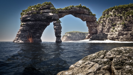
In this video workshop, you’ll be creating a Vue scene right from scratch. You’ll start off by creating a feature rock in Vue with the Metablob and procedural displacement tools. Then you’ll move on to the surrounding elements.
You’ll add an ocean,create a terrain and apply materials and ecosystems to bring scale, colour and life to your landscape scene. Once you’re happy with the Vue work, you’ll dive into ZBrush and create a foreground rock, and I’ll look at how to best export it to Vue with Normal maps generated from ZBrush to increase the detail. So grab a cup of coffee and let’s get started!
You can download the tutorial's accompanying files here.
01. Craft the focal point
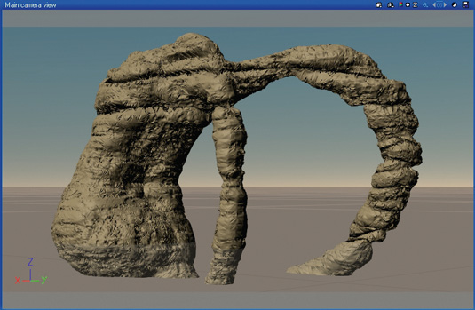
For this image, I wanted a large archway that looked like it was originally attached to the mainland and has been eroded.
01:34 - Create a Metablob
Create a few primitive objects and position them in your preferred arrangement. Think of the major shapes and silhouettes you want as your focal point. To avoid scaling and issues during displacement, keep the primitives as close to their original sizes as you can.
Select the primitives and click Create Metablob on the left-hand side of the screen. This will blend the primitives together into a single mass. You can adjust the positions of the primitives by expanding the group in the rollout on the right, then selecting the primitive you want to move.
Sign up to Creative Bloq's daily newsletter, which brings you the latest news and inspiration from the worlds of art, design and technology.
06:10 - Displace the Metablob
Just for reference, load the Rock and Grass material from the material browser and navigate to the bump tab. Right-click the bump preview, click Load Function, and navigate to the Fractals folder. Feel free to explore the various fractals that ship with Vue, but for this project, you’ll use the Sedimentary Rock function. Press OK and tick the Displacement Mapping option. The top-right screengrab shows how the Metablob should look when rendered.
10:20 - Bake and save
Before saving your Metablob as a Vue object, you want to bake the displacement to polygons. Right-click the Metablob and click Bake to Polygons. For this, I suggest selecting the highest detail (up to four million in Vue 8 and up). Baking displacement will speed up render times considerably. Once you’ve done this, right-click the object, select Save Object, and save it to your project folder for use later.
02. Compose the scene
To understand what needs to be done in ZBrush, it’s important to have a base to work from. Much like an artist places the base layers of paint on the canvas, you can do this in Vue.
00:19 - Generate the terrain
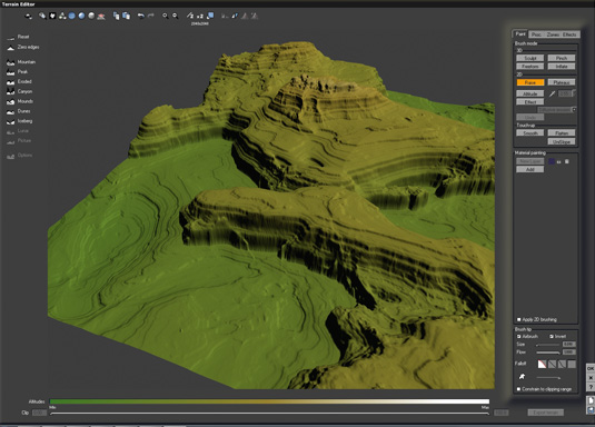
Add a procedural terrain and enter its function editor. Create a terrain fractal and adjust it to suit. This is where your instinct for exploration comes in. A single fractal can create many different styles of world, so if you play with the largest feature and find something you like, tweak the position by changing the fractal’s origin setting.
03:17 - Add the stratification
Next, add a Recursive > Strata filter. Connect its input to the terrain fractal, and connect its output to the Altitude node below, selecting Altitude (not rough areas) when prompted. Adjust the strata settings to your liking, or just use the settings I’ve used.
Fractal terrains have the advantage of being infinite in detail. The closer the camera is to the terrain, the more detail is displayed, so you can leave the mesh resolution at 256x256. (The mesh will be dynamically subdivided.)
08:32 - Scaling and adding water
Now that you’re done with the terrain editor, return to the main interface of Vue and adjust the terrain to a realistic size. In this case I made the terrain 8.3km x 8.3km. Add a water plane and adjust the height to the desired level. This will give you a basic water plane to compose your image on. Later you’ll modify the water and displace it, but for now this will do, and will save on the render times.
10:10 - Add the Metablob
Import the Metablob you created during video 1. The Metablob will have to be resized to the correct scale for the scene. For this, I adjusted the Z (vertical) dimension to 200m. Level the Metablob with the stratified terrain so that the top parts match up, and then position it so that the two terrains intersect at a natural point, and blend well.
03. Materials, scale and atmosphere
Materials and scale get their own section because these elements are imperative to achieving the style of image you desire. Having highly detailed 3D objects in your scene is important, but if the scale or materials aren’t right or your scene isn’t lit correctly, it won’t fuse together perfectly.
00:12 - Atmosphere light setup
Setting up the atmosphere is a complex procedure, so I’ll outline the settings I’ve used for this image. Always remember that to get realistic results you must understand how light works in nature, but not restrict yourself to realistic settings.
Set the lighting model to Global Radiosity and increase the gain to 0.7. This will create more indirect lighting. Next, boost the Sky Dome lighting gain to 6.00 to balance the light more, because this is such a large-scale scene. Finally, change the global lighting adjustment by setting the light balance to 90% toward sunlight, and Ambient Light to 100% (from the sky). This will give more contrast and provide a better lighting balance in the scene.
01:12 - Sky, fog and haze
This part is optional depending on your personal preference, which may change depending on your sun’s position, altitude, and lighting settings. The most important setting to focus on in this instance is the Haze. Set the colour to a very dark purple (I’ve used R 14, G 11, B 12 for this example), set the Density to 15% and Altitude to 2.13km. The dark haze colour allows you to use 15% as your Haze setting (instead of 100% or more).
01:24 - Highlight mixed materials
Enter the material editor of the standard terrain and change the material to a mixed material. You’re going to use the highlighters to properly see the distribution over the terrain. Click the Pen icon (to the right of the material you want to highlight). This will activate the highlight. Give these two colours highly contrasting hues so it’s easy to see the distribution, and to tell them apart. To change the colour, hold down the right mouse button over the colour swatch and choose a new one.
02:02 - Mixing materials
Add a distribution fractal function, change the blending mode to Full Blend, and increase the smooth blending strip to 43%. This will allow for a natural change in the rock colour over the entire terrain, and will blend the bumps together better.

02:36 - Influence of environment
Switch over to the Influence of Environment tab and tick the box to enable this section. The aim here is to create the effect of rock wearing away more on the vertical surfaces than it does on the flat ones, because the vertical sections will be more exposed to the weathering of wind and water in nature.
I suggest that you try moving the Influence of Slope setting to around 79% to make this happen. For this exercise, you can leave the rest of the settings alone, but I encourage exploration of the other settings at some point, because these options are powerful.
05:02 - Distribution tips
Copy the material over to the Metablob and render to see the result. If you’re having problems getting the right balance between the materials, try changing the Mixing Proportions towards the material you would like to see more of. The settings for Mixing Proportions, Influence of Altitude, and Influence of Slope are vital for controlling your distribution, so pay close attention to these settings. Also, try swapping the materials around and using opposite settings for distribution. This will quite often give a slightly different result, which may be exactly what you want.
05:35 - Material selection
Now that the final distribution is set, navigate to the rock section in the material browser and select Red-Brown Rock. Apply this material to both the mixed materials. Adjust the materials so that one has a slightly lighter colour than the other. Depending on the brightness of the atmosphere you choose for your scene, you may want to change the Luminosity (brightness) of the materials as well to get the desired rendered result.
Also, remember to keep in mind the scale of your scene. It’s important to match the scale of your materials with your scene or it will look strange. In this case, you can leave the materials at the default scale, but if you’re experiencing problems, try doubling or halving the scale of your material and compare the results.
07:38 - Adding ecosystems
Now that the terrains have a rock material applied, create an empty ecosystem layer and add two Alder tree types: Late Summer and Late Spring. Change the presence of the Late Spring instance to 1.750. This will bias the population towards the greener Alder trees and create better variations in the ecosystem. Set the density slider to 78%. Feel free to explore the Density, Scaling and Orientation and Colour tabs for more realistic ecosystems – but for this project, you won’t be needing them.
09:39 - Ecosystem control
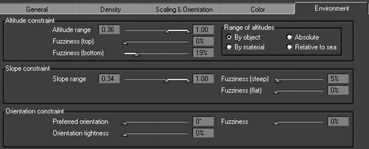
Switch to the Environment tab (Presence in some versions) to control the altitude ranges for your greenery. These settings are highly dependent on your scene and your preferences. For this scene, you want the plants growing high and on flat surfaces only. Bring the Altitude Range slider up to about 0.36 and set Fuzziness (Bottom) to 19%. This will constrain the population to the top altitudes of the terrain, and the Fuzziness will allow for scattered population of trees towards the lower altitudes.
Move the lower slider of the slope range to 0.34 (45 ̊ for Vue 9 and up), and the Fuzziness (Top/ Steep) to 5%. This will have a similar effect as the previous change, although it will be applied to the slope to stop trees appearing on more vertical slopes.
13:27 - Secondary ecosystem
Add another ecosystem, but this time select the Date Palm. Use the same Environment constraints as the previous ecosystem, but with a density of just 4%. This is because you only want a few palms scattered through the dense growth. In the Scaling and Orientation tab, decrease the Keep Proportions setting down to 70%. This will give the palms a realistic appearance by changing the size of each instance by a little bit.
14:18 - Colour variations
The standard colour of date palms is a little too brown for this scene. Change the overall colour to a greener tone. Tick the Variable colour tab and load the Soft Spots function from the Spots section. Load a colour map or create your own.
Change the scale to 3.00 for X, Y and Z and finally decrease the influence of variable colour to 46%. All these settings add up to create a better colour change over the ecosystem population. The effect will be subtle in your image, but it becomes more noticeable in larger populations.
04. Creating the water
The placeholder water plane has served its purpose: now it’s time to replace it with a Displaced Water Surface.
00:50 - Water displacement
Up until now, the water plane that you dropped down has served only as a reference for composition. Let’s tweak it now. Double-click the sea in the object browser. Tick Displaced Water Surface and set the Overall Agitation to 86%. This will create bigger waves and give the water plane a thickness.
01:22 - Water highlights
Enter the water material and select the second layer, in this case Default Water. In the highlight tab, change the Global Intensity to 94% and Global Size to 100%. This will create small, bright highlights on the water surface, much like you would see when close up to the ocean in the real world.
02:27 - Water transparency effects
In the Transparency tab of the same material layer, change the fade out colour to a darker green-blue (I’ve used R 26, G 36, B 36 for this example), and the light colour to a light blue (R 157, G 216, B 252). To control how dark your sea appears, change the slider from Clear to Murky depending on what kind of sea you’re looking for.
This setting will depend on your atmosphere and the distance between the water and terrain beneath. Use 50% as a starting point and adjust the water darker or lighter according to your preference. Next, set the Reflective With Angle setting to 78%. This will cause the water to become more reflective as the angle increases.
The last thing you may want to do is reduce the alpha boost of the foam layer on top. For this image, change the alpha boost of the foam layer to -65%. This will create only a subtle foam layer.
05. Sculpting the foreground rock in ZBrush
There are many ways to go about creating a model in ZBrush. What you’re going to create here is the foreground portion of the image, aiming for large, defined rocks with some small eroded features.
00:18 - Add terrain
Add a Terrain3D Mesh from the right-hand tool palette and enter the edit object mode by pressing [T]. Open the Initialize drop-down menu from the right-hand side, and adjust the Z Size to 18. This creates a flatter profile to work with.
You can leave the rest of the settings alone, but they can be powerful tools to get a basic custom shape before you start sculpting. Finally, press the Make PolyMesh 3D button (top right) so you can begin sculpting.
01:25 - Sculpt the basic form
A good tip with this is to keep the mesh at the lowest resolution possible for as long as you can. There are three shortcut buttons that every artist using ZBrush should know: Quick Menu [Space], Smooth [Shift] and Invert Brush [Alt].
A good brush to achieve rock-like shapes is the Clay Tubes brush. Start painting the model, adding layers of the brush strokes as you go. Let loose with your model, and use the Smooth brush to revert back instead of using Undo. This way you will end up with a more organic, natural-looking model. Use [Alt] to carve into the surface, and use the Pinch brush to close any unwanted gaps between the rocks.
03:02 - Subdivide and sculpt
Subdivide the mesh using [Ctrl]+[D] to create another level of detail, and start working on finer details. To get inspiration, it helps to look at photographs of rocks for reference while you’re sculpting. What you want to focus on at this point are the large features of each piece of rock. Experiment with the Planar Cut, Slash1 and Clay Tubes brushes to get these details. Remember to smooth back details using [Shift] instead of undoing.
09:57 - Adding noise
Noise is one of the most powerful tools in ZBrush, and can be used in a variety of ways. It can be applied to the entire object, or just the specifically masked area. For this rock, you’ll use the Noise function twice: once for small features and again for larger cuts. Click the Surface drop-down menu on the right, and enable Noise for the object. Set the scale to 25 and the strength to 0.05. This will give you an even noise across the entire mesh, and break up the smooth look. Click Apply To Mesh.
The great thing about noise is that it can be enabled but not applied to the mesh. In other words, you can see the effect of noise and continue to work on your model without projecting the effect.
11:03 - Add more noise
Enable Noise once more, then change the Scale to 217 and Strength to -0.066. This will create larger, subtractive noise. Adjust the noise curve (click to add any points that you might need) so it has a flat section. This will make the noise only appear on part of the mesh instead of all over.
To change a point to a straight edge, click and drag the point out of the window and back in again. Use the focal shift to move the noise over the mesh, then once again click Apply To Mesh.
17:09 - Normal map export
Now that you have your basic 3D mesh, select the subdivision two below the highest. Next, click the Normal map menu on the right and tick Adaptive. This will increase the computing time, but will create a better map. Finally click Create Normal Map.
You can adjust the resolution of the map in the UV Map menu. Once the map has been computed, you need to clone it to the texture palette. Click Clone NM to do this. Now the Normal map appears on the left- hand texture palette. Click it, and in the window that opens, click Export and choose a file name.
When you’ve done all that, finish off by exporting the model by clicking the Export button tool palette in the top right of the ZBrush window. Select OBJ output and save it to your project folder.
06. Final touches
Your final composition brings together the ZBrush model and the Vue scene. You’ll use the normal map from ZBrush to increase the detail of the rock perch you’ve modelled, and finally add a material.
00:00 - Importing the ZBrush object
Open the composition file you constructed earlier and click File > Import Object and load your ZBrush rock perch. When prompted, just press OK. Don’t resize the model yet: this would create problems when you import the normal map. Next, position the mesh in front of the camera in the foreground. You’ll want this to be close enough to the camera to allow a depth-of-field pass if you choose to use one.
01:17 - Add materials and the Normal map
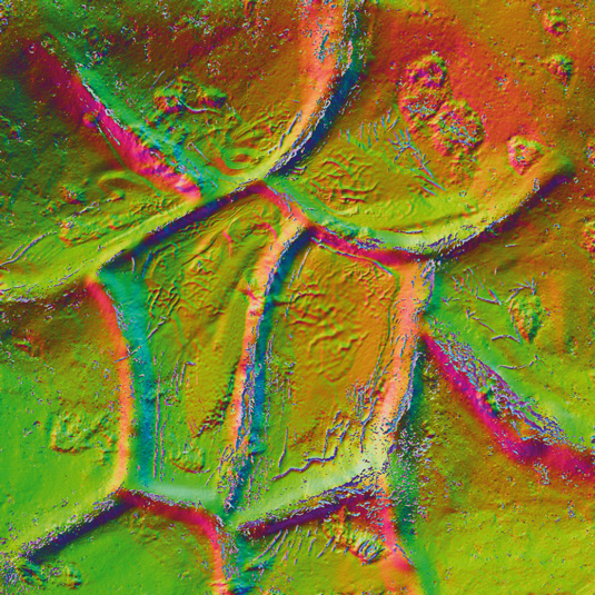
Open the material library and add a rock material to the model. For this scene I created a custom material based off the Voronoi fractal. Before importing the normal map, open the image and vertically flip it. This is required to get the normal map to display correctly in Vue.
In the Bump tab, click Import Normal Map on the right-hand side and select your normal map. Now the mesh has a normal map, you can resize the mesh if necessary. Render the image and change the scale of the material if needed.
08:23 - Final touches
Now you’re ready for the final render pass. For the render settings I suggest starting with the Final or Broadcast quality presets. One tip to get faster renders is to use Final (instead of Broadcast) and double the resolution. Once complete, resample it in an image editor. This will create a much smoother image, and leaves you with the option of painting extra detail at twice the resolution.
This article orginally appeared in 3D World issue 167
Liked this? Read these!
- Top free 3D models
- Best 3D movies of 2013
- Blender tutorials: ways to create cool effects

The Creative Bloq team is made up of a group of art and design enthusiasts, and has changed and evolved since Creative Bloq began back in 2012. The current website team consists of eight full-time members of staff: Editor Georgia Coggan, Deputy Editor Rosie Hilder, Ecommerce Editor Beren Neale, Senior News Editor Daniel Piper, Editor, Digital Art and 3D Ian Dean, Tech Reviews Editor Erlingur Einarsson, Ecommerce Writer Beth Nicholls and Staff Writer Natalie Fear, as well as a roster of freelancers from around the world. The ImagineFX magazine team also pitch in, ensuring that content from leading digital art publication ImagineFX is represented on Creative Bloq.
