7 WordPress UX basics you need to know
When creating a simple WordPress site, you need to get the user experience basics right. Here's how.

If you want people to come to your website and stay on your website, you must cater to them. With user experience at the forefront of every move you make on you WordPress website, you will not only make visitors feel welcome, you will encourage them to explore what you have to offer.
A bad web layout and design will turn any person away no matter what your company has to offer. No one will appreciate your innovative ideas, awesome products, or top-of-the-line services because they will bounce, and fast.
Streamlining your WordPress website with user experience in mind is not a hefty task. In fact, there are some fairly straightforward ways to improve user experience on your WordPress website, and I just happen to have seven top notch ones to share with you right now.
01. Have a clean and simple design

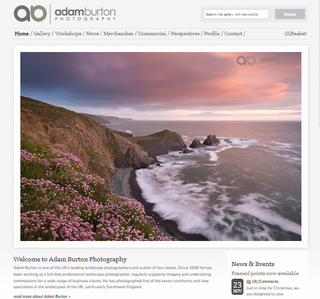
Function over design will always win. How you present your website to your visitors will affect your website's success. It's important to keep the overall look and feel clean and simple, without overwhelming your users.
When someone visits your website, they expect to get something useful out of that visit. If they are bombarded with garish web design and find nothing valuable to take away, you better believe they won't return.
Try using a simple WordPress theme, formatting with proper sub-headings, bullets, and lists, and focusing on a neat typography. Make good use of colour contrasting, include short and snappy paragraphs, and strike a balance between function and design.
02. Create easy navigation
There is nothing worse than visiting a website and having no clue how to find anything worth your time. The goal of your website is to never make your visitors work for information and for heaven's sake don't confuse them!
Get the Creative Bloq Newsletter
Daily design news, reviews, how-tos and more, as picked by the editors.
Include an obvious navigation bar, create a categories list in the sidebar, make sure you have a search box, and don't forget the breadcrumbs. Give your visitors a reason to stick around and see what your website has to offer. The easier it is to navigate, the longer they will stay.
03. Be mobile-friendly
We all know by now that mobile-friendly websites are a must these days. Since higher rankings in SERPs will be given to those websites that are optimized accordingly, it is essential you follow the rules and play along.
Making your website mobile-friendly by using a responsive theme makes users on the go happy. They won't have to twist their phones around to see your site, scroll right and left and up and down, and they will be able to navigate from page to page with the ease of a desktop experience. It just makes sense.
04. Speed up your site
If your website doesn't load within three seconds, say bye-bye to your visitors. People have no patience for slow loading websites and can you blame them? The frustration that sets in when you are trying to visit a website of interest that just won't load sucks and plays a huge role in user experience and the success of your website.
There are several ways to make your website faster than ever. Use a good hosting service or even a content delivery network (CDN), install a caching plugin, optimize your website's theme, images, coding, and framework, limit the use of plugins, and consider showing only excerpts of content so the pages load quickly.
05. Have a call to action
Do your website visitors know what you expect of them once they are on your website? Should they buy something? Subscribe to a mailing list? Download a giveaway?

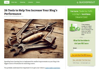
Make it immediately clear to your users what you expect their next move to be. Point directly to it and don't make it complicated! A large part of user experience is the functionality of a call to action. The fewer the steps involved, the better. A simple sign-up form will suffice and make both you and the user happy.
06. Make social sharing easy-peasy
Website users love social media. They follow, like, Tweet, share, +1, and so much more every single day like their lives depend on it. So, it would make sense you would encourage them to do the same on your website.
The key to increased social sharing is to make the icons visible and place them in an expected place. In the header space is a popular choice, near the navigation bar is great, in the sidebar is obvious, at the top or bottom of posts is expected, or even better make the icons floating and let them follow the user as they read your content.
07. Include easy-to-find contact info
You would be surprised at how many great companies leave the contact information at the bottom of their website, in print so small you need a magnifying glass to see it. I mean, seriously? Users want to know what your company is all about. They want to know who you are, what you stand for, and how to contact you. Visitors want to trust that you are the right company for them.
Start by making yourself and your company transparent and easy to contact. Do not make the information hard to find, do not make users scroll to the bottom searching for a 'Contact Us' link, do not make them click through a bunch of pages to get to the contact form. Put these things on your primary navigation menu and make it easy.
Conclusion
Prioritizing user experience while designing your website does not have to be daunting or take away from the awesomeness you want your website to have. You can still build a great looking website that is easy to navigate, that tells your visitors exactly what to do and how to contact you, while maintaining the look and feel your company has. Remember, a cool looking website means nothing if nobody visits it.
Related articles:
- UX portfolios done right
- Websites with brilliant typography
- Download the best free fonts

Thank you for reading 5 articles this month* Join now for unlimited access
Enjoy your first month for just £1 / $1 / €1
*Read 5 free articles per month without a subscription

Join now for unlimited access
Try first month for just £1 / $1 / €1
