How to futureproof your responsive WordPress website
Stop your responsive WordPress theme from breaking in the hands of user admins. WordPress guru Jesse Friedman explains what you need to do.
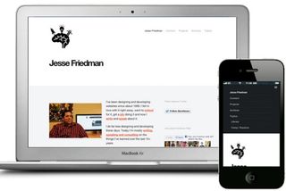
Last year I wrote an article called 'Responsive Design with WordPress' in .net magazine. Back then it made sense to cover specific strategies in responsive web design (RWD), and how they should be modified to work with WordPress. Since then, so much has changed - and I want to readdress things from a fresh perspective.
- Read all our WordPress-related posts here
The technology behind RWD has grown up. WordPress is more accepting of these strategies, and tools for learning RWD and WP are more accessible. Instead of how to do RWD, I want to discuss maintaining your site's integrity.
Liable to break
WordPress has, for several reasons, become the world's most widely used CMS. But many of those reasons, (including ease of use, access, availability of themes and plug-ins and cost) make themes susceptible to strain - or breakage.
You're likely turning your responsive WP theme over to someone with no knowledge of either RWD or WordPress theming. If you don't take measures to protect the integrity of your theme, it will only be a matter of time before it breaks.
There are RWD rules you must follow for it to be defined as such. Here the word 'integrity' comes in. You can design a beautifully fluid and responsive theme. An hour later, in the hands of a user admin, you have a mess. It's your job as a developer to both educate and provide resources to protect your user admins - from themselves.
Responsive design process
I have spoken on responsive and WordPress all over the country for nearly two years now, and the number one question I get is: "How should I change my design and development process for WordPress?" So it's fitting we start here - but you should be prepared for an anticlimatic response.
The answer is: "You shouldn't." WordPress is a CMS or web framework that connects a database of content to a frontend website. Whether you're designing and building for a static website or a WordPress theme, you still need to consider user experience, style, design, cross browser and device compatibility, compliancy and more. The only real difference in the process comes from the additional tools and resources that WordPress gives you.
Technology agnostic
The best designs, whether for WP, another CMS, or none at all, start with a technology-agnostic view. Begin by designing the best possible website you can. Incorporate all the strategies you normally do, then see how they fit into WordPress. I think you'll be pleasantly surprised by what WordPress can do.
If you take a look at some of the awesome WordPress-powered sites out there, they didn't get results by thinking linearly on a WP track. They arrived at the best experience they could create, then made WordPress do what they wanted.

It's also important to note that all your favourite frameworks, tools and strategies will still work with WordPress. This goes for anything from ZURB's Foundation to adaptive images. The most important takeaway is simply to not feel constrained or confined by WordPress.
Media
There's really one major opportunity for a user admin to gaff up media. WordPress core developers have made it so easy to upload, resize, modify and insert media. The one major issue that still exists is the inclusion of static width and height attributes.
When a user admin uploads an image and inserts it into a post, the HTML looks a bit like this:
<a href="http://jes.se.com/inspirational/ do-more-of-what-makes-you-awesome"><img src="http://jes.se.com/wp-content/ uploads/2013/03/20130324-220448.jpg" alt="Do more of what makes you awesome" width="500" height="628" class="alignnone size-full wp-image-249" /></a>
As you can see in the above markup, there are static width and height attributes included in the <img> tag. The problem is, the attribute values are based on the image's actual size - so if a user admin chooses 'full size' the image embedded can be thousands of pixels wide. There are two steps to solving this problem, and preventing users' content from blowing out of its containing area.
- Educate the user admin on media uploading. Help them understand we don't need to include the full size image every time. If they're comfortable, show them how to remove the attributes via the HTML view in the post editor.
- Put a CSS max-width class on all images, iframes and any other media in the post content.
CSS
.post img { max-width: 100%; }
This one line of CSS will prevent the image or media from ever being larger than the containing element. If you're looking for a JavaScript or jQuery based solution, here you go:
JavaScript
document.getElementById('post-image').
removeAttribute('width');
document.getElementById('post-image').
removeAttribute('height');
jQuery
$(".post img").removeAttr("width").
removeAttr("height");
This solution works well to ensure user admins aren't breaking the site with content they control. A solution like this is not a necessary one outside the limits of a CMS-powered site. But this is a good example of how you must compensate for that potential error.

Menus
Navigation must be done right, or you end up with a site that can't be traversed. User admins can have a lot of fun with navigations, which means a lot can go wrong too. There are several things you can and should do to make sure menus don't run wild.
If you haven't already, you should read up on custom walkers. With custom walkers you can take complete control over the output markup of all menus on your theme.
Whether you're working on a theme for a specific client, or building one to be released to everyone, you're probably testing with a simple and clear menu. Before you move on from testing, try adding 10 main nav items, then go on to 20. Then add drop-downs, and flyouts and then more dropdowns. If you think to yourself: "No one's going to add this many main nav items," then you're wrong.
It's easy enough to set the 'depth' parameter on the wp_nav_menu() to prevent the overabundance of drop-downs. Plus, you can work with a custom walker to take further precautionary measures.
Menu on mobile
Next, you want to make sure the menu looks good in a small device. Planning menus on a large screen is rather easy. The real challenge comes along on tablets and phones. Most sites will keep main nav items out in the open on tablets, maybe adding a little extra space to allow for ease of 'touch'. When you get down to phone size you have to be a little more creative with your decisions of how to display the menu.
As I said before, the good news is that your favourite techniques are still going to work with WordPress. Today, there are two major solutions to mobile navigations. The first is the triple-line menu icon that, when pressed, reveals the menu from either the top or the side.
The other popular choice is putting the main nav into a drop-down and using the phone's UI to display the navigation. At Astonish, we use SelectNav.js, a simple script that does all the heavy lifting for you.
Featured mobile menus
As I tend to do, I want to take things one step further. The biggest challenge with both of the solutions just discussed is that your navigation is hidden until a user initiates an action. For sites that need high conversion, and push interior pages heavily, this isn't a great solution.
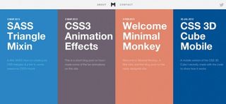
One of my favourite ways of solving this is to define an additional menu location. Menu locations should always be defined because they allow your menus to be agnostic to the theme.
With this additional menu location, you can define specific abilities that only permit the navigation to feature a small number of items, and only be present when the main navigation is hidden.
Registering additional menu locations
function register_my_menus() {
register_nav_menus(
array(
'header-menu' => __( 'Header Menu' ),
'mobile-featured' => __( 'Featured Mobile
Menu' )
)
);
}
add_action( 'init', 'reg is ter_my_menus' );
Displaying featured menu
$defaults = array(
'theme_location' => 'mobile-featured',
'menu' => '',
'container' => 'div',
'container_class' => 'featured',
Take a look at some of the awesome
WordPress-powered sites out there:
they didn't get results by thinking linearly
'container_id' => '',
'menu_class' => 'menu',
'menu_id' => '',
'echo' => true,
'fallback_cb' => 'wp_page_menu',
'before' => '',
'after' => '',
'link_before' => '',
'link_after' => '',
'items_wrap' => '<ul id="%1$s"
class="%2$s">%3$s</ul>',
'depth' => 0,
'walker' => ''
);
wp_nav_menu( $defaults );
Shortly we'll discuss a plug-in I wrote, which will give you the additional ability to only call the menu, when on a mobile device, at the server level - without the need for extra database calls, server calls, or hiding co ntent with JavaScript or CSS.
Featured images
Featured images are probably the most powerful tool in a responsive toolkit for web designers. There are two things that set them apart. First, the image is called outside the main content, which means that you c an do anything you want with it.
Second, you can set sizes and call them by name, which means, when a user admin uploads an image and sets it as the featured image, WordPress will automatically resize it based on your specifications.
Take a look at a website such as WordPress-powered Bates University. It makes excellent use of featured images. As you go through the site, you'll find the same image used in many different places, in many different sizes. The user admin didn't have to open Photoshop, crop and resize all these images, then upload them.

How does this relate to responsive integrity? Well, you're able to simply take control back. When a user admin uploads media through the content editor, they can do anything they want to it. When they upload an image through the Featured Image selector, the image now has to follow strict guidelines you've set in place.
<?php
add_theme_support( 'post-thumbnails' );
set_post_thumbnail_size( 50, 50, true ); // Normal
post thumbnails
add_image_size( 'sidebar-thumb', 260, 170, true );
add_image_size( 'index-thumb', 300, '', true );
add_image_size( 'index-thumb-cropped', 300, 225,
true);
add_image_size( 'footer-thumb', 200, 140, true );
add_image_size( 'archive-thumnb', 300, 300); //
used to add featured
The above code will be set in the functions.php of your theme. As you can see, I have five additional thumbnail sizes. In doing so, I've also given them a name. So if, on the front page of your responsive theme, the user admin has a list of the most recent posts, using the default featured image to show thumbnails, will pull 50x50px images.
This is more effective and efficient than grabbing and resizing a larger image. Later, on the sidebar you can call sidebar-thumb, an example of which is below.
It's paramount that you utilise featured images to the fullest extent. It will allow for greater optimisation of your site, make it far more mobile-efficient, and it's an easy way to take control back over media.
<?php the_post_thumbnail( 'sidebar-thumb' ); ?>
WP mobile detect
I spoke on this topic at last year's WordCamp Boston. During the talk I mentioned a PHP Class called PHP Mobile Detect (now maintained by Serban Ghita). With it you can detect the user's device at the server level. Right after the talk, I converted the class into a WordPress plug-in, which is free to download.
Device detection isn't the solution for every problem (and, to be frank, can be misused), but I feel this plug-in makes an important, positive impact for WordPress users. WP Mobile Detect is also one more step towards truly dynamic web environments.
Non-user initiated downloads
Remember five to seven years ago when we were fighting the use of non-user initiated disruptions? These were auto-playing videos and audio or popups and other annoying tactics. A non-user initiated download is similar: you don't give users a choice.
Let's say you run a blog. On the homepage of your site, you feature the full version of your most recent article (without a 'read more' link). Today, you've decided to write an article showcasing the top 10 infographics related to WordPress.
As a user of your site, I've arrived ready to read your most recent articles. I'm on a bus, heading to work, and am using my AT&T iPhone 5. I don't have unlimited data, and my coverage can be sketchy. Upon arriving at your site, I'm now automatically downloading 10 full size infographics, unknowingly.
Immediately, my experience is poor. Not only am I downloading data that's eating into my plan, but now I have to wait for the content I want to read.
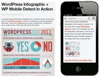
WP Mobile Detect aims to solve this problem. With simple shortcodes, you can swap the full size infographic for a small thumbnail. You can link to the original, presenting the user with an option.
[notdevice]<img src="FULL SIZE INFOGRAPHIC">[/notdevice]
[phone]<a href="LINK TO FULLSIZE"><img src="SMALL THUMBNAIL OF INFOGRAPHIC"></a>[/phone]
This experience is far better: users aren't being taxed to view your site, and are getting the content everyone else is. But they have the choice of how to consume it. This is done at server level, so you needn't worry about additional calls. WP Mobile Detect empowers user admins to take control of the mobile experience, stopping ads, content and files (JavaScript and more) that aren't needed loading, at the server level via shortcodes and functions.
Mobile featured nav
Shortcodes are fun and really easy. But the plug-in also offers a set of functions enabling you to make the same decisions at the theme level. In the code below I've written a test to see if wpmd_is_phone() returns true. If it does, the user is on a phone, and should see the featured menu discussed earlier.
if( wpmd_is_phone() ) {
/* Show Menu */
}
The featured mobile menu is only called when it needs to be displayed, again preventing additional server calls and unnecessarily hidden content. This can be a really helpful and powerful way of giving control back to the user admin – not to mention providing the user with a more unified experience.
You can use these shortcodes and functions any time you wish to call or remove content based on device. There'll be times this isn't the best solution, but there are many reasons you'd want to use it.
Having fun
With RWD, we're so focused on what works, the strategies and user testing that we often forget to have fun. There's so much we can do to provide a light, happy experience for our users. This may not be the keystone of site design, but it has its place.
Remember when Silverback came out? It had the parallax vines hanging from the top of the site. Did they help sell the product? Maybe not. Did they give users an excuse to have fun and possibly share the site? You betcha.
With responsive, we have so much to work with that it doesn't make sense to ignore it. For example, on my old site, I used to have a robot appear that would talk to you when you were on a really large screen. Never forget: RWD isn't just about mobile.
I also had fun last year creating a responsive robot. He's a cute little being who will hold up your navigation, but be careful not to hurt him by stretching the screen. You can play with and have the code behind him here.
UX, responsive and WordPress
Don't forget to consider the UX of responsive and WordPress. We have an opportunity to create some amazing experiences. For example, why not take advantage of the extra space around your site on large screens? On a traditional static site you might not have extra content to use. Yet, with WordPress we do and I rarely see it used.
Take a blog post, for example. Maximise a page like that on a 27in iMac and you get a lot of white space. What if we started putting the comments alongside the post? We all know that readers tend to skim web content. Wouldn't it be great to help users skim the content and the comments at the same time? This will provide a more engaging experience to the user and give them the ability to learn more on the same screen.
Tools
There are two additional tools that definitely need a mention in this article. The first is JetPack, a free plug-in now packaged with WordPress. It has a ton of features and tools, but the one that best relates to responsive and WordPress is JetPack Photon.
Photon is a free CDN powered by WordPress.com. You only need to configure this tool once, and from then on your images will be served from WordPress.com servers automatically. You'll still have local copies on your server. The best part? Photon auto resizes your images a lot like adaptive images, in order to serve optimised images for the viewport of the device.
The second tool is another plug-in, built by the guys at Linchpin. It's an in-dashboard responsive page tester and provides users with the ability to see what pages and posts will look like in different devices before posting. In the future I'd like to see this as a QA measure that, if configured in this manner, would prevent you publishing content until tested on all window sizes.
Conclusion
There are so many tools, resources, frameworks and testing environments to help you build a beautiful responsive website. Converting that to a responsive WordPress theme will not be all that challenging - especially if you read my book, Web Designer's Guide to WordPress.
The challenge comes after you hand it to your user admin. WordPress is a powerful CMS, but its ubiquity is reliant on its ease of use and adoption, a cycle that increases WordPress work for less experienced user admins. Find a balance of empathy, education and passion, so you can provide the tools, resources and knowledge to maintain your responsive WordPress theme's integrity.
Words: Jesse Friedman Image: Mike Chipperfield
Jesse Friedman is a veteran WordPress developer, author and speaker. He's director of web interface and development at Astonish, a professor at Johnson and Wales University, and co-ordinates two WordPress meetups and WordCamps.
Mike Chipperfield is co-founder and creative director of Brighton-based collective Magictorch.
This article originally appeared in .net magazine issue 242.
Liked this? Read these!
- Brilliant Wordpress tutorial selection
- Our favourite web fonts - and they don't cost a penny
- Top free WordPress themes for designers
Seen a great responsive site? Tell us about it in the comments!

Thank you for reading 5 articles this month* Join now for unlimited access
Enjoy your first month for just £1 / $1 / €1
*Read 5 free articles per month without a subscription

Join now for unlimited access
Try first month for just £1 / $1 / €1
Get the Creative Bloq Newsletter
Daily design news, reviews, how-tos and more, as picked by the editors.
The Creative Bloq team is made up of a group of design fans, and has changed and evolved since Creative Bloq began back in 2012. The current website team consists of eight full-time members of staff: Editor Georgia Coggan, Deputy Editor Rosie Hilder, Ecommerce Editor Beren Neale, Senior News Editor Daniel Piper, Editor, Digital Art and 3D Ian Dean, Tech Reviews Editor Erlingur Einarsson and Ecommerce Writer Beth Nicholls and Staff Writer Natalie Fear, as well as a roster of freelancers from around the world. The 3D World and ImagineFX magazine teams also pitch in, ensuring that content from 3D World and ImagineFX is represented on Creative Bloq.


