Why data is your greatest asset (after people)
Tom Barker on using data to identify blind spots in your workflow and maximise your efficiency
I just finished reading Google’s study 'Quantifying Movie Magic with Google Search'. If you haven’t read it yet, definitely check it out.
Essentially the report says that search activity and paid ad clicks for a given movie generally matches box office turn out. In fact, in the report, Google demonstrated this by showing data visualisations, such as a line chart with overlaid search trends and box office index results to show that they both followed a similar pattern. A scatterplot showed a positive correlation between search volume and opening weekend box office.
Honestly this should be a no brainer: that as a general habit or practice we search for what we are interested in. Personally, I think this study just demonstrates Google’s ubiquity more than anything else, and maybe that is the point of it as well.
The reason I bring this up isn’t to discuss the report, its merits, or its impact on the movie industry. I bring it up because it's the most recent and most public example of a core belief that I have: that your data is one of your most important assets, and one that's frequently overlooked.
Google doesn’t forget its data because its data is part of its reason for being. But in the day-to-day struggle and adventure of product development, it’s easy for a team or even an organisation to overlook its data. The focus is often on releasing features and products, meeting business KPIs and generally delighting users.
Don't miss out
Failing to collect, analyse and learn from our data is a huge organisational miss for a number of reasons.
By not girding and reinforcing our reputation with raw facts, we're at the mercy of recency bias. If you aren’t familiar with recency bias, it's an investing term used to describe the misconception that current market conditions indicate future performance. The New York Times did a fun piece on recency bias here.
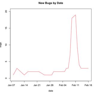
How recency bias can impact us is: say one of my teams has a number of new bugs opened because we took on a larger than usual project with a really tight deadline. If enough time goes by with this inflated bug backlog, it could look like the team really has an issue with quality and needs to focus on that. In fact, it could just be an anomaly based on workload.
But if I can report out to my stakeholders the chart that we can see below, we can very clearly illustrate not just the impact of the event of the new project but also how the team has been recovering from this event. This demonstration of the data reinforces with the stakeholders that my team doesn't in fact have a systemic issue with quality, but instead reacted to external forces, and recovered nicely from it.

Going back to the report put out by Google, it’s not enough for the general opinion to be that Google’s search is ubiquitous. Maybe you saw those Bing It On taste test commercials, and maybe even like the Pepsi challenge back in the day you tried it out, and your resolve of Google’s ubiquity might be wavering. But now you just read the report that demonstrated search results for movie trailers are lock step with box office results for those same movies, and it’s clear in your mind that most of the movie-going population are Google search users.
The above example of a team’s bug backlog is an ideal situation. Say we do have a systemic issue with bugs creeping up on us iteration after iteration. How would we even know we have an issue? How would we even identify where the issue is?
Another important question is: how do you improve if you don’t know where your problem areas are? Your data gives a clear picture of the state of your systems: how many bugs you have total, where your bugs are clustered, what error messages are being generated, where the error messages are coming from, what your API response times are, what your page load times are and what issues are users reporting in production.
These are all operational metrics that you should be tracking. There are also team and organisational metrics that can be gathered, like team velocity, cyclomatic complexity and code coverage.
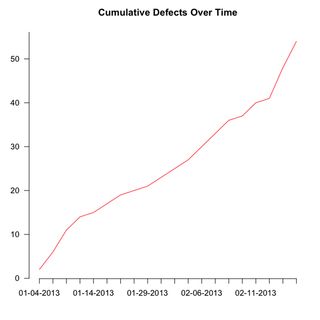
Maybe our bug backlog has been creeping up, week after week, iteration after iteration. I may have a time series chart that looks something like below:

Putting that in front of a team to illustrate a concern is imminently more convincing than a spreadsheet full of numbers.
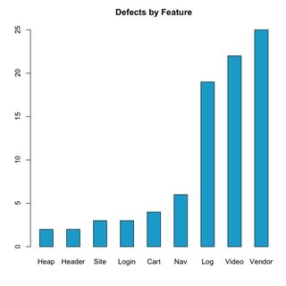
Or say we want to identify where we have the most clustering of bugs in our backlog. The below bar chart is an effective tool for identifying those areas.

Re-running this report regularly will also show progress with addressing these areas.
The point is to use your data as a tool for introspection to identify blind spots, much like a 360-degree review. Once your blind spots are identified you can craft goals for improvement, and your data can be used to track progress towards those goals.
This is important, not just in an abstract academic sense, but because the less time we spend addressing problems, the more efficient we are as a team, the more work we can do towards features that engage our users and the more successful we will be as an organisation overall.
Main image via Ponzi_Unit, licensed under Creative Commons
Get the Creative Bloq Newsletter
Daily design news, reviews, how-tos and more, as picked by the editors.

Thank you for reading 5 articles this month* Join now for unlimited access
Enjoy your first month for just £1 / $1 / €1
*Read 5 free articles per month without a subscription

Join now for unlimited access
Try first month for just £1 / $1 / €1
The Creative Bloq team is made up of a group of design fans, and has changed and evolved since Creative Bloq began back in 2012. The current website team consists of eight full-time members of staff: Editor Georgia Coggan, Deputy Editor Rosie Hilder, Ecommerce Editor Beren Neale, Senior News Editor Daniel Piper, Editor, Digital Art and 3D Ian Dean, Tech Reviews Editor Erlingur Einarsson and Ecommerce Writer Beth Nicholls and Staff Writer Natalie Fear, as well as a roster of freelancers from around the world. The 3D World and ImagineFX magazine teams also pitch in, ensuring that content from 3D World and ImagineFX is represented on Creative Bloq.
