Industry insight: Designers name their favourite typographic ads
Following Red Bee Media's promo spot for this year's Wimbledon tournament, we asked our industry panel to name their favourite typographic campaign.
The power of Wimbledon's top players was epitomised recently in an awesome typographic ad campaign by Red Bee Media. The promo shows characteristics of each of the tournament's top men and women displayed all over their bodies in type.
With more and more advertisers looking to exploit the power of the font, we asked our industry panel to name their favourite use of typography in an advertising campaign...
Dan Moat says

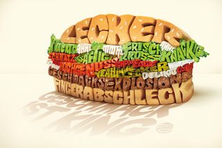
"One of my favourites is a German Burger King campaign featuring a wrap, fries and burger made up of 3D illustrated type. Each element is replaced by the words describing it, such as the burger-textured "geschmacks explosion!" ("taste explosion") running through the burger.
"It's quite a simple idea but it is very well executed. The way they’ve retained the textures and qualities of the original ingredients (from the sesame seeds, to the spiky lettuce, to the dripping 'mmm' of mayonnaise on the burger) really helps the feel of real food, which goes a long way to anchoring the words' meanings.
"The words themselves are also well chosen, to appeal to the audience's stomachs. The food is isolated on an off-white background: a bold move that pays off.
"It's vibrant, fun and even though it's 3D rendered and I don't understand half the words, it makes me hungry. So it must be doing something right!"
Dan Moat is a freelance graphic design operating from his UK-based studio Tahninial

Anthony Lui says

"My favourite typography-based campaign is one for Microsoft's typeface Segoe.
"Unlike IKEA, which went backwards and used a typeface designed for screen in 1996 for print ads in 2009, Microsoft commissioned a face that was as gorgeous in print as on-screen, ensuring a consistent 'transmedia' identity, and one that carries through to its products.
"Whilst Sego has been criticised for aping Frutiger, it's more friendly, modern and harmonious, although there are at least a dozen designers that will disagree with that.
"In Segoe, Microsoft's taken a progressive attitude to typography that helps make amends for the typographic travesties it foisted on the world in Arial and Verdana...and, of course, Comic Sans. And that says a lot."
Anthony Lui is a designer at digital design studio ustwo

Andy Thomas says:

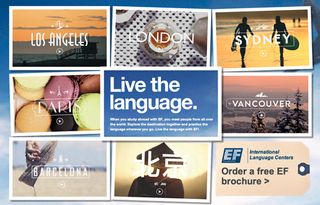
"For me, it's the 'Live for the language' campaign from EF Language School. I love these films for their warmth and authenticity and the type adds a sense local flavour and character without becoming cliché.
"The animation is really simple, which gives it the charm of old cinematic film titles, but the real strength is in the thoughtfulness and craft of the type treatment. The type designer, Albin Holmqvist, would have spent a great deal of time studying the cultural nuances of the various cities and did a really lovely job executing stylistically."
Andy Thomas is creative director at the London office of global digital agency HUGE

"Another example at the other end of the style spectrum is the title for Gaspar Noé's Enter the Void, one of the finest uses of type as illustration I have ever seen. It perfectly sets the mood of the film, with plenty of cultural and gaming references and no live-action film at all. Not exactly a campaign, but then you could argue that it is almost a film a within a film."
Shane Mielke says

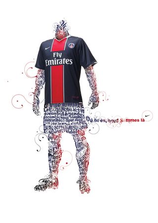
"Similar to the Wimbledon tournament campaign is the illustration that UK artist and designer Si Scott did back in 2008 for a Nike campaign.
"It’s a great combination of Si’s immediately recognisable hand drawn style of spirals and swirls and custom typography mixed with real world photography.
“I’ve always been infatuated by the amazing detail, symmetry and uniqueness of Si’s work over the years."
Shane Mielke is creative director at digital agency 2Advanced.

So, that's what our designers think. But what's your favourite use of typography in a campaign? Let us know in the comments box below...
And why not check out our typography tutorials, and view glossary of type terms if you've ever pondered the question What is Typography?.

Thank you for reading 5 articles this month* Join now for unlimited access
Enjoy your first month for just £1 / $1 / €1
*Read 5 free articles per month without a subscription

Join now for unlimited access
Try first month for just £1 / $1 / €1
Get the Creative Bloq Newsletter
Daily design news, reviews, how-tos and more, as picked by the editors.
The Creative Bloq team is made up of a group of design fans, and has changed and evolved since Creative Bloq began back in 2012. The current website team consists of eight full-time members of staff: Editor Georgia Coggan, Deputy Editor Rosie Hilder, Ecommerce Editor Beren Neale, Senior News Editor Daniel Piper, Editor, Digital Art and 3D Ian Dean, Tech Reviews Editor Erlingur Einarsson and Ecommerce Writer Beth Nicholls and Staff Writer Natalie Fear, as well as a roster of freelancers from around the world. The 3D World and ImagineFX magazine teams also pitch in, ensuring that content from 3D World and ImagineFX is represented on Creative Bloq.
