Wireframes aren't dead: they're just changing
UXPin's Jerry Cao explains the latest thinking on using wireframes in the UX design process.
Creating wireframes
Wireframes can come in many forms, some of which aren't even digital. Choose the method that's most suitable to your product, accounting for your time and resources. Personally, we prefer sketching on paper and then wireframing digitally – we fail quickly on paper, then improve ideas as wireframes (which can be shared and made interactive).
Here's a few common wireframing methods described in the free Guide to Wireframing:
- Sketching – The most basic method of wireframing is simply to draw your ideas on paper. Regardless of the level of detail, sketching your wireframe is fast and intuitive, though it lacks a lot of the online benefits and problems may arise when you need to share with other team members. Of course, sharing isn't too much of an issue if you sit near your team members (or aren't afraid of taking a photo and emailing).
- Paper-cutouts – This form of sketching takes a lot of the guesswork out of sketching and gives a better handle on usability. However, to create one properly requires time and sometimes even artistic ability, plus they also present the same problems with sharing as sketches.
- Graphic design software – If you're more comfortable with your favorite graphic design software, use that. With enough experience in Photoshop, Illustrator, or Sketch, these programs can feel just as natural as putting a pen to paper. Aside from no capacity for interaction, the other drawbacks are their learning curve and always-present temptation to dive into graphic detail.
- Presentation software – We all know how to use Powerpoint or Keynote, so this is usually the easiest method. Just draw a few boxes on a blank slide – templates like Keynotopia can even help you along. But while presentation software is very familiar and forces us to think about page flow (since slides are presented linearly), they lack substance. You won't be able to add complex interactions easily, so your wireframe becomes a dead-end deliverable.
- Wireframing tools – Specialized software designed specifically for wireframing facilitates the entire process and anticipates common concerns before they happen. The downside is they typically cost money – some more than others.
Choosing the best method of building a wireframe always depends on how you intend to use it, which we'll discuss next.
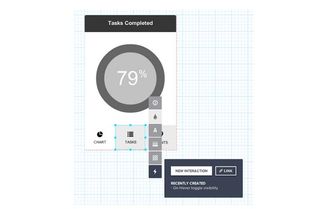
There's as many variations in the design process as there are designers, so there's no one way to use a wireframe. However, if we summarize some of the processes, we can show you how to best use wireframes under different situations.
01. Traditional process (wireframe => mockup => prototype)
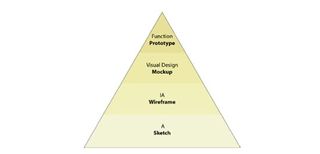
The wireframe originates from the wireframe-mockup-prototype process reminiscent of waterfall design methods. In this process, fidelity and functionality increase linearly in phases.
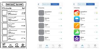
This process relies on the specialization of each phase: the wireframing phase specializes in outlining and formalizing a big picture, the mockup phase specializes on the visual details, and the prototype phase specializes on usability and interactivity.
In this case, the wireframing is the backbone – as the unifying document, it provides the foundation on which the mockup and prototype are built.
Get the Creative Bloq Newsletter
Daily design news, reviews, how-tos and more, as picked by the editors.
If you're stuck with the waterfall method, you can still use paper, Photoshop, or a wireframing tool. Just don't spend too much time, since things always change when you least predict it.
02. Rapid prototyping (wireframe => prototype)
A result of the Agile design strategy, rapid prototyping forgoes the traditional method of building one product to completion, and instead builds multiple, simpler minimum viable products for quick testing for smarter iteration.
Despite claims to the contrary, wireframing will not impede rapid prototyping, but in fact makes it more effective.
Due to the nature of quickly building, testing, and then recycling the prototypes, an interactive wireframe (lo-fi prototype) works better in this role than prototypes of higher fidelity.
Interactive wireframes are easier and faster to create, but will still yield the same usability data from testing. They're so easy to build, in fact, that you can build and test several simultaneously.
03. Early coding (wireframes => coded prototype)
Alternately, you can go straight from a wireframe into an early-stage coded prototype. This method works best for projects with unique technical requirements that need to consider coding as soon as possible, but is also a preference of designers who are confident in their coding ability and want to get the ball rolling.
Whatever the reason, wireframes still serve as a helpful visual guideline for HTML prototypes. In most cases, the wireframe is the only blueprint from which to design, and so anything absent will have to be addressed during the actual development, which can be problematic (unless you are extremely proficient in code).
On the other hand, a thoughtfully created outline will hold the project together and give you the chance to consider the details of layout before you're lost in the thick of coding.
If you'd like to learn more about jumping from wireframes to code, we recommend checking out Ash Maurya's piece describing his mid-fidelity process. If you'd like to learn about wireframing with code, check out designer Matt Griffin's article on A List Apart.
Takeaways
Serving as an early stage for planning and outlining, wireframes form the foundation on which the rest of the product is built. Because that foundation is still subject to change, don't spend days wireframing when that time is better used for building your prototype.
Think of wireframes as a design sandbox: once you've played around enough and have a basic structure in your hand, it's time to move on.
More cohesive than a sketch, and less involved than a hi-fi prototype, wireframes fill the all-important niche between abstract ideas and something you can actually see. Don't short-change your product by jumping that gap in a single bound. Take some time to conceptualize the fundamentals. And remember, with new tools and technology, you can always adapt your wireframe to be whatever you need it to be.
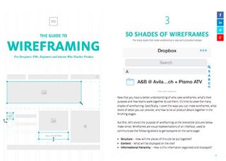
If you'd like to learn more about about practical wireframing, check out the free Guide to Wireframing. The free 119-page ebook explores wireframe fidelities, tools, processes, and dozens of analyzed examples from companies like Tinder, Instagram, Facebook, Yelp, AirBnB, Uber and more.
Words: Jerry Cao
Jerry Cao is a content strategist at UXPin — the wireframing and prototyping app.
Like this? Read these!
- Has your website survived mobilegeddon?
- The ultimate guide to logo design
- Brilliant Wordpress tutorial selection

Thank you for reading 5 articles this month* Join now for unlimited access
Enjoy your first month for just £1 / $1 / €1
*Read 5 free articles per month without a subscription

Join now for unlimited access
Try first month for just £1 / $1 / €1
The Creative Bloq team is made up of a group of design fans, and has changed and evolved since Creative Bloq began back in 2012. The current website team consists of eight full-time members of staff: Editor Georgia Coggan, Deputy Editor Rosie Hilder, Ecommerce Editor Beren Neale, Senior News Editor Daniel Piper, Editor, Digital Art and 3D Ian Dean, Tech Reviews Editor Erlingur Einarsson and Ecommerce Writer Beth Nicholls and Staff Writer Natalie Fear, as well as a roster of freelancers from around the world. The 3D World and ImagineFX magazine teams also pitch in, ensuring that content from 3D World and ImagineFX is represented on Creative Bloq.
