Why you should be using Lean style guides
Adam Fairhead explains what Lean style guides are and why you should use them.
Let's say you want to enhance a company's reputation. Or perhaps you'd like to get more done by streamlining project design and development. Maybe you're looking to do better work by improving a site's user experience. In any of these cases, conventional style guides are likely to enter the picture.
Style guides are massively important for brands of all sizes. Without them, a band of hundreds of employees would never be able to communicate a single visual identity. But style guides aren't always useful. At least, not in their current form.
In this article I'll explain how conventional style guides could cause teams to feel left out, or even cause people who need them to abandon the idea of style guides altogether.
First, let's take a look at some beautiful style guides. Then we'll elaborate on some points that were first described in the free ebook Style Guides for Web UI Design by the wireframing & prototyping app UXPin.
Beautiful style guides
Style guides are their own form of art. Uninteresting to many, gorgeous to few. Let's take a look at what a beautiful style guide looks like.
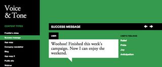
VoiceAndTone.com is a content guide for all of MailChimp's client-facing copy. It has domain and style all of its own. It takes a highly visual approach to articulating how MailChimp's content team should communicate, sharing everything from sample copy to intended emotions, to tips on effective usage.
Content pages change between colour-coded sections with fluid animations. The design adapts happily from mobile to desktop displays. It's been given the same level of production that a client-facing marketing site might receive.
Get the Creative Bloq Newsletter
Daily design news, reviews, how-tos and more, as picked by the editors.
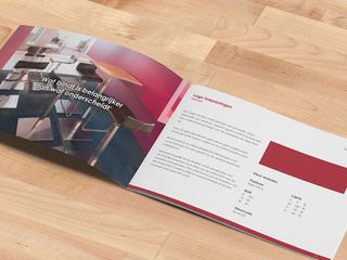
A quick look on sites like Dribbble will reveal a variety of equally beautiful printed style guides. Many pay careful attention to ensure that the style guides look as well designed as the collateral they exist to help create.
Brands equipped with style guides like these understand the value of solid style guides, and the value they undoubtedly bring to the consistency of their brand voice.
The flaws only begin to reveal themselves when we consider brands in the marketplace that don't already understand or appreciate the value of style guides. Particularly highly designed, printed portfolio pieces like the ones we see above.
So, let's come back to the earlier question: what's the difference between a regular style guide and a Lean style guide?
Definitions
Simply put, a Lean style guide delivers maximum value for minimal production and maintenance.
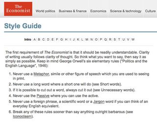
If the goal of a style guide is to enable brand consistency across multiple disciplines, then the goal of a Lean style guide is to do exactly that and nothing more. As an essential but often-underappreciated brand asset, we need to knock down some barriers of entry so that more brands can use them.
Some common barriers include:
- Financial investment of creation. How much does it cost to create?
- Financial investment of maintaining. How much does it cost to keep the thing in a state of usefulness?
- Time investment accessing the guide. Will people be wasting time figuring out how to get the guide, will we need to keep printing them and distributing them?
- Time investment of reading/learning/understanding the guide. Will everyone need to essentially read a whole book before getting on with any work?
- Emotional investment of keeping all teams equally included. Will this show favoritism to certain teams?
It's time to break down these barriers, and do so by creating Lean style guides, to deliver maximum value for minimum production & maintenance.
So what do we need to keep in mind while creating style guides that are, in fact, lean?
01. They know who they're written for
Whether it's a battle-tested web development strategy that maintains blazing-fast load times, or a visual design that's both intricate and unified, the work that goes into these pieces is always more than the sum of its parts.
As a result of having done all that work, the temptation is to blend the finished results with the scientific and artistic rationale behind them. Let's look at a couple of examples of why this might not be helpful.
Web designers: Many web creatives appreciate the work that went into a style guide. Particularly if they've ever (or ever plan to) work on creating such guides themselves. Not all web creatives will share that appreciation, though, nor will many want to dive into it while on the clock for the client the guide belongs to. Simply seeing what he must do and not do in order to honor the brand must be the priority.
Copywriters: For a contract copywriter who comes on board to write an article under the brand, documentation covering style guide creation is likely to be seen as unnecessary weight to an already content-heavy document. For that copywriter, the style guide may be skimmed or discarded entirely due to the weight and complexity of the read. Would that be irresponsible? It would. But people aren't robots, and we owe it to the creatives that come after us to create a guide that's easy to digest.
Let's look at an example from Google's Material Design guidelines: "Material has certain immutable characteristics and inherent behaviors. Understanding these qualities will help you manipulate material in a way that's consistent with the vision of material design.”
What's that even mean? Did the copywriter need to see that? Did the designer need to see that?What's that even mean? Did the copywriter need to see that? Did the designer need to see that?
As described in the free ebook Style Guides for Web Design, Lean style guides should keep in mind who they're written for:
- If there's a simpler way, take it. Readers are unlikely to be as enthusiastic about the "why" as the "what" as the people creating and maintaining the guide. Separate your documented process from the deliverable guide others use. Use images to communicate ideas quickly. Consider a web version instead of a PDF they might lose or a .doc they can't open.
- Favour clarity over verbosity. Books tell you what the author is about to say, then they tell you what they want to say, then they tell you what they just said. If your guide is structured like a book or even a blog post, it's probably too verbose. Careful structure and design should allow you to keep things succinct. Strip out artsy descriptions and get down to business.
- See how long it takes people to consume. New readers of your style guide should be able to find the sections they need quickly, and consume those sections quickly. Consider speaking to people who use your style guide and see how long it took them to get, read, understand and act on.
02. They aren't marketing sites
Much like mockups, style guides are a great opportunity creative teams use to showcase their skills in the design world. And it's fair to say that an exciting guide design, coupled with tailored marketing copy, could indeed promote your brand.
Marketing sites and style guides have different goals. Marketing sites help people overcome their doubts about a product or service and start buying. But a style guide has goals that aren't just about promoting a brand or product.
The highest praise a Lean style guide can have is:
- That it gets everyone speaking with one voice. That the content is proven to be effective in ensuring a consistent, common persona throughout the brand materials.
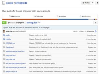
- That it's cost-effective to make and maintain. If it's consuming huge amounts of funding to exist, due to being portfolio pieces instead of style guides, is it really helping the brand? For example, Thoughtbot's code-style guide is just a bunch of markdown files in a GitHub repo.
- That it actually gets used. Many creatives want to dive right in on content or visuals. A style guide that can integrate with the enthusiasm of creatives is a style guide that works.
Much like with marketing sites, we should keep the key goals in mind when creating style guides, and measure their success against those goals.
03. They're never done
Brands are never 'done'. Websites are never 'done'. They're always evolving, just like and because of the people they serve. Style guides follow that same pattern.
If a style guide stops being the best brand biography available, the brand's style could lose touch with its audience. To maintain a state of constant evolution, a Lean style guide should be:
- Easy to update. The guide's design should say “look at this” rather than “look at me”, to make sure it's own aesthetic doesn't get in the way of large changes. Thoughtbot, for example, uses version control for their guides, so anyone can update it at any time.
- Easy to access. Public web access will help users not only access the guide, but access the right version. Versionless access such as with a website will make the guide more likely to be used, which is a key goal of an effective style guide.
- Cheap to update. If the guide maintains extensive research and elaborations in every section, all that content will need rewriting if the results change. Similarly, if the visual style changes within the guide, an over-designed guide will need a redesign too. Keeping the guide simple will keep the guide cheap to update.
- Cheap to access. By this I mean that the cost of opening the guide is minimal. As I mentioned earlier, if you need to hunt for a new version, or check whether your version is the latest version or not, the access cost can be decreased.
04. They don't leave people out
Lean Style Guides should be lean. They trim the fat, not the value for different people and roles.
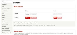
By matching clear content to each type of reader, you'll allow readers to get into the section that applies to them fast, then get out fast too.
- Voice & tone. There's a huge amount of personality in copy, and copywriters want to know what that personality is.
- Web visual. When a brand communicates online, the key visual patterns should be identified in the guide for web designers to use.
- Web code. When developers create for a brand, you won't want them all rolling their own flavor of code. A code guide will show them what markup to use.
- Multimedia. Video overlays, business cards, promotions - examples with short explanations will keep everyone on the same page.
- Social. How does the brand socialize? Similar to Voice & tone, Social guides should demonstrate how the brand interacts on social networks.
- Logo use. This is what everyone thinks of when they think ‘style guide'. How is the logo supposed to be used in different situations?
- Typography and colour. Identification of what typefaces should be used, what colours should be used, and when each is appropriate.
Conclusion
An effective style guide is the by-product of caring enough about a brand's relationship with its audience to solidify that relationship. They help humanize a brand by turning it from hundreds of voices into a single voice.
Next time you create or update a style guide, consider going lean. Let's recap:
- Remember who the guide is for. It's for the rest of the team, not just for you.
- Remember they're not marketing sites. Style guide designs should reveal the brand's design, not the design of the guide itself.
- Remember to make them maintainable. These things need to be flexible to be successful.
- Remember to not leave anybody out. Cut fat, not sections.
If you'd like to learn more about creating practical style guides, check out the free pocket guide Style Guides for Web UI Design by UXPin. The guide explains four of the most helpful categories of style guides with plenty of examples from Adobe, Atlassian, Ubuntu, Facebook, and others.
Words: Adam Fairhead
Adam Fairhead is the founder of Fairhead Creative, a creative web design & marketing company that helps online business owners motivate their visitors to buy online. Adam also contributes to the collaborative wireframing & prototyping app UXPin. Follow him on Twitter!
Like this? Read these!

Thank you for reading 5 articles this month* Join now for unlimited access
Enjoy your first month for just £1 / $1 / €1
*Read 5 free articles per month without a subscription

Join now for unlimited access
Try first month for just £1 / $1 / €1
The Creative Bloq team is made up of a group of design fans, and has changed and evolved since Creative Bloq began back in 2012. The current website team consists of eight full-time members of staff: Editor Georgia Coggan, Deputy Editor Rosie Hilder, Ecommerce Editor Beren Neale, Senior News Editor Daniel Piper, Editor, Digital Art and 3D Ian Dean, Tech Reviews Editor Erlingur Einarsson and Ecommerce Writer Beth Nicholls and Staff Writer Natalie Fear, as well as a roster of freelancers from around the world. The 3D World and ImagineFX magazine teams also pitch in, ensuring that content from 3D World and ImagineFX is represented on Creative Bloq.
