Why mood boards give designers more control
Mood boards matter in the boardman, argues Jerry Cao of UXPin, and offers tips on making best use of them.
Brightening things with mood boards
Want a way to unify your team that's a lot more fun and creative than an uncomfortable meeting?
We go into details about mood boards in Web UI Best Practices, but we'll discuss their significance again here. Mood boards are ideal for encouraging — but not forcing — input from your team, quite a different strategy than the committee mindset.
Popularized by industries such as fashion and interior design, these stylistic collages have been proven effective across many visual industries, including web UI design.

Mood boards give designers more creative control because the context is easily understood: since everyone's looking at an early stage design, the feedback is mostly conceptual. That helps prevent stakeholders from getting too prescriptive like when they pick apart the navigation or font size of a mid or high fidelity mockup. Even if they feel strongly about certain visual themes, the designer still has control over creative execution.
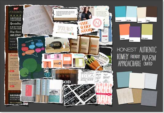
Take a look at the above mood board above, made by UX agency Clearleft. This mood board is more than just a Pinterest-style collage — its a canvas that shows (rather than tells) the typography, colours, and overall feel for the site. Web Designer Depot explains that mood boards show clearly the aesthetic feel of a site, and act as a quick reference guide for the design's visual elements.
You can think of mood boards as a succinct and abridged style guide, in poster form for easy reference. As to what you include on your mood board, make sure you cover brand guidelines, communication style, and the personality of the website. Web design mood boards should focus on a specific set of elements:
- Colour palette — your site's colour scheme and primary colours.
- Typography — any useful information about fonts, sizes, heading preferences, etc.
- Graphic style — what kind of photos or illustrations you prefer, with examples.
- Iconography — if your site uses icons or symbols, this is a good place to keep them straight.
- Navigation style — the basics of how users get around your site.
- Spacing — where and how much white space is used.
- Overall contrast — this helps to emphasize the overall visual hierarchy and structure
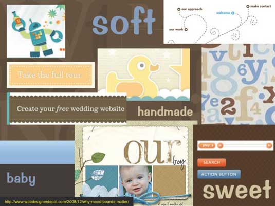
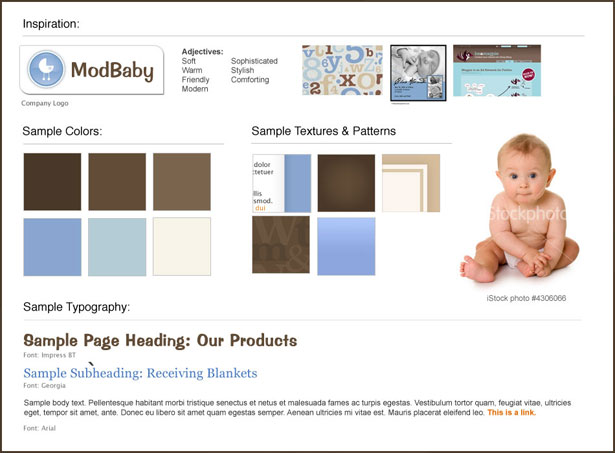
Mood boards are meant to be creative, so don't get pigeon-holed by the technical details of the board itself. They generally they fall into two styles, Loose and Refined. Compare the two different styles of mood boards for the same site, ModBaby.
Get the Creative Bloq Newsletter
Daily design news, reviews, how-tos and more, as picked by the editors.
Loose mood boards

This style is more about capturing a snapshot of the site's look and feel. In fact, the first moodboard by Clearleft is done in this looser style. All that's required is few quick adjectives to describe the brand, an overall colour scheme, and images and elements to show how everything "feels". In this case, feedback on the mood board would be mostly conceptual.
Refined mood board

The refined style is more streamlined, showing the brown and blue colour scheme but dropping handmade elements in favor of more explicit patterns, typography, and photos.
In general, mood boards help avoid design by committee in two ways. First, all team members have a clear visual representation of the their target (as opposed to relying on their own interpretations of verbal descriptions). Secondly, a visual asset in the beginning phases can help alleviate "empty canvas" syndrome, in which people provide feedback simply because it feels better than waiting for the first draft.
While some people would rather take a "hands-on" approach to their mood boards by cutting magazine clippings and pasted them to a board, there are some digital tools such as ImagePacker, Vhue, and Niice that can add a nice touch of refinement. Regardless of your methods, we've found Dribbble, Behance, Pinterest, and Flickr’s Inspiration Boards are great resources for mood board inspiration.
The anti-committee
If you want to create a successful web UI design, you'll probably need a little help. But that's a good thing — when done right, collaboration can enhance the final product in ways not otherwise possible. Just make sure that collaboration is complementary, and not supplementary, to the design process.
Like sketching, moodboards help you see the visual ingredients of the website while getting you over the groan zone faster. And if nothing else, they're a less labor intensive way of treating those afflicted with I'll-know-it-when-I-see-it syndrome.
To learn more about building successful web interfaces based on examples from 33 top companies like AirBnB, Wufoo, and Linkedin, check out the free e-book Interaction Design Best Practices.
Words: Jerry Cao
Jerry Cao is a content strategist at UXPin — the wireframing and prototyping app — where he develops in-app and online content for the wireframing and prototyping platform. To learn how to use mockups of all types and fidelities, check out The Guide to Mockups.
Like this? Read these!
- Great tools for creating mood boards
- How to build an app: try these great tutorials
- Free graphic design software available to you right now!

Thank you for reading 5 articles this month* Join now for unlimited access
Enjoy your first month for just £1 / $1 / €1
*Read 5 free articles per month without a subscription

Join now for unlimited access
Try first month for just £1 / $1 / €1
The Creative Bloq team is made up of a group of design fans, and has changed and evolved since Creative Bloq began back in 2012. The current website team consists of eight full-time members of staff: Editor Georgia Coggan, Deputy Editor Rosie Hilder, Ecommerce Editor Beren Neale, Senior News Editor Daniel Piper, Editor, Digital Art and 3D Ian Dean, Tech Reviews Editor Erlingur Einarsson, Ecommerce Writer Beth Nicholls and Staff Writer Natalie Fear, as well as a roster of freelancers from around the world. The ImagineFX magazine team also pitch in, ensuring that content from leading digital art publication ImagineFX is represented on Creative Bloq.
