Why great web design needs great copywriting
Jerry Cao offers 4 reasons why web designers need to become good writers, and how to go about it.
03. Copy is content
While not every site will include a blog or feature articles, most will have at least some textual content, even if just a paragraph in the About Us section. Text as content is where you encounter the true craft of writing, and there's no shame in hiring a professional. Regardless of whether you use a copywriter or not, the important thing is that your design factors in the writing earlier rather than in the later stages.

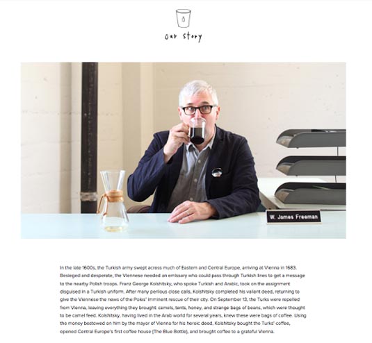
Blue Bottle's Our Story is a great example of how clever copy can elicit an emotional response while still serving a practical purpose. The war story from medieval times sticks in the reader's minds while giving the brand credibility from its centuries-old brewing techniques.
It's now common knowledge that users will not read every word on your site, and the more blocks of text they see, the more likely they are to scan for what they're looking for (we actually describe the patterns in the free ebook Web Design for the Human Eye).
That's why the content must be framed in a way to facilitate this by applying visual design techniques like:
- clearly defined rows and columns
- proper spacing between letters, words, lines, and paragraphs for legibility, readability, and vertical rhythm
- adequate white space to relax the eyes
Again, avoiding lorem ipsum will help accurately account for these details early on in design.
04. Copy creates tone and personality
What you say isn't always as important as how you say it.
Phrasing, tone, and word choice all affect the personality the site design exudes (it's all a part of the same design persona), and given that words are likely the main avenue for communication, the implications are great. It's not enough that the tone match the visuals – the tone has to match the product as well.
Get the Creative Bloq Newsletter
Daily design news, reviews, how-tos and more, as picked by the editors.
The writing is, after all, the product's voice.

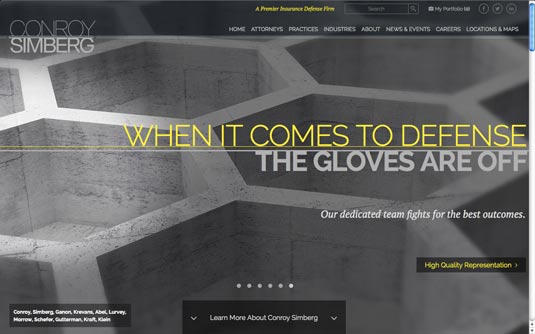
Pay attention to the word choice and tone of the website for Conroy Simberg. As a law firm, they must uphold a certain identity. Words like "defense" and "fights for," plus phrases like "the gloves are off" and "high quality representation," all further this tenacious identity.
So, too, do the graphics (angular shapes in what looks like concrete) and typographical choices (all capitals, and a no-nonsense font), making this site a good example of copywriting working with visuals to convey a unified message to users.
Imagine how out of place more casual words like "Welcome! When it comes to your rights, we know what's right!" would look on this site. Probably as out of place as this site's language would look on a site for crayons.
Conclusion
Copywriting shouldn't be something developed on an island that's shipped over to the rest of the design, where it must be forcibly inserted, losing bits and pieces along the way.
When we say copy is a design element, we mean that, as such, it will benefit the design most when working synchronously with the visual and interactive design. While tempting, and somewhat easier, to develop each element individually then jam them together at the end, the overall design is more consistent when the copywriting, visuals, information architecture, etc., all work together in harmony.

Maybe the designer is right is saying they're not writers, but they are undoubtedly orchestrators – understanding how each piece fits together as a whole is always a part of that role.
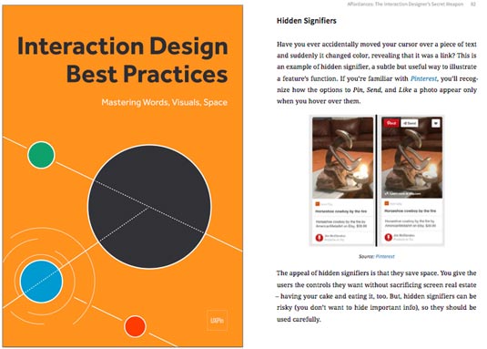
If you'd like to learn more about the designing copy for the web, check out our free 100-page e-book Interaction Design Best Practices: Words, Visuals Space. 30+ examples are analyzed from companies like AirBnB, Google, Yahoo, Github, and others.
Words: Jerry Cao
Jerry Cao is a content strategist at UXPin — the wireframing and prototyping app.
Like this? Read these!

Thank you for reading 5 articles this month* Join now for unlimited access
Enjoy your first month for just £1 / $1 / €1
*Read 5 free articles per month without a subscription

Join now for unlimited access
Try first month for just £1 / $1 / €1

The Creative Bloq team is made up of a group of design fans, and has changed and evolved since Creative Bloq began back in 2012. The current website team consists of eight full-time members of staff: Editor Georgia Coggan, Deputy Editor Rosie Hilder, Ecommerce Editor Beren Neale, Senior News Editor Daniel Piper, Editor, Digital Art and 3D Ian Dean, Tech Reviews Editor Erlingur Einarsson, Ecommerce Writer Beth Nicholls and Staff Writer Natalie Fear, as well as a roster of freelancers from around the world. The ImagineFX magazine team also pitch in, ensuring that content from leading digital art publication ImagineFX is represented on Creative Bloq.
