Why the future web will be led by visual designers
Tomer Lerner predicts a radical shift to in-browser web design.
The internet is vast, and has come a long way in a comparatively short time. It’s hard to remember, sometimes, why we ever did things the way we did. Years of background, trial and error, and learning often get condensed into simple explanations like, "It's best practice." Then the client says, "Yeah, but why?" and we struggle to put all of that context into words. We've all been there.
Here's my dirty little web designer "origin story": I started out as a craftsman dabbling in carpentry, molding, painting, with very minimal interactions with technology.
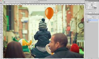
While working at a photo shop, they had a small graphic design team that put balloons on kids photos with Photoshop. It may seem insignificant, balloons on pictures, but that was the first time I realized that computers were also a creative medium.

Pretty soon after, the internet of things was kicking off and I discovered Dreamweaver. I started out by dragging and dropping things onto the screen, then wondering why everything seemed to randomly fall apart.
Why couldn't stuff be vertically centered, anyway? It was easy enough to do in Photoshop. I made basic web pages and freaked out a little when more experienced webmasters (oooh, remember when that was a thing?) told me that my work needed… well…more work. Eventually, I moved on to raw HTML and CSS. It took a while; but I learned.
When responsive standards erupted onto the scene, static design was shelved in favor of dynamic design as a default and once again I found myself looking to adapt but neither Photoshop nor code were necessarily the best stand-alone option to implement design.
Here's the thing that I think a lot of us forget, though: browser-based design came first.
A little bit of history
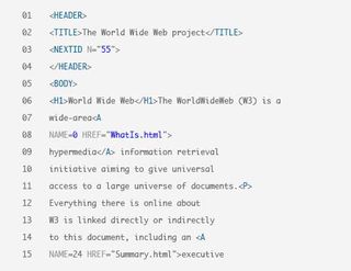
In 1991, Tim Berners-Lee released the first web browser, then called WorldWideWeb. Not long after, people began calling each other Nazis in comment sections and forums. But before that, there were no graphical ways of building websites.
Heck, there wasn't much you could do about a page's layout, in any case. Still, the first web pages were made with text editors, and then tested in the earliest available browsers. That's just how it was done.

Tables didn't show up until at least two years later, as far as anyone can tell. Not long after that, some smartypants probably said, "Wait, these 640-by-480-pixel monitors are just too big for one column of text. I can split this up with tables!"
Then people figured out that coding tables by hand was really boring, and wouldn't it just be nice to have a way to draw them, and that's how we got DreamWeaver, Frontpage, and other nightmares of the late '90s and early 2000s.
Well, they served their purpose. They wrote hilariously bad code; but they got beginners like my 23-year-old self into building websites for the first time.
The rest is all Photoshop tutorial sites and embarrassing early work, at least until I figured out CSS. Thank all the deities for CSS.
So what's wrong?
Well, the two main approaches to design, right now, are these: Photoshop-first, and designing in the browser. The drag-and-drop website builders of old are scorned, and rightfully so. They were unintuitive, wrote bad code, and didn't handle new developments in web design very well.
However, the Photoshop-first design and template-based or coded design in the browser approaches may both be reaching the end of their life-spans.
Photoshop-first

The problems with this approach are many, and pretty well-documented. The process of mocking up everything in Photoshop first has been falling out of favour for years, as fast as code-savvy designers can convince their clients to let it go.
Why? Because...
- Photoshop doesn't display web pages the way browsers do; so it's harder to show the client how the site really works.
- Photoshop renders fonts differently.
- Responsive design is basically triple the work.
- It can be a lot harder to make site-wide style changes in the design phase. (To be fair, recent versions of Photoshop have attempted to address this problem with varying degrees of success.)
- When a designer doesn't know how HTML and CSS work, it can be a real pain trying to translate their design to the browser.
In short, Photoshop-first design has trouble keeping up with the realities of building websites.
Code-first
Coming from a Photoshop-first background, it took me a while to get into browser-based design.
Going from a blank canvas where seemingly anything was possible to a blank web page where I had to write code to make anything happen was a big change for me.

Once I saw the benefits, I became a strong proponent of it. Designing your site with HTML forces you to think about logistics, learn to write better code, become familiar with each browser's quirks and capabilities, and more. I felt more creative in Photoshop, but I learned to be a lot more practical by designing in the browser.
Now, though, I am forced to ask myself if there might be a better way. As people copy and paste their way through the design process with endless templates and frameworks, I find myself asking if I lost something important when I ditched Photoshop and that strangely inspiring empty canvas.
Besides that, there are other issues:
- It's not beginner-friendly. At all. I saw someone tell a would-be web designer to start by learning "HTML, CSS, and git". git! If it hadn't been for Dreamweaver, I wouldn't be here.
- It's harder to iterate through design options and just let stuff go if it doesn't look right. Coding something up can take a while, and if it doesn't work for the design, it can be frustrating to just delete it.
- Depending on the designer, it can slow down the design phase by a lot.
The new approach
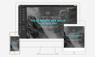
Naturally, drag-and-drop website builders haven't gone away. They have, however, seen a drastic evolution. Gone are the clunky desktop programs that were frequently, sadly left behind by newer technology. Now, we have web-based software-as-a-service platforms.
They're based on modern web standards, everybody gets the same version, and they make better code. No seriously, with code frameworks, better file and resource management, and over a decade of new knowledge put into their creation, the code is a lot better than it was.
We get that old canvas back, where we can drag and drop things in fast, or delete them faster. We can iterate endlessly, and all within the practical constraints of a browser. People can test their designs at any resolution they like. Even better, the learning curve is a lot easier to manage.
This means that the internet of the future will in many ways be led, once again, by visual designers. Having learned the value of user experience design, page speed optimization, and other more technical things, it's time we got back to that blank canvas. That's where I had all my best-looking ideas, anyway. If we can get away from using the same templates over and over, the future of the Internet could look very interesting indeed.
The technology for a quality visual website builder is here, and it's the right time for it. Give it a chance, because it's the future of small-to-medium-sized websites in any case.
Related articles:
- 3 keys to a killer freelance design portfolio
- How to set every design project budget in 4 steps
- How to build an app: try these great tutorials

Thank you for reading 5 articles this month* Join now for unlimited access
Enjoy your first month for just £1 / $1 / €1
*Read 5 free articles per month without a subscription

Join now for unlimited access
Try first month for just £1 / $1 / €1
Get the Creative Bloq Newsletter
Daily design news, reviews, how-tos and more, as picked by the editors.
