20 things web designers can learn from print design
Surely there's nothing that web designers can learn from print! Not so, says award-winning designer Paul Wyatt.
Long before the all singing, all dancing, click-me-now world of the internet arrived, print designers were making layouts which embraced the power of typography, image selection, and simplicity.
Traditionally, advice is given to a print designer who is transitioning to life as an online creative. But the tools and tricks of a print designer are highly transferable to the online world. Their typographic practices in particular can help take a web page from dull to pro in a few CSS tweaks.
The power of type shouldn't be underestimated and is something the online designer can embrace to make impactful and creative layouts. Here are 20 tips from the world of print design which you can use in your online work to make (even more) stunning layouts.
01. Getting it right first time
When content is put online it's never set in stone. It can be changed and fiddled around with in an instant. Missed that typo? Spelt the President's name wrong? Never mind, it's an easy fix.
Quality control (QC) can slip a little here as we have that knowledge that we can change these types of mistakes on the fly. Print designers know that the first impression is the best impression and getting it right first time is vital as their work is locked and sealed and sent to a printer.
Online QC processes should take a leaf out of the print designer's book by simply being thorough. Why shouldn't the President's name be right first time online?
02. Rise above the machine
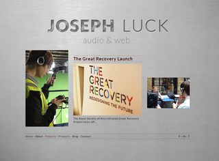
Have a look at a magazine such as Time or The Economist and you'll see images that seamlessly work with the copy around them. They support the copy and add impact to the article. They help tell the story because they've been art directed. They've been cropped into and positioned to show the most impactful or interesting part of the image.
Get the Creative Bloq Newsletter
Daily design news, reviews, how-tos and more, as picked by the editors.
Online content delivery tools (such as WordPress) usually does this for us by taking a full bleed big image and cropping it into smaller images to use as supporting images around a website perhaps as a thumbnail call to action. Sometimes this doesn't work out right with the top or bottom bits having been cropped and the image shoved off to one side.
Think about art directing your lead images and considering how they work with the rest of the page instead of just letting the CMS crop and place them for you. It might sound like designer speak nonsense but it will help you create impactful and enticing calls to action for your content.
03. Unified styles
Drop into that well known public library WH Smith's and you'll see a few hundred or so magazines all trying to out-dazzle you on the stands. The ones which work or catch your eye will have a point of difference to them by instantly communicating their tone and mood from their mast head, cover line typography and image choices.
Browse through the magazine and the whole thing (should) have a unity about it. Its tone should be quite distinct and reflect the subject matter. Websites should be as distinct as this and not a higgledy piggledy mess of templates and styles. A coherence of 'flavours' across a site will harmonize the content and make your visitors feel they're very much on your turf.
04. Reduction and copy lines
Reduction is a powerful lesson to learn for any web designer and one which print designers have been using in advertising and magazines for years. If you move away from the inherent differences between a website and print design and think about how the human brain is intrigued and informed it's mostly down to reduction.
Just because it's on a website doesn't mean we should throw everything but the kitchen sink into a website content page. Does it have a place? It is relevant? Do you really need a 15 word caption line? Wouldn't it be better to spend a few minutes coming up with a four word one which is snappier, sharper and easily digested by the brain? Snip, edit, snip.
05. Font hierarchies
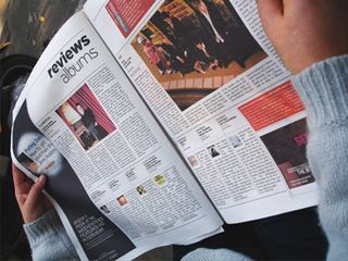
Look at websites such as BBC News or CNN or this one and there's quite a few web and print sensibilities at work in it and particularly in the choice of typography and how headings work.
Classically in print they'll be style guide for headings (in a similar way to how on the web we use CSS) and how they work. Most websites have a hierarchical structure where the headings, subheadings and text are different sizes. These classic hierarchies work. Print proves that.
06. Centred text
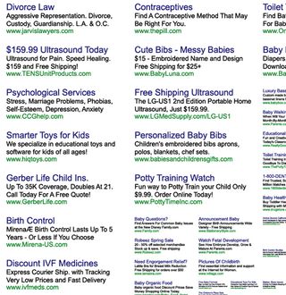
Unless you're looking at some horrifically dull corporate brochure chances are you won't see too much centred text in print design. A couple of lines are fine - a paragraph is a definite no-no.
Centred text is dull, pedestrian and lazy and the kiss of death to any print communication. Online it proliferates in calls to action and advertising copy. Avoid at all costs.
07. Colour
Colour styles are used in print to visually support content. Consideration is used as to how colour is used as backgrounds for text, borders, pull out quotes, and so on. It's a consistency which works across a print design as a style guide. The more you use this style guide the more your brand image and tone is reinforced to your audience. It's a great way of establishing your overall style.
08. Dip into the past
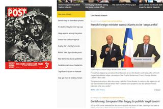
'Picture Post' was a photojournalist magazine published in Britain from 1938 to 1957. Simply put it told stories though the power of "the big image", big type, captions and text. Image plus caption plus text was pretty much what made this magazine a worldwide best seller.
And whilst this foray into the past may seem like an indulgence it does have a point. The recently relaunched ITV news website took Picture Post as one of its inspirations. The power of the well-chosen image, a good caption, and a block of text works.
09. Negative space
We all like a bit of space. Content in particular does. Print designers use negative space - the space around a subject or content for artistic composition. Visual 'clutter' should be reduced in order to make interesting and involving online content.
There is a tendency to fill up every last bit of space on a page with visual clutter but his removes the harmony negative space gives to a viewer and causes them subconscious annoyance with the page they're viewing . Give the content room to breathe.
10. Boxing in type
There's a tendency online to use a lot of key lines to border or box out content. What this ends up looking like are little boxes scattered on a page containing headlines.
You don't see this as much with print design as the designer understands that the white (or negative) space around the headline is what gives the headline strength and power. Boxing it in makes the type feel secondary and less powerful.
11. UPPER CASE
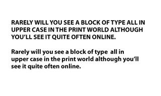
Rarely will you see a block of type all in upper case in the print world although you'll see it quite often online. Upper case is much more difficult to read as our brains recognise what a word is by the shape of the entire word and not by its letters.
All upper case can confuse the reader. It most certainly has its place in typographic expression but not in something such as content headlines or calls to action.
12. Pull out quote porn
Pull out quotes are snappy bits from a quote rendered in big type usually with quotation marks around them and sometimes the speakers name. Print designers use type hierarchies and styles to make these full of typographic design goodness. They make great visual eye candy as well as enticements to have a viewer read what else is on the page.
Pull out quotes make great visual eye candy
They can also be used as visual filler when no supporting images are available for a feature. Use them sparingly online as you don't want to bombard the visitor with too much visual overload. Use a few but make the ones you do use out of the best bits of copy you've been given.
13. Paragraph styles
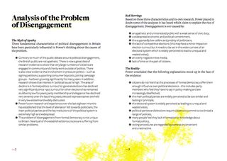
We keep banging on about type but it's one of the key ingredients to successful design, readability and successful web pages. Print designers have type down pat and we can learn a lot about how they do it.
In print layout programs (such as Adobe's InDesign CS6) you can apply a Paragraph Style. This has lots of options to set such as font, style, size, indenting and colour. Pretty much everything you can do here you can achieve in CSS by setting styles for block-level paragraphs <p>.
Type is a major consideration for how a page is put together. We have print standard control now and it's not just a matter of copy and pasted a word doc into a web page and applying a few style changes. Lay out your type.
14. Line spacing
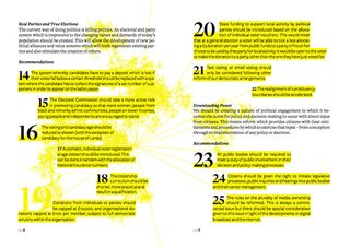
Line spacing (leading) can affect the readability of sentences - depending on the font size and type face chosen. Try not to bunch lines of text together and instead let them breathe by giving them enough space for the best possible display.
15. A picture paints a thousand words
Supporting images add flavour to a piece of content and on first glance help a viewer make a connection from your lead image to the smaller supporting ones to give them the gist of an article and entice them to read it. Look through any magazine to see how this visual connection works.
16. Design on a grid
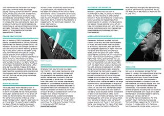
Design on a grid can cause some designers who "do it by eye" to roll their eyes at the perceived restrictions this places on them. Grids are just guides and aids and act as ballast for your web designs. They shouldn't limit creativity. Learn more about them at The Grid System.
17. Mixing fonts
Don't be tempted to mix your fonts. Different weights of one will have more impact that Gill sans for your headline, Gotham for your sub headings and Tahoma for your regular copy.
You could be thoroughly experimental and have sub headings in different fonts and experiment with the line heights and letter spacing, but you have to think of the audience you're targeting and if this would just... annoy them.
18. Composition and simplicity
The hardest layout to produce is the simplest. Six elements on a page with two blocks of text are harder to make work than reams of text and images.
Classically the print designer has understood the power of simplicity and how this can make or break a layout or design. Hard to understand layouts or overly complex columns and text which continually wraps to images is difficult to wade through. The simplest layout will always be the most effective.
19. Type
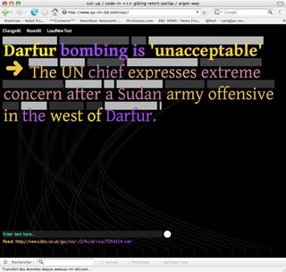
Good typography means good readability and affects the way your website looks and feels. There's no reason for bad online type. It's often been the case the limited amount of fonts available to the web designer was the reason which caused the 'we can't do type online like print' nowadays that excuse doesn't hold as much water.
Fonts galore for online creative endeavour can be found at Fonts.com, Type kit, and Google fonts - these allow designers to embed custom fonts into their web pages without the end user needing to have then installed. Brilliant.
20. Smart objects
Non-destructive editing is the way forward for pain free work flow for a print or web designer. Print designers work at much higher resolutions than their web counterparts so know to use a 'smart object' layers.
Smart objects will keep pasted in vector or raster art work at its original resolution - regardless of how many times you down size it. It will look good no matter what. This of help if your main image becomes your small supporting image and then (subject to a client change) becomes your big image again. It'll help you through the vagaries of client changes.
What else can web designers learn from print? Tell us in the comments!
Words: Paul Wyatt

Thank you for reading 5 articles this month* Join now for unlimited access
Enjoy your first month for just £1 / $1 / €1
*Read 5 free articles per month without a subscription

Join now for unlimited access
Try first month for just £1 / $1 / €1
The Creative Bloq team is made up of a group of design fans, and has changed and evolved since Creative Bloq began back in 2012. The current website team consists of eight full-time members of staff: Editor Georgia Coggan, Deputy Editor Rosie Hilder, Ecommerce Editor Beren Neale, Senior News Editor Daniel Piper, Editor, Digital Art and 3D Ian Dean, Tech Reviews Editor Erlingur Einarsson and Ecommerce Writer Beth Nicholls and Staff Writer Natalie Fear, as well as a roster of freelancers from around the world. The 3D World and ImagineFX magazine teams also pitch in, ensuring that content from 3D World and ImagineFX is represented on Creative Bloq.
