26 websites that are in need of an update
Our web design contributor doesn't want to offend anyone, but these sites really could do with a refresh…
17. The Big Ugly Website
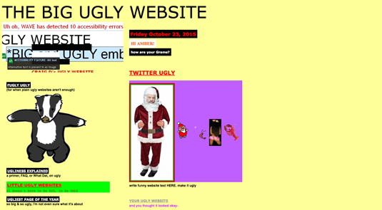
This is a great example of everything you should not do when building a site. However, I think this was done on purpose. So why include it? Well, the dancing badger. Come on. You know you love it!
18. GhettoDev

I could have played for hours on this site thanks to the fantastic use of mouse trails. The unicorns and bright purple background was just an added bonus.
19. Christian Gil
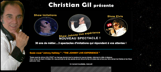
Need an Elvis impersonator? No. But, look at that smile and those blinking lights! Doesn't that make you want to hire this guy? Besides, he can actually sing... mostly.
20. OMFGDOGS

Hang on. I'll be with you in one minute. First, me and these fancy rainbow pack of killer dogs need to run, and run, and run. And oh my goodness... this music. What's not to love? Everything about this site is wrong from the animated graphics to the music, and yet it's so much fun. Go figure.
21. StichWorte
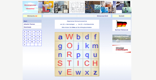
I'm not entirely sure what I'm looking at here. From what I can tell, it might have something to do with images and marketing or clouds. Yes, clouds for sure. Which might have been where this designer's head was when working on this site. Sorry, man. I just don't get it.
22. La Pizza Riv
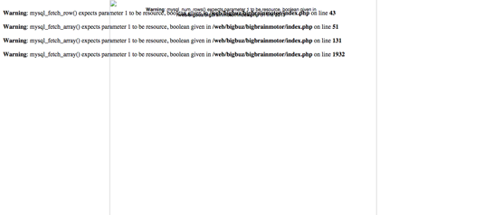
I bet the food is a lot better than their web design. Not too mention, there are multiple php errors. On the plus side, they have a cute little basket image. But seriously... test your sites and make sure people can navigate with ease. You're killing me. But I love pizza, so I'll forgive you.
23. xomjk.narod.ru
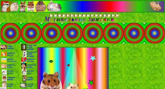
This site has so much to offer... if you like hamsters and poor design choices, that is. Honestly, if this were cats, I'd probably be in love with this page. But, it's hamsters. I don't need to tell you what's wrong with this site; it's like everyone grabbed the same crappy template and ran with it.
Get the Creative Bloq Newsletter
Daily design news, reviews, how-tos and more, as picked by the editors.
24. Pacific Northwest X-Ray Inc
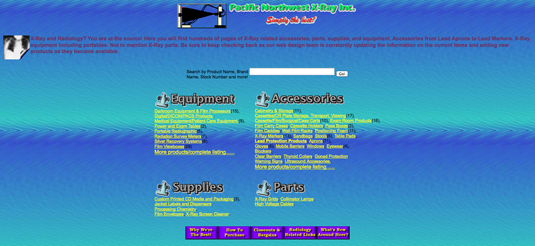
I truly wonder if pages like this actually generate sales. It's like 20 people each decided on a colour scheme and every single one was approved and added to the site. My eyes cannot handle it.
25. Spectrum Powderworks
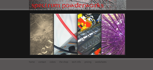
Contrast is the silent killer on this one. Brown on brown. Not a very good idea. And can we talk about that header? It's so '90s. That has got to go.
26. Creative Bloq
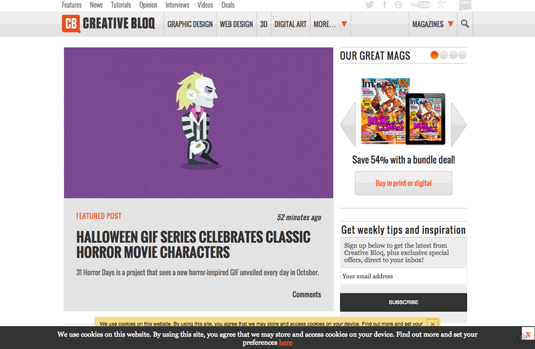
I don't want to bite the hand that feeds me, but come on Creative Bloq – you have not one but two cookie warnings! And that's not all... [Yes, okay – we'll cut this feature right here. And we are working on things behind the scenes. Watch this space! – Creative Bloq Ed]
So that's the round-up. Some sites are clearly satirical, and some are just poorly designed. It was not my intent to offend anyone who landed on this list. Perhaps you're new to this. If so... it's a great start, but I think you need a bit more guidance.
Take a zen moment folks, it's Friday: http://rustledjimmies.com/
Words: █████ █████
█████ █████ is a web developer and writer – and wishes to remain anonymous!
Like this? Read these...
- 10 things nobody tells you about going freelance
- Free graphic design software available to you right now!
- Download the best free fonts

Thank you for reading 5 articles this month* Join now for unlimited access
Enjoy your first month for just £1 / $1 / €1
*Read 5 free articles per month without a subscription

Join now for unlimited access
Try first month for just £1 / $1 / €1

The Creative Bloq team is made up of a group of design fans, and has changed and evolved since Creative Bloq began back in 2012. The current website team consists of eight full-time members of staff: Editor Georgia Coggan, Deputy Editor Rosie Hilder, Ecommerce Editor Beren Neale, Senior News Editor Daniel Piper, Editor, Digital Art and 3D Ian Dean, Tech Reviews Editor Erlingur Einarsson, Ecommerce Writer Beth Nicholls and Staff Writer Natalie Fear, as well as a roster of freelancers from around the world. The ImagineFX magazine team also pitch in, ensuring that content from leading digital art publication ImagineFX is represented on Creative Bloq.
