26 websites that are in need of an update
Our web design contributor doesn't want to offend anyone, but these sites really could do with a refresh…

Web design, to some degree, is like art. However, there are a few rules you need to keep in mind while designing your sites. For example, navigation is key. Keep it simple. Also, make sure your colour scheme is pleasing to the eye and easy to read; too many colours, or not enough contrast is no good. But, almost more important than anything else... stay away from repeating background. I repeat (see what I did there?)... stay away from the repeating backgrounds.
Here are 26 examples of sites that commit cardinal web design sins.
01. High School Sports in Mississippi
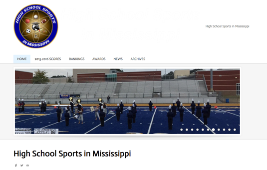
The main issue with this site is low-res/poor quality images, and lots of them. I can almost forgive the lousy color choices and 'interesting' use of PDF links at the bottom of the page, but when you fail to use sharp images, you've gone too far.
02. Suzanne Collins
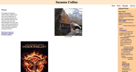
Oh, Suzanne, I don't even know where to start with this one. I guess the biggest issue here is the site's navigation and header.
03. Patimex
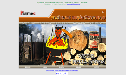
There's nothing worse than clicking on a link and hearing obnoxious music coming from your speakers. Now, imagine that same music on every page – with no way to turn it off, site-wide.
Note: Although this site was updated, and they did ditch the music, it still needs some work. For example, that large header image, one that is almost the same on every page, doesn't really add anything to the site. Consider replacing it with your main content.
04. Siberians of the Heartland (formally The Puppy Ranch)
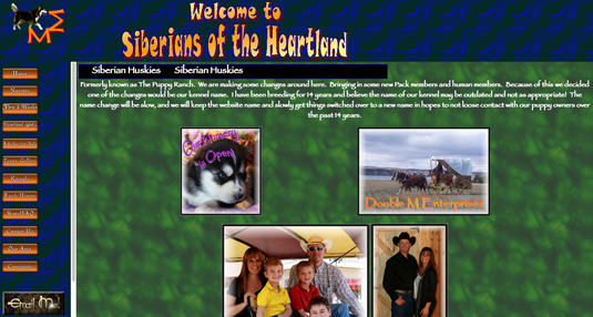
Every page is like a direct hit to my eyeballs. Cohesive doesn't seem to be in this designer's repertoire. Fun fact: The dog in the top-left corner is trying his hardest to run away. Also, don't use animated images like this on your pages; it detracts from the content.
Get the Creative Bloq Newsletter
Daily design news, reviews, how-tos and more, as picked by the editors.
05. Flying Things
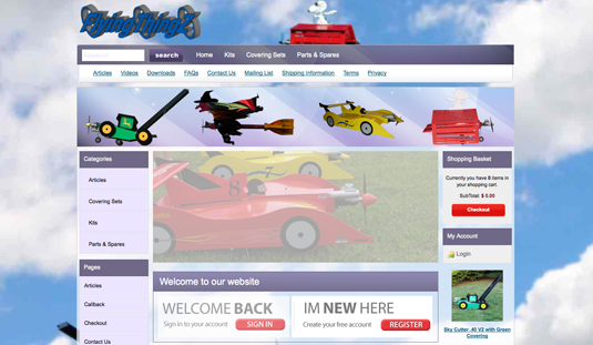
Oh, Snoopy-look-a-like. You poor thing. Stuck on a page with a lousy background, multiple navigation problems and hard to read logos. Maybe you can fly out of there?
06. Yale School of Art
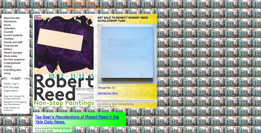
Wait. Hang on. This is the home page for an art school? Mind blown. I think they need to spend a bit more of that school budget on web design. Even if this site is designed and maintained by its students, they are clearly not learning the fundamental aspects of proper web design. Pro-tip: burn that background image.
Next page: the next 10 sites in need of a refresh

Thank you for reading 5 articles this month* Join now for unlimited access
Enjoy your first month for just £1 / $1 / €1
*Read 5 free articles per month without a subscription

Join now for unlimited access
Try first month for just £1 / $1 / €1

The Creative Bloq team is made up of a group of art and design enthusiasts, and has changed and evolved since Creative Bloq began back in 2012. The current website team consists of eight full-time members of staff: Editor Georgia Coggan, Deputy Editor Rosie Hilder, Ecommerce Editor Beren Neale, Senior News Editor Daniel Piper, Editor, Digital Art and 3D Ian Dean, Tech Reviews Editor Erlingur Einarsson, Ecommerce Writer Beth Nicholls and Staff Writer Natalie Fear, as well as a roster of freelancers from around the world. The ImagineFX magazine team also pitch in, ensuring that content from leading digital art publication ImagineFX is represented on Creative Bloq.
