Six ways to make your website work better on tablets
Ben Terrill of Mobify explains how you can keep your visitors happy if they're using an iPad or Android tablet to view your site.
When tablets first hit the market, web designers agreed that the best way forward was to build a desktop site that would "gracefully degrade" to work on tablets and other mobile devices. That was sound advice at the time. But with advances like adaptive web design, we can go further and build on a core layer of web content, enhancing it with features and customized material for all kinds of different devices and user contexts.
We can - and should - reject desktop web browser limitations and think tablet first. This makes good sense, especially when research shows that tablet users spend 20 per cent more per purchase than regular desktop visitors, making them the premier visitors you want.
Here are six best practices that explore what a truly tablet-optimized experience looks like. These tips come from Mobify’s free ebook, Tablet Web Design Best Practices.
- Read all our web design articles here
01. Disable ‘Pinch to Zoom’ on pages, but not images

If you’ve formatted your website with tablets in mind, users shouldn’t need to zoom in to read text or click links. But that doesn’t mean zooming isn’t a key tablet function.
For instance, if you have high-resolution images, users should be able to pinch and zoom an image in order to view details more clearly. Give users the best of both worlds by allowing them to change image size without altering page size.
02. Embrace flexible font sizes
The tablet’s versatile form factor makes it a joy to use. You can hold it vertically or horizontally, close to your face or at a distance. Since users can choose how to position their tablets, let them choose their preferred font size, too. This works especially well for content-heavy websites, like online magazines and blogs.
Scale font size with JavaScript and rem (root em). Learn how to change the base font size of the body or a content element by altering the rem unit for that element.
03. Populate data fields automatically
Whenever you can, give tablet visitors a hand by automatically populating data fields. You can use Google location services, reverse geocoding and some JavaScript to fill in shipping estimations, so users don’t have to.
04. Be creative with content navigation

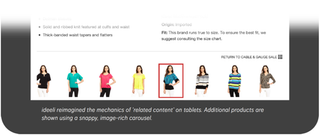
Using adaptive web tactics, creatively remix content in ways that make the most of tablet, smartphone and desktop design patterns. Customize related content pieces, calls to action and image galleries to compliment user behavior on various device types.
05. When sticky navigation works
We have a love-hate relationship with sticky navigation. When implemented poorly it can distract and frustrate users. But it can also make browsing a site up to 22% faster and can cut 36 seconds off of a five-minute visit to a website.
Tablet audiences typically move through ecommerce and shopping websites quickly, so sticky navigation can be a useful feature. It’s especially beneficial for sites with a lot of content since users won’t get lost when referencing navigation.
Sticky navigation also works well for shopping sites that allow users to access their shopping card in addition to any product or category in the shop at any time.
06. Teach whenever you can

Our interactions with tablets are distinct from desktops and smartphones. So, if users are new to tablets, you may need to show them how to interact with augmented, touch specific functions.
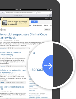
Google News does this well for new visitors. The site displays a contextual arrow that suggests content can be swiped in from the right. The arrow disappears after the user has mastered this new interaction.
Adding adaptive enhancements to your websites (like the ones above), will transform your existing site into a modern and sophisticated tablet-friendly web experience. Get 24 more best practices in Mobify’s free ebook, Tablet Web Design Best Practices.
Words: Ben Terrill
Ben Terrill is the VP of Customer success for Mobify, an open mobile platform. He has over 10 years of experience creating award-winning campaigns and currently leads the professional services team that helps Mobify’s customers, such as British Telecom, Starbucks and Expedia achieve adaptive web success on mobile and tablets.
Liked this? Read these!
- Brilliant Wordpress tutorial selection
- The best free web fonts for designers
- Discover what's next for Augmented Reality
How do you take tablet users into account when designing your sites? Let us know in the comments!

Thank you for reading 5 articles this month* Join now for unlimited access
Enjoy your first month for just £1 / $1 / €1
*Read 5 free articles per month without a subscription

Join now for unlimited access
Try first month for just £1 / $1 / €1
Get the Creative Bloq Newsletter
Daily design news, reviews, how-tos and more, as picked by the editors.
The Creative Bloq team is made up of a group of design fans, and has changed and evolved since Creative Bloq began back in 2012. The current website team consists of eight full-time members of staff: Editor Georgia Coggan, Deputy Editor Rosie Hilder, Ecommerce Editor Beren Neale, Senior News Editor Daniel Piper, Editor, Digital Art and 3D Ian Dean, Tech Reviews Editor Erlingur Einarsson and Ecommerce Writer Beth Nicholls and Staff Writer Natalie Fear, as well as a roster of freelancers from around the world. The 3D World and ImagineFX magazine teams also pitch in, ensuring that content from 3D World and ImagineFX is represented on Creative Bloq.
