10 brilliantly innovative website menu designs
The success of your site hinges on how well you design your navigation system. Take inspiration from these brilliant website menu designs...
When you're putting together a website, the importance of your navigation design cannot be stressed enough. Put simply, the success of your site will hinge on how usable it is, and how easy visitors find it to navigate from one section to another.
Regular, horizontal menus and small drop-down boxes work fine for many sites. But designing navigation can become a real challenge for websites that have a huge amount of content, or a lot of different categories that need to be accessed easily.
This is a problem that's faced by all kinds of sites, from web apps, to newspapers and online stores. While there are many examples of sites that are awkward and difficult to navigate, there are some very thoughtfully crafted examples too. We've highlighted a selection of brilliantly designed menus that all do a great job of allowing users to navigate around, or login and logout, in a way that's frictionless and easy. We hope you find these examples a useful source of inspiration for your next site design project.
01. The Guardian

The Guardian newspaper's website has a large number of different categories, including 'Culture', 'Business', and 'Travel', and each of these categories have a number of sub-categories.
Real care and attention has gone into designing a navigation for each of these in a way that's accessible and instantly intuitive. Despite there being so many different sub-categories, they're never more than two clicks away from anywhere on the site.
Each category, such as 'Culture', is given its own colour too, with everything it involves, such as 'Film' and 'Music', coloured accordingly, which helps to tie the categories together nicely.
02. Medium
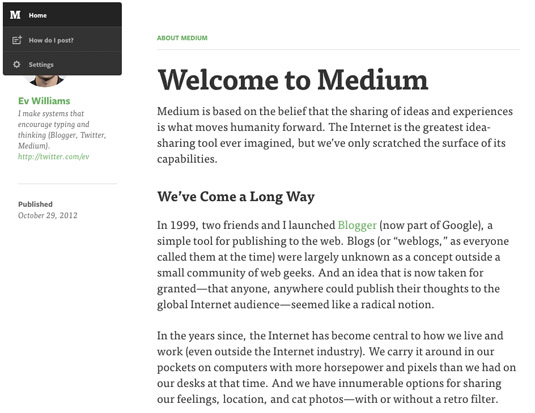
Medium is the new publishing platform built by Evan Williams, who also created Blogger and Twitter. The focus of each page is on the content, and he's worked incredibly hard to remove all distractions. Even the menu is hidden away, behind the logo in the top left-hand corner. Hovering the cursor over the logo reveals the menu, neatly tucked away.
Get the Creative Bloq Newsletter
Daily design news, reviews, how-tos and more, as picked by the editors.
Another clever feature of Medium's menu is revealed when the browser window is small. Instead of overlapping the logo (with its menu hidden behind it) over the text, it simply disappears and reappears only when you scroll to the top of the page.
03. Svbtle
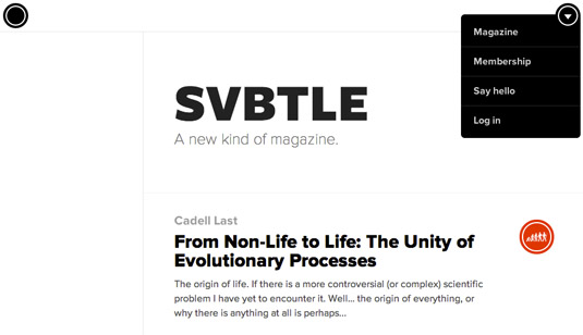
Svbtle is the creation of Dustin Curtis, and bills itself as a new kind of magazine. It cleverly merges a beautifully crafted blog CMS with a curated selection of some of the best posts.
Curtis is famous for crafting beautiful user experiences and for having a keen, somewhat obsessive, attention to detail. Sometimes the improvements he makes are so subtle that you may not notice them, but when they do pop up they definitely improve the user experience.
The menu of Svbtle is a great example of this: when you hover over the drop-down icon, the menu expands as you'd expect. However, when you move your cursor away from the menu, it remains in place for a second or two - just long enough to move the cursor back if you'd moved it a bit too far by accident. While that seems simple, the fact that he's thought about coding that shows how much passion and attention to detail has gone into his work.
04. Twitter
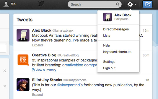
Twitter gets around the aforementioned issue by keeping the dropdown menu activated. The downside here is that you have to click the settings icon to activate the menu - if it activated and stayed open just by hovering over it, it'd be awkwardly activated all the time - but once it's selected, it remains until closed. Cleverly, particular actions are separated too, such as 'Help' and 'Keyboard shortcuts'. By grouping related sections, it can be easier to find what you're looking for.
05. B&O Play
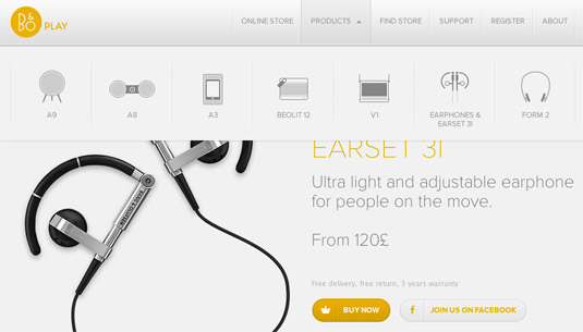
B&O Play, part of audio specialists Bang & Olufsen, has a number of products that you may not be able to recognise from their name alone, but could perhaps recognise from what they look like. For example, the A8 is a very distinctively styled speaker dock that looks completely different to the A9, but it'd be easy to confuse the two based on their names.
To help combat this, and to make their navigation much more intuitive and useful for browsers, the menu under 'Products' is given a lot of extra white-space with a simple illustration of each product. While this approach isn't suited for every site (especially one with a wide range of products) in the case of B&O Play, it's a great idea that's been executed flawlessly.
06. Apple

Apple is the world leader in design, and it's no surprise that its website is as beautifully crafted as their products. The main navigation, like B&O Play, shows each product, along with a fun, sliding animation for each when a new section is clicked (for those of us with modern browsers).
Showing each product in the navigation using highly detailed, high quality images means that it's easy to get around without even having to think.
07. Vimeo

Video sharing site Vimeo has opted to include a bit more description in its navigation. Hovering over 'Create' or 'Watch' leads to a number of other options, like 'Video School'. Because many people will be unfamiliar with what Vimeo's video school is, they've added a small caption saying 'Learn how to make better videos', which quickly and succinctly explains what'll happen before you click.
08. Google Plus
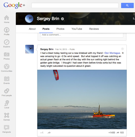
Google Plus, the search giant's rival for Facebook, has a beautifully designed navigation that runs vertically down the left-hand side of the browser. The vertical menu helps to free up space for the all-important header, while still making each section easily accessible.
Each of the icons can also be customised by being dragged and dropped into position, so if you're more of a fan of games than you are photos, you're free to rearrange the navigation to your liking.
09. Threadless
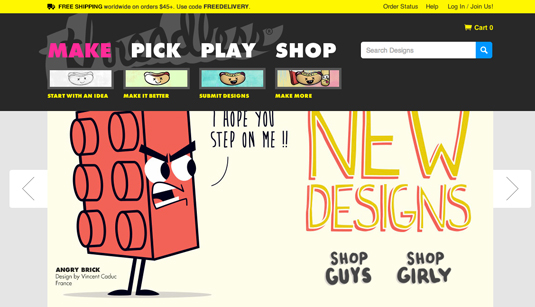
Threadless, the crowdsourced T-shirt company that's loved by the design and art crowd, makes use of big, bold visuals in its navigation.
The whole concept behind Threadless is quite specialist and has some pretty distinct user groups. There are those who are there to submit their artwork, others may be there to vote for their favourite designs, while others want to be a part of the community, review upcoming artwork and talk to others, while others still may just be there to shop.
They've carefully considered each of these use cases and grouped each section into 'Make', 'Pick', 'Play', and 'Shop' - and then hovering over these options leads to beautifully designed options underneath each.
10. Squarespace
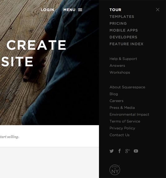
Squarespace is a hosting and CMS platform that helps people launch their own sites conveniently. The site makes use of big, leading images for the header, but they've got so many sections on the site that including them all in a drop-down navigation would obscure the imagery and make it seem cluttered.
Their solution is to include a small 'Menu' option in the top-right corner. Clicking the button leads to a panel sliding out - moving the whole site with it - to reveal a vertical navigation. The beauty of this method is that it doesn't get in the way of the imagery, and they've got a ton of room to include even the most extensive navigation options.
Words: Alex Black
Alex writes for PrintExpress.co.uk. In his spare time he enjoys studying web and print design and learns to code. You can follow him at @iamalexblack.
Liked this? Read these!
- How to build an app
- Brilliant Wordpress tutorial selection
- Create a perfect mood board with these pro tips
Are there any examples of thoughtfully designed, beautifully crafted and elegant menu options that you've found that should be included in our roundup? We'd love to hear what you’ve found in the comments.

Thank you for reading 5 articles this month* Join now for unlimited access
Enjoy your first month for just £1 / $1 / €1
*Read 5 free articles per month without a subscription

Join now for unlimited access
Try first month for just £1 / $1 / €1

The Creative Bloq team is made up of a group of art and design enthusiasts, and has changed and evolved since Creative Bloq began back in 2012. The current website team consists of eight full-time members of staff: Editor Georgia Coggan, Deputy Editor Rosie Hilder, Ecommerce Editor Beren Neale, Senior News Editor Daniel Piper, Editor, Digital Art and 3D Ian Dean, Tech Reviews Editor Erlingur Einarsson, Ecommerce Writer Beth Nicholls and Staff Writer Natalie Fear, as well as a roster of freelancers from around the world. The ImagineFX magazine team also pitch in, ensuring that content from leading digital art publication ImagineFX is represented on Creative Bloq.
