5 web font trends for 2015
Faster, smarter, small, bigger and quite simply everywhere, Ryan Arruda explains how he sees type and type tools changing in 2015.
Typographic consistency across media – whether in print, on screen, or on the web – is an inherent cornerstone of crafting a cohesive brand. While graphic design and typography are inextricably linked, until fairly recently it has felt like type has been forced to play second fiddle on the web – not because there wasn't a demand, but rather because of technical limitations.
However, with web font adoption quickly approaching 50 per cent (compared to just 2 per cent in 2010) the tipping point for a majority of sites using Web fonts may be not too far in the future. There are a lot of signs and improvements to suggest that web fonts are starting to become "the norm".
01. Web fonts are becoming even more prominent in everyday life

We know that typography on the web has come a long way in just a few years, and there are still advances to come. In addition to general adoption and increased efficiency, continually impressive aesthetic stylings – such as layered, chromatic, and gradient fonts – may soon enjoy an uptick in usage as well.
What's perhaps even more fascinating is thinking of ways in which web fonts could be used outside of the traditional graphic design structures of print and web design. Imagine Web fonts finally allowing us to see e-mails in more than just a handful of standard typefaces.
Or perhaps use Web fonts to render the letterforms of a14-foot tall electronic billboard. Digital HTML5 ads hold the promise of using web fonts to present more thoughtfully designed experiences to consumers.
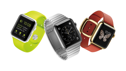
Wearables, such as watches and glasses, as well as connected gaming systems could be fair game for web font utilization. More utilitarian uses, such as the type needs of automotive displays, healthcare devices, or your smart home's smoke detector could help to make them more effective.
Web fonts could potentially have a positive impact in situations where legibility is a requirement not simply for the aesthetics, but to help assure that potentially life-saving information is quickly and adequately conveyed.
Get the Creative Bloq Newsletter
Daily design news, reviews, how-tos and more, as picked by the editors.
It could be said that the best typography is that which not only looks great, but functions equally as superbly. Web fonts could be an integral partner to advancing that notion in the ever-evolving digital landscape of the post-PC era.
02. Creating good web typography is becoming easier

Perhaps this is due, in part, to a larger shift in the social ether; it feels like even non-designers are more aware and interested in type. Plus, the tools to create typographic designs have become more and more accessible – whether through easier access to Adobe's suite of tools, or more affordable options like the Sketch, Affinity Designer or Canva tools.
Additionally, free web font offerings from providers such as Google and Fonts.com also put typographic assets in the hands of more and more designers, both new and established.
Responsive web design has also paved the way for typography to be experienced more optimally across a myriad of devices and screen sizes. The panoply of these digital devices now offering higher resolution displays gives rise to typography that is even more beautifully rendered.
03. Web typography is becoming easier to finesse

With web fonts becoming increasingly used and, indeed, more efficient, the future of web typography will hopefully include more improvements on the aesthetics of type itself.
There has previously been a gap between print and digital design in the ability to bring the finer nuances of typography to the web. Since the difference between acceptable and outstanding typography often rests in the final fit-and-finish design details, it can be frustrating to have an almost-perfect project limited by technical restraints of devices or browsers.
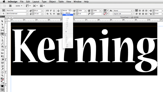
However, kerning abilities and OpenType features provide many of those advanced capabilities to typographers – think of all the optional ligatures, alternate characters, fractions, and swashes that give certain typefaces their distinct personalities.
While these features are employed easily enough in print design, implementing them on the web has proven tricky, again due to varying levels of browser support. If your aim is typographic consistency, not having all of your users experience the same presentation can become an interruption to that end. It's getting better, but legacy browsers still at times throw wrenches into the works.
All is not lost, however. Nearly all modern browsers now support OpenType features. This inclusive approach to staying faithful to your brands will not only let your designers and clients sleep more soundly but also contribute to a more put-together, professional looking Web.
04. Web fonts are getting faster

In addition to the number of sites featuring Web fonts continuing to increase, data from the HTTP Archive also shows that average font transfer sizes have increased 30-fold from 2010 levels, from around 2kb to nearly 70kb.
Especially considering that mobile device hardware must be thoughtfully considered in addition to traditional desktops or notebooks, speed is a constant concern when employing a multitude of typefaces on your site.
One advancement is the new WOFF2 font format – which browsers and Web font providers have begun to support. This format features improved font compression, which, in turn offers smaller file sizes and quicker page load times for users.
Aside from purely aesthetic considerations, these quicker page load times can also be an impetus for designers to finally take the step to use Web fonts in their projects. The advances in compression allow you to have great custom type while lessening the impact on your site's performance.
Some fonts – especially those for Non-Latin languages with expansive character sets – can carry prohibitively large file sizes, sometimes megabytes instead of kilobytes. Some providers, however, offer custom solutions for these situations.
For instance, dynamic subsetting is a patent-pending technology used on the Fonts.com Web Fonts service – it works by scanning a site's content and building a font on the fly containing only the characters needed for that specific page. Especially in the case of large non-Latin character sets, this helps reduce load time and presents a more seamless user experience.
05. The web is becoming more media rich

This might be evident from even casual observation: how many sites do you now encounter that feature live, beautiful display type as a main focal element? It certainly feels like the web is becoming more typographically keen.
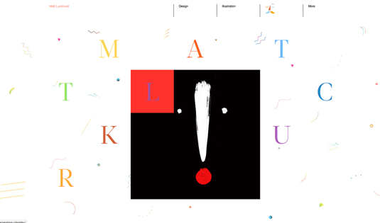
While text has always been an element (in the early days, the only element) of web design, nowadays it feels like type has achieved a level playing field with imagery and video content. In fact, you've no doubt encountered more and more instances where expressive typography drives the entire design of a web experience.
Words: Ryan Arruda
A designer and illustrator by trade, Ryan Arruda can be found grilling up design, authoring content, and wrangling promotions for the Fonts.com team at Monotype.

Thank you for reading 5 articles this month* Join now for unlimited access
Enjoy your first month for just £1 / $1 / €1
*Read 5 free articles per month without a subscription

Join now for unlimited access
Try first month for just £1 / $1 / €1

The Creative Bloq team is made up of a group of design fans, and has changed and evolved since Creative Bloq began back in 2012. The current website team consists of eight full-time members of staff: Editor Georgia Coggan, Deputy Editor Rosie Hilder, Ecommerce Editor Beren Neale, Senior News Editor Daniel Piper, Editor, Digital Art and 3D Ian Dean, Tech Reviews Editor Erlingur Einarsson, Ecommerce Writer Beth Nicholls and Staff Writer Natalie Fear, as well as a roster of freelancers from around the world. The ImagineFX magazine team also pitch in, ensuring that content from leading digital art publication ImagineFX is represented on Creative Bloq.
