Why simplicity matters in UX and digital design
Who's doing it well? Plus 8 tips for succeeding in simplicity.
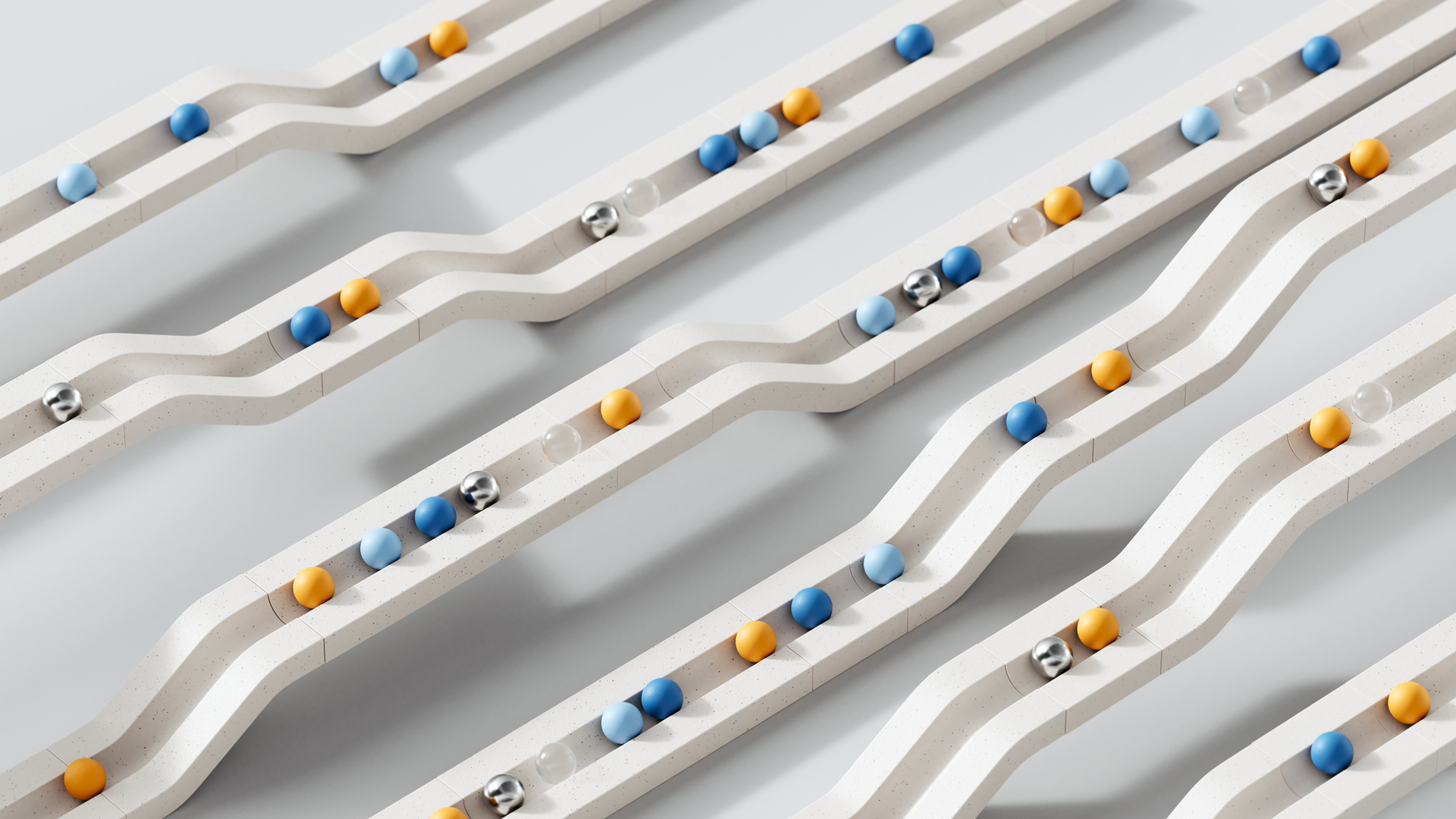
Today, users are constantly bombarded with information, making simplicity a crucial aspect of effective design. A cluttered interface can quickly overwhelm and frustrate users, while a well-crafted, minimalist approach enhances usability, reduces cognitive load, and fosters engagement. By embracing the 'Zen of design', we can create digital experiences that feel intuitive, effortless and enjoyable. Simplicity isn’t just about aesthetics – it’s about making interactions seamless and ensuring users can navigate with ease.
Here, I will explore the importance of simplicity in UX and digital design, the challenges designers face in achieving it, and how to find inspiration from minimalism, Japanese aesthetics, and nature. I’ll also share practical tips on how to streamline interfaces, prioritise content, and enhance usability without sacrificing functionality. By focusing on clarity and essential elements, we can craft designs that feel both elegant and efficient, ultimately delivering a better experience for users.
For more of my tips, see my piece on the psychology of colour in UX design.
Why simplicity matters in UX and digital design
Simplicity in design offers numerous benefits:
- Improved usability: A simple interface is easier to understand and navigate, allowing users to find what they need quickly and efficiently.
- Reduced cognitive load: Minimising visual clutter and complexity reduces cognitive load, making it easier for users to process information and complete tasks.
- Enhanced focus: A clean and uncluttered design allows users to focus on the essential content and interactions without distractions.
- Increased engagement: A simple and intuitive design can be more engaging and enjoyable to use, leading to greater user satisfaction.
- Faster loading times: Simpler designs often translate to smaller file sizes and faster loading times, which is crucial for a positive user experience.
The challenge of simplicity
Achieving true simplicity in design is often harder than it looks. It requires a deep understanding of user needs, a keen eye for detail, and a willingness to let go of unnecessary elements. Here's why it can be so challenging:
- Feature creep: The desire to add more and more features can lead to cluttered and complex interfaces.
- Stakeholder demands: Designers often face pressure from stakeholders to include various elements, even if they detract from simplicity.
- Fear of empty space: Some designers may feel the need to fill every inch of space, leading to visual overload.
Finding inspiration for simplicity

If you're not sure where to start, the following can be good inspiration:
- Minimalist approach: Explore minimalist websites and mobile apps to see how they achieve clarity and focus through essential elements and negative space.
- Japanese aesthetics: Embrace principles from Japanese aesthetics, such as 'Ma' (the concept of emptiness) and 'Wabi-sabi' (finding beauty in imperfection), to create a sense of calm and balance.
- Nature: Observe the simplicity and elegance of natural forms for inspiration on how to create harmonious and uncluttered designs.
8 tips for achieving simplicity in design
- Prioritize content: Start with the core content and functionality, then strip away anything that isn't essential.
- Embrace white space: Don't be afraid of empty space. It can improve readability and create a sense of calm.
- Limit colour palettes: Use a limited colour palette to avoid visual clutter and maintain focus.
- Choose simple typography: Opt for clear and legible typefaces with ample spacing.
- Streamline navigation: Make navigation intuitive and easy to use with clear labels and visual cues.
- Reduce visual noise: Minimise unnecessary graphics, animations, and decorative elements.
- Prioritise functionality: Ensure that every element serves a clear purpose and contributes to the user experience.
- Test and iterate: Gather user feedback and iterate on your design to continuously improve simplicity and usability.
Brands and experiences that exceed in simplicity
Many brands have successfully leveraged their experience with a simplistic approach focusing on fewer things to don’t distract their users:
Get the Creative Bloq Newsletter
Daily design news, reviews, how-tos and more, as picked by the editors.
01. Notion
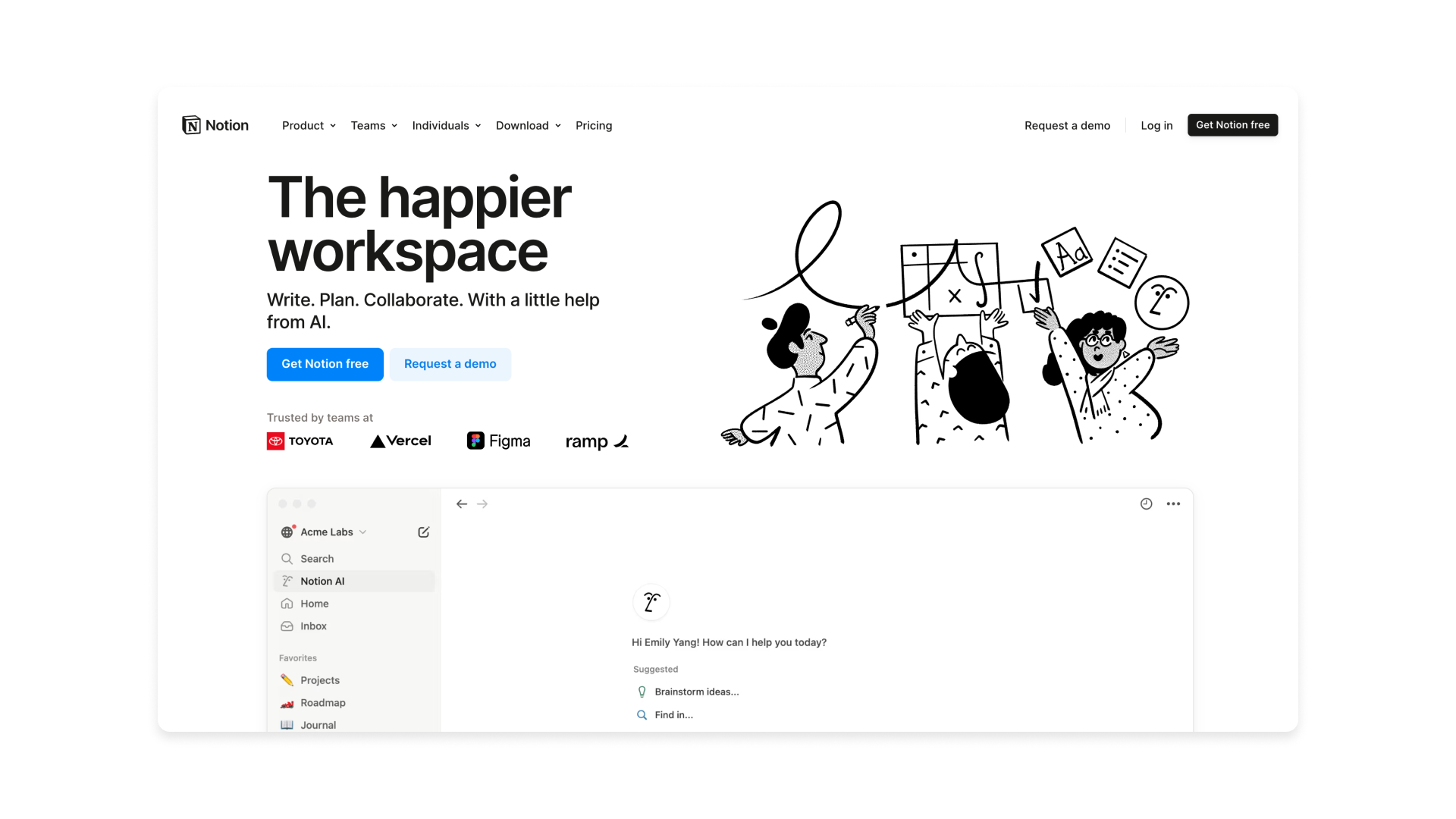
Notion is an all-in-one workspace that combines note-taking, task management, databases, and collaboration tools in a flexible and highly customizable interface. Its design is simple and straightforward because it uses a clean, minimalistic layout with a focus on clarity and ease of use. By relying on a block-based system, users can seamlessly structure content without overwhelming menus or cluttered interfaces. The neutral color palette, intuitive drag-and-drop functionality, and modular organization make it accessible to both beginners and power users, ensuring a smooth and distraction-free experience.
02. Typeform
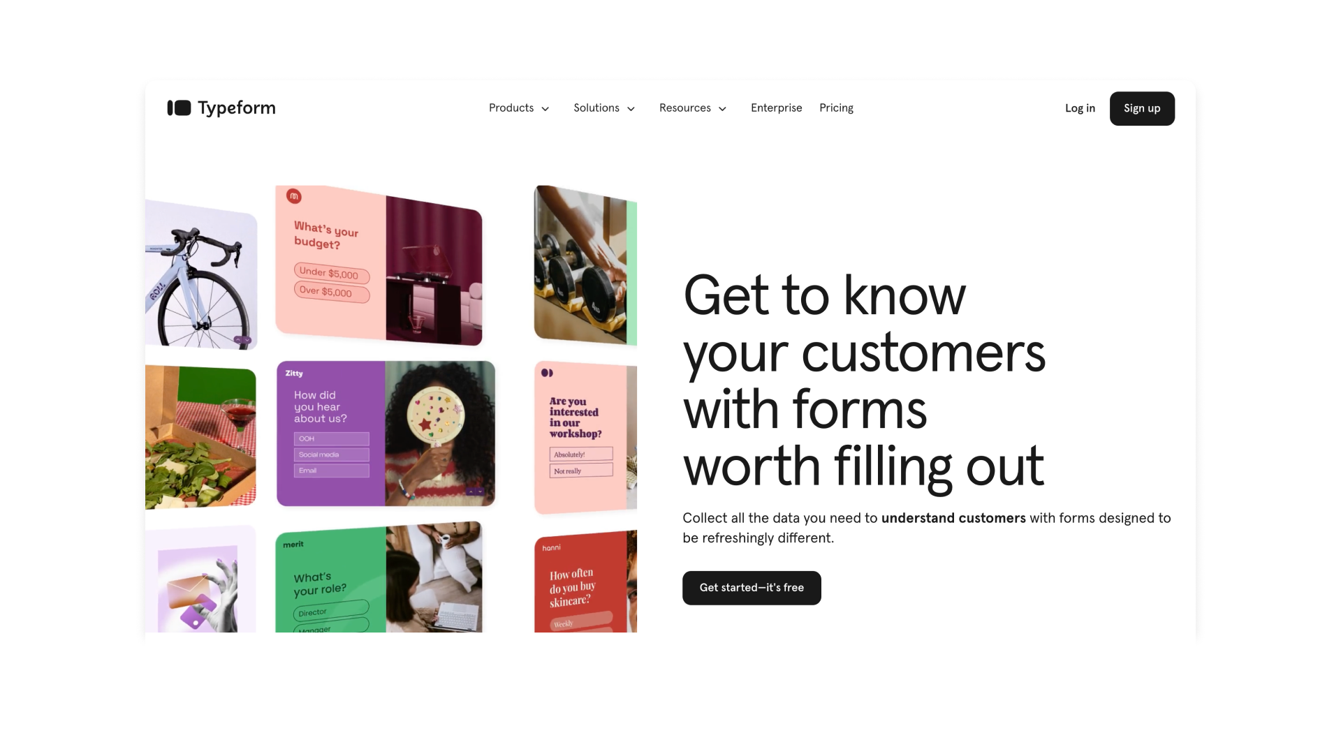
Typeform is an online platform for creating interactive and engaging forms, surveys, and quizzes. Its design is simple and straightforward because it uses a clean, conversational interface that presents one question at a time, reducing cognitive overload. With a minimalist layout, ample white space, and smooth transitions, Typeform keeps users focused while ensuring an intuitive and enjoyable experience.
o3. WeTransfer
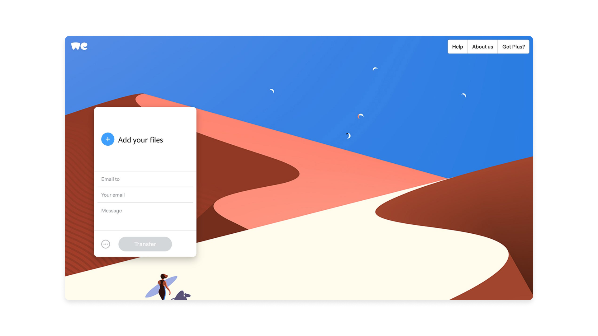
WeTransfer is a file-sharing service that allows users to send large files quickly and easily without requiring an account. Its design is simple and straightforward featuring a minimal interface with just a few essential elements: a file upload button, an email field, and a send button. The clean layout, lack of distractions, and smooth user flow make the process effortless, ensuring that anyone can transfer files in just a few clicks.
04. Mobbin
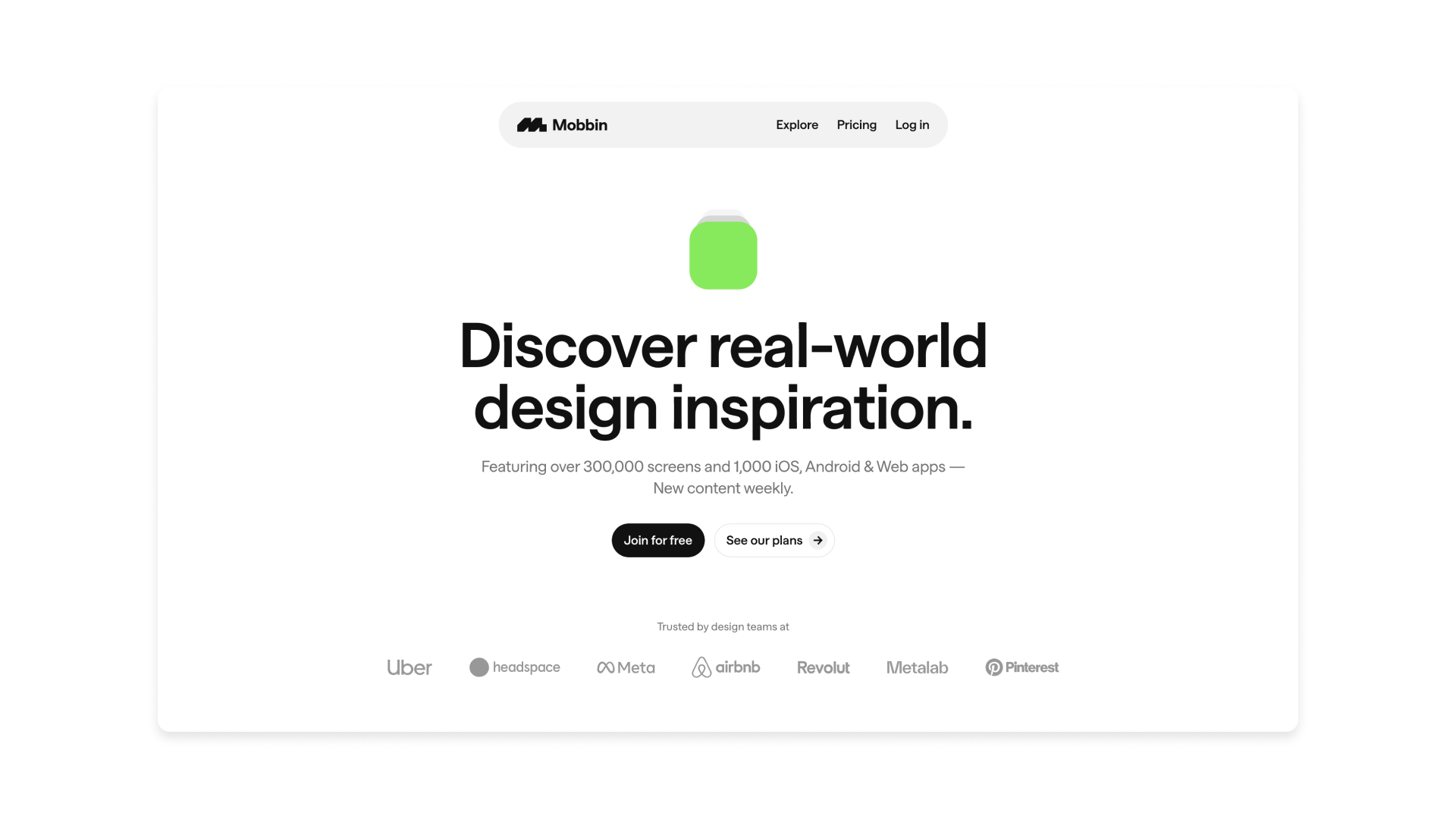
Mobbin is a design inspiration platform that curates mobile and web UI patterns from top apps. Its design is simple and straightforward, with a clean grid layout, easy navigation, and powerful filters that help designers quickly find relevant examples without distractions.
In a world of increasing complexity, simplicity in design is more important than ever. By embracing the 'Zen of design' and following these tips, you can create digital experiences that are both beautiful and user-friendly. Remember, simplicity is not about stripping away everything but rather about focusing on the essentials and creating a sense of calm and clarity.
For more on UX, see our UX Design Foundations course.

Thank you for reading 5 articles this month* Join now for unlimited access
Enjoy your first month for just £1 / $1 / €1
*Read 5 free articles per month without a subscription

Join now for unlimited access
Try first month for just £1 / $1 / €1

Rodolpho is a multidisciplinary digital designer working at the intersection of product, brand, and technology. Currently, at Google, he designs digital products used by more than 3 billion people worldwide. Before that, he was a Design Director at McKinsey & Company. Over the past 13 years, he has been transforming ideas into first-class digital experiences for startups and big leaders.
You must confirm your public display name before commenting
Please logout and then login again, you will then be prompted to enter your display name.
