As a digital designer who's been working in the tech industry for more than 10 years, I understand that colour is more than just a visual element; it's a powerful tool that shapes user experience. In this article, we'll explore the crucial role colour plays in digital products, diving into the psychology behind colour associations and how they influence user behaviour. We'll examine how colour evokes emotions, strengthens brand identity, and impacts readability and accessibility. I'll be using examples from well-known brands to illustrate how strategic colour choices contribute to a product's success, from calming blues in meditation apps to the energetic reds that drive conversions for limited-time offers.
This exploration will cover key concepts like colour theory, including hue, saturation, and brightness, and how these attributes work together to create impactful designs. We'll also delve into practical application, outlining a framework for applying colour psychology in UX design, including defining your brand and target audience, selecting primary and accent colours, and considering cultural differences. Finally, we'll discuss the importance of consistency in colour usage and how the 60-30-10 rule can help create balanced and visually appealing colour palettes, ensuring your digital product is not only beautiful but also user-friendly and effective.
The importance of colour in digital
In the world of UX design, colour is much more than just aesthetics. It's a powerful tool that can significantly impact a user's experience with a digital product. Colours evoke emotions, influence behaviour, and contribute to a product's overall usability. For example, the right colour palette can make a website more inviting and trustworthy, while strategically chosen accent colours can draw attention to important calls to action, ultimately driving conversions. By understanding and harnessing the psychology of colour, UX designers can create digital experiences that are not only visually appealing but also intuitive and engaging. By strategically using colours in your designs, you can:
- Evoke specific emotions: Want to create a sense of trust and security? Blue might be your go-to. Aiming for excitement and energy? Red could be the answer.
- Influence user behaviour: A green call-to-action button can signal "go" and encourage clicks, while a red one might signify a warning or caution.
- Strengthen brand identity: Consistent use of specific colours helps users instantly recognise and connect with your brand. Think of the iconic red and white of Coca-Cola or the calming green of Starbucks.
- Improve readability and accessibility: Careful colour choices ensure that text is legible and the interface is usable for everyone, including people with visual impairments.
Colour associations
Have you ever noticed how certain apps or websites just feel right? How do the colours seem to draw you in and create a specific mood? That's not by accident. Designers carefully select colour palettes to evoke specific emotions and guide user behaviour. In the digital realm, where first impressions are crucial, understanding the psychology of colour can be the difference between a user engaging with your app or bouncing off to a competitor.
Just like in the physical world, colours in digital design carry symbolic meanings and trigger subconscious associations. A calming blue might be used for a meditation app, while an energetic red could drive conversions for a limited-time offer.
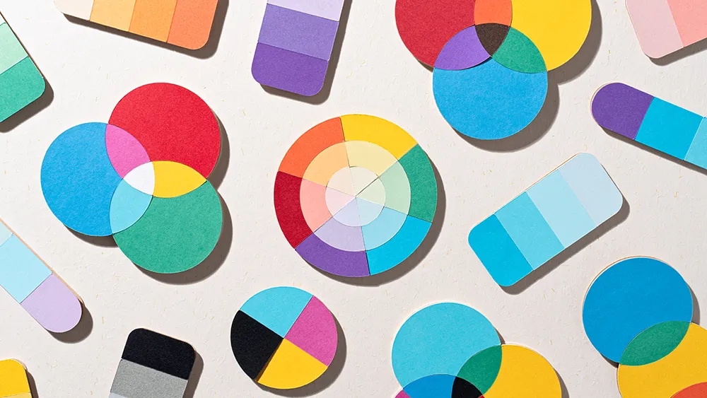
Colour theory unlocks the secrets of how colours work together. It reveals how different hues can create harmony or contrast, and how these combinations can evoke specific emotions and responses in the viewer. By understanding colour theory, we can use colour to communicate ideas, create moods, and enhance the visual appeal of our work.
Here's a quick guide to some common colour associations:
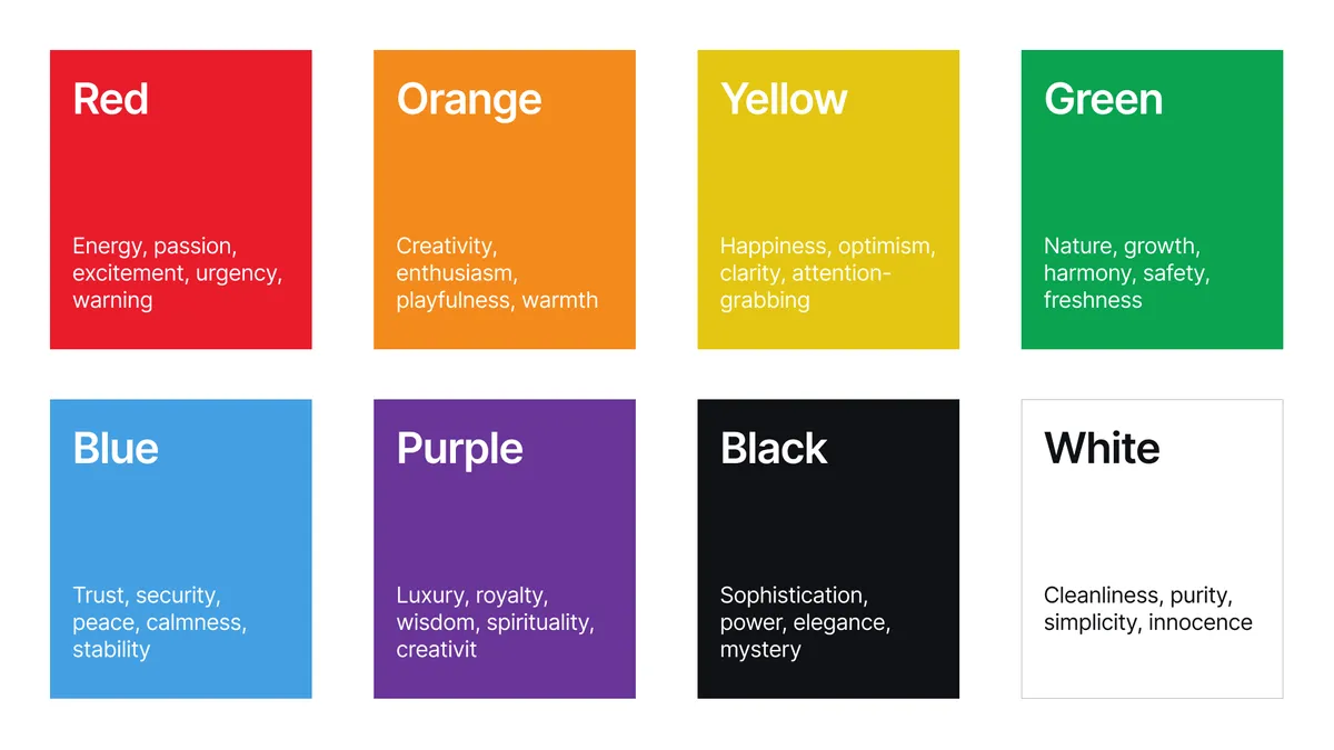
- Red: Energy, passion, excitement, urgency, warning.
- Orange: Creativity, enthusiasm, playfulness, warmth.
- Yellow: Happiness, optimism, clarity, attention-grabbing.
- Green: Nature, growth, harmony, safety, freshness.
- Blue: Trust, security, peace, calmness, stability.
- Purple: Luxury, royalty, wisdom, spirituality, creativity.
- Black: Sophistication, power, elegance, mystery.
- White: Cleanliness, purity, simplicity, innocence.
Hue, saturation and brightness
Colour theory provides a framework for understanding and manipulating colour in design. Three fundamental attributes – hue, saturation, and brightness – define the visual characteristics of any colour and play a crucial role in shaping user perception and experience.
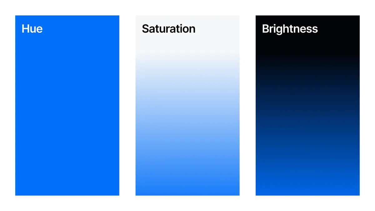
- Hue: Hue refers to the pure spectral colour, representing the colour's position on the colour wheel. It's the most basic element of colour, distinguishing red from green, and blue from yellow. Hues are typically organised based on primary colours (red, yellow, and blue) which can be mixed to create secondary colours (orange, green, and violet), and further combined to produce tertiary colours. Selecting hues with appropriate relationships (e.g., complementary, analogous, triadic) is essential for establishing colour harmony within a design.
- Saturation: Saturation, also known as chroma, refers to the intensity or purity of a colour. A highly saturated colour appears vivid and rich, while a desaturated color appears muted or dull. Saturation is often manipulated in design to create visual hierarchy and emphasis. For instance, a highly saturated accent colour can draw attention to a call-to-action button, while desaturated colours might be used for background elements.
- Brightness: Brightness, or value, refers to the relative lightness or darkness of a color. It represents the amount of light perceived from a colour, ranging from pure white to pure black. Managing brightness contrast is crucial for readability and accessibility. Sufficient contrast between text and background colours ensures legibility for all users, including those with visual impairments.
Colour in UX
By understanding the psychology of colour – how different hues evoke specific feelings and associations – designers can create more engaging, intuitive, and effective user experiences.
Creating a visually appealing and user-friendly digital experience goes beyond simply choosing colours that look nice together. It requires a strategic approach that considers the psychology of colour and how it influences user perception and behaviour. To make informed colour choices, designers need to delve deeper, considering factors like brand identity, target audience, cultural nuances, and user feedback. Here is a practical framework for applying colour psychology in UX design, guiding you through the essential steps to create digital products that resonate with users on an emotional level:
- Define your brand and target audience: What emotions and messages do you want your brand to convey? Who are your ideal users, and what colors resonate with them?
- Choose a primary colour: This will be the dominant colour in your design, representing your brand's core identity.
- Select secondary and accent colours: These colours will complement the primary color and provide contrast and visual interest.
- Consider cultural differences: Colour associations can vary across cultures. Research your target audience to ensure your colour choices are appropriate and effective.
- Test and iterate: Gather user feedback on your colour palettes and make adjustments as needed.
The 60-30-10 rule
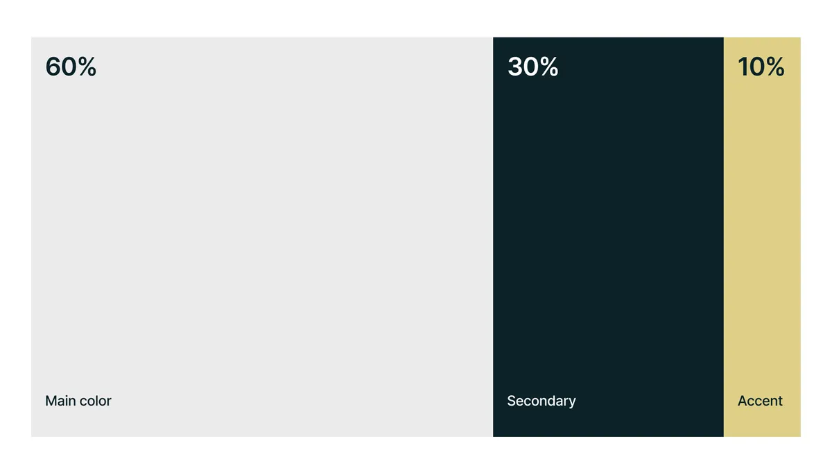
The 60-30-10 rule is a classic guideline in design that helps you create balanced and visually appealing colour palettes. It suggests that you should use:
- 60% of your dominant colour: This is your primary colour, often used for backgrounds and larger elements to create a consistent foundation.
- 30% of your secondary colour: This colour provides contrast and supports the dominant colour, often used for key elements like headings or call-to-action buttons.
- 10% of your accent colour: This is used sparingly to highlight important details, create visual interest, and draw attention to specific elements.
Think of it like an outfit: 60% is your main garment (like a dress or trousers), 30% is a secondary piece (like a shirt or jacket), and 10% is an accessory (like a scarf or jewellery).
This rule helps create visual harmony and ensures that no single colour overwhelms the others. While it's a great starting point, remember that it's just a guideline, and you can adjust the proportions based on your specific design needs.
Colour consistency
Maintaining colour consistency throughout your digital product is essential for creating a cohesive and user-friendly experience. A consistent colour palette strengthens brand recognition, improves navigation, and helps users understand the hierarchy and relationships between different elements.
Think of your favourite apps. Chances are, they have a distinct colour palette that you instantly associate with their brand. Whether it's the calming blue of a social network or the vibrant yellow of a video platform, these colours contribute to a cohesive brand identity and a seamless user experience (read more about outstanding uses of colour in branding).
Why is colour consistency so important?
- Brand recognition: Consistent colours across your app create a strong visual identity, making your brand easily recognisable and memorable. Users should be able to identify your app instantly, whether they're browsing the app store or switching between apps on their phone.
- Improved navigation: Using specific colours consistently for buttons, menus, and interactive elements makes your app more intuitive to navigate. Users quickly learn to associate certain colours with specific actions, leading to a smoother and more efficient user experience.
- Enhanced trust and credibility: A consistent colour palette conveys professionalism and attention to detail. It signals to users that your app is well-designed and trustworthy. Inconsistent or jarring colour choices, on the other hand, can make your app feel amateurish and unreliable.
- Seamless user experience: When colours are used consistently, they create a sense of visual harmony and flow. This contributes to a more enjoyable and engaging user experience, encouraging users to spend more time in your app.
Colour is a powerful tool in the hands of a UX designer. By understanding the psychology of colour and applying it thoughtfully, you can create digital products that are not only visually appealing but also emotionally engaging, user-friendly and effective in achieving your business goals.
Read more in our designers' guide to using colour in branding.