Star Wars fans will love this fun addition to Spotify's UX

Spotify Star Wars
(Image credit: Spotify/Lucasfilm)

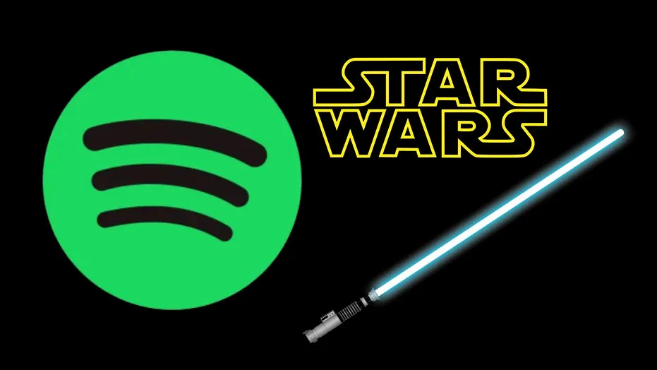
People (including me) are just noticing a cool addition to Spotify that will delight Star Wars fans – a lightsaber in place of the progress bar on all Star Wars soundtracks. UX is a brilliant way to include fun Easter egg through design, and Spotify is the perfect medium to do this to reach different fan bases. Unlike that other UI design change that drove users wild, this type of tweak is a light way of keeping a user base hooked. (Yes I know this is quite an old addition but people are just discovering it, okay?).

I've had a play (on web browser) and you can change the colour of the lightsaber by clicking on the handle, and also change the type of lightsaber! This has delighted Star Wars fans over on Reddit, with one also pointing out the same thing happened to Taylor Swift songs but with a twinkle symbol (this thread discusses the UX addition as of last year, but I can't see it right now).

Thank you for reading 5 articles this month* Join now for unlimited access

Enjoy your first month for just £1 / $1 / €1

*Read 5 free articles per month without a subscription

Join now for unlimited access

Try first month for just £1 / $1 / €1

TOPICS
Georgia Coggan

Georgia is lucky enough to be Creative Bloq's Editor. She has been working for Creative Bloq since 2018, starting out as a freelancer writing about all things branding, design, art, tech and creativity – as well as sniffing out genuinely good deals on creative technology. Since becoming Editor, she has been managing the site and its long term strategy, helping to shape the diverse content streams CB is known for and leading the team in their own creativity.

Read more
Airbnb and Apple icons
From Apple to Airbnb, brands are finally ditching boring icons
Star Wars logo in the Star Wars logo font
The 11 best Star Wars fonts to download
NASA/Apple/Nike logos with chrome effect
From Apple to Nike, I’m mesmerised by these hypnotising chrome logos
Dropbox brand guidelines site
Dropbox's new brand identity website puts boring style guides to shame
Papercut diagrams showing aspects of colour theory
Why colour is such a powerful tool in UX design
Animated logo overlaid on woman dancing in the street
9 amazing examples of motion in logo design
Latest in UX & UI
Airbnb and Apple icons
From Apple to Airbnb, brands are finally ditching boring icons
little marbles in marble run
Why simplicity matters in UX and digital design
Opera Air web browser
Meet Opera Air, the web browser that wants you to disconnect
Papercut diagrams showing aspects of colour theory
Why colour is such a powerful tool in UX design
Spotify Star Wars
Star Wars fans will love this fun addition to Spotify's UX
A25 Y2K promo website
A24's new website is giving me major Y2K nostalgia
Latest in News
Activision Guitar Hero Mobile
It’s official, Activision has sold its soul to the AI overlords
Super Mario Bros 6
Incredible Super Mario Bros 6 hack brings a new instalment of pure retro joy
Amazon and Beverly Hills Polo Club logos
Amazon slammed by judge in 'landmark' logo dispute ruling
An image of a buff Shrek from Shrek 5 trailer
There's a technical explanation for Shrek 5's controversial new look
A liquid silver Xiaomi 15 on a detailed blue background
The Xiaomi 15 is the camera phone Samsung wishes it made
Image of a cat underwater from Best Animated Feature Oscar winner Flow
"Any kid now has tools to make Academy Award-winning films" – Gints Zilbalodis thanks Blender as Flow wins best animation Oscar