Why UX design patterns work and how to use them
People are hard-wired to recognize patterns. Ben Gremillion explains how to exploit that.
Sign up to Creative Bloq's daily newsletter, which brings you the latest news and inspiration from the worlds of art, design and technology.
You are now subscribed
Your newsletter sign-up was successful
Want to add more newsletters?
The web's been around for more than 20 years, giving us ample time to discover user experience problems — in fact, to discover "user experience" at all — and invent solutions.
Some solutions worked so well that designers everywhere began to use them repeatedly. And through familiarity, users came to expect them. This was the beginning of web design patterns: a common visual language that both designers and end users understand.
It wasn't hard to do. People are hard-wired to recognize patterns, even where there are none.

Shapes in clouds, numbers in lottery tickets, predictable stock market fluctuations, stellar constellations, and faces on toast all show how people see things that don't exist. Research shows that people look for relationships between values, and patterns reinforce those relationships.
UX designers can easily take advantage of users' pattern-seeking tendencies. How do people navigate many pages? How do we indicate that, when clicked, a video will start playing?
The answer lies in design patterns, which are reusable solutions to usability problems. They're also time-savers. Patterns are the first solutions people go to when they don't have time to invent something new. And like many "it just works" solutions, patterns tend to stick around.
In this post, we'll explain the psychology and techniques for successful UI patterns.
Sign up to Creative Bloq's daily newsletter, which brings you the latest news and inspiration from the worlds of art, design and technology.
How users interact with design patterns
First impressions are critical since users know within 10-20 seconds if they'll leave your site. Patterns communicate function and intent as clearly as possible within that window of opportunity.
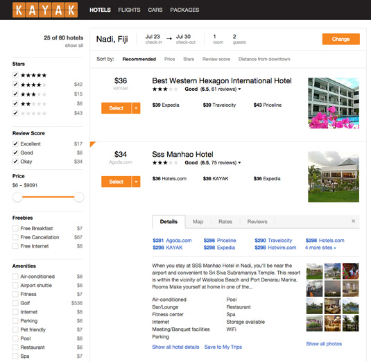
Here's how it works. Let's say a user wants to accomplish a task, like to book a hotel.
Take a look at a possible series of user actions:
- A travel site presents the user with a list of possible places to stay.
- The user taps the photo of a charming bungalow. Nothing happens. Lesson learned: Photos do not lead to more information about each property.
- The user continues to explore. He or she may look for a "more info" link or tap on the nightly rate. They may try tapping the photo again, just in case. Left on their own, a determined user will continue to tap different elements in search of more information about the bungalow.
- Finally, they tap the hotel name (perhaps presented as a button or link), and they're redirected to a more detailed page. The user sees a charming atmosphere but no complimentary breakfast. It doesn't fit their criteria, so they keep searching.
Now, here's where the pattern kicks in. Having learned that one thumbnail photo isn't tappable, but the hotel's name is, the user now knows exactly what to do.
Learned behavior
This learned behavior is something people do especially well. While many factors influence how people learn, a little experience goes a long way. This is a form of instrumental learning, in which people remember the result of past experiences well enough to alter their future behavior.
Not every pattern is so absolute as the search results example. As explained in the Web UI Pattern Handbook, the idea of a pattern supercedes its implementation.
For example, maybe bullet points are round dots, little squares, check boxes or funny squiggles. But if an object sits to the side of a line of text, and there's more than one of them, users understand it functions as a bullet point.
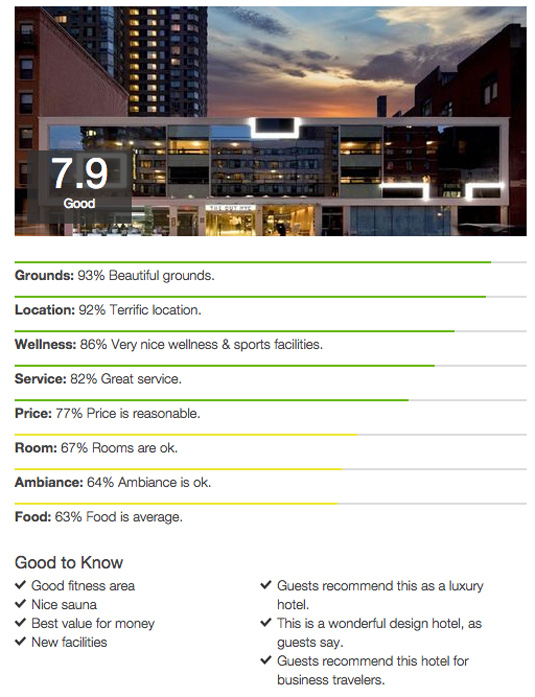
In a similar vein, links don't always need to change from blue to purple. Like the different bullet formats, users understand that the real pattern is that links change colour to reflect their status.
Users remember pattern behavior more than how the pattern itself looks. If you want to play it safe, always stay consistent with the behavior.
Universal design conventions
Why did our hypothetical hotel-seeker even try to tap a tiny images of hotels? Because making small photos tappable, each next to brief descriptive blurbs, is common.
News sites use it. Blogs use it. Amazon makes product images in search results tappable. So does Google and, more to the point, TripAdvisor, Orbitz and Yelp. This is an established pattern. It's simply understood without explanation.
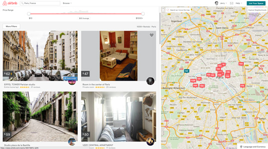
In our hotel example, we broke the established pattern. The user tapped a thumbnail on our site and nothing happened. They got slightly irked. Not enough to drive them away (remember that they kept tapping) but enough to set a bad precedent.
Broken expectations are cumulative. If a design deviates too far from expected conventions (externally inconsistent), designers face resistance to using the site. If a design deviates from itself (internally inconsistent), then it just becomes downright frustrating.
It takes a strong curiosity, or exceptional surprise and delight, to educate users about new conventions. But old habits die hard, especially on the web, where conventions reinforce each other with every new hyperlink. We describe many visual patterns in Web Design for the Human Eye, but let's recap some fundamentals behind them.
01. Gestalt
People draw connections between disparate shapes. In 1910, psychologist Max Wertheimer watched flickering lights of a railroad crossing. The pattern created an illusion that the lights were moving in a circle, even though they were merely alternating with good timing.
Wertheimer, along with his colleagues, developed theories on sight perception that are foundational to web design. The theories expound on Aristotle's simplistic but classic axiom, "The whole is greater than the sum of its parts," as applied to visuals.
The Gestalt principles tend to revolve around a handful of similar concepts. While relating to all sight perception, these ideas are especially applicable to UI design.

The logo above, created in the prototyping app UXPin, doesn't have a capital letter "H" — but our tendency to see shapes where there are none suggests otherwise.
Application to web design: Shapes and contours should take precedence over lesser details. It doesn't matter how fascinating a clickable button looks if your users don't know it's a button. These "signifiers" help suggest the function (known as affordances).
02. Proximity
People perceive that closely-placed elements are related, especially if separated from other groups by even more space. This also ties into the time and spatial elements of Fitts' Law.
This principle uses negative space to push certain elements apart, and others closer together, to create apparent groups that don't need lines or other indicators to spell out "this is a group" like, say, default HTML fieldsets.
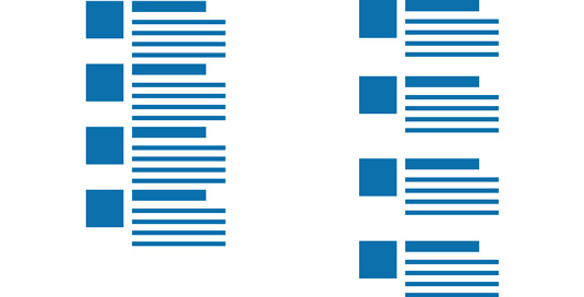
Application to web design: Grouping elements into sections is vital to page composition. Sidebars need to stand apart from main content. Sections within content need breathing space to indicate that they're sections. Photos, titles and descriptive text in search results need to form clusters to form discrete units.
As you can see on the right in the above illustration, the search results become discrete items when you add a little space to indicate "this is a group."
03. Colour
Bright colours seem to "rise above" cool, dark shades and hues. When adding depth to design, few techniques are more effective than darkening items in the background. To understand why, we break down colour theory into three parts:
- Contrast: Every shade of colour has a set opposite – an "arch-nemesis" whose contrast is far greater than any other colour.
- Complementation: colours aren't always at odds with each other. Complementary colours accent each other and bring out their best, the opposite of contrast. These are the colours immediately next to each other on the colour wheel, for example, purple's complements are blue and pink.
- Vibrancy: Each colour evokes a specific moods: the brighter warm colours (red, orange, yellow) tend to energize a user and make them more alert, while darker cool shades (green, blue, purple) tend to be more relaxing and tranquil.

Two variations of the logo made in UXPin lead to two different feelings. On the left, cool shades in the background make the gestalt shapes pop off the canvas. On the right, warm colours are more inviting — and possibly exciting. But they fall behind the white H shape, which dominates and defines the logo itself.
None of this registers to the average user. All she or he wants is to book a clean room. The fastest way from searching to booking is to use a pattern they're already familiar with. As we mentioned, search results — hotel or otherwise — have an established format.
In the case of a hotel-finding site, we must present users with relevant search results so they can make an informed decision. Sometimes that means foregoing our creative impulses and following tried-and-true-and-boring processes. But that doesn't mean we can't have fun.
04. Applying empathy to UI design patterns
We can use familiar patterns to our advantage. But to consciously use their unconscious tendencies, we need a little empathy and a lot of planning.
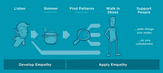
To start, we must define the exact problems. That's a discipline in itself, and often includes questions like:
- Which elements are more important than others?
- What's clickable, and what isn't?
- How do users know they can scroll for more information?
- Which icon should I use for a given task?
- What tells users that a function is disabled?
- How do users know when one section ends, and another begins?
- How do we tell users "be patient — this is still loading?"
… and other questions about communication that designers ask themselves. But to approach it with empathy, we have to turn things around. See things from the user's point of view.
- Where am I on the site?
- What should I look at first?
- Where can I go from here?
- How do I make this modal window go away?
- Should I tap this, or should I tap that?
- For that matter, what can I tap?
- Does this page contain the information I want?
- What can I ignore on this page?
When we seek patterns on the web, we're hunting for proven solutions that help users accomplish their goals, whether it's choosing a hotel, browsing articles, reading sports statistics, posting pictures or chatting with friends.
Luckily we're surrounded by patterns. They're so common that it's easy to overlook them. But they exist. Aside from looking for them yourself, sources include:
- UI Patterns — A repository of samples from around the web, organized by subject with helpful descriptive text.
- Web UI Design Patterns — Packed with information about the how and why of patterns, our free e-book covers current trends in UI design.
- Persuasive triggers — Search the web long enough and you'll find gems like this Smashing Magazine article about psychological and behavioral patterns.
- PatternTap — A vast collection of screenshots, organized with tags, that drive inspiration for design elements.
Conclusion
The more designers use patterns, the more users come to understand them, making them more valuable for designers to use. This reciprocal relationship has persisted since the first days of web design. Trends come and go, but the underlying ideas remain timeless.
If you found this post helpful, go ahead and check out the free Web UI Pattern Handbook.
The book was written based on my experience designing websites for the past 20 years. The 104-page guide explains how to select and use the best design patterns with 100+ examples from ESPN, Adobe, AIGA, The Discovery Channel, and more.
Words: Ben Gremillion
Ben Gremillion is a content designer at the prototyping app UXPin where he writes for their free ebook library. He's been designing and coding for the web for nearly 20 years. He also builds and maintains a CMS for web comic artists.
Liked this? Try these...

The Creative Bloq team is made up of a group of art and design enthusiasts, and has changed and evolved since Creative Bloq began back in 2012. The current website team consists of eight full-time members of staff: Editor Georgia Coggan, Deputy Editor Rosie Hilder, Ecommerce Editor Beren Neale, Senior News Editor Daniel Piper, Editor, Digital Art and 3D Ian Dean, Tech Reviews Editor Erlingur Einarsson, Ecommerce Writer Beth Nicholls and Staff Writer Natalie Fear, as well as a roster of freelancers from around the world. The ImagineFX magazine team also pitch in, ensuring that content from leading digital art publication ImagineFX is represented on Creative Bloq.
