5 innovative examples of user interface design
These inspiring user interface designs all pushed the envelope and delighted users.
In these days of intuitive touchscreens and intelligent iPhone apps, your audience is not going to put any work into using your product, app or operating system – they'll expect it to be obvious. No one is going to read a lengthy, detailed instruction manual; instead, the UI design should guide your customer through to achieving their goals – doing all the hard work so the user doesn't have to.
To inspire you, we've gathered together some recent examples of user interfaces that do it right; that keep it simple (unlike some of the most iconic user interfaces in movie history...) and don't distract from the function.
So read on and discover cutting edge and well thought out products, apps, and operating systems that focus on creating a great user experience through design...
01. iOS
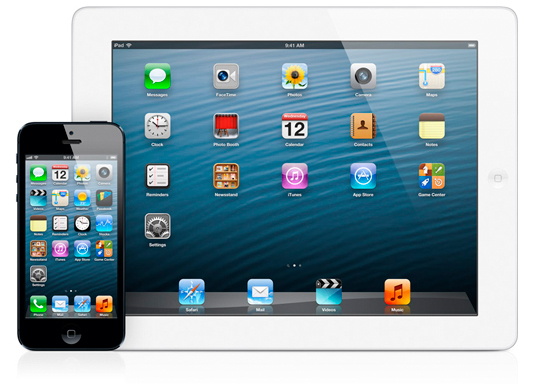
Apple may have come under fire recently, for things like the debacle over Maps, and the continuing debate over its use of skeumorphism. But sometimes it's good to stand back and look at the big picture: how Apple revolutionised the computer interface in a way that has influenced and shaped everything that's come about since.
The company pioneered the use of the GUI (graphical user interface) with the introduction of the Lisa computer in 1983 and later made it mainstream with the release of the Macintosh in 1984. Then, when it introduced the iPhone in 2009, it brought a unique and user-friendly experience to the mobile phone market.
For years, mobile phone users had been managing with just scroll wheels or arrow buttons to navigate through their phones. The iPhone’s touch interface and application icons changed the game because it worked and it was easy to use.
Little has changed regarding the core functionality of the iOS platform since 2009, playing to the old saying: "If it ain’t broke, don’t fix it". Meanwhile Apple has continued to expand its product offerings, adapting iOS to the iPad and iTouch.
Get the Creative Bloq Newsletter
Daily design news, reviews, how-tos and more, as picked by the editors.
02. Windows 8 Mobile
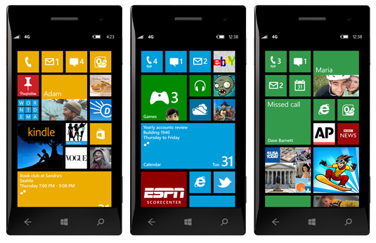
Microsoft has been playing catch-up in the smartphone market since Apple and Google took centre stage a few years ago. In 2012 Microsoft introduced their latest mobile phone operating system, Windows 8, along with a similar desktop version. Windows 8 for mobile features the use of live interactive tiles. This means that when you look at your phone's home screen you see multiple application 'tiles' that are constantly updating you with information.
See your latest tweets or text messages with just a glance and all in one spot. Not to mention that the arrangement and importance of the tiles are completely customizable.
The overall look is distinctively different from iOS , which focuses on the use of static icons to navigate and pop-up like notifications to catch incoming data. The Window’s 8 mobile interface stands out from the crowd because of its rethinking of how we view of now almost-constant stream of data.
03. The Nest Thermostat
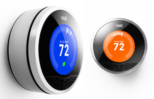
Often, you don't even realize how bad the user experience of a traditional product is until someone comes along and improved on it. Case in point, the household thermostat.
The movement into the digital edge has not done much to improve your home's thermostat. In fact, new digital thermostats tend to be much more difficult to program, with their confusing multiple menu systems and complicated displays. So, the designers of the Nest thermostat has simplified the process for you.
Turn it up when you want it hotter and turn it down when you want it colder. The thermostat does the rest by learning every time you make an adjustment and building a heating and cooling schedule based on your changes. You can even control it from your Smartphone via Wi-Fi.
Watch this! Nest thermostat:
04. Nintendo’s History of Mario Kart
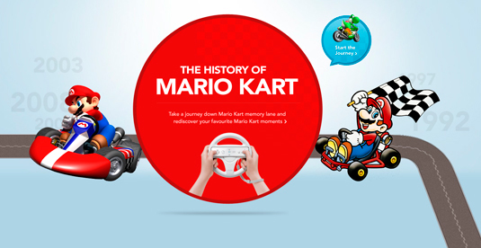
One of the big trends in website design at the moment is the use of parallax scrolling. Essentially this means that by using your mouse’s scroll wheel you can advance through a website in such a way that the site appears to be three dimensional.
This 3D effect is created by using some fancy HTML5 and CSS3 coding that makes the websites background move at a slower rate then objects set in the foreground.
This creates a unique user interface that is visually more interesting than the traditional, flat two-dimensional up and down scrolling found on most websites. The site is a great example of parallax scrolling and how it creates a unique user experience.
05. World Wildlife Fund’s iPad App
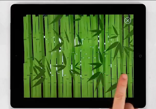
Consumer products and websites aren't the only places you will see advances in user interface design. iPad app developers are continually experimenting with new ways to allow users to interact with their iPad beyond just swiping their finger to change a page.
The World Wildlife Fund has released a free new iPad app called WWF Together that is a stunning example of what you can do with gesture-based interactions.
You can use your finger to move icebergs or erase an image to reveal important information about the world’s wildlife. All of this wrapped up in an elegantly simple interface that is easy to follow and informational.
Watch this! WWF app in action:
Words: Ben Whitesell
Ben Whitesell is a media designer specializing in a variety of different types of content creation including tradition print page layout, poster design and illustration.
Liked this? Read these!
- Discover what's next for Augmented Reality
- Stunning iOS icons
- Our favourite web fonts - and they don't cost a penny

Thank you for reading 5 articles this month* Join now for unlimited access
Enjoy your first month for just £1 / $1 / €1
*Read 5 free articles per month without a subscription

Join now for unlimited access
Try first month for just £1 / $1 / €1

The Creative Bloq team is made up of a group of art and design enthusiasts, and has changed and evolved since Creative Bloq began back in 2012. The current website team consists of eight full-time members of staff: Editor Georgia Coggan, Deputy Editor Rosie Hilder, Ecommerce Editor Beren Neale, Senior News Editor Daniel Piper, Editor, Digital Art and 3D Ian Dean, Tech Reviews Editor Erlingur Einarsson, Ecommerce Writer Beth Nicholls and Staff Writer Natalie Fear, as well as a roster of freelancers from around the world. The ImagineFX magazine team also pitch in, ensuring that content from leading digital art publication ImagineFX is represented on Creative Bloq.
