Transform PSDs into layered prototypes
Kamil Zieba explains how UXPin can help you create rich mockups from Photoshop files, without using code or rebuilding your designs.
Wireframes and mockups show you how a design looks, but prototypes demonstrate how a design works. Prototypes let you experience the design the same way a user does. Simply put, prototyping is the ultimate reality check.
Modern designers may follow different processes, but at one point they all need to build some sort of mockup. But the prototyping process is far from perfect – most available tools mean that you'll need to compromise in some way.
If you want a quick prototype, you'll have to sacrifice interactivity, as most solutions flatten your files. Animations and interactions are the lifeblood of modern design, so this is far from ideal. If you want a rich prototype, you'll need to invest time in working on code. Again, not ideal.
However, there is one tool that enables designers to build prototypes without compromising on either of these fronts: UXPin. We built UXPin to adapt to a range of design approaches, whether that's going from low-fi to hi-fi in UXPin or using it to add interactivity to Photoshop or Sketch files.
In this tutorial, I'll show you how to move an existing PSD for a website design into UXPin, and add some simple interactions to the layer groups. When we're done, you'll have a high-fidelity prototype that looks and acts just like a real website. You can see what we're aiming for here.
Step 01
For this example we will import an existing Photoshop file from our free web UI kit into UXPin. The first step is to log in to UXPin and install the Photoshop plugin in the bottom left-hand corner.
Step 02
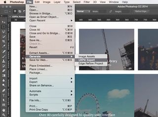
Open Photoshop, select the elements you want to export and click File > Generate > UXPin Export. We're going to export all the elements to UXPin, to ensure we will be able to add interactions to any existing layers. The file will likely export to the desktop, and will have a '.uxpin' extension.
Get the Creative Bloq Newsletter
Daily design news, reviews, how-tos and more, as picked by the editors.
Step 03
Return to UXPin and find your project. Drag and drop your '.uxpin' file into your project view. Now your exported file has been successfully uploaded into UXPin, and you're ready to turn it into a prototype.
Step 04
When you open the file in UXPin, you'll see that all the Photoshop layers have been preserved. Feel free to click around and add some interactions. This is pretty easy to do – just click on any object on screen, then click on the 'lightning bolt' icon to choose your interactions.
Step 05
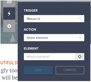
To set your first interaction, click the 'Interactions' button. The 'Link' button is a shortcut that enables you to link UI elements to pages. Below that, 'Recently created interactions' is a list from which you can quickly jump to any recently created interaction in your design.
Step 06
Setting up interactions for a given UI element is a three-phase process: first choose what should trigger the action, then what type of action the trigger should initiate, and what element should be affected by it. There are two ways of picking the element that should be affected by the interactions – you can either choose it from the list of all elements, or use the crosshair to point it out on the canvas.
Step 07
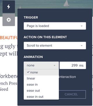
In UXPin, there is a vast number of triggers, interactions and animations you can choose from. Triggers include Click, Double-click, Hover, Mouse in, Focus, Key press, Window is scrolled to, and Page is loaded. Actions include Show element, Hide element, Toggle visibility, Go to page, Scroll element, State: enable, Move by, Rotate element, Change opacity and Change style. Finally, animations include Linear, Ease in, Ease out, Ease in-out, Fade and Slide.
Step 08
For every interaction you can choose a time delay before it occurs. For more precision, some interactions have additional settings, like the amount of pixels you want an element to move by, or how much time an animation should last for.
Step 09
In this tutorial, we'll add a few simple interactions and animations to our uploaded PSD file. On hover, the 'Learn more' button will change from translucent to orange. On clicking the button, the user will be scrolled down to the sign-up form at the bottom of the page. The sign-up form will also appear when a user scrolls down the page. Finally, after completing the form, a 'Thank you' message will appear.
Step 10
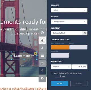
First, let's add a interaction to the 'Learn more' button. We'll set up our interactions so when we hover over the button, it eases into a different colour. Set your trigger to Hover and set the button action to Change style. Now, let's select the new style for the button – we'll use orange. To make the colour appear smoothly, set the animation to Ease in, with a delay of 300ms.
Step 11
Now we need to add another interaction to make the page scroll to the next section when the user clicks the orange 'Learn More' button. Set your trigger to Click, then set the button action to Scroll to element. Now, just click on the sign-up box to designate it as the 'scrolled to' element. The drop-down menu will automatically update with the name of the element (Box #7858).
Step 12
To make the scroll feel nice and smooth, let's set the animation to Ease in, with a delay of 300ms. Click the first button in our prototype to see the effect we've created.
Step 13
Next we will take care of the sign-up form. I'll show you how make it smoothly appear when the window is scrolled to a certain level. Because we want the form to appear following a certain action, you'll need to make sure it's hidden by default. Now, select the whole layer of the form and click the 'lightning bolt' icon for interactions. The trigger will be Window is scrolled to and the action will be Show element.
Step 14
As we've introduced a form in our prototype, why not make the inputs interactive to complete the experience? Choose inputs from the library of elements (cmd+F and type 'input'), style it accordingly and place it where you want customers to sign up. You don't need to set any interactions to enable users to type inside the inputs or switch to the next one using the tab key – those features are automatically included.
Step 15
As the final touch we'll introduce a sign-up confirmation. We'll be setting interactions between three elements: the 'Sign up' button, the sign-up form and the 'Thank you' slide. However, we only need to set up the interaction on the 'Sign up' button, because this will trigger the actions for the other two elements. When clicked, the 'Sign up' button will hide the sign-up form and the 'Thank you' slide will appear in its place.
Step 16
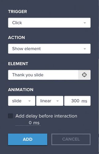
To hide the sign-up form when the 'Sign up' button is clicked, make sure your interaction menu is set to Trigger: Click, Action: Hide element and Element: Sign-up form. To show the 'Thank you' slide when the 'Sign up' button is clicked, make sure your interaction menu is set to Click, show element and Thank you slide.
Step 17
Now you're all done! Your 'Learn more' button will scroll the user down to the input form, which transitions to a 'Thank you' page upon completion. If you want to create responsive versions of the design, just click on the Add responsive version tab in the bottom-left corner. You can set breakpoints for mobile, tablet and custom resolutions, and it's simple to copy over all your elements to the new, responsive version.
For example, if you select 'iPads (768px)', you can immediately see the screen limits in the new version of the design. The existing layout will obviously need to be modified for the new screen dimensions. Tweak these as needed, and you're all set.
So there you have it, a comprehensive guide to turning a flat PSD into an interactive prototype, with responsive breakpoints. You can explore all these features and more by signing up for a free 30-day trial on UXPin.
This article was originally published in issue 267 of net magazine.
Words: Kamil Zieba
Liked this? Read these!
- 3 top ways to build a website prototype
- Illustrator tutorials: amazing ideas to try today!
- Great examples of doodle art

Thank you for reading 5 articles this month* Join now for unlimited access
Enjoy your first month for just £1 / $1 / €1
*Read 5 free articles per month without a subscription

Join now for unlimited access
Try first month for just £1 / $1 / €1
The Creative Bloq team is made up of a group of design fans, and has changed and evolved since Creative Bloq began back in 2012. The current website team consists of eight full-time members of staff: Editor Georgia Coggan, Deputy Editor Rosie Hilder, Ecommerce Editor Beren Neale, Senior News Editor Daniel Piper, Editor, Digital Art and 3D Ian Dean, Tech Reviews Editor Erlingur Einarsson, Ecommerce Writer Beth Nicholls and Staff Writer Natalie Fear, as well as a roster of freelancers from around the world. The ImagineFX magazine team also pitch in, ensuring that content from leading digital art publication ImagineFX is represented on Creative Bloq.
