5 big brands with brilliant ecommerce websites
These major retailers show the way when it comes to selling online. Check out their websites to find out what raises them above the rest.
In 2012, 53 per cent of Americans shopped on the web. With more than half of the American population choosing to buy online, Forrester Research predicts that by 2016, more than $320 billion will be spent on online shopping.
Online sales are becoming a norm and now, more than ever, ecommerce websites are facing tough competition. So what should you keep in mind when creating an ecommerce website that drives sales? Read through our list of the best examples as we break down five ecommerce websites to tell you what they're doing right:
01. Philips
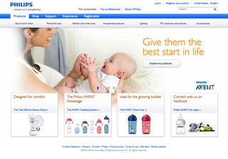
The best thing about Philips' ecommerce website is that there are added benefits for consumers shopping online - and these benefits are clearly visible. Great motivation for the buyer.
The site enables you to choose a product by category (which the sleek navigation makes very easy) and then customise the listings according to price or, interestingly, what is most environment-friendly.
You can quickly compare prices, learn more features about the product and see a large thumbnail of the product itself so no extra clicks are required to get a clear picture.
02. Adidas
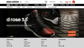
We all know that picky person who wants a very specific product, and those people are well represented amongst fans of sneakers. To meet that need, Adidas's online store lets you first browse by category and then filter the search results with a wide range of options such as sub-category, gender, style and colour.
Clean shots of the products show both the profile view and the sole of the shoe so buyers can gauge the product right there. Need more information? Simply click on a thumbnail to read more about the product’s features.
Get the Creative Bloq Newsletter
Daily design news, reviews, how-tos and more, as picked by the editors.
The navigation at the top of the page manages a lot of information without seeming cluttered, giving you a clear sense of where you are and how you got there.
03. Microsoft
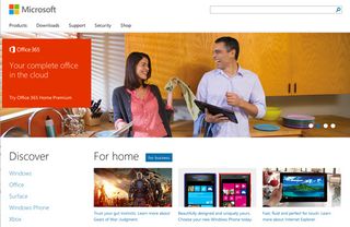
You'd expect a technology giant like Microsoft to get online sales right, and it certainly does here. This ecommerce website showcases a handsome number of products, including trial versions, but not once during your visit will you feel overwhelmed by information.
The design is sleek and smart and extremely user-friendly. There are clear calls to action so the user is guided step by step through the buying process.
The best thing about the Microsoft online store is that it smoothly combines creative graphics and smooth interface design. The visuals are colourful and product-related and complement the user-friendly layout well.
04. Intel
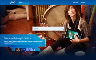
Intel’s ecommerce site lets you shop for processors, laptops, desktops and the all-new Intel Ultrabook Convertible. The online store gives you the liberty to select several items in your curated search results and then hit 'compare'. The website automatically generates a grid and presents you with an easy-to-understand analysis of each product. Finally, as with all great ecommerce sites, users can start their buying process without being nagged about accounts or registrations.
05. COCO Chanel
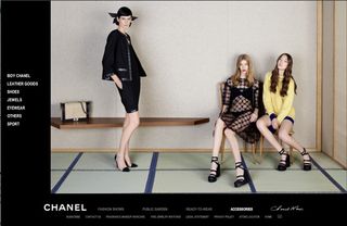
As a popular fashion brand, Coco Chanel's ecommerce website has to deliver its brand image while keeping the user design simple and easy. The Coco Chanel's online store achieves all this and makes it look like a piece of cake. The negative spaces around the page give the air of exclusivity and elegance while the simple layout allows users to 'Quick Buy' perfumes online.
The best thing about the Coco Chanel's ecommerce site is the amalgamation of its brand philosophy with UX design. It goes to show how well Coco understands its audience.
Useful takeaways
If you're making an ecommerce website, we hope these examples will serve as inspiration for you. We've selected some of the best features from these websites and compiled them here:
- Easy user interface that guides buyers through the purchase process and allows them to navigate back and forth between the pages using navigation breadcrumbs.
- Visible calls to action such as 'Buy' buttons or 'Try It' links with minimal forms or registration hurdles
- Related suggestions that help your buyer know if there are similar products available. Also, buyers may be interested in buying accessories with their products if you show them they can
- Product overviews that mention specifications, price, variations and any extra information you want the buyer to know. Not only that, adding buyer reviews or allowing buyers to ask their Facebook friends about the product increases trust and credibility.
- Sleek website designs that combine user efficiency with appealing graphics are the most successful in ecommerce websites because they give added value to your buyer.
Words: Nabiha Zeeshan
Nabiha Zeeshan is a student bi-majoring in graphic design and animation in Karachi, Pakistan. She is also working for Cygnis Media, analysing social media trends and reading about human psychology. When she feels like it, she blogs here. Follow her on Google+ and Twitter.
Liked this? Read these!
- 10 brilliantly responsive ecommerce sites
- Brilliant Wordpress tutorial selection
- Adobe Photoshop CS6 hands-on review
- Free Photoshop actions to create stunning effects
Have you seen a great example of an ecommerce website? Let us know about it in the comments!

Thank you for reading 5 articles this month* Join now for unlimited access
Enjoy your first month for just £1 / $1 / €1
*Read 5 free articles per month without a subscription

Join now for unlimited access
Try first month for just £1 / $1 / €1
The Creative Bloq team is made up of a group of design fans, and has changed and evolved since Creative Bloq began back in 2012. The current website team consists of eight full-time members of staff: Editor Georgia Coggan, Deputy Editor Rosie Hilder, Ecommerce Editor Beren Neale, Senior News Editor Daniel Piper, Editor, Digital Art and 3D Ian Dean, Tech Reviews Editor Erlingur Einarsson, Ecommerce Writer Beth Nicholls and Staff Writer Natalie Fear, as well as a roster of freelancers from around the world. The ImagineFX magazine team also pitch in, ensuring that content from leading digital art publication ImagineFX is represented on Creative Bloq.
