Test your responsive web designs with free new Google tool
Testing a responsive site just got a lot easier with Google Resizer.

Responsive web design is no longer an optional extra – if you want your site or app to reach the largest possible audience then you need to ensure that it looks just as good on an Android phone as it does on an iPad Pro or a massive desktop monitor.
Which is great in theory; however there's no real one-size-fits-all solution for responsive design, meaning that launching a responsive site can be a bit of a shot in the dark. Who can afford to test on every conceivable device?

There's help available, of course. Google's Material Design guidelines are great repository of information on responsive design topics such as breakpoints, responsive grids, surface behaviours, and user interface patterns, and beyond the theory Google now has a way to help you test that it's all working.
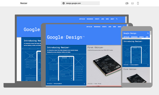
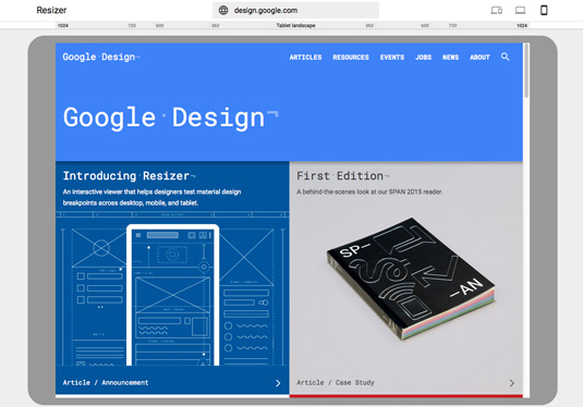
Resizer is a simple and brilliant site for testing responsive designs. You can just type in the URL of your site and see how it looks across the most common desktop and mobile resolutions and orientations, from a phone in portrait mode up to widescreen HD monitors.

You can switch between different views instantly, making it easy to see how various users view your site, and to spot any problems in your responsive design.
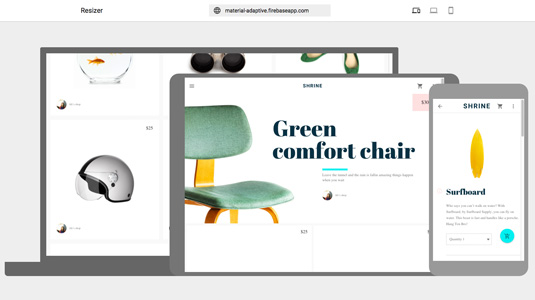
And if you need a little inspiration, Google has included a couple of demos with Resizer that show off the possibilities of responsive design: click on its address bar and instead of typing in your URL, select either Pesto or Shrine from the drop-down.

Pesto is a recipe app that demonstrates a few responsive patterns, using a grid list that reflows based on screen size, while Shrine is a shopping app that uses a different type of responsive grid list that changes navigation patterns based on screen size, rather than simply rescaling.
Get the Creative Bloq Newsletter
Daily design news, reviews, how-tos and more, as picked by the editors.
Resizer is free to use now, and it's just one of Google's web design resources. You can find more here.
Like this? Read these!
- Discover the best user testing software
- Read our step-by-step guide to user experience
- Top Chrome extensions for designers and devs
- Free WordPress themes for creating blogs, portfolios and more!
- Choose a website builder with these top tools

Thank you for reading 5 articles this month* Join now for unlimited access
Enjoy your first month for just £1 / $1 / €1
*Read 5 free articles per month without a subscription

Join now for unlimited access
Try first month for just £1 / $1 / €1

Jim McCauley is a writer, performer and cat-wrangler who started writing professionally way back in 1995 on PC Format magazine, and has been covering technology-related subjects ever since, whether it's hardware, software or videogames. A chance call in 2005 led to Jim taking charge of Computer Arts' website and developing an interest in the world of graphic design, and eventually led to a move over to the freshly-launched Creative Bloq in 2012. Jim now works as a freelance writer for sites including Creative Bloq, T3 and PetsRadar, specialising in design, technology, wellness and cats, while doing the occasional pantomime and street performance in Bath and designing posters for a local drama group on the side.
