Parallax scrolling infographic gives you more for your money
This brilliant online infographic showing how to save money on a car purchase has to be scrolled to be believed. Read on to find out how it was made.
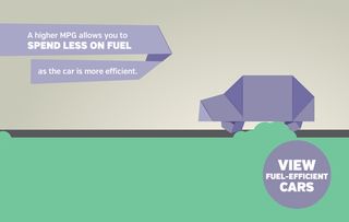
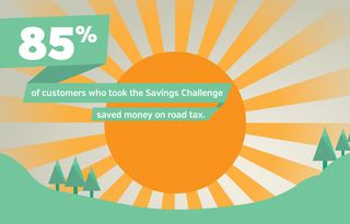
In order to publicise UK-based car dealership network Arnold Clark's latest promotion, where customers are asked to 'challenge' the salesman in their local dealership to save them money on their monthly motoring outgoings, the in-house web team came up with the idea of a parallax site built on an infographic style - the Savings Challenge site.
The team created the site in a mere three weeks, and the designer who created the artwork for the entire campaign drafted his vision for animated, engaging data visualization - despite never having worked on a parallax scrolling site before.

"The design is based on the idea of paper money that can be folded into the key element," said the designer, Stephen Kay. "Hence the slogan 'do more with your money'. This folding notion helped formalise not only the initial logo design, but also the potential for a moving, interactive web page. It really lends itself to being animated.”

Once in development, the storyboard was split into seven key 'scenes' in order to help manage the workflow and the checking process. The developers used skrollr.js as their core technology to handle user scroll events. This allowed for rapid prototyping, giving more time to smoothing out transitions and building a workable user interface.
They also made use of grunt.js to assemble handlebars templates and compile their coffeescript and SASS files. They created a task to reload the page whenever files were altered, allowing them to see changes instantly. To achieve the desired animations, the team used CSS3 3D transforms extensively.

Each scene in the webpage was created as an individual handlebars template, meaning the guys could split the work between them and deal with a scene each rather than pairing up. Splitting the development between two developers - and into smaller, manageable tasks - was paramount to getting the page up swiftly and efficiently.
Thanks to the handlebars and grunt, it was an easy process to thread the individual scenes together and deliver a fully-functional parallax scrolling page in just three weeks. "We're very pleased with what we've managed to achieve in a rather limited time period," the team commented. "But we're confident that, with such strong supporting statistics, the campaign message will speak for itself."

The page is now live at www.arnoldclark.com/challenge/ and is best viewed in Chrome or Firefox.
Like this? Read these!
- Free graffiti font selection
- Illustrator tutorials: amazing ideas to try today!
- Great examples of doodle art
Have you seen a cool parallax site? Tell us about it in the comments!

Thank you for reading 5 articles this month* Join now for unlimited access
Enjoy your first month for just £1 / $1 / €1
*Read 5 free articles per month without a subscription

Join now for unlimited access
Try first month for just £1 / $1 / €1
Get the Creative Bloq Newsletter
Daily design news, reviews, how-tos and more, as picked by the editors.
The Creative Bloq team is made up of a group of design fans, and has changed and evolved since Creative Bloq began back in 2012. The current website team consists of eight full-time members of staff: Editor Georgia Coggan, Deputy Editor Rosie Hilder, Ecommerce Editor Beren Neale, Senior News Editor Daniel Piper, Editor, Digital Art and 3D Ian Dean, Tech Reviews Editor Erlingur Einarsson and Ecommerce Writer Beth Nicholls and Staff Writer Natalie Fear, as well as a roster of freelancers from around the world. The 3D World and ImagineFX magazine teams also pitch in, ensuring that content from 3D World and ImagineFX is represented on Creative Bloq.
