The web designer's guide to style tiles
Halfway between a mood board and a mock up, style tiles are a way of defining the visual approach for a website. Here's how to use them.
Style tiles are a visual reference to the design language of a website (or other design deliverable). They help tell a story through fonts, colour and style collections, and when viewed in combination with wireframes, site-maps and other UI elements, they define that story in an accessible, client-friendly manner. In this article I'll explain how to get the best out of this handy technique.
01. What do style tiles contain?
A successful style tile should contain sample user interface elements, define a colour scheme, show how the principles of typographical design will be used and demonstrate the relationship between the client's brand and the proposed visual solution. For example, if a client has used the words 'reliable' or 'dependable' to describe their business, the style tile should visually represent this.
Most of all, style tiles offer a starting point for discussion and clarification on the client's business goals and personal preferences.
02. When to use style tiles
Style tiles offer a flexible starting point to help define what a website will look like, in an accessible way that clients can understand. Think of them as something in between a mood board and a mockup - they help define and communicate how a visual style will be applied across a website, including both desktop and mobile orientated user interfaces.
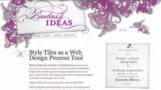
You can use them in place of the traditional first mockups, generating ideas and feedback from the client to help inform the final design approach. In Samantha Warren's A List Apart article, she describes how the style tile process helps "tease out the passion behind a brand, revealing nuggets of descriptive goodness all while connecting the client to the project".
03. What do style tiles look like?
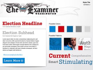
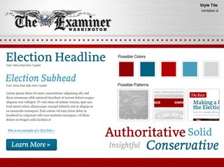

There's no set way your style tiles need to look. The key is to ensure that you don't mistake them for mood boards, which are insufficient to fully establish a visual language, while also not going too far the other way towards a full design mockup.
Check out the above examples from Phase2 Technology, created while working on a new website for the Washington Examiner 2012 Campaign site.
04. How to use style tiles successfully
Once you understand the principles of style tiles, they should fit neatly into your design process. Typically they'll be generated earlier in the design lifecycle than you might have created your first mockups, and as a result they'll enable you to get feedback sooner. Follow the four following steps to put Style Tiles into your workflow:
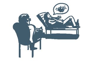
Listen to your client
Meet with your client at the start of your project, and gather as much relevant information as possible. Some designers may find it easier to conduct individual interviews with stakeholders, while others will prefer a group meeting; do what works for you. Make sure you ask all the key decision-makers and stakeholders the same core questions.
If it helps, you can create a questionnaire for your clients ahead of the first project meeting. If you're struggling to know what questions you should be asking your client, the StyleTil.es website highlights some some useful resources including these from Andy Rutledge and Kim Cullen.
Samantha's A List Apart article also helps to define some useful questioning techniques to get the most out of these first meetings. Crucially, you need to gather adjectives to usefully describe the story your clients want to portray through their website.
Use a design framework to interpret the brief
Using the adjectives you recorded in the first step, create an aggregated set to identify themes in the adjective language. Apply these themes to your design framework, using design principles such as harmony and unity to make choices about the elements of design and their visual representation of the story. Don't forget to use any existing branding, hand-writing and visual language that's already in place to help contextualise the design brief and your response.
Define the visual language
Using the information you gathered in step 01, and the output generated through your interpretation in step 02, determine over-arching themes and start to match these up with stylistic devices. Generate a different tile for each visual interpretation you came up with. The completed style tiles will allow you to quickly establish whether you're on the same page as your client from a visual language perspective.
The styletil.es website, created by Samantha Warren, provides a handy PSD template for you to download and use as a starting point for your style tiles output.
Iterate until style is agreed
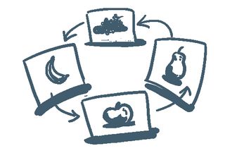
Work with your client to make changes to the style tile. Because you're iterating outside the context of the final website layout, you can focus on ensuring your stylistic approach continues to reflect the business goals and design goals.
05. Should style tiles replace mock ups?
It's a common approach at the start of a design project to produce page mock ups, but if you've ever found yourself having to negotiate over a hybrid - comprising elements from two or more mock ups, and compromising on the design approach - you'll be familiar with the frustration that using mock ups early in the design process can bring.
From a client perspective, a mock up represents a complete design solution, but as it's often the first time they've seen your interpretation of the design brief, it's understandable that they'll identify elements they like, and elements they don't. It's also a natural conclusion that the feedback you receive will compel you to bring together disparate elements from the various mock ups, leading to what Samantha Warren brands a 'Franken-comp' solution.
Mock ups might seem like a simple, obvious way to define how a project can start the process of moving from the design brief to completion. But style tiles can be a smarter way of going about things, getting feedback, and define a visual language in collaboration with your client early on.
This can help avoid the feeling of frustration and disappointment in having to assemble a final mock up from individual parts of completely disconnected comps, and helps to keep the client fully engaged and bought-in to the design process.
06. Where to learn more
- Style tiles and how they work - An A List Apart article
- Cheat sheet and free PSD template for Style Tiles
- The Foundry: our new responsive design deliverable: the style prototype
Words: Sam Hampton-Smith
Like this? Read these!
- Free Photoshop brushes every creative must have!
- The best Photoshop plugins
- The ultimate guide to designing the best logos
What do you think? Will you be giving style tiles a go, or are you sticking with traditional page mockups? Let us know your views in the comments below...

Thank you for reading 5 articles this month* Join now for unlimited access
Enjoy your first month for just £1 / $1 / €1
*Read 5 free articles per month without a subscription

Join now for unlimited access
Try first month for just £1 / $1 / €1
Get the Creative Bloq Newsletter
Daily design news, reviews, how-tos and more, as picked by the editors.
The Creative Bloq team is made up of a group of design fans, and has changed and evolved since Creative Bloq began back in 2012. The current website team consists of eight full-time members of staff: Editor Georgia Coggan, Deputy Editor Rosie Hilder, Ecommerce Editor Beren Neale, Senior News Editor Daniel Piper, Editor, Digital Art and 3D Ian Dean, Tech Reviews Editor Erlingur Einarsson and Ecommerce Writer Beth Nicholls and Staff Writer Natalie Fear, as well as a roster of freelancers from around the world. The 3D World and ImagineFX magazine teams also pitch in, ensuring that content from 3D World and ImagineFX is represented on Creative Bloq.


