3 online style guides that do it right
Sam Kapila explores what to consider when building an online style guide, and looks at three sites that do it well.

2015 seemed like the year of style guides. While it's awesome to see more and more websites sharing their design guidelines online, there are a few points to consider when creating your own style guide.
First, support your design elements with clear instructions. There are a number of web design style guide examples out there that include all the elements of a design system, but with little to no information about when and why to use them. When it comes to writing dos and don'ts, captions and labels, communicate as if you're leaving the team, but want the system to live on. Share the goals of the system and its elements, and your expectations of what the outcomes should be. Be consistent with voice and tone.
Second, consider the evolution of the design. Include patterns that may not exist now but might in the future. Considering how patterns will evolve helps a design system stay in place longer. Starbucks' older style guide may not include a lot of supporting content, but it does use sample layouts within its grid system that weren't used regularly in the previous version of the site.
Finally, take advantage of the interactive style guide. Build out elements that support multi-device design and the various states of those elements (like hovers on buttons), then design the style guide to reflect those patterns and interactions. When a style guide can show how elements change when a user interacts with them, it adds an extra layer of depth to the experience.
Here are three great examples.
01. NC.gov

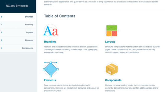
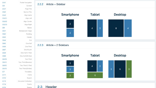
NC.gov's style guide includes supporting captions for design and markup patterns, setting the tone for how these elements should be used.
02. CodePen

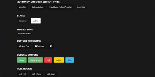
CodePen's guide has multiple button states, a responsive grid that follows its grid system, and goes deep into form validation styling.
Get the Creative Bloq Newsletter
Daily design news, reviews, how-tos and more, as picked by the editors.
03. Frontify

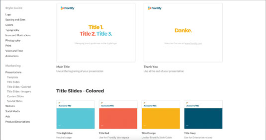
Frontify, a service that helps generate style guides, uses its own product to build its style guide. The result is well-organised, and goes into incredible detail.
Words: Sam Kapila
Sam Kapila is a designer living in Texas and an instructor at The Iron Yard, an international, immersive coding school. This article originally appeared in issue 277 of net magazine.
Liked this? Read these!
- Nail styles guides with this mini master class
- We reveal the best web fonts for your site
- View these stunning examples of pointillism
- These Adobe Illustrator tutorials will keep you busy for days
- Check out these inspiring examples of 3D art

Thank you for reading 5 articles this month* Join now for unlimited access
Enjoy your first month for just £1 / $1 / €1
*Read 5 free articles per month without a subscription

Join now for unlimited access
Try first month for just £1 / $1 / €1

The Creative Bloq team is made up of a group of art and design enthusiasts, and has changed and evolved since Creative Bloq began back in 2012. The current website team consists of eight full-time members of staff: Editor Georgia Coggan, Deputy Editor Rosie Hilder, Ecommerce Editor Beren Neale, Senior News Editor Daniel Piper, Editor, Digital Art and 3D Ian Dean, Tech Reviews Editor Erlingur Einarsson, Ecommerce Writer Beth Nicholls and Staff Writer Natalie Fear, as well as a roster of freelancers from around the world. The ImagineFX magazine team also pitch in, ensuring that content from leading digital art publication ImagineFX is represented on Creative Bloq.
