Get the perfect website layout in 27 steps
Craft your ideal website layout with our foolproof guide.
Design approach
14. Rethink the established
Do we really need a search button any more? In most cases the answer is no. As designers we shape the way users browse the internet, it's up to us to decide how many steps a simple action will take and how efficient our site will be.
Some conventions are there because they work, but some are there because no one spent enough time evaluating them. It's important to rethink the established interactive patterns of all components to see how we can improve them.
15. Challenge yourself
I encourage every designer out there to challenge themselves on every project. Innovation isn't always a requirement for the project, so it's up to us to come up with something fresh. Examples of different challenges could include using a new grid system, creating a new component, or even minor challenges like avoiding blend modes or using a specific colour.
16. Pay attention to the details
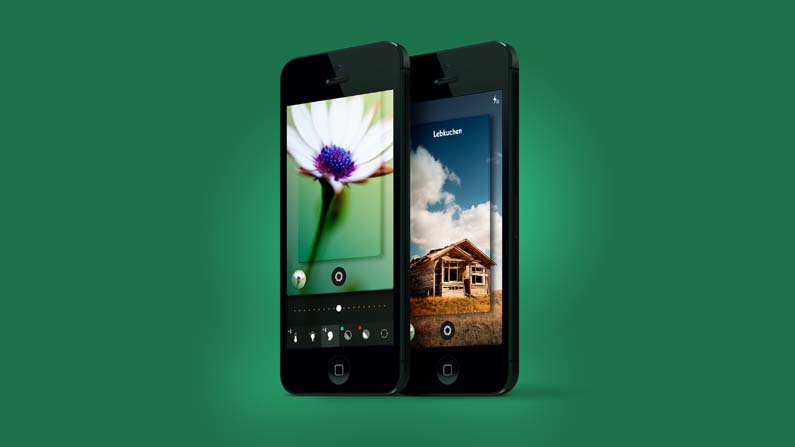
This statement has been overused lately but it's not always visible in the final product. Depending on the concept behind the project, that 'attention to detail' can mean different things.
It could be a small interaction, an unexpected animation or an aesthetic touch like a little gradient in a button or a subtle stroke around a box in the background. But overall this touch is essential – and it will come naturally if you really enjoy what you do.
17. Design the best case; prepare for the worst

Bear in mind how your layout will work across different devices and screen sizes. As designers, our job is to solve problems through different constraints. With web design, the constraints range from conceptual and technical problems to content-related issues.
We need to build a site that can work not only in the ideal scenario, but also in the worst-case scenario. For instance, a user could be using a really small screen and check the site when there is barely any content on it so it looks broken.
Get the Creative Bloq Newsletter
Daily design news, reviews, how-tos and more, as picked by the editors.
However for the purpose of presenting your work, I strongly recommend building the best case scenario for it (which should also be the most common scenario for most users). You want to display the ideal amount of text and show the site inside the ideal browser size.
18. Don't get too attached to your ideas
There is a thin line between knowing when to advocate for your ideas and learning to recognise when your team or client doesn't see them as 'the one'. As a designer you need to firmly believe in what you do, but you should also be open to quickly turning over any of your ideas and coming up with something else. Don't forget that there is more than one solution.
19. Obsess over the design until you hate it
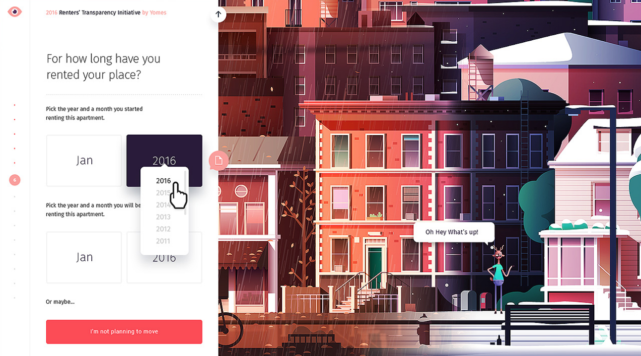
If you are passionate about design, I'm sure this is something you are already doing. Whenever I finish a comp I feel proud of, I tend to make that comp a part of my life. I take screenshots of it, check it out it different devices, make wallpapers of it and even print it and hang it on the wall.
As a result of this process, I get to a point where I finally end up hating my design. I start seeing everything that's wrong with it and eventually I change it. Disliking your previous work is a sign of maturity, and it means that you are finally learning from your own mistakes.
20. Be your developer's best friend
Developers are creative people and they love their jobs as much as you do. But they are not always included in a project from the very beginning, and often only get involved when the concept is decided and their creative role has been overridden.
This process is wrong; some of the best ideas come from the development team, so make sure you team up with them from the very beginning of the project. Sharing your concepts and excitement with them will lead to better ideas and a better execution in the end.
21. Over-communicate

I’ve never regretted over-communicating with my clients. Do not hesitate to tell them as soon as something is not clear or you feel blocked. Remember it’s in their best interest to make sure you use your time together in the most efficient manner. I tend to communicate quite often with my clients at the beginning of every project, until we both feel comfortable with the workflow and understand the expectations on both sides.
22. Present things as clearly as possible
It's just as important to produce great work as it is to present it. Your best design can be ignored or thrown away if you don't present it properly. When it comes to presentations, you want to explain your work like you're showing it to a four-year-old. Always keep in mind that what is totally clear to you might not be that clear to somebody seeing your design for the first time.
Wrapping up
23. Sharpen your work
To avoid blurry pixels, try to set the right contrast between strokes and background or background colours. Besides any aesthetic considerations, there are some common things that have to be avoided in order to create a clean and correct piece of work.
Some things you should be on the lookout for when trying to sharpen your work include gradients banding, blurry edges, font rendering options (some fonts, depending on their size are best viewed, on a specific render mode), and strokes that merge badly with the background.
These are just a few basic examples of issues to look for, but in reality the list is endless. Always look at your design as a whole to see if everything works well and then analyse each component individually more carefully.
24. Tidy up your design files
This (along with the use of a grid) is one of the most important pieces of advice, no matter what design tool you are using. Regardless of the size of the project and the number of designers working on it, you need to keep your files clean. This will make it easier to export different sections, to speed up the design process and to work collaboratively with other designers.
25. Follow your design into development

If you work inside an agency you'll probably know how easy it is to find yourself struggling with the design of a new project when the previous one is being developed. Contrary to general belief, your work on a project doesn't end when the PSD and style sheet are delivered.
If you really care about your designs and interaction ideas being well executed, check in on your old best friends the developers from time to time, and help them as much as they need to ensure every little pixel is perfect.
26. Show your work in progress
As part of a community of designers, we all love to see not just the final results but also the work in progress. Sometimes the best part of a project is left out for several reasons and gets lost in your Archive folder. Share your project development to give some insight as to how you arrived at your final website layout.
27. Promote the hell out of it
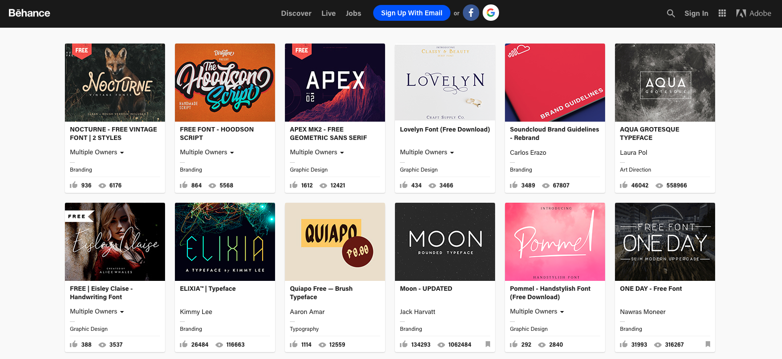
Now you have finished your project, it’s time to put the word out and promote it online. Showing your work is the best way to attract new clients and bring attention to your craft. In some cases I’ve collaborated with clients to prepare the assets required to promote the work we have done together as part of the project. At the end of the day, it’s a win-win situation for both you and your client. Getting the word out will also bring attention to their business. So shout about it!
Read more:

Thank you for reading 5 articles this month* Join now for unlimited access
Enjoy your first month for just £1 / $1 / €1
*Read 5 free articles per month without a subscription

Join now for unlimited access
Try first month for just £1 / $1 / €1
- 1
- 2
Current page: Website layout: Design approach and wrapping up
Prev Page Website layout: Getting started and design workflowClaudio Guglieri is an independent designer and creative director. Claudio has been responsible for directing and executing interactive experiences for clients like Google, Kayak, EA, CNN, Nickelodeon, Microsoft, History Channel and Motorola to name a few. He previously was CD at Elephant working for Apple, led the Design Department at Fantasy Interactive as Design Director, and freelanced helping companies like Lonely Planet or MixPanel creating and improving their digital products.
