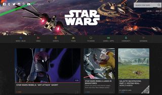
Revamped Star Wars site harnesses the force of CSS
As the Episode VII hype grows, we look at the latest redesign of StarWars.com.

The new Star Wars site is a fine example of simplicity sprinkled with a just the right amount of detail. The use of parallax and animation for the navigation and hero image give the scrolling experience personality without going overboard.
The site is packed with little tricks and treats, which give it some extra personality – for example, the mobile hamburger menu and close icon for search turn into lightsabers, and different highlight colours help differentiate each section.

The creators even got a little fancy with the loader. Created using CSS only, one circle rotates clockwise while the other moves anti-clockwise, and with one element – an interesting approach.
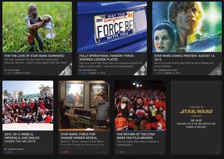
This site houses a ton of information and the grid system is flexible enough to allow for variety in layout while maintaining enough structure for the continued addition of content.
The creators have also crafted a responsive design that leaves viewers happy, no matter what device they’re on. Building a content-heavy site that can be maintained across a variety of devices is tough, but this is a great example of it being done right.
Words: Brian Hoff
Brian is the founder and creative director of Brian Hoff Design, a Philadelphia-based boutique digital agency creating web and mobile platforms and products. Follow him on Twitter at @behoff.
Like this? Read these!
- The best free script fonts
- Free graffiti font selection
- 50 great parallax scrolling websites
- Why your website needs a landing page
Have you seen any amazing new sites or portfolios? Let us know in the comments!

Thank you for reading 5 articles this month* Join now for unlimited access
Enjoy your first month for just £1 / $1 / €1
*Read 5 free articles per month without a subscription

Join now for unlimited access
Try first month for just £1 / $1 / €1
Get the Creative Bloq Newsletter
Daily design news, reviews, how-tos and more, as picked by the editors.
The Creative Bloq team is made up of a group of design fans, and has changed and evolved since Creative Bloq began back in 2012. The current website team consists of eight full-time members of staff: Editor Georgia Coggan, Deputy Editor Rosie Hilder, Ecommerce Editor Beren Neale, Senior News Editor Daniel Piper, Editor, Digital Art and 3D Ian Dean, Tech Reviews Editor Erlingur Einarsson and Ecommerce Writer Beth Nicholls and Staff Writer Natalie Fear, as well as a roster of freelancers from around the world. The 3D World and ImagineFX magazine teams also pitch in, ensuring that content from 3D World and ImagineFX is represented on Creative Bloq.
