Speed up your web workflow with a style guide
A style guide might be the missing piece of your workflow.
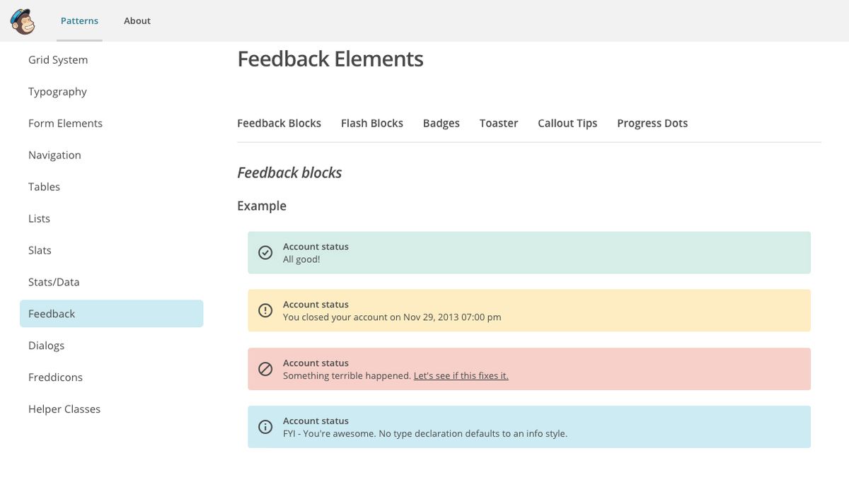
Style guides are now firmly established as a key part of the modern web design workflow. Their use in web projects has been steadily rising for some time now, thanks to heightened community awareness, with various industry professionals demonstrating their use and effectiveness. So whether you're building a site from scratch or using a website builder, it's vital you create a style guide.
The rise of style guides was partly linked to the development of responsive web design, but they're now helping designers and devs deal with the demands of a more capable web and increasingly ambitious web projects (if yours is seriously ambitious, make sure your web hosting is up to scratch). They will help you design and build faster,with more accurate and consistent results. And remember to save them in shared cloud storage so everyone can access them.
In this article we'll go through everything you need to know about what a style guide is, how to put one together, and how to use one. Use the quick links on the right to jump to the section you want.
What is a style guide?
In contrast to a traditional static website layout composition produced in Sketch, Photoshop CC or similar, a style guide is a set of elements and components that when used together can form a complete layout or parts of that layout. When produced correctly, they are scalable and flexible, making them the perfect tool for building responsive designs. Take a look at styleguide.io for lots of examples of great style guides, and resources for learning more.
In this article, I'll use the terms ‘style guide' and ‘design system' interchangeably, as I believe style guides are most effective when they form a system for managing existing designs and allowing the production of new ones with ease.
So why would you want to switch from a traditional workflow? For a start, introducing a style guide means you will be able to get into the browser quicker and spend less time in desktop web design tools.
At their most useful, style guides enable you to work up all your design concepts in the browser, demoting the likes of Photoshop and Sketch to asset creation tools, rather than what you use to envision layouts.
Where do style guides fit into a project?
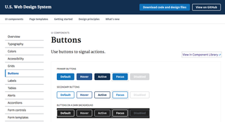
Whilst style guides are primarily a tool for web designers and/or developers, they can be a deliverable for clients too. Style guides give clients an insight into the design system being established, and the palette that will form their product. Samantha Warren explores this idea in detail with her Style Tiles; a method for demonstrating a visual language to clients in the form of fonts, colours and interface elements.
The problem with the traditional approach of asking clients to sign off on static layouts is that these are essentially photographs of what the website might look like. Of course, we'll try our best to make the final product look like the promise we've made in this photo, but we're creating an idealistic render, without having to contend with all the living parts of the web.
Many small nuances – such as type rendering and spacing – may change. This can amount to the client feeling like they have been misled by the Photoshop render.
Using style guides as a design deliverable eradicates these difficult discussions with a client. They make design changes easier to complete without much hassle, and get you in the modular mindset from an early stage in the project workflow.
What do you include in a good style guide?
Ideally your style guide should give you everything you need to design and build a page at a moment's notice, without having to open up Photoshop or Sketch. In regards to the format, a style guide should be live HTML, categorised in a manner that is easily maintainable for you and any other designers that might come into contact with it.
Starting with the basics, let's look at the ingredients of what makes a good style guide. I find the headings I've covered here help as a base to get started with, but feel free to add sub-headings and get more specific. Take a look at Brad Frost's Atomic Design as a potential methodology for organising this part of a design system.
Type
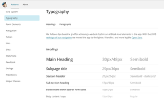
This includes the whole typographic hierarchy, covering headings, lists, block quotes and paragraph text. It should also cover any variations within these categories, such as captions, drop caps and any other special typographic treatments, and UI contexts like buttons, navigation and form fields.
Grids and spacing
This should include both horizontal and vertical layout grid systems. Grid guidelines enable you to rapidly prototype and build layouts without having to make time-consuming adjustments to spacing and margins.
Colour
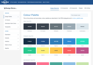
Your primary colour palette, including the main link colours, actions and element colours (for example, buttons, labels and icons). In this section you'll also need to include any colours outside of this palette that occur for circumstances outside of the ideal design state, like error and system messages, and validation.
Modules
Modules comprise elements such as buttons, form fields, tabs and navigation, as well as collections of elements such as captioned images and blog post meta data. They also include combinations of elements working together – for example an article heading, date and introduction paragraph, a tooltip with a small heading and text, and so on.
How do you create a style guide?
How exactly do you put together a style guide? Here, I'll walk you through the process I use.
Start with wireframes

Before you code a single line of your design system, you need to know roughly what parts you're going to need for it. Early on in the project, when a client has provided the initial content and assets you'll be working with, you should aim to establish the foundation of your design system with a set of wireframe sketches.
Wireframes are a style guide's secret weapon. Take time to sketch out all the screens in your product, either with a pen and paper, or using a wireframe tool. Include any specific UI design components you'll likely need in the final product.
Look for patterns
It's at this point I recommend finding a large physical work area where you can spread out your wireframe sketches so they are all visible at once and you can get a broad view of the system you're about to establish. Look over your sketches and notice patterns emerging. Perhaps a combination of elements appears together frequently, and could become a reusable module?
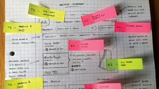
Also look for patterns that are trying to emerge. For example, a list of blog articles might take a similar format to a list of search results, but let's say the elements are arranged in a different order. Perhaps changing one of the two to match the other will help the user read a pattern they have subconsciously learned elsewhere in your product.
Catalogue everything
I like to use a set of Post-It Note page markers to label all of the elements in my wireframe pages for reference. For example, a module like a breadcrumb that occurs throughout the sketches could be labelled ‘M01'. ‘M' indicates it's a module. The number indicates which module it happens to be in my system – the next module would be M02, M03 and so on.
The element itself could be repeated elsewhere, so this breadcrumb pattern might appear on a product page as well as a blog article, both labelled M01, so I don't end up designing and building multiple versions of the same element when it comes to prototyping the wireframes.
Move into HTML
After you've finished cataloguing and labelling the wireframes, it's simply a matter of taking that catalogue of elements and modules and building them as a live HTML style guide.
Think of it like an Airfix model. You have an instruction sheet (your wireframe sketches) and a set of labelled parts (your style guide) corresponding to the instruction sheet. Once you have a concept of what you want to create, you will know what parts you are going to need, and at that point you're ready to start building your design system.
The best part of approaching design systems in this manner is that it enables you to rapidly produce new screens and components – each scenario is only a wireframe sketch away. The style guide reminds you of your existing components and patterns when drawing your next sketch. Once the sketch is complete, you are ready to build quickly with the wireframes as your instruction sheet, using the ready made elements in your style guide.
How do you use a style guide?
Technically speaking, a style guide is never really complete; it's an ever-evolving document that grows with your project. It's impossible to know in advance every combination of elements, patterns and modules that will need to exist, beyond what you currently have planned. But that's okay. True to the ever-changing nature of our web, a style guide can only be as complete as the current state of your product.
In its (mostly) complete state, a style guide is a reference for the over-arching visual language of the product you are building. It means you can visualise how new features might take shape, and the look and feel they adopt. It's also a living library of tested elements and components that can be used to quickly construct new screens or parts of a product, making it the most efficient way to rapidly build projects on any scale.

It is essential a style guide is maintained beyond its initial conception. It must remain current, rather than being a snapshot of what the product's design system looked like at a particular time. It should be the visual lexicon of your project – the entity you consult whenever a design decision is made after sketching. All new components and modules are made from its DNA, so from a user experience perspective, any new pieces will look consistent as part of the complete brand picture.
If you have never used a style guide in a web project before, try it on your next project and see the difference it makes in helping you design, build and prototype quicker. With practice, they'll become easier to create, and you'll even find patterns within your style guide that can be reused to speed up the process of creating the next style guide.
A useful style guide goes beyond the capabilities of a visual reference. It becomes your product's DNA, from which every piece of current and future design originates to produce the consistent style and characteristics of the rest of the product.
This article originally appeared in net magazine. Subscribe here.
Read more:

Thank you for reading 5 articles this month* Join now for unlimited access
Enjoy your first month for just £1 / $1 / €1
*Read 5 free articles per month without a subscription

Join now for unlimited access
Try first month for just £1 / $1 / €1
Get the Creative Bloq Newsletter
Daily design news, reviews, how-tos and more, as picked by the editors.
