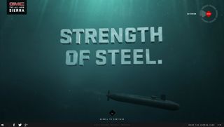
You've probably never seen a scrolling site like this
The Sierra 2014 website takes scrolling to a new, cinematic level. We reveal how it was made.
More and more sites are using scrolling techniques, most notably parallax scrolling, to present content or tell a story in an engaging way. But there are more ways to use scrolling than down a single page. And this new promotional site for the GMC Sierra 2014, created by DigitasLBi US and MediaMonks, takes things into a whole new dimension.
Designed to complement a broadcast campaign, the HTML5 site features immersive sound and Hollywood-calibre computer-generated imagery (CGI), and offers an interesting new take on what you can do with scrolling.
By scrolling, visitors get to see, hear, and feel the advanced features of the all-new Sierra pickup, using context-dependent interactions and full-frame HD animations. In fact it feels and looks more like an epic, cinematic game than a scrolling site.
New dimension
"Scrolling sites to date have seemed lightweight, two-dimensional and thin," says Jouke Vuurmans, interactive director at MediaMonks. "In contrast, we wanted a website that could embody the substantial, carefully sculpted feel of the GMC Sierra.

"What's more, the larger story being told about the vehicle is a journey of inspirations from unrelated fields. It is not a linear narrative of six stories; they are each of equal importance, but independent of the others.
"That's why innovating the navigation was so important to us – we wanted to put the user in control of how they could explore these stories by making their actions feel purposeful."
Technical challenge
Building the site presented a number of technical challenges. "An integral element of the website is scrubbing through 3D-animated video using the scroll feature," Vuurmans says. "This approach has never really been used before, which meant we were venturing into unexplored territory – something that always requires some extra hard work if you’re pursuing perfection.

"We also used a 3D-render of the Sierra – situated in each of the explorable environments – as the starting point for each story. We therefore had to add this sequence to the scrolling experience whilst also ensuring it felt intuitive and natural.
Filmed sequences
In fact, while it may look like some sequences have been filmed, "almost everything was CG", confirms Vuurmans.
So what wasn't? "To improve the quality and realism of the final product, a few shots were filmed and then composited into a final render. For example, in the 'Exterior' story, there is a transition where the camera goes underwater.
"MediaMonks' film department shot a live action backplate of an immersion blender churning water bubbles through the clear walls of a fish tank. They used this in composite for the realistic bubbles and fluid dynamics. However, all the vehicles, environments, and animations were 100% CG."

And what about mobile? "We developed a mobile site that can deliver the same essence and takeaway as the desktop/tablet site, but without all the site weight or technical limitations," adds Vuurmans.
"A lot of the 3D CGI was unavailable to mobile (for obvious reasons), but the Monks created equally substantial assets and visuals, which could be utilized in a different way to produce a startlingly similar effect."
Liked this? Read these!
- How to take a real car out for a virtual test drive
- Our favourite web fonts - and they don't cost a penny
- Inspiring ecommerce website designs
- How to build an app: try these great tutorials
Have you seen a great example of scrolling? Let us know below!

Thank you for reading 5 articles this month* Join now for unlimited access
Enjoy your first month for just £1 / $1 / €1
*Read 5 free articles per month without a subscription

Join now for unlimited access
Try first month for just £1 / $1 / €1
Get the Creative Bloq Newsletter
Daily design news, reviews, how-tos and more, as picked by the editors.
The Creative Bloq team is made up of a group of design fans, and has changed and evolved since Creative Bloq began back in 2012. The current website team consists of eight full-time members of staff: Editor Georgia Coggan, Deputy Editor Rosie Hilder, Ecommerce Editor Beren Neale, Senior News Editor Daniel Piper, Editor, Digital Art and 3D Ian Dean, Tech Reviews Editor Erlingur Einarsson and Ecommerce Writer Beth Nicholls and Staff Writer Natalie Fear, as well as a roster of freelancers from around the world. The 3D World and ImagineFX magazine teams also pitch in, ensuring that content from 3D World and ImagineFX is represented on Creative Bloq.
