The secrets of a successful newsletter design
Digital creative agency We Love explains the secrets to a cleverly crafted email newsletter campaign which reaps huge rewards.
Email newsletters may not be the sexiest or newest topic in web design. But they're still a massively useful way to spread your message, promote your product and get people visiting your site. Getting them right can be the key to a successful project; getting them wrong can be hugely counterproductive. So how do you strike that perfect balance between enticing and informative? How you push your message without seeming pushy? And how do you ensure your carefully crafted newsletter isn't perceived as that dreaded word, 'spam'?
In this feature we'll address these questions with reference to a campaign We Love created to celebrate its third birthday (view it at we-are-welove.com) and hopefully give some insights into how to run a successful email marketing project, from idea conception to final coding flourishes.
Define your goals
At the start of any creative project, you need to get together and define what you want to accomplish. For this project, our aim was to raise awareness of our company, our achievements and what makes us stand out from the crowd. We wanted to thank everyone who has been part of We Love, from clients and colleagues to friends. We also wanted to reflect the life cycle and growth of our company from what we have become to what we will be in the future.
Once you've identified your objectives and target audience, the brainstorming can begin. This stage is all about pinning down that unique idea. In the concept phase we'll have a team of copywriters, designers and developers all throwing ideas around until they find something special. We can have a number of great ideas, but if they don't fit our core objectives, they're thrown out.
We settled on a concept that was true to our personality, reflective of our qualities and perfect for our current life cycle. It was encapsulated in the words, 'We are who we wanted to be', which focused on our youthful exuberance, fearlessness and enthusiasm for what we do and how we've stayed true to ourselves. We wanted to highlight how the early seeds of our idea to start up an agency with a difference had grown to fruition and how the company stands today.
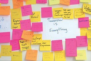
The next part is crucial – turning your idea into reality and creating a strong foundation for it to sit on. First, we'll research visual language and technology to put together a feel of what we want to achieve. During this stage, we start to piece together our idea, work out what channels we want to use to maximise its success and start putting together a campaign life cycle. With our birthday campaign, we soon realised that video would be the perfect channel because we wanted it to work as an easily digestible and emotive showcase that would engage our audience.
A thorough project plan was put in place to incorporate all the usual digital activities and make sure our chosen core channels of PR, eDM (electronic direct marketing), microsite and press ads were included. But this campaign had an extra level of complexity due to its many micro components and the inclusion of video, meaning that activities such as scripting, casting, licensing, location and prop sourcing, studio time and post-production had to be managed in tandem. This was quite a challenge when working with such a short lead time and to a budget. Communication was key throughout. The team consisted of an experienced project manager, designer, copywriter and developer.
Get the Creative Bloq Newsletter
Daily design news, reviews, how-tos and more, as picked by the editors.
It's good to remember that internal projects should be treated like any paid work for your clients. It can always be a challenge to keep internal projects within budget, while working on other commitments, but it's crucial to put markers down and make sure team members own the project and keep on top of the budget throughout.
Staying on track
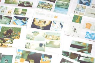
To ensure the project stays on track, see that everyone has and is working from a shared vision. One of the first things to get done is to put together a mood board to visualise what you're aiming to achieve. At this stage of our birthday campaign, we also started the framework for our script and narrative. For video, it's extremely important that the visuals, script and sound work beautifully together.
Breaking down the narrative into sections helped to make sure we covered all of our key messages and objectives. Once we felt the script was polished and reflective of the story we wanted to tell, we started to listen to background music that would complement it. As this was happening, we were also reviewing voice-over artists and beginning to narrow down the right tone.
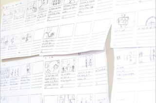
It's important at times of heavy activity and delegation that everyone works fluidly as a team. While some members were concentrating on sound, finding the right location for the shoot, casting and gathering props, others were starting to put the storyboard together, ready for filming. The retro feel of the video came from the idea of the children representing us in the past, plus a combination of different sources of inspiration. It was also useful, when briefing the videographer, to show the type and length of shots, mood and styling of the footage.
Activate your audience
As a creative agency, the reason we carry out internal campaigns is not only to showcase what we can do and have a bit of fun, but also to activate our audience and reach out to new faces. eDMs have always played an important role in our internal marketing strategy and they're something we've become known for. It's key to build a solid and up-to-date database to which you can reach out, to help generate new leads, build relationships and continue the conversation.
Visual impact
When designing eDMs and newsletters, our advice is to stay away from linear layouts. You don't have to stick to traditional formats and designs – instead, push boundaries and go against the norm to make your audience smile, add colour to their inboxes and leave a big visual impact. This will ultimately help increase visibility and generate leads. Don't forget that it's not good to send out comms without having something relative and interesting to say. No one wants to be spammed.
Although our birthday campaign was set to work across the digital arena, we believe it's still important to invest in offline advertising media to drive new audiences to your site. We took out a press ad in a relevant publication to promote our campaign presence and give it added visibility. PR, seeding and placing adverts are key in supporting a campaign, not only to create impact but to ensure that it's all one cohesive story, one key communication that connects across multiple channels. Get this right and you'll extend the success and longevity of your campaign.
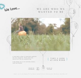
The team got together to pin down the subtle elements that would make the page light up. We decided to animate the balloons as the page began to load and to make the balloons 'float' after they've moved in – as if there's a gentle breeze – reflecting the outdoor shoot location. We also added cute animation touches to the button and outward links. Admittedly, this is simple stuff, but when applied carefully, this kind of animation can make a website look understated, beautiful and polished. It's far too easy to go over the top.
For the campaign site, we had free rein to use CSS3 where possible to enhance the page for users with modern browsers. We toyed with the idea of a mobile version, but decided against it. The focus of the site was to entice people to watch the video and then move on to our portfolio. Both are easily done on a mobile device and, in retrospect, we could have optimised the layout, but for a single- purpose campaign it wasn't the most effective use of time and budget.
Email build and testing
We're always keen to impress, and with a fantastic, minimal design to work with, building the eDM and campaign site was going to be easy. After being talked and walked through the design, the development team set aside time to build it. While our web development style is up-to-date and we're exploring the ever-shifting boundaries of HTML5 and CSS3, eDM builds can sometimes feel like a window into an older world.
Table layouts
Given the huge variance of capabilities across email applications (covering desktop, web and mobile clients), you need to be quite conservative with your structure, and that comes back to table layouts. First, grab a doctype. We always use XHTML 1.0 Transitional out of habit; we haven't tested the HTML5 doctype for eDMs yet. There's no reason why it shouldn't work, though – it's just a validation tool, after all. Then add the head with only three tags inside it, a content type, style tag and a title. So far, nothing out of the ordinary, but now we'll take a step back in time and say hello to inline styles and proper attributes.
Correct rendering
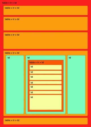
We need to make sure a height and width is set on every image and table cell (<td>). This is to ensure correct rendering in even the most wayward email client. Every table cell also needs the valign attribute set (usually middle but it depends what you're trying to achieve).
Every image has display: block; set, every link has no border or outline, cell spacing or padding is removed on each table and as often as possible we break up the layout into a series of rows, each being an independent table.
Table nesting, as ugly as it is from a coding point of view, can help with more complex layouts, but avoid trying to fit the whole creative into one table – it will break. With those golden rules, most of the layout issues we've come across when testing can be avoided.
The CSS in the style tag is mostly there to help force a reset on some elements. It means we don't need to take away the border, outline and more on some elements, as it's taken care of. When testing and sending through services such as Campaign Monitor, all styles are placed inline automatically.
Once the email is built and tested in a local browser, the fun of testing in email clients begins. Each one has its own foibles, and the variance between even different versions of the same client can be surprising (Outlook being our favourite!).
An added twist is that web-based clients display your template within their own page structure, so look out for unexpected effects where styles are over-ridden. This is one of the primary reasons to use inline CSS and it will have the highest specificity in the document. This kind of multi- client testing is made easy with tools such as the Litmus web app (litmus.com), which will preview your build in a suite of clients and deliver the results as screenshots for inspection.
To see how we built the email template, go to we-are.welove72.com/email. When sending emails through a service, the code will get messed with, but Campaign Monitor keeps this to a minimum. See the email as it was delivered to thousands of people by going to netm.ag/newsletter-217.
Optimising this website to perform well was a quick process. We weighed up using web fonts for one section over an image, whether to use a JavaScript library, whether to use our own video players and storage and more. We felt the best way to optimise the site was to combine almost every background image into a single sprite.
Just in case the user's connection is running slowly, we wait for every asset to download via jQuery's $(window).bind("load",function(){/* code */}); function before playing the video. For us, this is far more useful than the more common $(function(){/* code */}; function.
With most HTML builds that use absolute positioning rather heavily, browser issues are few and far between – and this build was no different. We only had a single minor layout problem in IE7 with the 'Share on Twitter' text. In terms of browser support, we decided to ignore IE6. No attempts were made to fix PNG images, even though that seemed to be the only issue with the page. We like to push forward where we can, and this is an obvious step.
We initially toyed with the idea of delivering the video via a Flash player with HTML5 fallback. Flash seems to have a better quality of video streaming at present. We even made a Flash player with files streaming from Amazon S3 as an experiment.
In the end we opted to use Vimeo, which would help the campaign by putting the video in front of other creatives and also covered embedding and playback on a wide range of devices.
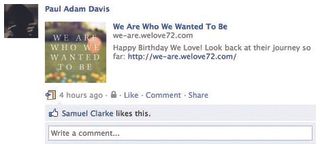
We used Facebook meta tags to define what content was displayed when a user decides to pass on our campaign. This is a simple task to complete. In a few short steps, make a link to your page:
http://www.facebook.com/share.php?u=http://we-are.welove72.comAnd add these meta tags:
<meta property="og:title" content="We Are Who We Wanted To Be" /><meta property="og:description" content="Happy Birthday We Love! Look back at their journey so far: http://we-are.welove72.com" /><meta property="og:image" content="http:// we-are.welove72.com/images/facebook.jpg" />Make sure you include a full path to the image, otherwise Facebook will look for other images on the page and miss your specified one. If you leave out this step, it's difficult to make Facebook pick up an image from a meta tag added later without changing the URL that the share link sends.
Brand awareness
Strong campaigns will lead to strong brand awareness. Our eDM had an open rate of 36 per cent, with a click-through of 37 per cent, and huge spikes in traffic to our main site. We were happy to see an average of two minutes spent browsing. We even had a Europe-based company contact us within 15 minutes after the eDM went out, asking if they could put us forward for a project.
It's key to think of every communication as a campaign. If you're visible in any form, you'll be judged and evaluated. Remember to set down solid foundations and don't lose sight. There are plenty of good ideas out there, but if they don't fit your core vision, something isn't right. Remember, it's usually the simplest message and idea that's the most effective.
Five golden rules for newsletter design
Here are some top tips to help you get the most out of your eDMs and newsletters:
- Keep your files clean and tidy. We always create two groups in our Photoshop files: text and image. This way, when it comes to the build, it's clear for the developer to see the different elements of the design. If an animated GIF is used, we put this in a separate group with a semi-transparent block of colour sitting over the design as a guide. Labelling this with the GIF filename also helps if you have multiple animations in your design.
- For emails to look the same across all email clients, we don't design with background images behind text. As a rule, after finishing designing a newsletter, we always create a new layer below all of the text and create blocks of solid colour, so we know there aren't any unnoticed gradients or textures hiding behind the copy.
- Give your text plenty of room to expand to the sides and below. When various email clients and browsers render the text differently, you don't want any unexpected line breaks.
- Add an animated GIF or two. In our birthday campaign, we added a subtly animated balloon to mimic the animation on the site. It created a relationship between the eDM and the site and added the finishing touches to the design.
- When designing the email, think about your design in horizontal strips, particularly if you're using multiple columns of text. This makes the build of the email much smoother in terms of tables and makes debugging easier.
Words: We Love
This article first appeared in issue 217 of net magazine - the world's best-selling magazine for web designers and developers.

Thank you for reading 5 articles this month* Join now for unlimited access
Enjoy your first month for just £1 / $1 / €1
*Read 5 free articles per month without a subscription

Join now for unlimited access
Try first month for just £1 / $1 / €1
The Creative Bloq team is made up of a group of design fans, and has changed and evolved since Creative Bloq began back in 2012. The current website team consists of eight full-time members of staff: Editor Georgia Coggan, Deputy Editor Rosie Hilder, Ecommerce Editor Beren Neale, Senior News Editor Daniel Piper, Editor, Digital Art and 3D Ian Dean, Tech Reviews Editor Erlingur Einarsson, Ecommerce Writer Beth Nicholls and Staff Writer Natalie Fear, as well as a roster of freelancers from around the world. The ImagineFX magazine team also pitch in, ensuring that content from leading digital art publication ImagineFX is represented on Creative Bloq.
