The secrets of great web typography
Making quality type for the web means attention to detail and a passion for the craft. Brian Warren runs through some ideas and lessons learned along the way.
This is an incredible time to be a web designer. We find ourselves delightfully constrained by limitations, and eager to find and master new tools to make our lives easier and designs better.
Web typography is no different, but I caution against considering 'web typography' as different from 'real typography'. Typography is typography, and each application of typography to a medium such as web, book, poster or film bears its own set of interesting quirks and limitations.
This article focuses on how to craft typography for the web. We will explore ideas on making good decisions with type, and how sweating the details of typography, browser idiosyncrasies and delivery is part of the design process.
Choosing appropriate faces
A bevy of technical considerations awaits when starting to select typefaces for the web, including where they're sourced, page weight and type styling. We will address those considerations. But for now we're going to take some time to be thoughtful about our typeface decisions from a design perspective.
I don't intend to be overly dramatic. (I realise this isn't world peace, and the sun is likely to still rise tomorrow if you make a bad call with type, and it doesn't take a particle physicist to know to avoid Comic Sans - or does it?) But keeping that in mind, I want to stress one thing: the decisions you make with type are the most important design decisions you make in any project, for print or web.
"Fundamentally, the responsibility we bear is twofold," says John Boardley's article 'On choosing type'. "First we owe it to the reader not to hinder their reading pleasure, but to aid it; second, we owe a responsibility to the typefaces we employ. Good typefaces are designed for a good purpose, but not even the very best types are suited to every situation."
When choosing type, the easiest rule of thumb is this: honour the content. If you do nothing else, at least make an effort to choose type that suits the content being displayed.
Get the Creative Bloq Newsletter
Daily design news, reviews, how-tos and more, as picked by the editors.
Is the text dense, technical material, or short-form content? Is there a historical or geographic angle to consider? For example, say you are doing a project for a museum in Germany: you could choose a pair of typefaces designed by someone from that region and time period. To aid in this, I recommend taking some time to explore Typedia as a research tool.
You have no shortage of food for thought, and I'm barely scratching the surface. Take time to consider some aspects of how your project and your chosen typeface will fit together instead of just going with your gut.
Using mockups
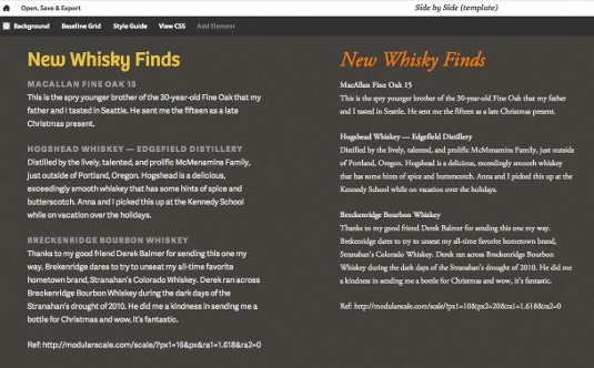
Once you find a couple of type candidates for your project, you need to mock them up with real content to see how they fit. A fantastic tool to see how they look on screen is Typecast.
With Typecast, you can take real content, full of headlines, subheads, and body text, and lay it out in the browser using actual web fonts from a variety of web font providers. The clever folks at Typecast also built a side-by-side tool, letting you mock up infinite combinations of text and web fonts, side-by-side, to see which system you're putting together looks best for your project.
Modular scale
In the same way we can be intentional and thoughtful about the typefaces for a design, we can be thoughtful about type sizes, proportions and spacing. There's no sense in leaving such important things to chance. I'm a sucker for making decisions using a construct that I can trust. A modular scale is such a construct.
Modular scales are sets of numbers based upon a harmonious pattern. You start with a number, say your base text size for body copy. Using that number, apply a ratio found in mathematics, nature, or music. What comes out on the other side is a set of numbers that we call a modular scale.
For example, let's start with 16px as the base text size, and apply the golden ratio (1:1.61803, an incredible ratio found everywhere in nature from sunflowers to snails). The results are 6.1, 10, 16, 25.9, 41.9, and 67.8. These are all numbers you could use for type size, leading, margins and more.

You can take this even further: another number in that same series is 464. Why not use 464px for a column width or an image size, instead of 480px (a less-interesting default we seem to find everywhere)?
You may worry that using these tools might introduce too much rigidity to your design. You want to be a free spirit, a leaf floating in the wind. Not to worry! Sure, being intentional about these decisions gives some consistency to your design, but I submit such harmony will provide a nice structure from which you can break occasionally to really strut your stuff.
For more on modular scales, have a read of Tim Brown's excellent article for A List Apart. Brown built Modular Scale, which is a stellar tool for creating modular scales based on a variety of ratios.
Font-feature settings
The CSS3 font specification contains support for enabling advanced OpenType features. The implications of this will tickle the senses of any type nerd.
Font-feature settings include the ability to use discretionary ligatures, fractions, advanced language support and much more.
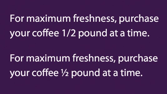
The syntax to enable these is a little strange. But, once you learn it, you can go wild. Let's say you want to add support for fractions, so instead of 1/2, you get the actual ½ symbol. No problem.
With this markup:
<span class="fraction-feature">
For maximum freshness, purchase your coffee 1/2 pound at a time.
</span>
Use the following CSS:
.fraction-feature {
-moz-font-feature-settings: "frac=1";
-moz-font-feature-settings: "frac" 1;
-webkit-font-feature-settings: "frac" 1;
-ms-font-feature-settings: "frac" 1;
font-feature-settings: "frac" 1;
}
Including all those extra browser prefixes feels a little silly. For now, that's the price we have to pay to have these futuristic features.
Someday, browser support will get better, syntax will be friendlier and the need for prefixes will go away.
Back in 2010, Firefox 4 debuted as the first major browser to include impressive support for font-feature settings. Since then, other browsers have been catching up and, believe it or not, Safari has been lagging behind. Currently, Safari has only partial support for font-feature settings. To check the current status of browser support, head to http://caniuse.com/font-feature.

One final thing to remember when working with the font-feature settings is that they usually require a more complete character set than the default web fonts. If you're looking to use some of these extra features, make sure your font files include the appropriate characters.
While still nascent, font-feature settings offer plenty of interesting possibilities for enriching typography. With careful usage, you can deliver a delightful experience to your audience.
Things to keep in mind
Web fonts are a powerful tool. Sure, we could play it safe and use Georgia and Verdana for everything – but, seriously, if you wanted to do that, you wouldn't be reading this article. You'll want to keep a few things in mind as you incorporate web fonts into your projects.
How do you plan to serve them up?
You have two fundamental choices on how to serve web fonts to the browser: hosting through a web font service or self-hosting on your server.

I have no opinion on which choice is better. You may find practical considerations outweigh any personal feelings you might have on the matter. In order to make this decision, you will want to consider the following:
- Cost: As you choose typefaces for a project, make sure you inform the client of costs as soon as possible. I've had clients who loved the typeface choices we made, but were unable to pay for the fonts. I've also had clients who had partnerships with particular web font vendors, so that dictated our selection before we started the design phase. The lesson learned here? Talk to your clients early and often.
- Selection: The typefaces you pick for your project can dictate the method or service you use to serve fonts to the browser. Why? Because some fonts are available exclusively at a particular vendor. Wherever possible, consolidate your choices to a single vendor or your method of serving up web fonts. If you find yourself in a situation where, due to limited options, you have to use two different web font services, stop.Seriously, don't do it. You're asking for a lousy experience for the website visitor. The visitor's browser now has to hit two different servers (in addition to the one hosting your website) in order to download all the associated JavaScript, CSS and font files to get them working on the page. This is slow at best, and buggy at worst.There's only one exception to this rule, which is to use a hybrid approach of self-hosting and a single web font service. If you really have to use more than one method of serving up web fonts, this one has worked for me in the past.
Mind character sets
An unfortunate reality of using web fonts is they must be downloaded from a server before they show up in a web browser. We can lighten the load by making sure only the characters we're likely to use are included.
A well-made font has thousands of characters, providing support for many languages. This is awesome – but if you're only ever likely to use one particular set of characters, you can optimise for that. Most web font services enable you to choose to have the standard Latin character set vs including the entire font.
If you're hosting the fonts yourself, you can subset the fonts to include the exact language support or even just the individual characters you need. Font Squirrel has a generator that can do the custom subsetting for you, in addition to many other fancy features. A word of warning, though: examine font user licence agreements carefully. Many don't allow for creating derivative works out of the font files provided upon purchase, so subsetting would be a no-no.
Weights and styles
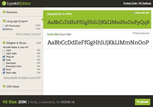
Another consideration with payload is weights and styles. Web fonts come in a single weight or style per font file. To avoid shipping more fonts than you need, take a look at which ones you'll be including in your CSS.
Also, we should make sure we style these fonts correctly when it comes to the CSS. Sometimes web browsers can get a little carried away, so let's do our part to keep them in check.
Say you have an innocent little paragraph of text with a few bold words and another few words that are italic. Not an outlandish proposition, is it?
<p class="faux-text">
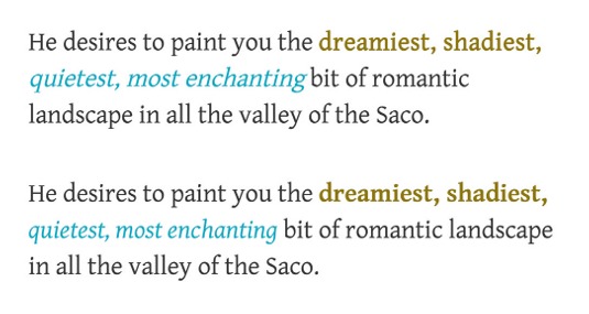
He desires to paint you the <b>dreamiest, shadiest,</b> <i>quietest, most enchanting</i> bit of romantic landscape in all the valley of the Saco.
</p>
Of course, without any CSS to guide it, the browser will make the text in the <b> tags bold, and that in the <i> tags italic. No big deal. However, when web fonts are concerned, I'm not going to blindly trust the browser, and neither should you.
In fact, without proper CSS, the browser often does some dastardly things. If the browser doesn't find the proper font to use when bold or italic is required, often it will concoct a bold or italic from the font it already has. So, to make text bold, it will artificially add a few pounds of weight to the letterforms to make them look heavier. Italic text is even worse. The browser will slant existing text to make it italic. Where the browser uses faux bold and italics, the results are awful.
But avoiding this mess isn't hard. First, make sure to include the @font-face rules for the bold and italic fonts. (To save space here, I won't include the syntax for all three @font-face rules. I trust you can manage that.) In the above example, I'm using Gentium Basic, so let's assign that to our paragraph:
.faux-text { font-family: 'GentiumBasicRegular'; }Next, style the italic and bold text:
.faux-text i { font-family: 'GentiumBasicItalic'; }
.faux-text b { font-family: 'GentiumBasicBold'; }
I'd like to say that takes care of business, but alas, I cannot. Despite feeding it the right font, the browser will still try to make our bold text bolder, and our italic text even more slanted. The browser has no idea that the font files we are providing are well-suited for the job – so we must instruct it not to intervene:
.faux-text i { font-family: 'GentiumBasicItalic'; font-style: normal; }
.faux-text b { font-family: 'GentiumBasicBold'; font-weight: normal; }
Now we're cooking.
Details make the difference
Whether it's by suiting the typeface selection to the content or by sweating the download speeds of the web fonts, caring about and advocating for these details is a part of the design process. Your client's customers won't write in to praise them about the well-chosen modular scale, but was that the point? No, the point is that sweating the details of typography matters – and will improve the impact of your design.
A good friend of mine, Jason Santa Maria, in his An Event Apart talk about typography said quite simply: "If your type is bad, the design fails".
And so, I leave it to you, dear designer, to bring success and beauty to your designs by well-chosen, well-formed and well-presented typography.
Words: Brian Warren
This article originally appeared in net magazine issue 241.
Liked this? Read these!
- Our favourite web fonts - and they don't cost a penny
- Illustrator tutorials: amazing ideas to try today!
- The ultimate guide to logo design
Make sure you have a bit of a dig at our typography in the comments!

Thank you for reading 5 articles this month* Join now for unlimited access
Enjoy your first month for just £1 / $1 / €1
*Read 5 free articles per month without a subscription

Join now for unlimited access
Try first month for just £1 / $1 / €1

The Creative Bloq team is made up of a group of art and design enthusiasts, and has changed and evolved since Creative Bloq began back in 2012. The current website team consists of eight full-time members of staff: Editor Georgia Coggan, Deputy Editor Rosie Hilder, Ecommerce Editor Beren Neale, Senior News Editor Daniel Piper, Editor, Digital Art and 3D Ian Dean, Tech Reviews Editor Erlingur Einarsson, Ecommerce Writer Beth Nicholls and Staff Writer Natalie Fear, as well as a roster of freelancers from around the world. The ImagineFX magazine team also pitch in, ensuring that content from leading digital art publication ImagineFX is represented on Creative Bloq.
