12 responsive agency websites to inspire you
Is your agency's website as cool as these? Check out these great examples of how to do responsive web design right...
Like it or not people do judge a book by its cover and your agency's website is crucial to how the business is perceived by the outside world.
And the task of creating an impressive looking site that offers a great user experience has become ever more complex in recent years due the rise of smartphones and tablets.
The art of responsive web design has evolved to make your site look good on a variety of different devices, without having to code separate sites for each. If you're looking for inspirational examples of this practice, then look no further than these responsive sites, which tick all the usability boxes and still manage to look fantastic.
01. Pinch/zoom
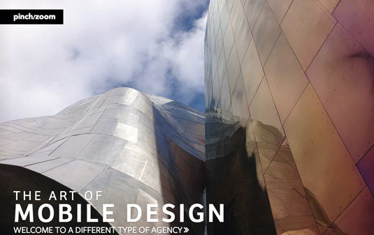
Pinch/zoom is a mobile design agency led by renowned mobile expert Brian Fling, and has a remarkable site that performs along the x-axis, the web’s less trodden path, on wide displays. The design uses CSS columns, which can be difficult in responsive design to control the presence of a horizontal scrollbar, but pinch/zoom prevails and elegantly addresses the problem with some vertical responsive craftiness.
The content has space to sing while the navigation, which works effortlessly in small or large viewports, sits out of the way and is only triggered on clicking the pinch/zoom logo. On small devices, the dynamic shifts to traverse the more familiar y-axis. It’s clearly a considered decision: the wide viewport accommodates multiple columns and the horizontal layout seamlessly, but smaller viewports unable to handle several columns would offer a disjointed reading experience.
Often you’ll find websites that take this approach are open to experimentation, but it can often battle with our inbuilt habits. Pinch/zoom manages to step up to the challenge and produce something that feels solid and intuitive against the odds.
02. Envy Labs
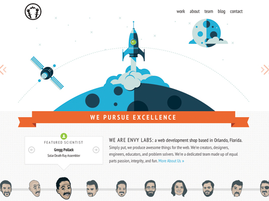
Web development shop Envy Labs redesigned its site to reflect the company’s growth, an internal task that can be daunting. "As many in the industry can relate, we’re our own worst client," admits frontend developer Nick Walsh. "After many unfinished concepts, and a week long sprint of final production, the site now conveys Envy Labs' culture and values."
Get the Creative Bloq Newsletter
Daily design news, reviews, how-tos and more, as picked by the editors.
The site highlights slick web fonts, CSS transitions on hover, and CSS-driven shapes. The delightful illustrations by Justin Mezzell round out the look. The homepage hero has drawings with half-circle bases that lend themselves to a circular motion on transition.
"The challenge stemmed from making that motion scale responsively; a hefty bit of tweaking percentages in transform-origin was required for lining things up across all screen sizes," says Walsh of the unique effect. The team also used MVCSS, a Sass-based MVC CSS architecture to aid in the build.
03. Momentum
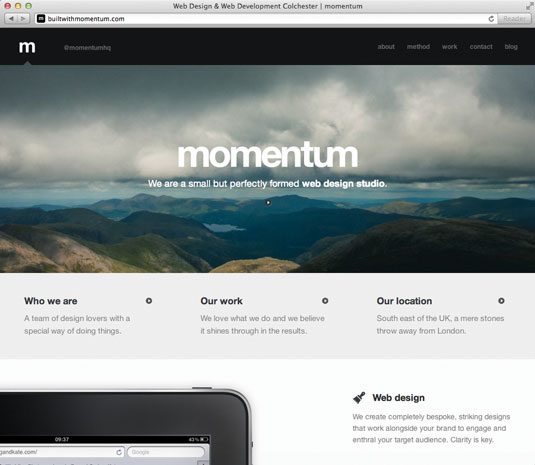
Momentum is a small studio of designers, developers, video experts and photographers based in Colchester, UK. Its site has an incredibly focused message and design, but we also appreciate the obvious attention paid to delivering a performant experience.
Creative director Olivier Bon told us he'd wanted a device-agnostic site that retained its coherence. "I'd seen too many sites where people had only converted pixels to percentages and called it responsive," he says. "I didn't want our site to squeeze itself to fit a screen; I wanted it to make sense."
Bon discovered that thinking in terms of mobile is a good way to establish hierarchy. "I'd spent a long time trying to make navigation work in a narrow window, but couldn’t solve the issue," he continues. "As soon as I experienced the site on my phone, it was obvious. The navigation had to be at the bottom of the website on mobile devices."
04. Palantir
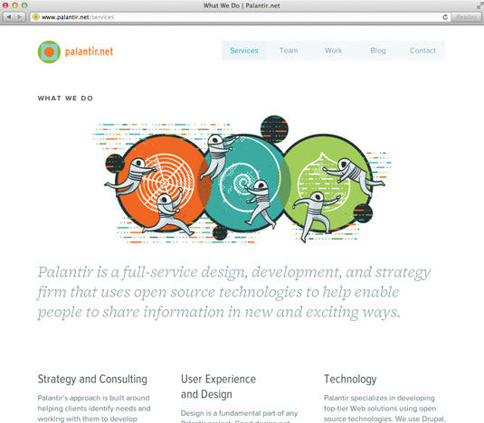
Palantir is a full-service design and strategy agency based in Chicago, which specialises in Drupal-powered development. It's hard not to fall immediately in love with this site, with its charming retro space-themed illustrations, gorgeous colour palette and beautiful typography. The spacious layout is a welcome feature too, though it could be tightened up on smaller screens.
"We definitely wanted to make sure that the site wouldn’t be too heavy for mobile users," explains Palantir’s founder and CEO George DeMet, "so we did everything that we could to optimise images, CSS and JavaScript. In our experience, responsive Drupal sites are not significantly larger than other responsive sites as long as best practices are being followed."
That said, with a homepage size of 1MB there’s still room for improvement. HTTP requests could be reduced by concatenating CSS and JavaScript files, and the overall size of pages could be trimmed by optimising image assets.
05. Supereight Studio
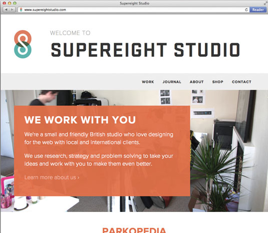
Supereight Studio is a small and friendly British design studio run by Matt Hamm and Peter Orme. Its site, which builds on a logo created by Brent Couchman, features bold type and large photographic backdrops (which unfortunately contribute to the rather large page size). Each section name is set in the brilliantly chunky Stratum typeface, with the remaining copy dutifully offset by the more rounded Proxima Nova.
We ask Supereight creative director Matt Hamm about how the studio approaches the design of a responsive site. "We've learnt that it's totally unrealistic to make Photoshop visuals for every single breakpoint in the design," is his response. "It's better to have a strong idea of the direction you want to go in and then just design the break points in the CSS as you build. It's all about tweaking until it feels right."
06. Design Intellection
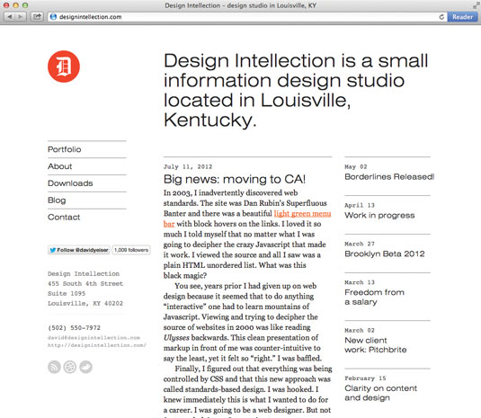
Design Intellection is a small design studio that’s located in Louisville, Kentucky and run by David Yeiser. Acting both as a portfolio of Yeiser's work and as his personal blog, the Design Intellection website is a masterclass in achieving beauty through simplicity.
We're huge admirers of its innovative blend of serif, sans serif and monospaced typefaces, which works really effectively – even though it shouldn't!
"Proper planning beforehand is paramount when it comes to the complexity of responsive design," says Yeiser. "Of course, you can only plan so much - and at some point you have to jump in and see what works and what doesn’t as you build it."
07. Weightshift
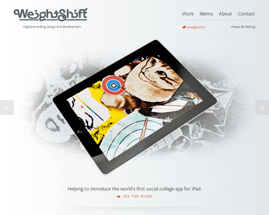
Weightshift is a small digital design studio in San Francisco that has worked with clients such as Microsoft, WordPress and Mozilla. Previous versions of its site have featured a jaw-dropping level of craft and attention to detail; it's now relaunched with a responsive design. The new site is lighter and sparser than its predecessors.
"The aesthetic idea we had was to be 'airy'," says Naz Hamid, studio founder and principal. "Coupled with the desire to focus on the content, we devised the central column focus, which aligned nicely with the mobile-first approach." Photoshop saw little involvement in a largely browser-driven design process: "Designing in code allowed us to iterate quickly and fail, but also succeed faster. You get the 'feel' of something almost immediately."
This approach led to the site mixing fluid and adaptive layouts: "We opted for a 50/50 approach," Hamid continues. "Breakpoint-static for wide screens, 960 and iPads; fully fluid for phones."
08. ZURB
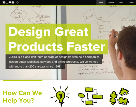
It's easy to think of Silicon Valley as filled with pointless startups building apps to rate hamsters, but it's also home to innovative design agencies such as ZURB. Alongside work for clients, they build applications to help others design great products too.
The company has grown considerably in the last three years, so their website needed to catch up. The redesigned site retains the unique ZURB feel but augmented with large photography, iconic sketches and bold colours.
All combine to produce a really engaging experience.
ZURB have taken an interesting approach on internal pages, combining different sections onto long single pages, navigated via a left-hand menu. Yet this breaks down on smaller screens where the navigation disappears, and a few pages are almost 2MB in size.
Still, much of the site remains lightweight - quite a feat given the large imagery and amount of content provided.
09. Teixidó
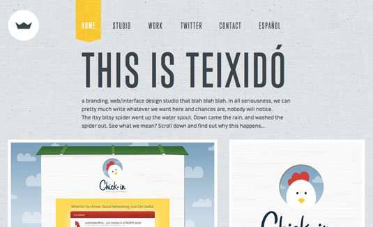
Teixidó is a young but award-winning five-person creative agency based in Paraguay. The team has a passion for simplicity and crafting people’s ideas, and the use of vibrant colours and subtle textures in its work showcases a great sense of design and individuality.
For the company site, a responsive approach has been used, plus single-, double- and triple-column layouts. Text and thumbnails reduce slightly in size in single- and double-column layouts, allowing for a little more content to be shown on one screen.
"It took a lot of trial and error, especially because unlike many other responsive sites, we went with a five-column grid and since we don’t simply ‘scale down’ the grid, we pretty much had to design five different layouts first," says project manager Meli Aguilbeck. "The whole process took about two months." Our only suggestion would be to use tinySrc to dynamically rescale the project detail images, so they fit perfectly into the browsing view.
10. Create Digital Media
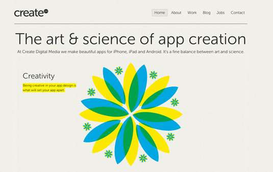
Create Digital Media's site was designed by Mike Kus and developed by Ryan Taylor and it looks superb. On the one hand, it's clean and typographically simple, but on the other, the illustrations that are peppered throughout the site give off intense, brash, and delicious sensations.
The main page has some great CSS3 animations that bring things to life even more. They look great on desktop, and surprisingly well on higher-end iOS devices too. That said, testing on slightly older Androids showed some sluggishness and obscured the text somewhat, which is a shame.
Some nice details worth noting are the thinning of the border that appears nice and fat on a wide view, narrowing it down as the screen width does the same, the nice prioritised re-ordering of project info on the Work page in mobile view, and the solid use of typography as the width changes.
This is a great example of a 'modern' responsive site with all the CSS3 and typography trimmings.
11. Creuna
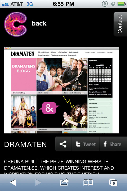
Creuna is a full-service digital agency with multiple offices across Scandinavia. Its site has some really cool design touches when viewed on mobile. I love how the logo continually transitions into different designs every five seconds or so. I also really like the contact navigation and how it pops out on every page.
The main links expand and contract when touched, which is successful because it doesn't require a page refresh and shows the user lots of additional content. I'd love to see it work like an accordion, closing the other sections when one is opened, but it still works well as it is.
Creuna mobile concept developer Simon Kibsgård is clearly passionate about mobile.
"We are true believers in the concept of 'mobile first'," he says, "and use Creuna.com Mobile to both showcase some desirable touch-based interaction and to experiment with the design and features for new versions of Creuna.com on more platforms."
The agency has even developed software that simplifies device detection for your website and integrates with any .NET CMS. This can be found at mobiledetect.creuna.com.
12. Plank Design
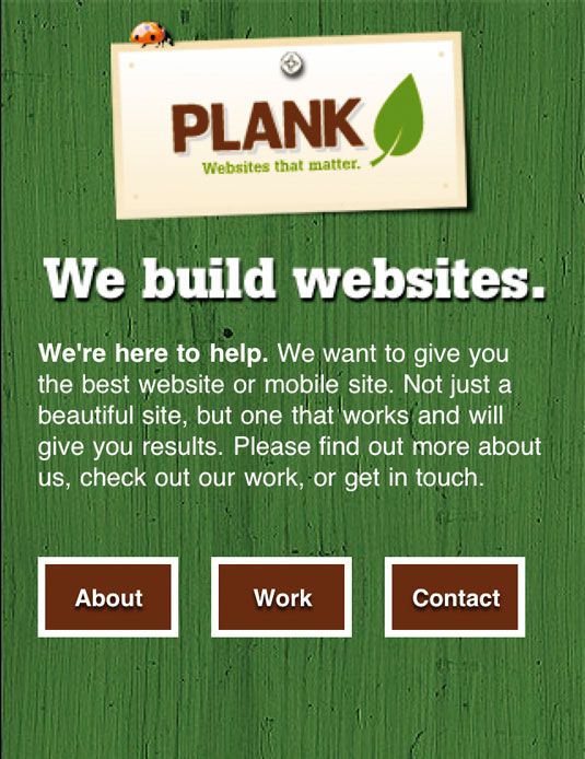
Plank Design is an interactive agency based in Montreal. The mobile version of its website is optimised for the iPhone using the jQTouch mobile framework, which is a perfect fit. The whole site can be loaded in a single HTML file and jQTouch does all the work to load page content with a variety of fancy transitions and native-like interactions.
"We'd been doing some R&D on mobile web development and decided that our own site would be a good test bed to try out new technologies before imposing them on our clients," says Plank Design’s founder Warren Wilansky. "Once we had a chance to play with jQTouch a bit, we realised we could design something simple, fun and well-suited to the small screen, so we just pushed ahead."
Frameworks such as jQTouch are enabling developers to create mobile sites in hours rather than days or weeks. Plank Design executed its mobile strategy perfectly, from the design to the optimised page copy, and now have another platform they can promote to potential clients.
Words: Paul Lloyd and Antony Ribot
These reviews were originally published in .net magazine
Liked this? Read these!
- How to build an app
- Brilliant Wordpress tutorial selection
- Discover what's next for Augmented Reality
Have you seen a great example of a responsive agency website? Tell us about it in the comments!

Thank you for reading 5 articles this month* Join now for unlimited access
Enjoy your first month for just £1 / $1 / €1
*Read 5 free articles per month without a subscription

Join now for unlimited access
Try first month for just £1 / $1 / €1

The Creative Bloq team is made up of a group of art and design enthusiasts, and has changed and evolved since Creative Bloq began back in 2012. The current website team consists of eight full-time members of staff: Editor Georgia Coggan, Deputy Editor Rosie Hilder, Ecommerce Editor Beren Neale, Senior News Editor Daniel Piper, Editor, Digital Art and 3D Ian Dean, Tech Reviews Editor Erlingur Einarsson, Ecommerce Writer Beth Nicholls and Staff Writer Natalie Fear, as well as a roster of freelancers from around the world. The ImagineFX magazine team also pitch in, ensuring that content from leading digital art publication ImagineFX is represented on Creative Bloq.
