Faster web design with rapid paper prototyping
Put a pencil to paper to test out interactive concepts and interaction flows, says Lauren Johnson.
Eva-Lotta Lamm will be at Generate London in September, where she'll host an all-day workshop on sketching interfaces. She'll also be talking about how to kickstart your sketching skills; book today so as not to miss out!
You know that point in a project where you are at least halfway into the development cycle and you realise a key function just isn't working out as expected? Maybe the process has become overly convoluted, perhaps the steps are poorly defined, or perhaps there's just a better way to execute the project. You look at the time spent, the money involved, and you plough through anyway because there's just no turning back at this point.
Paper prototyping aims to stop that issue before it becomes an issue. When the only resources you've committed to an idea are paper, pencil, and some time, it becomes much easier to test the feasibility of a design or process and revise as needed. Our hearts aren't attached to paper; it's a disposable commodity and perfectly suited to the early, creative, steps of the development process. This is part of a larger style of prototyping referred to as 'throwaway prototyping' , because the artifacts created in the paper prototyping phase lay the groundwork for the larger development process, but aren't present in their paper state in the finished product.
This type of prototyping work is done in a low-fidelity, low-cost format that can be suited to large development teams as well as small or single person design shops. For larger groups, paper prototyping fosters a collaborative design process that can be inclusive for stakeholders and departments without technical background. For small shops, paper prototyping can be quickly accomplished with a small team or just one person. Although it's decidedly easier if you have an extra person or two around to help out and give feedback.
Twice the work?
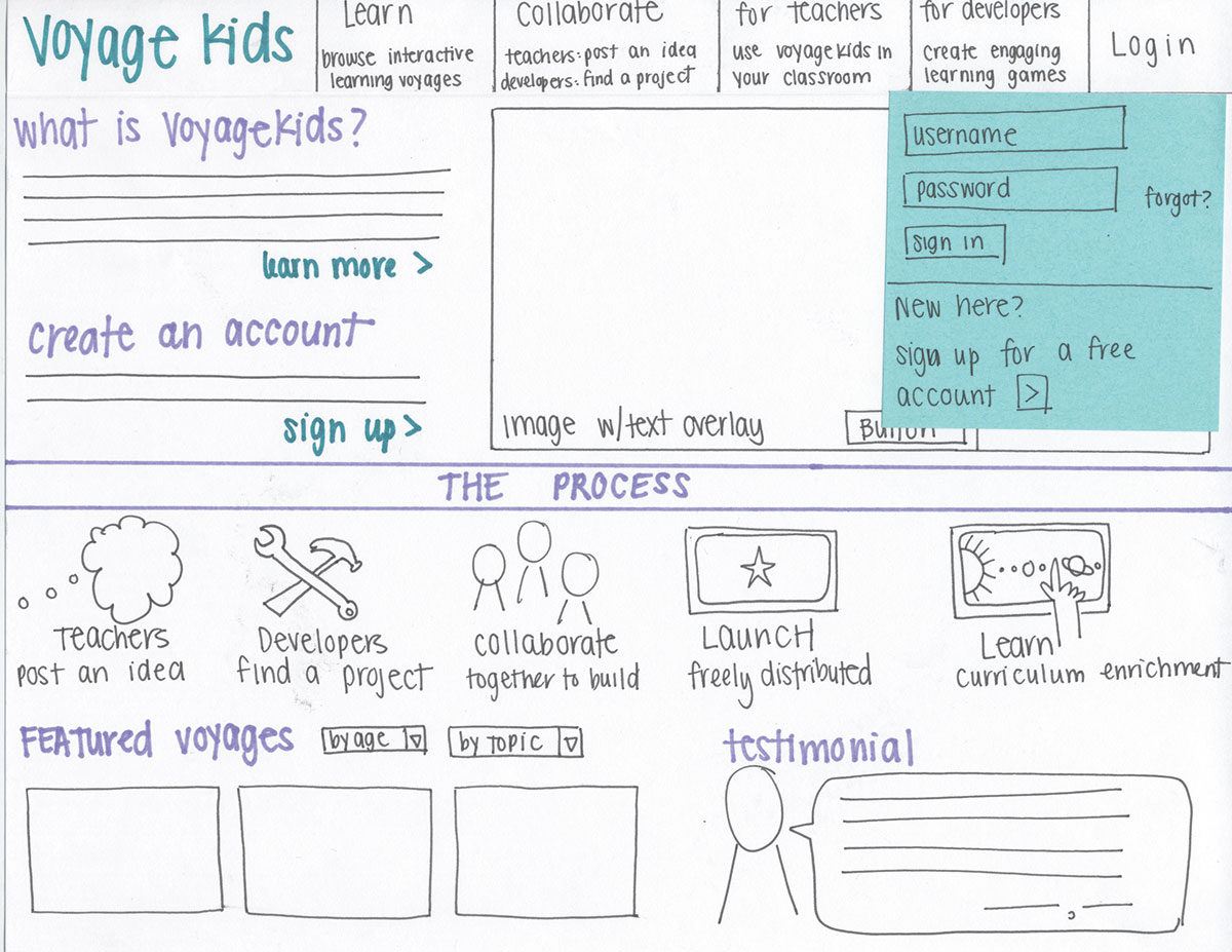
Wireframing and prototyping are often confused with each other, but they are very different concepts. Wireframes show layout, visual hierarchy and information architecture, but are flat and not interactive. While wireframes may work their way into a paper prototype as a step in the process, they aren't an endpoint. Paper prototyping can help to elevate the design depth of a series of wireframes into an interactive flow.
Pencil and paper
While many prefer to do their conceptual work digitally, there's a freedom when you put an old-school pencil against the page. While perhaps counter-intuitive to living in a digital environment, you may find that moving out of the screen bubble and into a tactile environment allows you to think more broadly and, importantly, more creatively. You can try a pen or marker if you really hate pencils and want to be daring. A few minutes spent laying out various 'what about this idea' conceptualisations can prove highly productive and bring you to a design approach that may not evolve from a purely digital concepting approach.
Low fidelity
Undesigned is not the same as unprofessional. The fact that rapid paper prototypes are lo-fiis a feature, not a bug. When you show high fidelity work to a user, they may hedge their responses at the risk of hurting your feelings, as they can see that a fair amount of work went into the designs you present. This may taint the response process and risk missing out on important early feedback.
Get the Creative Bloq Newsletter
Daily design news, reviews, how-tos and more, as picked by the editors.
In some cases, this may come back to impact the project much later when a user's apprehension bubbles to the surface. An article from usability.gov a few years back found that "low-fidelity prototypes appear to be as effective as high-fidelity prototypes at detecting many types of usability issues. Low-fidelity prototypes have an additional advantage in that they can be created quickly and easily, and they do not require advanced computer skills."

The process
Don't let the word 'rapid' fool you; while creating the prototypes themselves is rapid in execution, it assumes that you have done some legwork ahead of time to create a foundation for the process.
The scope of this first step can vary widely according to your project's context. Depending on your team development process, you may have content analysis and information architecture already in place, copy and content and a style guide. At the very least, you should evaluate what the client needs, what the user needs and what the overall goal is. You should also create a general content outline, rank features from high priority to low priority, and define some core terms central to the piece or brand.
Understanding the user, and being empathetic to their needs, is central to successful prototyping as it helps you narrowly define the project focus. You may have a single primary audience, or you may have a primary, secondary, and maybe even a tertiary audience. There are many schools of thought when it comes to audience analysis, but I am partial to user personas. These personas help you give a face and name to the otherwise nebulous term 'user'. Personas are also helpful when brainstorming your interaction paths: "What would Mary do now? What would Mary want to achieve?"
Now that you've established requirements and your audience, it's time to separate the wheat from the chaff. Review the requirements and define what the user actually needs to do. What tasks do they need to accomplish? What steps make up these tasks? Is there a way to simplify a process? From there, you can start to visualise the primary interaction flows that the user will need the piece to accommodate.
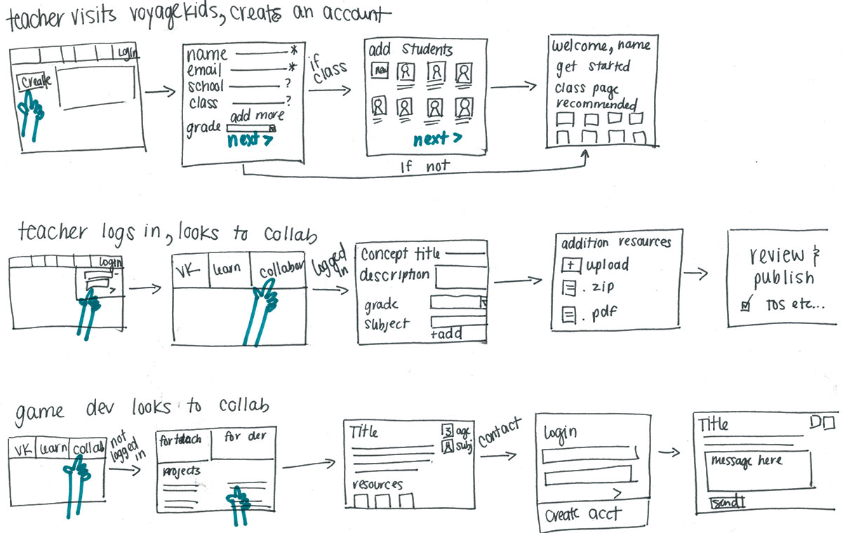
With the project requirements, core audiences and needs analysis pinned down, this is where the rapid element begins. Again, rapid sketching differs from regular wireframing. The concept is inspired from 'gesture drawing', which you may be familiar with if you have taken any fine art classes. Quantity is preferred over quality. Define a specific task from your needs analysis, and set a timer for two minutes. Sketch layout ideas for the steps in the interaction flow, spending no more than two minutes per sketch. Once you finish a flow, start from the beginning and do the process again, but draw a different solution. Aim for three different versions of the interaction flow, or more if you can. Assuming an interaction flow has five steps, this process can be completed in about 30 minutes.
Collect all of your rapid sketches together and define the ones that seem the most interesting or promising. It may be that one flow seems to work the best, or you may find that you want to mash up a couple of aspects from all of your sketches into a single idea.
When working on paper, you may find it easier to draw a single global frame for the prototype with repeating elements like the page header, navigation, and footer. If you're working digitally, you can create a file with these elements that you can use to create your remaining pages.
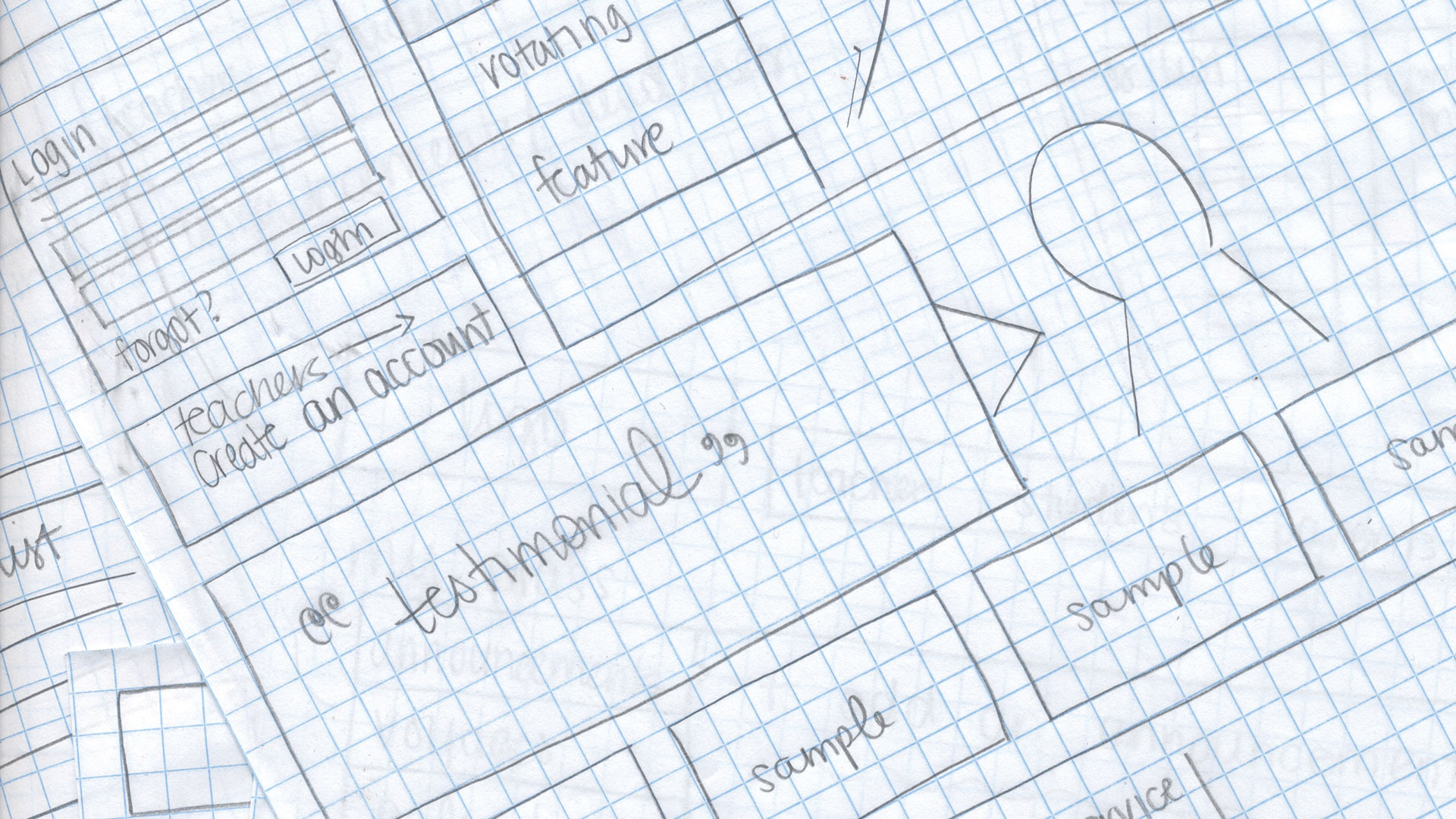
Now, this is the fun part. Raid your junk drawer and get together paper, scissors, low-tack glue, paper clips, note cards, Post-its, markers, and more. Depending on the task, the pieces you will need to create may need to contain the following:
- Main content areas to overlay on the global frame
- Post-its to represent all the modal windows
- Accordion folds for any of the dropdown elements
- Long strips and slits for any sliding content
- General GUI elements
- Keyboard input
- Some small pieces of paper for form fill-in
A good testing script will normalise your results, so think about how to write your script. Make sure you don't lead the user to their answers, and keep the questions broad. Start by letting them know that the only thing being tested is the idea, and they can't fail the test. Get a little background, and then move on to general tasks that are centred in a scenario. Ask them for their overall opinion at the end. Run through the testing script on your own using the prototype, and refine as needed. If you notice holes in the interaction, create additional paper elements to address them.
Try to get five users for the testing, and make sure they are relevant to your core audience(s). If you can, get a colleague to take notes or run the test for you. If you're flying solo, you can record the test so that you can analyse it later without having to interrupt the test to take notes.
Once the test has been completed, ask the user how they felt about the interaction flow. Give them their own paper and pencil and allow them to draw their own solutions. They may have a solution that would surprise you or provide additional insights that informs the project needs.
If the users encountered any issues within the test, refine your design and test it again. It is better to run a series of small tests using iterations than to test a lot of users just once.
Words: Lauren Johnson
Want to get sketching? Get to Generate London from 21-23 September and you can pick up expert tips from Eva-Lotta Lamm in her all-day workshop on sketching interfaces, and her conference session on how to kickstart your sketching skills. This article originally appeared in net magazine issue 251. Subscribe today!

Thank you for reading 5 articles this month* Join now for unlimited access
Enjoy your first month for just £1 / $1 / €1
*Read 5 free articles per month without a subscription

Join now for unlimited access
Try first month for just £1 / $1 / €1

The Creative Bloq team is made up of a group of art and design enthusiasts, and has changed and evolved since Creative Bloq began back in 2012. The current website team consists of eight full-time members of staff: Editor Georgia Coggan, Deputy Editor Rosie Hilder, Ecommerce Editor Beren Neale, Senior News Editor Daniel Piper, Editor, Digital Art and 3D Ian Dean, Tech Reviews Editor Erlingur Einarsson, Ecommerce Writer Beth Nicholls and Staff Writer Natalie Fear, as well as a roster of freelancers from around the world. The ImagineFX magazine team also pitch in, ensuring that content from leading digital art publication ImagineFX is represented on Creative Bloq.
