Rap website shows why Flash is yesterday's tool
You don't need Flash any more. Rat Boy's new site is a great example of CreateJS in action: find out how it was put together.

We're big fans of Martin Hughes of WeFail, who's one of the few creatives around who can still combine top quality web design with a sense of fun; as witnessed by his dancing portfolio website. So when we learned he was designing a website for buzz-causing Essex rapper Rat Boy, we couldn't wait to take a peek.
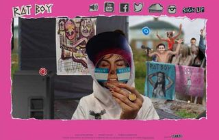
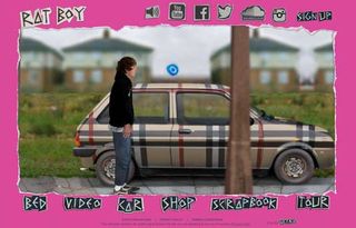
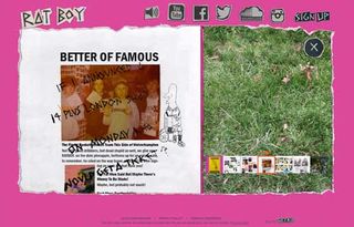
And we weren't disappointed. Featuring a hilariously interactive approach to navigation, where you 'walk' the musician around the various parts of his locale, this is a refreshing change from the normal cookie-cutter musician website.
Most intriguingly, Hughes has made great use of Create.js to make it sing on mobile as well as desktop (who needs Flash these days, eh?). We chatted to him to find out how it was put together...
What was the brief?

We were asked to put together a site for the artist Rat Boy, an important signing for Parlophone as part of Warner Music UK. Points of contact were Josh Saunders, head of technical and creative (Digital) at Warner Music UK and Thomas Jones, Social Media Manager at Parlophone.
Given the precedents of sites we've done before, including for the music industry, a highly individual character such as Rat Boy (real name Jordan) was definitely a perfect candidate for this type of site, as opposed to the 'standard/regular' artist website.
How did you fulfil it?
WeFail met with the artist and label and the management company, which was an important stage in setting the scene and ensuring a signature and authentic edge to the site.
In the "old days", these sites were sometimes called viral sites, but it's not really something you see much anymore, as an approach, because it's been pretty tough to put together fun interactive sites with the tools available post Flash and SWF format.

In order to do this site, CreateJS fills that void, and WeFail can put anything together that we used to build in Flash, but running in JavaScript.
What were the biggest challenges?
We only had 4 weeks to work with and had to take in all kinds of issues that would have to be overcome. Things like the initial footprint of the site, no one wants to sit on mobile and wait for a 10MB+ site to load in, so we had to stagger the load, pulling in assets as they were called for.
The site had to be responsive, too. Adding breakpoint in with CreateJS so that the dimensions would fit within all phones, tablets and desktop while keeping a good FPS rate for the animation.
Beyond that came the dynamic content, adding live data to display within Canvas, but the tools are there and there's always a way.
How did you use CreateJS to create the animation?
It's simple to create animations, open up Animate CC (what was Flash Pro CC), animate your content, export for HTML5.
Lots of tricks to learn along the way though, optimising your bitmaps pre Animate CC, limiting the amount of layers and bitmaps so that it retains a decent FPS on mobile, labelling each bitmap well so that you can locate it later on to hook in your JavaScript once you've published the animations out.
The inner workings of the site come later after you've published your animations. Then it's a matter of using the CreateJS libraries to get the code in and build the actual site.

We're at a point now though that you can build anything you can think of, like the good old days of Flash, but it works on iOS, Android, desktop, everything but the watch. We don't do the watch
What sort of user testing did you do?
Tons. Half of our traffic on a site like this will come from mobile, and Apple are fond of changing the res and dimensions of their viewport every other month.
The mobile version is best viewed in Landscape rather than Portrait. So a lot of time's spent in device simulators to make sure breakpoint's set to scale correctly, but you also need to test on every physical device to hand to make sure sound, animation, code are all working as they should.
We built the site in four weeks, but device testing then takes up another week to make sure there's no problems in any browser on any operating system.
Where do you expect people to interact with the site?
From day one I think you need to design a site for both mobile and desktop nowadays, so even from your initial wireframe layouts you have to be thinking about how it's going to look at full-scale on desktop, but also balance that with how it will look on a phone. Especially with this site being aimed at a new audience, the phone generation are here now, and we have to cater to them predominantly.
Like this? Read these!

Thank you for reading 5 articles this month* Join now for unlimited access
Enjoy your first month for just £1 / $1 / €1
*Read 5 free articles per month without a subscription

Join now for unlimited access
Try first month for just £1 / $1 / €1
Get the Creative Bloq Newsletter
Daily design news, reviews, how-tos and more, as picked by the editors.

Tom May is an award-winning journalist and editor specialising in design, photography and technology. Author of the Amazon #1 bestseller Great TED Talks: Creativity, published by Pavilion Books, Tom was previously editor of Professional Photography magazine, associate editor at Creative Bloq, and deputy editor at net magazine. Today, he is a regular contributor to Creative Bloq and its sister sites Digital Camera World, T3.com and Tech Radar. He also writes for Creative Boom and works on content marketing projects.