9 tips for creating your UX portfolio
Your UX portfolio is proof that you're worth hiring. Here's how to make it the best it can be.
For UX and UI designers, your portfolio is more than just your website. It's a resume, a business card, an advertisement, and most of all proof of your skill. As far as employers are concerned, you're only as good as your portfolio.
We spoke with designers, the CEO, and the Chief Product Officer at the collaborative wireframing and prototyping app UXPin for the best bottom-line advice. We also scoured the web for some of the best expert advice on giving you an edge in landing the dream design job.
Here are our top 9 tips for UX portfolio perfection...
01. Target the right people
The first step in, before you even being the actual portfolio, is deciding who it's for. Are you going for an in-house corporate role, or perhaps an agency that better appreciates some humor and cheekiness? This will directly determine:
- Which samples you include
- The tone of your text and imagery
- The medium you use
As for the medium, there are several options.
A personal website is a sample of your ability by itself. It's a great avenue for showing off without showing off, but it's not always enough alone. A traditional resume in a .pdf, downloadable from the site, covers all bases.
A .pdf portfolio alone can sometimes do the trick, but keep in mind that your competition will most likely all have well-designed websites. Plus, you won't be able to email the file if it's too large.
Get the Creative Bloq Newsletter
Daily design news, reviews, how-tos and more, as picked by the editors.
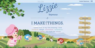
As is obvious, Lizzie Seymour works for people who want cartoony and/or cutesy interfaces, so she can get away with a site where her social media links are fluffy sheep. If she were trying to break into political sites, on the other hand…
02. Use case studies to explain how you solve problems
As described in the free ebook Web UI Best Practices, this tip is what separates the experts from the amateurs. Most industries, even web design to an extent, focus more on the final product – but UX and UI design are not like other industries.
“Don't obsess over visual showcases,” says UXPin CEO Marcin Treder. “It's much more important to emphasise how you solve business problems through design.”
The best way to do this is through case studies. Showing the final product is not enough, as it glosses over the most important part: the real talent of a UX designer is in how they tease out the right problems before creating any solutions. A case study explains this, and if done properly will also showcase your final work.
Case studies can be long or short, depending on how many you want to include. Size and volume don't matter so much, as long as each one hits this important points:
- Problem – Start with the problem the client had or what they wanted to accomplish. Because UX revolves around design thinking, you can even explain how you helped the client identify the right problem to solve.
- Solution (and Process) – Explain frankly why you choose the solution you did, and if there were any crucial factors influencing your design (such as user testing).
- Customization – How did you tailor the solution to fit the specific client. You don't want to seem like you just slap the same band-aid fix on all your projects.
- Results – How did your solution ultimately help the client when all was said and done? Avoid vanity metrics like pageviews or buzzwords like “clout” or “engagement”. Focus on bottom-line business metrics like conversion improvements.
Don't forget the importance of storytelling here. After the actual content of what you're saying, the most important part of a case study is presentation.
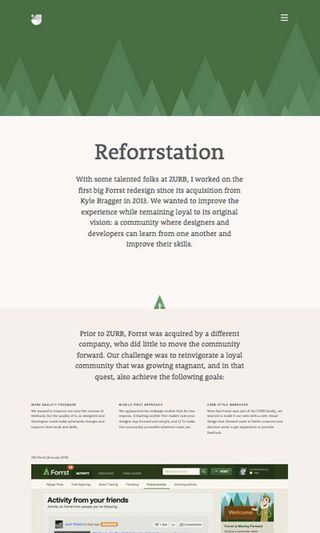
Jackie Ngo combines the practicality of a case study with her clever designs. As the viewer scrolls down, new progressions of the story are revealed, accompanied by visuals illustrating the actual work.
03. Show your process
Hand-in-hand with demonstrating your problem-solving, employer's look at a UX designer's process more than the final result. However, this can be difficult to show, and other designers opt instead for screenshots of the finished product.
A finished persona only says so much. Employers want to know how you made this persona, what kind of research you based it on, how long you spent on each phase, what questions you asked participants, how you found participants, etc.
On his website about improving UX portfolios, Jason Mesut offers this advice which we completely agree with:
Take photos and screenshots during the process – Think ahead about your portfolio while working on other projects. These documents showing the early steps of you developing an idea are just as valuable as a sparkling finished project. You can even scan sketches or handwritten notes.
- Explain the steps briefly – Add some context around these images to aid the viewer in understanding your process.
- Deliverables like sketches, wireframes, and prototypes are perfect for a UX portfolio. They serve as engaging visuals, but also demonstrate the behind-the-scenes work that interests employers. Unfortunately these sometimes fall under NDAs – but we talk about ways around that in the final tip.
If you'd like to learn more about important UX processes and documents, check out the free Guide to UX Design Process & Documentation.
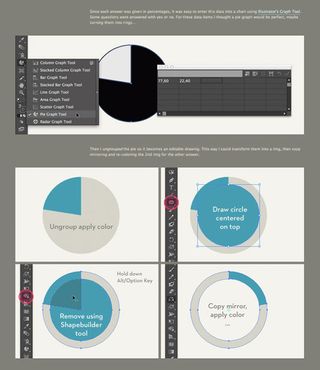
Designer Veerle Pierters posted a thorough explanation of how she created an infographic for Grinta about women cycling.
She describes all the minutiae of the process, from the layout, to choosing the color palette, to how she designed the charts in Illustrator. She accompanied each step of the narrative with helpful images, so you could see her process unwind.
04. Personalize it
No matter the industry, employers hire people more than workers.
Let your employers know why they should hire you, not just your work. This is typically done in two ways: directly through a description of yourself, such as an About page, or indirectly in the style of your portfolio.
In 99u, Mell Ravenel explains some tips for adding personality to your personal page:
- Include your point of view – Offer your own personal perspective whether on your work, your industry, or the world in general.
- Tell your story – How and why did you become a UX designer? Everyone has their own different origins.
- Be real – Your portfolio doesn't have to be all business. Share some personal quirks, hobbies, idiosyncrasies, etc. about yourself that make you memorable.
The biography section should be about you, not your work – you have the rest of the portfolio for that.
Aside from simply stating your personality, you can show it through the portfolio itself. This is most effective in websites, where you can exhibit your design style in how the users interact with the sight.
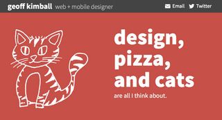
Geoff Kimball shows off his playfulness without sacrificing his professionality. The way his quirky sketches alternate demonstrate his abilities as in web animation, while the content shows off his sense of humor.
05. Be honest
Everyone wants to put their best foot forward when applying for a job, but sometimes to the extent that they're willing to use someone else's foot. If we can't appeal to your ethics here, then we'll appeal to your sensibility: employers always sift out the truth.
Whoever is conducting the interviewer does this for a living. They hear candidate after candidate lying about their accomplishments and claiming to have experience in areas they don't. The honest candidate always wins in the end.
More than anything, this applies to taking credit for a team effort. Your employer knows the process just as well as you do, and will be suspicious of claims that you worked alone.
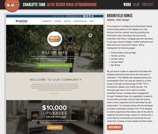
Charlotte Tang knows how to be honest without minimizing her role. Using key language, such as referring to the team as “we” and saying things like, “My job was…” and “I've worked closely with the developer to…” she makes it clear she was an integral part of the design without taking all the credit.
As described in Design Collaboration in the Enterprise, you're better off emphasizing your ability to work with others in facilitating the design process. “You can't just show your skills in a vacuum,” says UXPin Chief Product Officer Kamil Zieba. “We specifically look for designers who bring out the best in the whole product team.”
On a related note, don't pretend to be a visual design whiz. As an architect of experiences, it's harder for you to showcase what you do than visual designers. But be aware that UX designers have a harder time conveying their work through portfolios. That's why we're emphasizing showing your process and problem-solving through case studies.
06. Get to the point
Any UX designer worth hiring understands the significance of time for user experiences. The standard user doesn't want to wait or waste time searching for the content they want, and your employer is no different.
For website UX portfolios, simplicity and navigation are paramount. The same rules of regular UI design described in Web UI Best Practices still apply, and the site is the most important evidence of your work. The employer has an entire list of portfolios to search through, so they won't spend too much time on each.
“I don't need to see 10 projects,” says UXPin chief product officer Kamil Zieba. “I only need to see three of them well documented (ideation phase, research, designs ) and explained (what were our goals and why, what was the result)”.
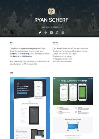
Ryan Scherf wastes no time with his one-page portfolio. After his header with his social media, users scroll down through only two brief blocks of his biography and philosophy, then reach his work samples, culminating in a call-to-action.
07. Pick only the best
Furthering the previous tip about getting to the point, only feature your best samples and don't bother with anything less. Works that aren't exceptional – even if they're still good – will just water down the works that are great.
Because speed is relevant, it's rare that someone will look through every piece in your portfolio. Keeping only the upper-tier will afford you a little more control in what gets seen.
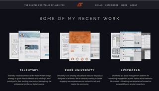
Short and sweet, Alex Fox's portfolio site summarizes his experience and previous work. He only displays three samples of his “recent work,” focusing on depth over breadth.
Notice the clever way he combined the photos for each to show three telling images from the different phases without taking up too much space.
08. Use testimonials
The concept of social proof should be familiar to any UX designer, and the same principles apply to your portfolio.
Typically, a testimonial is the most common method of having someone else brag for you. Simply explain to 3–6 good clients that you're collecting testimonials for your portfolio and ask them to provide you with a complimentary blurb. If you can, urge them to talk about not only your work, but what it's like to collaborate with you as a person.
Likewise, if any publications or articles mentioned anything about your work, pull one of their quotes or link to the article. If you won any awards, include a graphic about it. Anything positive said about your work by a third party is ten times more effective than anything you say about yourself.
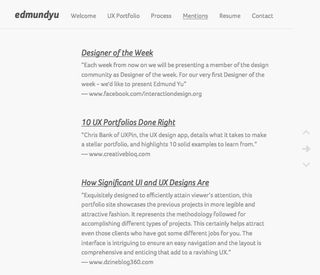
Because Edmund Yu has an entire page dedicated to testimonials, you know he's an experienced UX designer with knowledge and plenty of mileage.
09. Cleverly address NDAs
Non-disclosure agreements may intimidate most designers, but there are some ways to be compliant without limiting your portfolio.
Here are a few tips to for addressing NDAs:
- Grey out or blur information – You can remove sensitive information without removing the point of the image. Your employer isn't interested so much in the details as they are the big picture.
- Ambiguous recreations – Redraw or build a duplicate of the protected material without any of the problematic elements – just remember to mention that it's a recreation.
- Smart photography angles – For photographs of sketches or white boards, a well-planned angle will make the content illegible while still conveying the meaning.
- Request permission – You can always ask clients for permission to use the work in your portfolio. Offer to redact any sensitive design elements or project details.
- Text only – While an image would work best, a written account of the project is better than nothing (if that project warrants that much effort). Simply describe the events without visual aids.
- Original material – Similar to building recreations, try creating a sample of what you can do in your spare time.
In general, employers are understanding when it comes to NDAs. After all, it's all part of the process.

The design collective Mostly Serious gets around any legal concerns by using a mixture of final screenshots, artful behind-the-scenes photography, and specially made infographics about the design process. These work because of the text descriptions that fill in the gaps.
These tips have helped UX designers land the jobs they want, and they can help you, too. If you'd like to sharpen your UX and UI design techniques, check out the free e-book Web UI Best Practices.
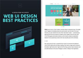
Across 109 pages, the book teaches important techniques by examining 33 case studies from companies like Apple, Spotify, Skullcandy, and others.
Words: Jerry Cao
Jerry Cao is a content strategist at UXPin — the wireframing and prototyping app — where he develops in-app and online content for the wireframing and prototyping platform.
Like this? Read these!
- 10 UX portfolios done right
- Web design training: The top online resources
- Underrated web design tools

Thank you for reading 5 articles this month* Join now for unlimited access
Enjoy your first month for just £1 / $1 / €1
*Read 5 free articles per month without a subscription

Join now for unlimited access
Try first month for just £1 / $1 / €1
The Creative Bloq team is made up of a group of design fans, and has changed and evolved since Creative Bloq began back in 2012. The current website team consists of eight full-time members of staff: Editor Georgia Coggan, Deputy Editor Rosie Hilder, Ecommerce Editor Beren Neale, Senior News Editor Daniel Piper, Editor, Digital Art and 3D Ian Dean, Tech Reviews Editor Erlingur Einarsson and Ecommerce Writer Beth Nicholls and Staff Writer Natalie Fear, as well as a roster of freelancers from around the world. The 3D World and ImagineFX magazine teams also pitch in, ensuring that content from 3D World and ImagineFX is represented on Creative Bloq.
