Big brand agency site is dripping with confidence
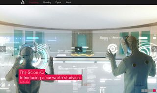
Showcasing work for Coca-Cola, Adidas, Adobe and more, Attik's new website grabs the audience's attention with an impressively imposing carousel. We chat to its creators about how it was made.
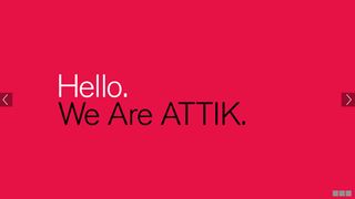
It's every ad agency's toughest brief: building a website that showcases its own work in an effective and impressive manner that grabs the visitor's attention. One way to do so is via a carousel that presents the use with an in-built slideshow of images. And in its latest site redesign, advertising agency Attik have taken that idea and run with it.
Although the agency's roots are in branding, they've since taken those strategic insights to evolve into a fully integrated ad agency. The company has partnered up with a ton of world class brands - from Adidas to LucasArts, Adobe to Coca-Cola - delivering creative solutions from traditional to digital platforms.
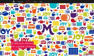
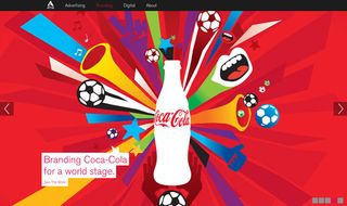
An agency with a portfolio like that deserves a confident looking site and they've certainly achieved that here. The new carousel is big, bold and lets the striking campaign images speak for themselves.
Clean design
Above all, it's a very clean design - and that wasn't easy to achieve, admits Jacob Ford, creative director, digital. "Leaving things out was the entire challenge in-and-of-itself," he says. "You often forget an immense effort goes into taking things out. This is particularly the case when you’re putting together your own ‘portfolio’ site. There is always something more to add.
"It really comes down to a concentrated exercise in restraint to whittle things down - even more so when you have a range of department heads voicing their opinions."
Championing collaboration
There was another consideration when designing the site, adds Ford. "An overarching direction was to champion the collaboration between disciplines. For example, how do we best reflect how our branding work directly ties-in and supports the advertising, which also a built-in digital component?
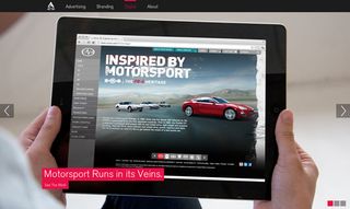
"Each one of those stories is amazing on its own. Connecting the dots was tricky. Our approach was to keep the navigation simple, based on discipline - narrowing entry points letting visitors self-select based on interest.
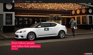
"From there, the work unfolds to then surface related items, allowing one to jump freely between branding, advertising and digital. Very akin to ATTIK’s style, as we do begin on a direct branding project that unfolds into a broadcast spot then into a tablet ad."
See more of Attik's work over on their brilliant website.
Like this? Read these!
- Adobe Photoshop CS6 hands-on review
- Free Photoshop brushes every creative must have!
- Brilliant Wordpress tutorial selection
Come across a site that you think is worth shouting about? Let us know in the comments box below!

Thank you for reading 5 articles this month* Join now for unlimited access
Enjoy your first month for just £1 / $1 / €1
*Read 5 free articles per month without a subscription

Join now for unlimited access
Try first month for just £1 / $1 / €1
Get the Creative Bloq Newsletter
Daily design news, reviews, how-tos and more, as picked by the editors.
The Creative Bloq team is made up of a group of design fans, and has changed and evolved since Creative Bloq began back in 2012. The current website team consists of eight full-time members of staff: Editor Georgia Coggan, Deputy Editor Rosie Hilder, Ecommerce Editor Beren Neale, Senior News Editor Daniel Piper, Editor, Digital Art and 3D Ian Dean, Tech Reviews Editor Erlingur Einarsson and Ecommerce Writer Beth Nicholls and Staff Writer Natalie Fear, as well as a roster of freelancers from around the world. The 3D World and ImagineFX magazine teams also pitch in, ensuring that content from 3D World and ImagineFX is represented on Creative Bloq.
