Perfect your UIs with Craft - the free Photoshop plugin
Clark Wimberly reveals 5 real-world use cases where Craft shines.
The other night I watched a movie where the main character kept reliving the same events over and over. It drove the character insane — and it was insanely tiring to watch. Nobody wants to see the same thing happen over and over and over. That's the same reason I try to cut out repeat steps from my design workflow.
The faster I can cut through grunt work, the more time I'll have to spend on what I came here to do: solve problems. Which is why I was stoked to hear about Craft, a design workflow tool built to bring powerful data right into Sketch (or Photoshop). Craft is the latest release from InVision LABS, a new incubator aimed at creating the design tools of tomorrow. Craft comes with three tools:
- Duplicate: clone and arrange any element with lightning speed. So long copy and paste!
- Photos: easily add beautiful high-res photographs to your layouts
- Type: forever kill filler text and lorem ipsum. It can even pull live data from the web!
In this article we'll take a look at five real-world use cases where Craft shines. We'll mix and match all three tools in a variety of situations where moving from mockup to hi-fi will never be the same.
Installing Craft
Before we get started, you'll need to install Craft. It's available free at labs.invisionapp.com/craft. You'll also need Sketch or Photoshop. For this article, I've used Sketch for all the samples, but everything I'm showing works in Photoshop just the same. Let's get started!
01. Create realistic users
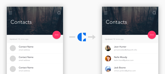
Building a user-centric product sometimes involves actually building your users into the product. Their faces. Their names. A contact list. A social stream.
Presenting a design to be used by real people needs to look like it's been used by real people. We'll need metadata like name, location, contact information, and avatars.
Craft makes creating realistic users a snap. In just a few clicks we can insert realistic stand-ins with names and faces. To insert the content we need, we'll be using 2 modules in Craft: Photos and Type.
Get the Creative Bloq Newsletter
Daily design news, reviews, how-tos and more, as picked by the editors.
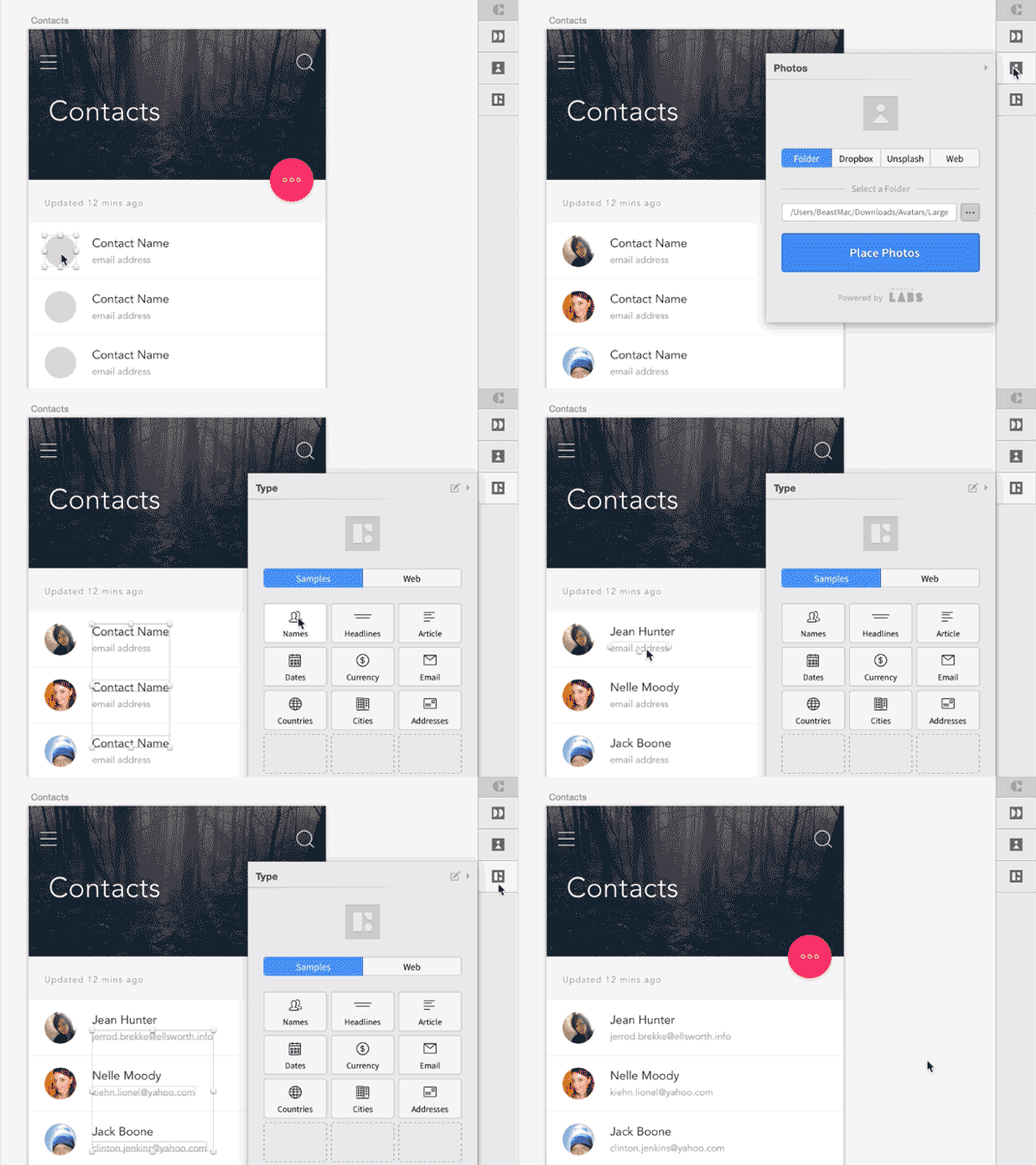
- First, let's add the user avatars. Select all the gray circles, then open the Photos panel from the Craft toolbar. Select a folder containing user photos (I used this set I found online), and click Place Photos.
- To add real names, select all the placeholder "Contact Name" text layers, then head to the Type panel in the Craft toolbar. Select Samples > Names > Both to fill the layout with names.
- To add email addresses, we're going to follow the same basic steps. Select all the layers you want filled, open the Type panel, select Samples > Email.
Having the power to insert realistic users without taking the time to stop and collect a dataset is a huge boost when building out files. Skipping steps and looking more realistic? Yes please!
02. Getting rid of lorem ipsum
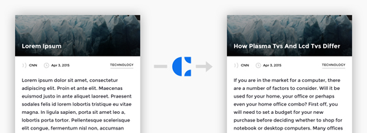
If you've made it this far, I probably don't need to tell you why we want to get rid of lorem ipsum filler text. After countless 'Why is this page in Greek?' moments during a meeting, I made myself a promise to forever avoid non-sensical filler content.
Craft makes filling a layout with real words simple. We just use a single module: Type.
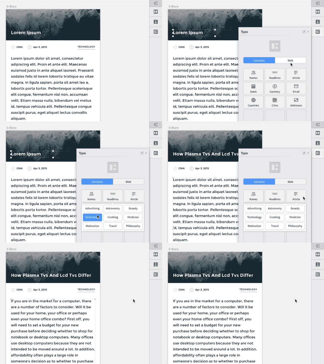
- To insert a real headline, select the text layer and open the Type panel in the Craft toolbar. Select Samples > Headlines > Technology (or whatever category you want).
- To replace an entire article of gibberish, select the text layer and head to the Type panel. Pick Samples > Articles > Technology.
Bonus points: if you need to insert specific text, like a collection of pre-written headlines, you can easily create your own custom actions. With the Type panel open, select Add action > Add custom action.
With the ability to easy swap placeholder text for something with real meat, you’ll never get caught in an unseemly looks-like-Greek meeting room incident again.
03. Make a grid in seconds
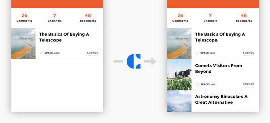
Doing the same work over and over is a chore. It's the reason we design and program things to begin with — to smartly skip steps that can be automated. So it's ironic that so much of my screen design process includes production grunt work: make element, copy element, paste element, place element. Sometimes across dozens of screens. It seems like the perfect candidate for a robot helper.
Enter Craft, which has a tool just for creating and placing elements into a manageable grid. It's called Duplicate.
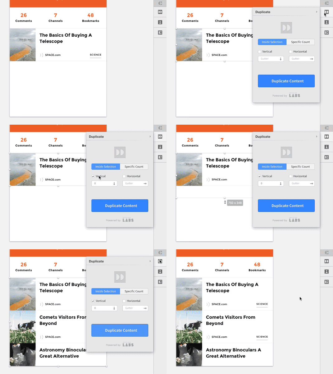
- Select the group you want to duplicate (in this case we're taking a single article and creating a full stream).
- Open the Duplicate panel in the Craft toolbar, and take note of the 2 main toggle options:a) Inside Selection: this option will let you define an area to be filled with duplicated items. It's helpful when you are defining layouts with scrolled and overflow areas. Add however many will fill this space.b) Specific Count: this option will let you define the exact count of items to be duplicated. It's handy when you know the size and specific layout you want. Add a 2x3 grid, specifically.Both options allow you to duplicate vertically or horizontally, as well as setting gutters (spacing between items). We're using Inside Selection > Vertical.
- When you click the Duplicate Content button, Craft will automatically insert a selection mask into a group with your content. Resize this selection to define the area you'd like filled with duplicate content. When you’ve got it sized, clicked the Duplicate Content button again to complete the action.
Bonus points: if the layers you're duplicating were previously filled by Craft (using Photos or Type), you'll get a fresh set of content for every item created. Aside from saving the extra steps of manually copying and pasting, Duplicate saves me a bunch of calculations. Having items fill into a selection is so handy — I'm surprised it didn’t exist until now.
04. Make a photo gallery
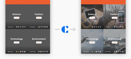
If you're not seeing the pattern just yet, here's a quick example of how easy it is to shuffle in data. A photo gallery, especially with user-generated content (your users uploading their own pictures), is like a chameleon.
As photos are added, it's going to look different each time you look at it. Instead of gathering a ton of photos to make that effect a reality, we can let Craft do the heavy lifting. When filling in pictures using the Photos module, it's really easy turn up great looking images — from Unsplash, Dropbox, a local folder, or the web.
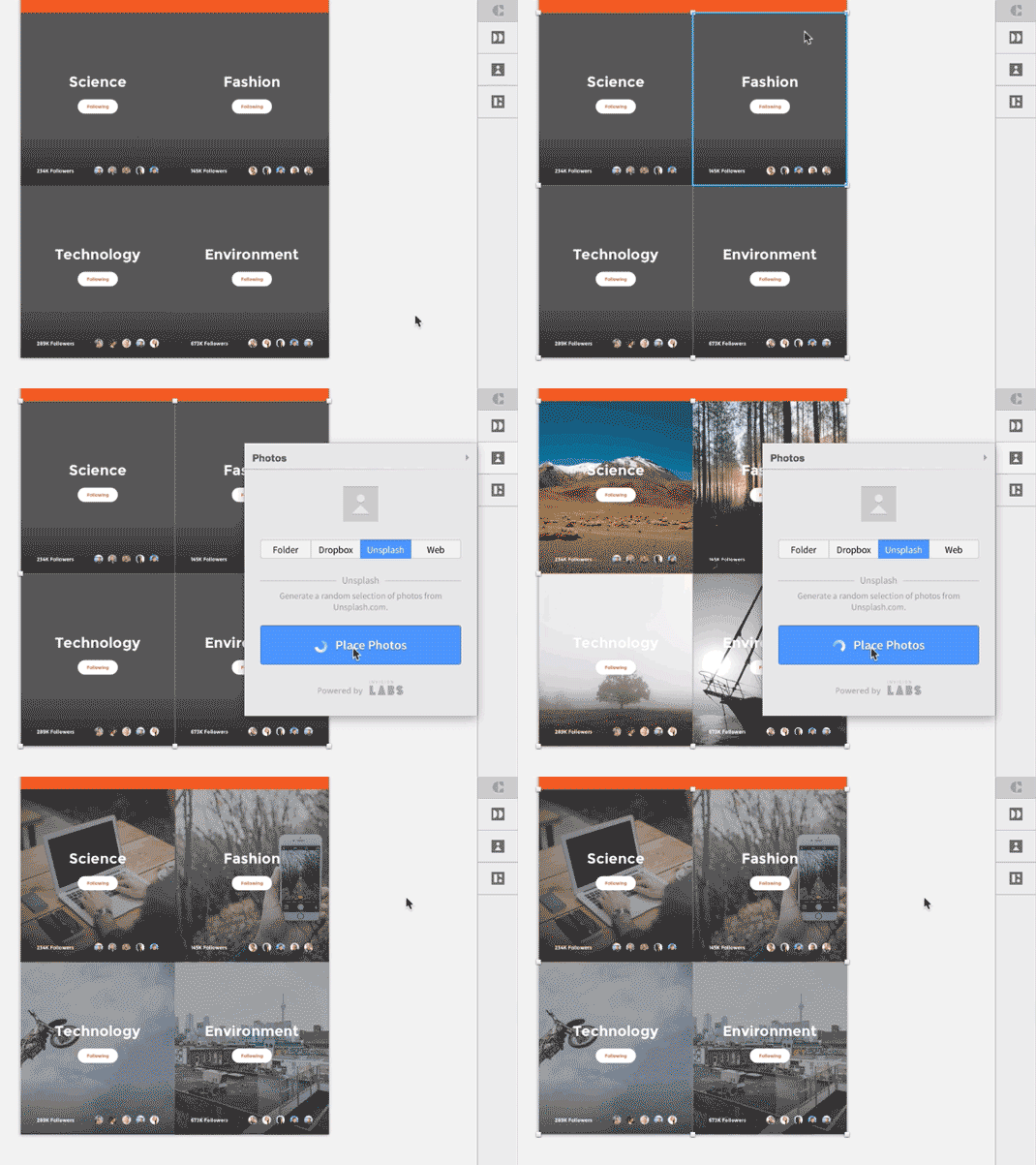
- To replace placeholder shapes with real photographs, start by selecting the shapes you want to fill (in this case, a bunch of gray squares standing-in for photos)
- Open the Photos panel in the Craft toolbar and select where you’d like to load photos from. You can use a local folder, a Dropbox folder, grab from Unsplash, or the web (using the built-in browser). Click Place Photos to fill your layout with photos from the selected source.
Bonus points: you can continue to click Place Photos to shuffle and replace the selected photos. It's like a shuffle button for your design process!
Using real photos beats a boring gray square just about any day of the week, especially when you're preparing a presentation or trying to get sign-off. The more filler you can kill, the better off you'll be. On that note...
05. Designing with live data
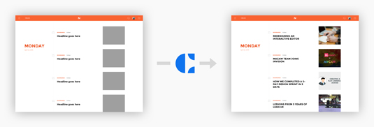
When working on a new design, there's this wonderful and stressful point where you start to add real content, where the hypothetical choices you've made in the design get tested.
Lots of times, that comes during the final build-out, long after design is complete. Lately, to avoid that unfunny feeling, I've been pulling real content into my designs earlier and earlier.
Craft lets you pull Photos and Type straight from the web by way of a mini-browser built right into the tools. Now you can grab the latest blog post content or this week's top albums, direct from a live web source.
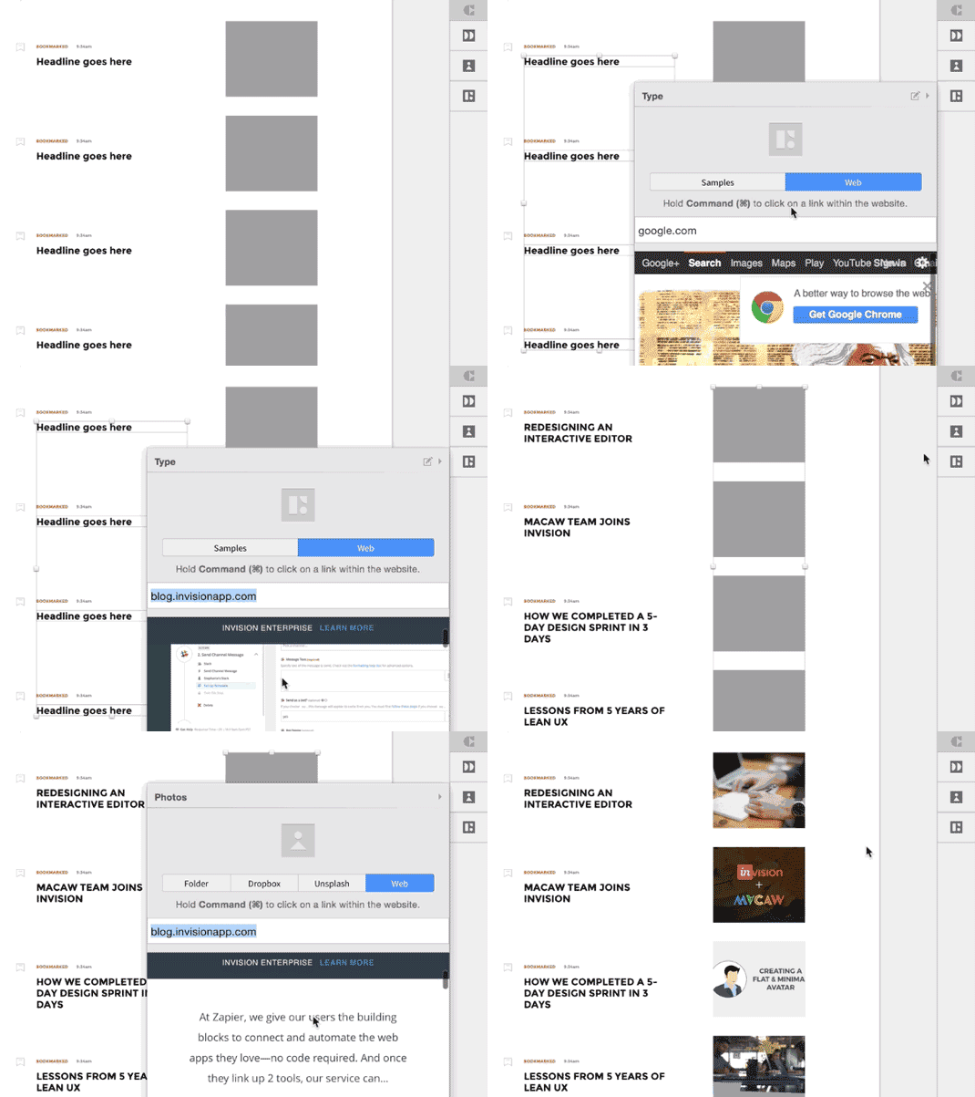
- Let's start by selecting the placeholder headlines we'd like to replace with live content. Open the Type panel from the Craft toolbar. Select Web from the top toggle.
- Browse to a website that contains the headlines you'd like to import (we're using the InVision Blog here). Simply scroll to a headline and click on it to insert it into your layout. Craft will automatically find sibling elements (other headlines) to make sure each headline is unique.
- To insert images from the web, select your placeholder layers (the gray boxes), then open up the Photos panel.
- Browse to a website and select an image. Just like before, Craft will find siblings and fill each of your selected layers with a fresh image.
Bonus points: when using the built-in browser, clicking on a headline or image will automatically insert that content into your document. If you need to navigate inside the built-in browser, hold Command (or Ctrl) when clicking a link to navigate to that page.
From redesigns of existing properties to stress testing a layout with live content to simply pulling down the latest photos, designing with data is a quick way to add a huge dose of reality to your workflow process.
The implications of grabbing live data from the web and straight into a design tool are pretty wild to consider, so I’'l leave some the dreaming up to y'all.
Wrapping up
I've only had a short time to play with Craft, but it's already making waves into my workflow. From gathering sample content to pulling down live data from the web, it's been both a time-saver and a fidelity-booster, a combo that doesn’t often arrive together. You can download Craft for free from InVision LABS.
Words: Clark Wimberly
Clark Wimberly is a content designer at InVision.
Like this? Read these:
- Choose a website builder with these top tools
- Behold the very best in website templates
- These free WordPress theme are better than beer
- These Photoshop plugins will boost your skills
- Read our guide to image resolution

Thank you for reading 5 articles this month* Join now for unlimited access
Enjoy your first month for just £1 / $1 / €1
*Read 5 free articles per month without a subscription

Join now for unlimited access
Try first month for just £1 / $1 / €1

The Creative Bloq team is made up of a group of art and design enthusiasts, and has changed and evolved since Creative Bloq began back in 2012. The current website team consists of eight full-time members of staff: Editor Georgia Coggan, Deputy Editor Rosie Hilder, Ecommerce Editor Beren Neale, Senior News Editor Daniel Piper, Editor, Digital Art and 3D Ian Dean, Tech Reviews Editor Erlingur Einarsson, Ecommerce Writer Beth Nicholls and Staff Writer Natalie Fear, as well as a roster of freelancers from around the world. The ImagineFX magazine team also pitch in, ensuring that content from leading digital art publication ImagineFX is represented on Creative Bloq.
