Parallax Cadillac site is a quirky masterpiece
Cool illustrations, retro animation and clever scrolling techniques combine for a winning microsite.
Parallax scrolling may be on the way to becoming a web design cliche, but as long as agencies keep putting it to imaginative and aesthetically pleasing uses, there's surely life in the old dog yet.
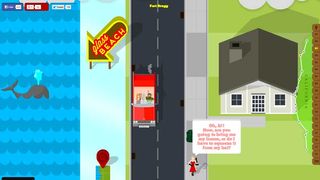
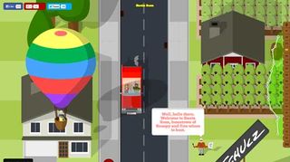
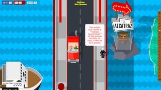
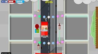
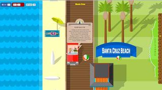
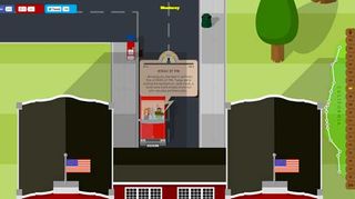
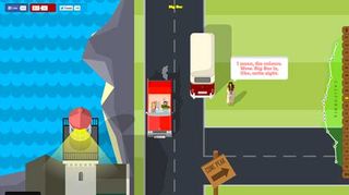
This cool microsite, created by Newcastle agency Shout Digital, for luxury travel experts, Exsus, is another great example of the trend. Its delightfully retro cartoon scene takes you on a virtual trip along California's Highway One.
The scrolling journey seats you in a classic Cadillac Eldorado 1959 starting out in the Redwood Highway, which takes you though Fort Bagg, San Francisco, Cambria, Santa Barbra, LA, and San Diego, to name but a few. At first glance the effects look quite simplistic - but as you scroll down you'll see the site's got a few quirky tricks up its sleeve to keep things interesting.
Technical challenges
The microsite is essentially all static HTML5, explains Jen Rudd, who was lead web developer on the project. "The site is cut up into 'slides' and there are only ever two to three slides shown at any given time," she explains.
"JavaScript/jQuery is used with Ajax to call slides in and out as needed. JavaScript is only used for functional tasks like this. All of the animations seen on the site are achieved with CSS3," she adds. "The slide-switch method was chosen in order to keep the page weight down."
Weight of images
The major hurdle the team needed to overcome was the weight of the images. "I've never worked with so many very large images all on one page before," admits Rudd. "It was essential to create the compelling style we were trying to achieve. But it meant I had to pull out all of the stops to fight the fire."
That including recreating some of the images in CSS rather than using the original file. Also, "anything that could be re-used elsewhere was, and by the end of the project a whole lot of 'spriting' and compression had helped to pull it down as much as possible."
Close relationship
Throughout the design process, development and design worked very closely, Rudd reports. "This allowed for a much higher quality of animation and a much better end result. We reviewed the work daily and re-visited areas often.
"It was tough to get a handle on exactly what the site would need to really polish it until we got far into the build, which is why it was essential to always be looking backwards as well as forwards."
Liked this? Read these
- How to make an app
- Brilliant Wordpress tutorial selection
- Our favourite web fonts - and they don't cost a penny
- Download these free iPhone apps for designers
Have you seen a great example of parallax scrolling? Let us know in the comments below!

Thank you for reading 5 articles this month* Join now for unlimited access
Enjoy your first month for just £1 / $1 / €1
*Read 5 free articles per month without a subscription

Join now for unlimited access
Try first month for just £1 / $1 / €1
Get the Creative Bloq Newsletter
Daily design news, reviews, how-tos and more, as picked by the editors.
The Creative Bloq team is made up of a group of design fans, and has changed and evolved since Creative Bloq began back in 2012. The current website team consists of eight full-time members of staff: Editor Georgia Coggan, Deputy Editor Rosie Hilder, Ecommerce Editor Beren Neale, Senior News Editor Daniel Piper, Editor, Digital Art and 3D Ian Dean, Tech Reviews Editor Erlingur Einarsson and Ecommerce Writer Beth Nicholls and Staff Writer Natalie Fear, as well as a roster of freelancers from around the world. The 3D World and ImagineFX magazine teams also pitch in, ensuring that content from 3D World and ImagineFX is represented on Creative Bloq.
