Build a parallax scrolling website: 10 pro tips
Parallax scrolling is the biggest trend in web design at the moment - but there's a right way and a wrong way to go about it. Josh Chan of Chromatix explains how to get it right.
The term 'parallax' refers to the apparent movement of objects when viewed from different positions. The technique was originally used in 2D video games where background images moved slower than foreground images, creating an illusion of depth. Who would have thought something popularized in 1982 arcade game Moon Patrol would become a major trend for web design 30 years later!
Parallax websites have come a long way since the simple two-layered site. With HTML5, CSS3 and modern browsers, there are many parallax sites that use multiplane animation, introduce new elements and create motion beyond the y-axis using scrolling. If you're unfamiliar check out these eye-popping examples of parallax scrolling websites.
Creating one of these visually interactive masterpieces can be overwhelming, so here are 10 tips that will help you build your parallax scrolling websites in the right way.
01. Make it mobile friendly
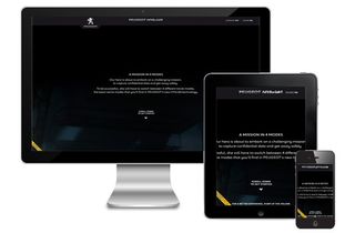
It is no surprise that with the increase of internet usage via mobile devices, that design concepts such mobile first and responsive web design have become highly popular.
Currently, the majority of parallax scrolling websites are not mobile device friendly - including the big names like the Peugeot graphic novel pictured above. But given the trend towards mobile web use, that approach is increasingly going to be untenable.
02. Don't use it for the sake of it

Parallax scrolling is very cool technology, but try not to use it for the sake of it. Green Splash Design's site, shown above, is well designed and serves its purpose perfectly, but its use of parallax scrolling does not add much to the user experience.
03. Make it fun

Audiences like to be entertained and parallax scrolling is often used to give users some fun. The Kystalrae Fall Collection - where the outfit on the given model changes as the user scrolls down - is a great example of an entertaining use of the technique.
Get the Creative Bloq Newsletter
Daily design news, reviews, how-tos and more, as picked by the editors.
04. Make it tell a story

Parallax scrolling can be used to take your visitors on a journey through a timeline or story. Digital agency inTacto's site is a great example of parallax scrolling used to narrate the history of a company in a fun and involving manner.
05. Make it engaging

The Activate Drinks website engages its audience with clever use of animations and parallax scrolling. Keeping the user on your website has always been a challenge for designers. But parallax scrolling can enhance the pull of natural curiosity if the visual effect is fun, enticing and/or hypnotic.
06. Harness calls to action
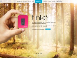
We scroll and something happens. Capitalizing on the instant feedback when interacting with parallax scrolling websites is a great way to pull people into your site and entice them towards your calls to action.
For example, the Tinke fitness gadget website lures visitors towards its 'next button' call with images of the gadget interacting with the parallax scrolling. The website also perfectly guides the visitor to the 'Shop Now' call to action at the bottom of the page.
07. Add layering and depth
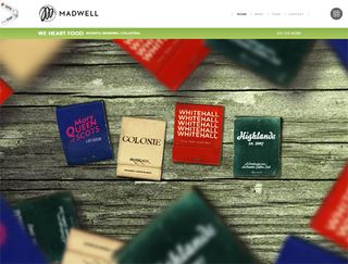
Madwell's own site won an awwwards site of the day for good reason, as its website demonstrates perfect use of layers and depth for a parallax scrolling site. Notice the fast moving blurred foreground imagery compared to the slow moving clear background images.
As previously noted, the art of parallax is about creating an illusion of depth. Remember to experiment and not to give up!
08. Don't overdo it
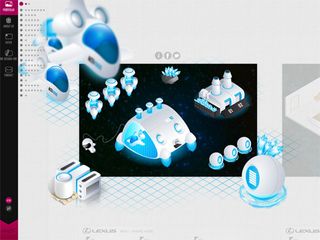
Muffi has bombarded its website with all sorts of fanciness, and it's definitely an impressive display of technical prowess and beautiful imagery. However, personally I believe they've gone a little too far with the use of parallax scrolling. When it becomes difficult to find the company logo and understand what exactly the website is about, you should probably question the possible overuse of technology.
09. Remember IE

It's quite rightly common practice for web developers to do cross-browser testing. And it's particularly important with parallax scrolling websites, as they are likely to employ HTML5 and CSS3. HTML5 Boilerplate cam help care of most cross-browser normalizing contain fixes for Internet Explorer.
10. Pre-loading assets
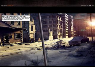
A large amount of parallax scrolling websites involve heavy use of imagery. Often the use of other multimedia assets can be the reason for large downloads on parallax scrolling sites as well. The Soulreaper comic is a prime example of this, and also a great example of pre-loading images and assets.
Words: Josh Chan
Josh Chan is a digital specialist for Chromatix, a web design and online marketing agency in Melbourne, Australia. Web design and web innovation are his passions, along with some breakdancing in his spare time.
Liked this? Read these!
- How to build an app
- Brilliant Wordpress tutorial selection
- Discover what's next for Augmented Reality
Have you seen a great example of parallax scrolling? Let us know about it in the comments!

Thank you for reading 5 articles this month* Join now for unlimited access
Enjoy your first month for just £1 / $1 / €1
*Read 5 free articles per month without a subscription

Join now for unlimited access
Try first month for just £1 / $1 / €1
The Creative Bloq team is made up of a group of design fans, and has changed and evolved since Creative Bloq began back in 2012. The current website team consists of eight full-time members of staff: Editor Georgia Coggan, Deputy Editor Rosie Hilder, Ecommerce Editor Beren Neale, Senior News Editor Daniel Piper, Editor, Digital Art and 3D Ian Dean, Tech Reviews Editor Erlingur Einarsson and Ecommerce Writer Beth Nicholls and Staff Writer Natalie Fear, as well as a roster of freelancers from around the world. The 3D World and ImagineFX magazine teams also pitch in, ensuring that content from 3D World and ImagineFX is represented on Creative Bloq.
