How to optimise your web content for sharing: 7 expert tips
Greg Meek of Stickyeyes explains how to optimise your web pages for increased social sharing.
Shareable content is part of a recent shift in marketing strategy, where brands have discovered that creating great content can reap rewards through social sharing.
Although search engines keep their cards close to their chest on the impact social signals have on search rankings, there’s no denying that shared content is beneficial for brand awareness, increases direct and brand traffic, and likely impacts search engine rankings due to generated backlinks and traffic coming direct from social networks.
There are a number of techniques that can be easily implemented to optimise your web page for social sharing. Here are our seven top tips.
01. Content
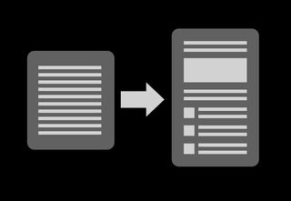
Whilst coming up with a great idea for content is the focus, an often forgotten consideration is how it should be optimised for the end-user. It’s easy for your content to be overlooked in an environment of information-overload and short attention spans.
“Dual-coding theory” works on the premise that people learn and remember better when presented with a combination of verbal and image-based stimuli. “Progressive disclosure”, another cognitive design principle, dictates that you should present your content in concise, bite-size chunks to aid consumption of information.
Break your content into different components using sub-headings, bullet-points, different typography and images to ensure your visitor has the best chance of reading and understanding your content.
02. URL Optimisation
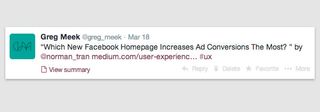
Making sure that page URLs are clean, user friendly and relevant is good practice when developing for the web, but the URL has added importance when you consider how and where it is displayed on social networks.
Get the Creative Bloq Newsletter
Daily design news, reviews, how-tos and more, as picked by the editors.
Using real URL strings instead of shortened links, as well keeping the URL string clean (by avoiding added parameters such as UTM codes), provides a much more trustworthy link – hence users are more likely to click through.
03. Sharing buttons
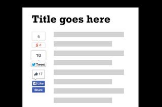
If you want your content to be shared, the most effective tool is via share buttons placed on the page. There has long been debate about the validity of share buttons, but, as long as you don’t overdo it and plaster every available share button on your page, adding share buttons to your page is imperative.
The key is featuring relevant buttons and in the most relevant position. Stuffing your page with every button you can find will have a negative effect on user experience, slowing page load times and creating visual clutter, which can affect decision-making.
With different social networks attracting different demographics and content types, make sure you’re working within the relevant networks for your brand’s audience. It’s also worthwhile looking at your site’s referral traffic via Google Analytics, which will show you which networks are sending the most traffic to your pages.
Official not bespoke
You should also use the official buttons provided by each network rather than bespoke designs. These are the most utilised and therefore the most recognised; hence using them will increase the chances of getting shared.
And ensure that you position the sharing buttons in a prominent position. Of course, this will make them more visible for ease of use, but recent research also shows that many users share content without even reading it.
With the increasing possibility that a number of visitors won’t even scroll down to see your social buttons if they’re at the bottom, make it easy by placing them near the top of the content.
04. META tags
Meta tags allow us to define metadata to optimise content for use in various social networks. Choosing which of the many metadata types to implement can be tricky but we’d recommend:
Title and META description
Title and META description tags should always be defined, but are especially useful for social as they are used by some networks such as Google+.
<title>Page Title. Maximum length 60-70 characters</title>
<meta name="description" content="Page description. No longer than 155 characters." />
Authorship and Publisher mark-up
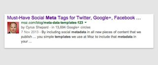
Whilst this markup doesn’t directly impact the display of content on social networks, it does allow the listing to reference relevant Google+ profile pages in search results, which can add credibility to your content. Google has also stated that it plans to rank content that is connected to authors of reliable content, over content that is not.
Ensure that the rel="publisher" tag is associated with the site and any authors are also linked with rel="author".
<link rel="publisher" href="https://plus.google.com/publisher-name”/>
<link rel="author" href="https://plus.google.com/author-name"/>
Schema.org markup
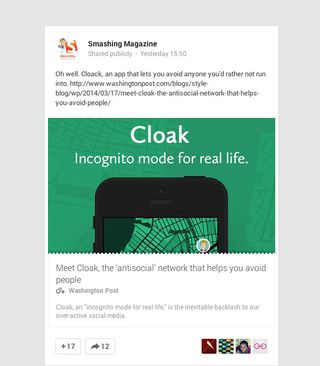
Schema.org tags can dictate how your content displays on networks such as Google+. There are alternatives to Schema.org, namely RDFa and microformats. However, Google, Bing and Yahoo! all support Schema.org so it makes sense to embrace it.
<meta itemprop="name" content="The name or title">
<meta itemprop="description" content="This is the content description.">
<meta itemprop="image" content="http://www.example.com/image.jpg">
Open Graph tags
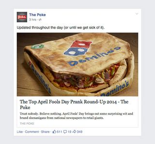
Open Graph is a protocol similar to Schema.org that Facebook uses to gather information about your content. Other platforms like Pinterest can use it too. We recommend the following tags:
<meta property="og:title" content="The name or title"/>
<meta property="og:type" content="article"/>
<meta property="og:url" content="http://www.example.com"/>
<meta property="og:image" content="http://www.example.com/image.jpg"/>
<meta property="og:description" content="This is the content description."/>
Twitter Card tags
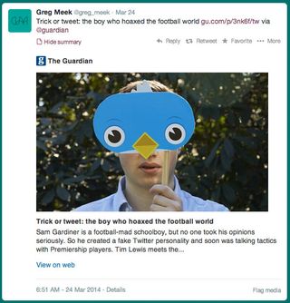
Twitter also has its own meta tags. You can choose from a number of different formats in which to display your content. Details of all formats can be found here. We recommend the new Summary Large Image card:
<meta name="twitter:title" content=”The name or title">
<meta name="twitter:description" content=”This is the content description.”>
<meta name="twitter:card" content="summary_large_image">
<meta name="twitter:site" content="@site-twitter-handle">
<meta name="twitter:image:src" content=”http://www.example.com/image.jpg">
05. Optimise images for sharing
Referencing images in your metadata allows social networks to include them when displaying your content. It’s important that the image is relevant to the content it’s accompanying, and in a perfect world its size should be optimised for the network it’s being displayed on.
Facebook recommends images at least 600 x 315 pixels in size to make full use of the listing view. They suggest an aspect ratio of 1.91:1 to avoid cropping.
Twitter prefers images that are at least 120 x 120 pixels for its summary card format. If you’re using the large summary card format as recommended above, at least 280 x 150 pixels in size is preferred.
To avoid creating multiple images for different networks, it makes sense to create a single image to use across all networks. We recommend going for Facebook’s preferred size of 600 x 315 pixels, which should cover most bases.
06. Social commenting
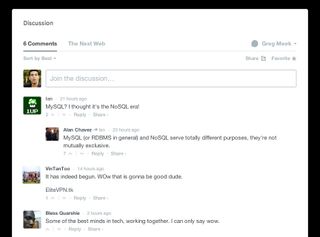
Integrating plugins from platforms like Facebook’s comments, Disqus, Echo and Livefyre allows visitors to comment on your content and then share directly on their favourite social networks.
Having these plugins in place makes comments on your site more credible as users are already verified, therefore reducing the amount of trolls and spam. Most importantly, the reach of your content and the conversation around it is extended to your visitors’ social networks as a result.
07. Social network debugging tools
After you’ve implemented the techniques above, make sure you test your content on the debugging tools available for each social network:
- Facebook: https://developers.facebook.com/tools/debug
- Google+: http://www.google.com/webmasters/tools/richsnippets
- Twitter: https://dev.twitter.com/docs/cards/validation/validator
- Pinterest: https://developers.pinterest.com/rich_pins/validator/
Twitter and Pinterest require you to have your domain approved before your content’s metadata can be used. When we tested it, Twitter took two days to approve our site although some developers have reported waiting weeks.
Pinterest users have also reported that it took weeks to approve their content, so make sure you do this sooner rather than later! Pinterest also requires you to have a business account.
Words: Greg Meek
Greg Meek is head of design and development at digital marketing agency Stickyeyes. Follow them on Google+ or share the content on their blog

Thank you for reading 5 articles this month* Join now for unlimited access
Enjoy your first month for just £1 / $1 / €1
*Read 5 free articles per month without a subscription

Join now for unlimited access
Try first month for just £1 / $1 / €1
The Creative Bloq team is made up of a group of design fans, and has changed and evolved since Creative Bloq began back in 2012. The current website team consists of eight full-time members of staff: Editor Georgia Coggan, Deputy Editor Rosie Hilder, Ecommerce Editor Beren Neale, Senior News Editor Daniel Piper, Editor, Digital Art and 3D Ian Dean, Tech Reviews Editor Erlingur Einarsson, Ecommerce Writer Beth Nicholls and Staff Writer Natalie Fear, as well as a roster of freelancers from around the world. The ImagineFX magazine team also pitch in, ensuring that content from leading digital art publication ImagineFX is represented on Creative Bloq.
