How New York City redesigned its website
The city of New York's public service website has just undergone a major overhaul. We find out how it was made.
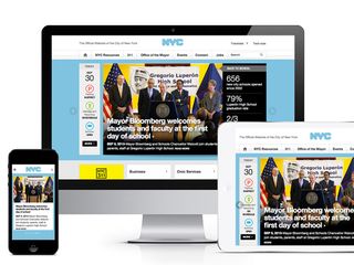
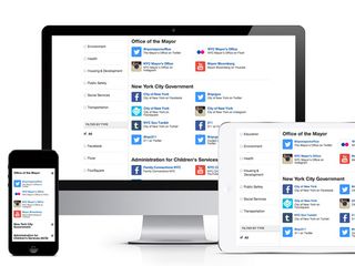
For the first time in over a decade, NYC.gov has undergone a major overhaul, developed by Brooklyn-based digital design agency Huge, the New York City Mayor’s Office of Media and Entertainment and the Department of Information Technology and Telecommunications.
We spoke to chief experience officer at Huge Michal Pasternak about the redesign...
Q: What was your design approach on this project?
Our vision was to do two things very well: First, create an experience that is a true resource for New Yorkers. An experience that enables users to quickly and easily complete simple tasks. Second, to provide a way for the mayor and the city to share all of the initiatives they are doing in more compelling ways. There are so many great things the city is doing for its citizens that are buried in press releases every day.
We used a very iterative design process working in collaboration with the City
We used a very iterative design process working in collaboration with the City. While part of our team worked on the content strategy and information architecture, another group created design concepts to get the main interactions and look and feel right. Then we moved into detailed design, building out interactive prototypes and testing with real New Yorkers (who are never shy about sharing their opinions). Finally we partnered with NYC's tech team to bring the site to life.
Q: What did you use to develop the site?
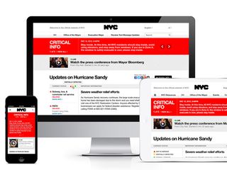
To develop the responsive, front-end interface for NYC.gov, we used HTML5, CSS3 and Javascript. The City's Department of Information Technology & Telecommunications owned the integration and back-end work.
Q: How did you improve the site's usability and accessibility?
Our main goal was to create an experience that would make it easy for New Yorkers to accomplish tasks and find information they need. The old site was quite flat with thousands of pieces of content that were hard to find.
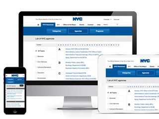
We organized the experience into eight buckets
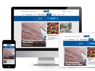
So we organized the experience into eight buckets. From a development perspective, we designed templates that would work across those buckets with modules that could be swapped out in the CMS as needed.
This approach also helped us plan for the future; by developing templates with modular components, the city can then extend code framework and style guide across its many agencies to create a more unified look and feel across all of its digital properties.
We went with a responsive framework so that users could interact with the site on any device.
Q: Did you use any new or notable techniques to develop the site?
We used up-to-date front-end tools and frameworks such as Modernizr, SASS, Jquery, Javascript Mustache Templating, Compass, and Susy Grid to develop the new site.
The technique we had in mind was to create a standard modular template that can be reused, so that the city can grow and scale the system over time. The last redesign of the site was in 2003, and our hope is that this one surpasses that 10 year mark.
Liked this? Read these!
- Our favourite web fonts - and they don't cost a penny
- Check out these top examples of JavaScript
- Pro tips for the perfect website layout
Have you seen any cool web design projects recently? Let us know in the comments.

Thank you for reading 5 articles this month* Join now for unlimited access
Enjoy your first month for just £1 / $1 / €1
*Read 5 free articles per month without a subscription

Join now for unlimited access
Try first month for just £1 / $1 / €1
Get the Creative Bloq Newsletter
Daily design news, reviews, how-tos and more, as picked by the editors.
The Creative Bloq team is made up of a group of design fans, and has changed and evolved since Creative Bloq began back in 2012. The current website team consists of eight full-time members of staff: Editor Georgia Coggan, Deputy Editor Rosie Hilder, Ecommerce Editor Beren Neale, Senior News Editor Daniel Piper, Editor, Digital Art and 3D Ian Dean, Tech Reviews Editor Erlingur Einarsson, Ecommerce Writer Beth Nicholls and Staff Writer Natalie Fear, as well as a roster of freelancers from around the world. The ImagineFX magazine team also pitch in, ensuring that content from leading digital art publication ImagineFX is represented on Creative Bloq.
