New skills in web design
Knowing what to focus on in order to stay up to speed with the web can be a challenge. Here are the areas you should be brushing up on.

Our industry is evolving at a dizzying rate, and it seems to develop faster and faster each year. Knowing what to focus on in order to stay up to speed can be a challenge. Ask 10 different designers or developers 'What should I learn this year?' and you'll get 10 different answers.
As a senior lecturer teaching Interaction Design at the Belfast School of Art, it's important to me to ensure my curriculum's up-to-date and fit for purpose, so I welcomed the opportunity to reflect upon the skills that web professionals should be homing in on this year. Like everyone, I find it a struggle to keep on top of everything, so I think it's important to spend some time at the start of the year outlining a list of topics on which to focus during the year ahead.
To ensure this list was industry-focused and relevant, I approached a number of others whose opinions I respect (including Sara Soueidan, Andy Budd, Jonathan Snook, Dan Edwards and Jake Giltsoff) to find out where they see things heading. I've combined their thoughts with the topics I'm focusing on learning to create a 'skills roadmap' for the rest of 2016.
Some of these topics will merit deep dives and focused research, others are included as areas to read up on and familiarise yourself with. So without further ado, let's get started!
01. Rediscover the basics
In the headlong rush into the future, let's not forget the basics. HTML, CSS and JavaScript are the core building blocks of the web. Understanding them – properly understanding them – is important. This year at the Belfast School of Art, in addition to core design principles, I've been teaching fundamental HTML, the principles of CSS and vanilla JavaScript.
As Sara Soueidan puts it: "Libraries and tools come and go, but the only skills that will last a lifetime on the web are the fundamentals of the three main pillars of web design: markup, style and functionality, using dependency-less scripts."
In my teaching I explain that HTML is a design element. We can do a great deal at the markup layer, and we owe it to our content to do so. Understanding CSS is important before embracing tools like Sass that abstract it – and the same goes for JavaScript. Know the cost of dependencies such as jQuery plugins and other libraries and frameworks. Keep your HTML, CSS and JavaScript tight and rely on dependencies only if you need to.
Get the Creative Bloq Newsletter
Daily design news, reviews, how-tos and more, as picked by the editors.
02. Layout techniques
How we lay things out within our viewports is evolving. There are exciting developments here – not least the Flexible Box Layout Module and CSS Grid Layout, which are rapidly reaching maturity. Embrace these and you'll be able to create fine-grained, responsive layouts that are perfect for RWD and interface design.
Flexbox is a layout mode that, as the W3C puts it, is optimised for UI design. Chris Coyier's flexbox guide is regularly updated. Wes Bos has also created a series of 20 free videos entitled 'What the flexbox?!' to help you master this dark art.
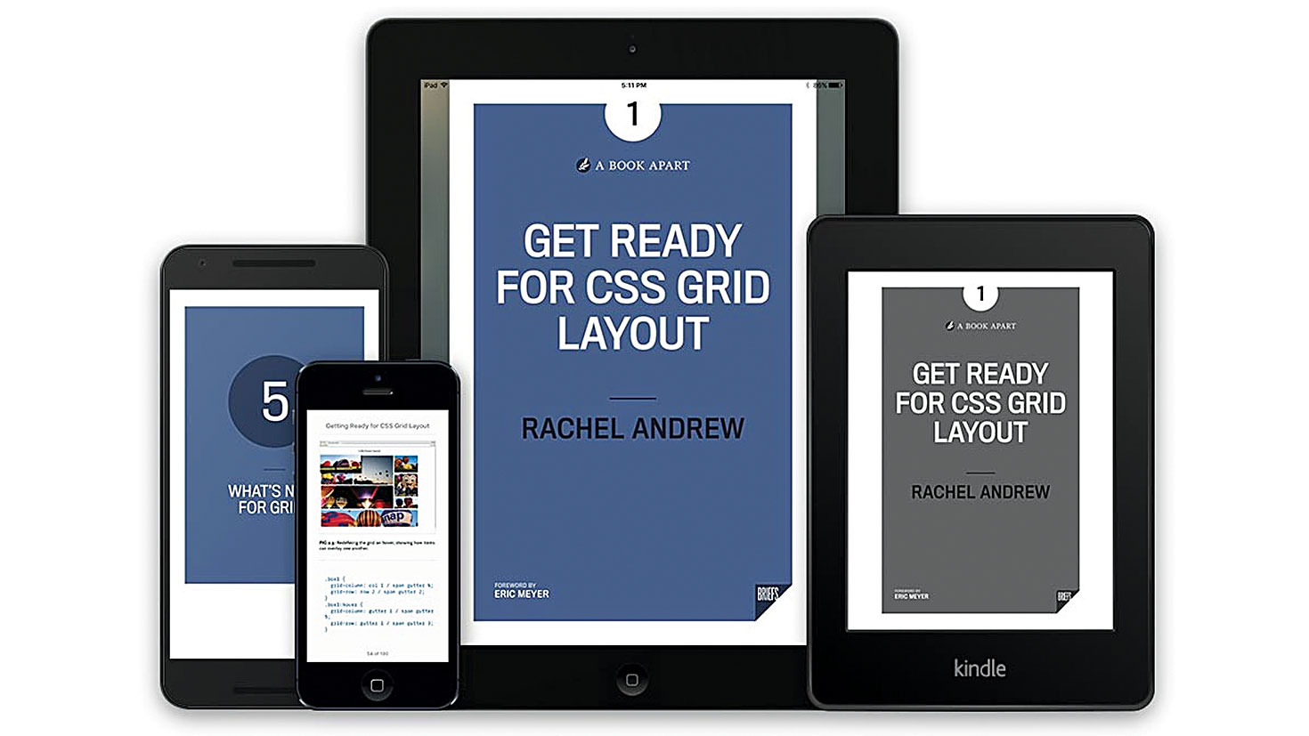
CSS Grid Layout looks equally interesting. For more on this, take a look at Rachel Andrew's Get Ready For CSS Grid Layout – one of A Book Apart's new Briefs series, it's a short read that covers the fundamentals. Finally, if you're just starting out, I'd recommend Learn CSS Layout. This takes you through layout principles in an easy-to-follow manner, so you can ensure your skills are up to date.
03. Modular design
As screen sizes multiply, the contexts we design for are changing. What we need are 'content building blocks' that adapt themselves to any environment. Learning about modular, reusable fragments of content as a basis for design helps us create content that fits any situation, which is a powerful skill to have.
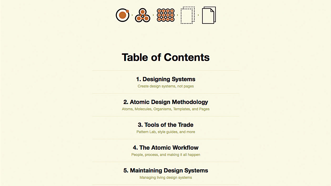
With this in mind, I'm looking forward to Brad Frost's Atomic Design book, which should see the light of day this year. Frost is helpfully sharing the content of his book while he works on it.
"My search for a methodology to craft interface design systems led me to look for inspiration in other fields and industries, " explains Frost. "Fields such as industrial design and architecture have developed smart, modular systems for manufacturing immensely complex objects like aeroplanes, ships and skyscrapers."
Frost's approach involves designing systems built around atoms, molecules, organisms, templates and pages. When we couple this approach with Jonathan Snook's SMACSS (Scalable and Modular Architecture for CSS), we end up with an approach I call 'modular design' , which lends itself to the multiple contexts we have to design for.
04. Typographic principles
"95 per cent of the information on the web is written language, " says information architect Oliver Reichenstein. "It's only logical to say that a web designer should get good training in the main discipline of shaping written information. In other words, typography."
Reichenstein raises a good point. However, I would argue that understanding 'the craft of words' should take priority. Words are an essential design element and, as designers of content, we often find ourselves working with language. A little time spent learning about language and how it can shape user experiences can go a long way.
That being said, the principles of typography – especially as applied to the web – is something I think we can all stand to learn more about. Great typography enhances readers' enjoyment of content; something we should all strive for.
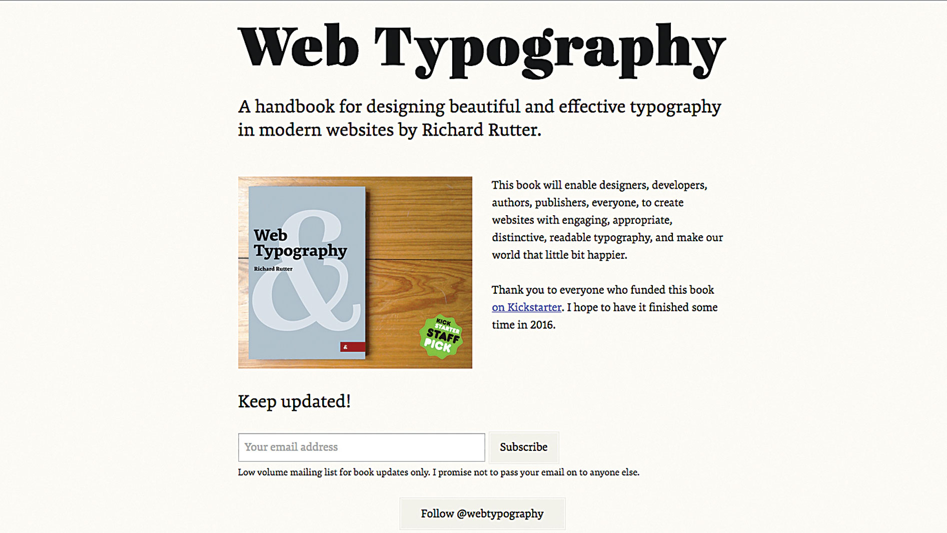
I'm looking forward to reading Richard Rutter's Kickstarter-funded Web typography: A handbook. While Rutter works on completing his book, I'd recommend exploring his site webtypography.net, which provides a practical guide to web typography.
05. Prototyping tools
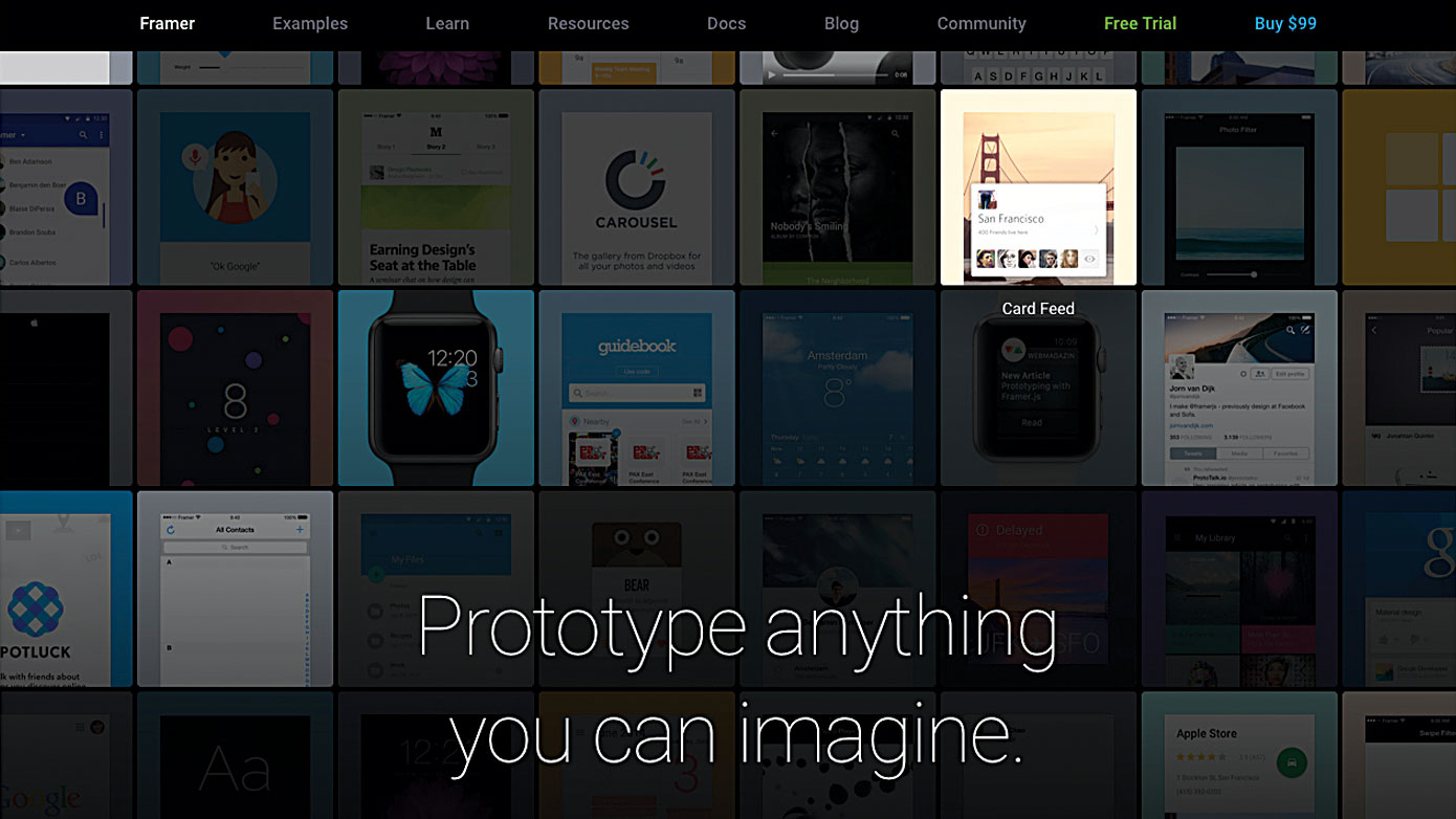
Digital prototyping tools have come of age over the last few years, and the opportunities in this space are developing rapidly. Tools like InVision, Marvel and Principle (not to mention Adobe's soon-to-be-unveiled Project Comet) enable designers to create fully fledged digital prototypes, quickly and easily.
If your focus is on the frontend, the ability to design and prototype websites and mobile apps, from wireframe to finished product, is extremely valuable. I'd strongly recommend diving in and acquiring some new knowledge.
This progression in tooling also means that designers focused on designing complex, interactive products now have the tools at their disposal to turn their visions into rich prototypes – complete with an emphasis on user interaction and also, importantly, animation and transitions.
Of course, understanding the fundamentals of what is possible (and what is codable) is important. This knowledge, coupled with an understanding of how digital prototyping tools work, will ensure you're future-focused and ready for the exciting opportunities that lie ahead.
06. Animation principles
Animation is increasingly expected in the interfaces we design. "Subtle animations and interactions, used well, can be the difference between an app or site that's feeling native, seamless and engaging, and one that is static and unintuitive, " states designer Dan Edwards.
Understanding the principles that underpin animation – ideas like timing, easing and spatial awareness – is becoming increasingly important. There's lots to learn from here, but I'd recommend starting with the work of Disney.
There are a number of helpful tools that allow you to work on animation within an interaction design context, and exploring these is going to become increasingly helpful for designers. Tools like After Effects, Framer and Atomic will become a valuable part of the designers' toolbox.
One key point to stress, however, is that animation should be used with caution. After all, as Sophie Paxton blogged, 'Your UI isn't a Disney movie'.
07. SVGs
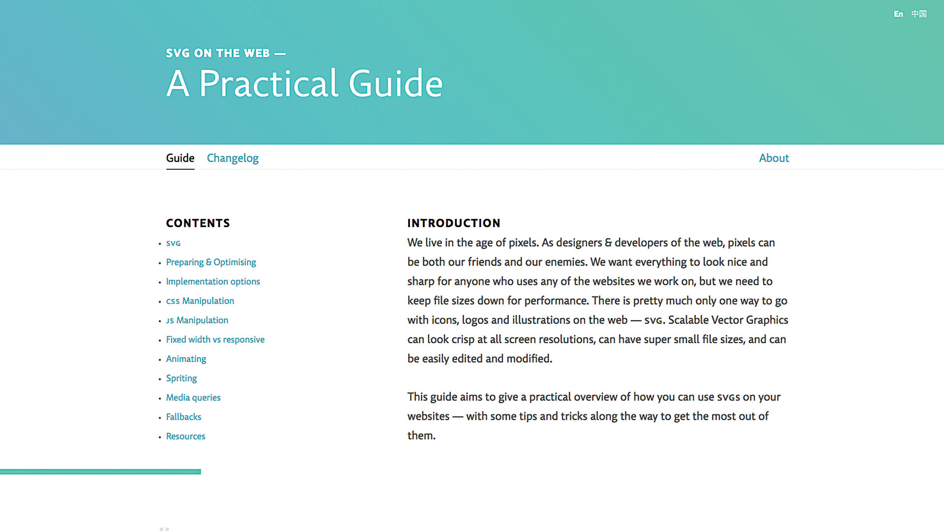
Scalable Vector Graphics (SVGs) have been around for a while, and understanding them is a great additional skill to have. "In the constant battle between high-resolution imagery and web performance concerns, there is pretty much only one way to go for logos, icons and illustrations on the web: SVG, " says Typekit's Jake Giltsoff. "Scalable Vector Graphics stay sharp at all screen resolutions, allow for very small file sizes, and can be easily edited, modified and maintained."
Using SVGs offers a number of benefits: reduced file sizes, improved performance, and the possibility of lean and efficient animations. These are all good things from a performance perspective. A little time spent learning about SVGs will pay off considerably.
Giltsoff's site 'SVG on the web: A practical guide' affords an overview of the scalable landscape, and is the perfect primer if you're just getting started with SVGs. Sara Soueidan has also shared a number of great resources through her site, which is worth bookmarking. If you've yet to dip your toe in the SVG waters I'd recommend doing so very soon.
08. APIs
I find APIs a little complicated, as I live firmly on the designer end of the nerd-designer continuum, but that doesn't mean I can't learn a little more about these technologies. I think it's important that we spend a little time getting to know skills from outside our comfort zones.
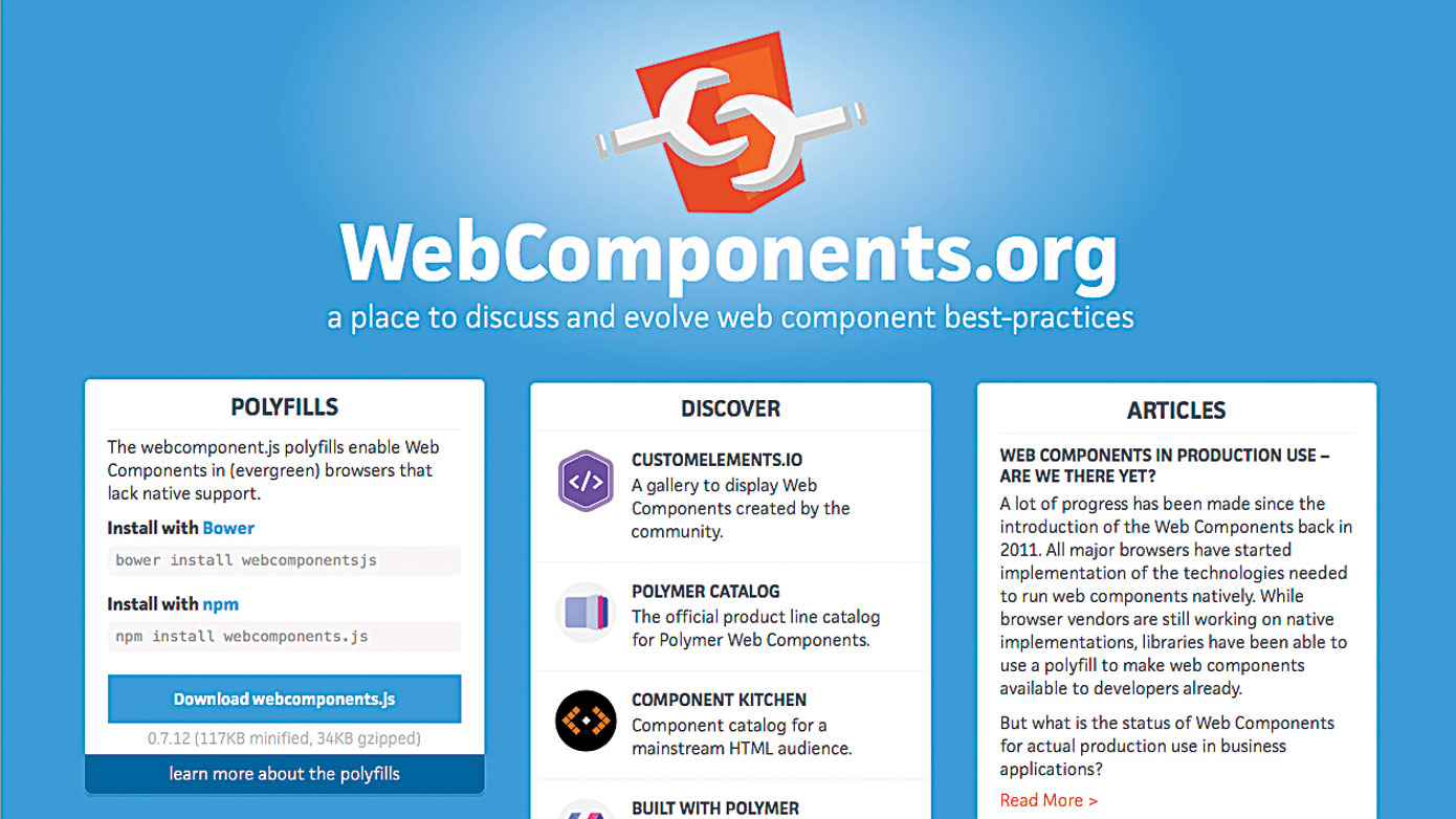
Jonathan Snook states: "It's a good year to get back to basics. Browsers have implemented new APIs at a dizzying pace and while frameworks abound, I think getting more familiar with APIs like service workers will allow developers to build leaner and cleaner sites and applications. I'm pretty excited about Web Components also, but always feel like they're going to be ready soon, but never quite yet."
One efficient way to pick up skills in these areas is to spend some time identifying conferences that are running workshops in your particular area of weakness. A day spent at Industry conference's React JS Workshop with Wes Bos, for example, is a great way to learn something new, in a time-focused manner, away from the everyday distractions of the studio.
09. Performance
I'm sure we're all guilty of having built cumbersome, overweight pages in our time. We know we should do better (optimise!) and this year, like most years, I'm reminding myself of the need to be mindful when it comes to page weight and performance.
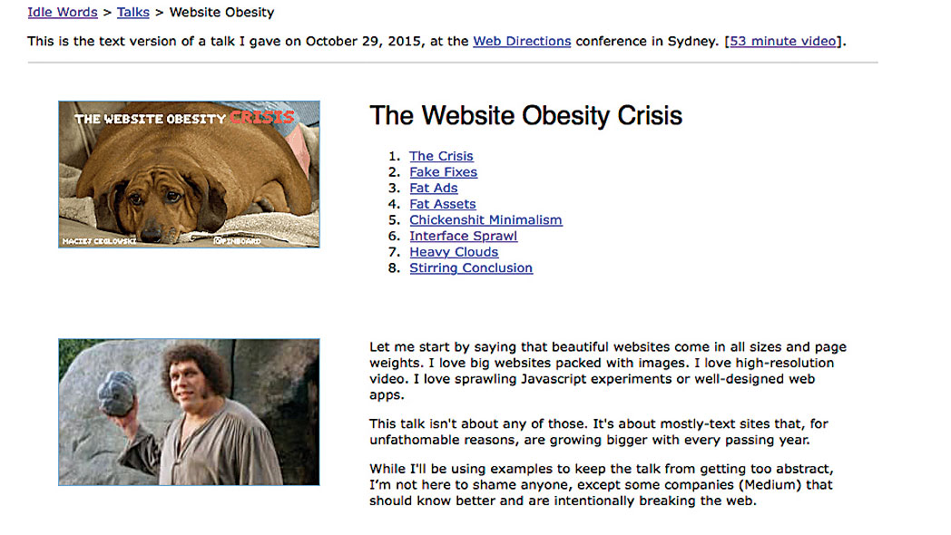
Pinboard founder Maciej Cegłowski recently published a wonderful roundup of his thoughts on this matter: 'The website obesity crisis'. Skewering, amongst other things, 'fat ads' and 'interface sprawl' , he makes a passionate case for paring things back. As he puts it: "Keeping the web simple keeps it awesome."
I'd strongly suggest spending some time developing your skills around performance: learning about image compression; focusing on keeping your HTML, CSS and JavaScript lean; reducing weighty dependencies and so on. All of these things matter, not least due to the increasing shift towards mobile patterns of consumption, where bandwidth is expensive.
The web is struggling under the weight of giant hero images, gargantuan video backgrounds and growing quantities of web fonts. Let's all go on a diet and address this. Ask yourself, 'How can I make this smaller?' Trust me, your users will thank you.
10. New technologies on the horizon

The web is evolving at a dizzying rate and, as part of this constant development, we're seeing a number of new and exciting technologies starting to appear on the horizon. Though these might not be within our reach at this precise moment, our realm as designers is ever-expanding, and they might very well be soon.
Virtual reality, augmented reality, discursive interfaces … there's a lot on the horizon and plenty to learn here. It's always good to stay ahead of the curve, and a little research and reading around these topics will add a further string to your bow.
With the recent growth in messaging-centred services, one area worth focusing on in the coming months is text-driven interfaces and other, conversational forms of discursive UI. Emmet Connolly, a digital product designer at Intercom, spoke about this recently in a talk titled 'Design is a conversation' at Rebase in Dublin. Read some of his comments around the subject at emmetconnolly.com.
In closing…
There's never been a more exciting time to work on the web, but, equally, it's never been more challenging. The modern web is rapidly diversifying, and looks very different to when I first started wrestling with it in the early 90s. It's becoming increasingly difficult – if not impossible – to hold everything you need to know in your head.
And that's alright – after all, no one can know everything. We are finding ourselves increasingly gravitating towards specialisms; focused areas of practice we can learn inside out.
So long as you can master the core techniques around your area and acquaint yourself with other techniques in related areas, you should be fine. You might not be able to dig deep into everything I've covered, but the key is to keep on learning!
Illustration: Marco Goran Morano
This article originally appeared in issue 279 of net magazine; buy it here.

Thank you for reading 5 articles this month* Join now for unlimited access
Enjoy your first month for just £1 / $1 / €1
*Read 5 free articles per month without a subscription

Join now for unlimited access
Try first month for just £1 / $1 / €1
Christopher Murphy is a writer, designer and speaker based in Belfast. He's a passionate educator, mentor to creative entrepreneurs, and the author and publisher of Tiny Books.
