Netflix given a fresh new look in this design concept

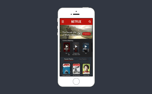
Netflix may have unveiled a redesigned logo in April, but for Dublin-based tech startup PR Slides that went nowhere near far enough. In a blog post confidently titled 'What Netflix should look like', art director Philip Joyce outlined a refreshed look for the streaming service - because he loves it so much. This is not as paradoxical as it may seem - there's care and attention-to-detail gone into this concept, designed to improve the experience while retaining the all-important Netflix identity.

Thank you for reading 5 articles this month* Join now for unlimited access

Enjoy your first month for just £1 / $1 / €1

*Read 5 free articles per month without a subscription

Join now for unlimited access

Try first month for just £1 / $1 / €1

Craig Stewart

Craig Stewart is a writer, SEO strategist and content marketer, and is a former editor of Creative Bloq. Craig has written about design, typography, tech and football for publications including Creative Bloq, T3, FourFourTwo and DSG, and he has written a book on motoring for Haynes. When he's not writing, you'll usually find Craig under his old car learning about DIY repairs the hard way.

Latest in Web Design
A screenshot of the new YouTube UI
Yes, YouTube has a new UI. Yes, it's terrible
Adobe XD logo
It seems Adobe's given up on UI design (for now)
Adobe Muse
Why Adobe is frustrating web designers
Dropbox Relay interface with photo of man running
How Dropbox Replay is helping designers future-proof their practice
UX revolution
From 2D to 3D: How brands can harness the latest UX/UI revolution
Personal portfolio of Julie Bonnemoy with a retro vibe
From AI to no-code: The top web design trends for 2024 according to Designmodo
Latest in Inspiration
Hayden Williams interview; fashion illustrations featuring famous characters, from Wicked and Disney
How fashion illustrator Hayden Williams got Beyoncé on speed dial
Best anime; a black-haired character wrapped in a red and black cloak from the anime movie Redline
Best anime: the films and series every animator should watch
main
Why Krita is the new Photoshop
Black Magic
I finally switched from Adobe to DaVinci Resolve – here's how it went
The best fonts for books
Header image displaying examples of the logos mentioned in the article with the title, 'The best Christmas logos' in a sans serif font in the middle of the image.
The best Christmas logos: What happened when brands got festive