Paint retailer's website goes for the natural look
Nature Paint's website has a relaxed, sophisticated feel that reflects its non-toxic approach. We find out how it was put together.

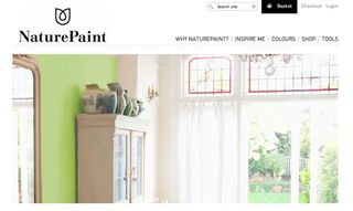
You might expect a site selling paint to be dominated by loud, bright colours, but Nature Paint has taken an altogether different approach.
A site for selling cleaner, more natural paints made with non-toxic ingredients, it obviously needs to brand itself differently from more mainstream paint retailers.
And so the designers have opted for a design based on a classic grid structure, clean lines, generous use of white space and upscale photography to create the kind of relaxed and sophisticated atmosphere that will appeal to the thoughtful, environmentally-concious paint buyer.

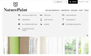
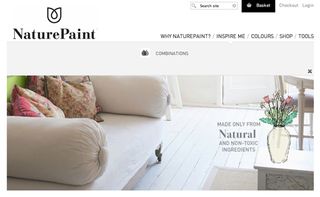
Only when you click on one of the main nav elements does an image appear - along with a large dropdown menu containing the subnavigation. It's a bold visual way to symbolise the possibilities of paint and how you can use it to make your mark on a blank canvas.
Interestingly, if you choose the 'Why Naturepaint' option, the carousel scrolls the main image up the page - and you'll see a flock of hand-drawn birds fly past the window; it's a nice little animated flourish.
Use of ExpressionEngine
The website is a collaborative effort by designer Ed Thomas and developer Cole Henley, who decided to use the content delivery platform ExpressionEngine to build it.

“We wanted a robust solution that allowed us to deliver content and ecommerce through a single platform," explains Henley. "ExpressionEngine, with the Store add-on, enabled us to offer the client one control panel for managing their content, inventory and sales as well as giving us total control in the frontend.”
Creative freedom
"This is the tenth or so EE site I’ve built," he continues. "As a CMS, it’s not without its limitations, but it offers a great degree of freedom in how to organise, structure and display content.
"Also the fact that EE and many of its add-ons are licensed offers me reassurance of dedicated support both during the development and once the site is live."
Liked this? Read these!
- Brilliant Wordpress tutorial selection
- How to create an app: try these great tutorials
- The best Photoshop plugins
Have you seen a great ecommerce website? Tell us about it in the comments!

Thank you for reading 5 articles this month* Join now for unlimited access
Enjoy your first month for just £1 / $1 / €1
*Read 5 free articles per month without a subscription

Join now for unlimited access
Try first month for just £1 / $1 / €1
Get the Creative Bloq Newsletter
Daily design news, reviews, how-tos and more, as picked by the editors.
The Creative Bloq team is made up of a group of design fans, and has changed and evolved since Creative Bloq began back in 2012. The current website team consists of eight full-time members of staff: Editor Georgia Coggan, Deputy Editor Rosie Hilder, Ecommerce Editor Beren Neale, Senior News Editor Daniel Piper, Editor, Digital Art and 3D Ian Dean, Tech Reviews Editor Erlingur Einarsson, Ecommerce Writer Beth Nicholls and Staff Writer Natalie Fear, as well as a roster of freelancers from around the world. The ImagineFX magazine team also pitch in, ensuring that content from leading digital art publication ImagineFX is represented on Creative Bloq.
