Measure your site's performance on Google
Discover some free Google tools that will help your site perform better in organic search and across the web.
In Beyond measure, her talk at Generate Sydney on 5 September, Erika Hall will be looking beyond site analytics and asking how we can look beyond the data to create a web informed by human experience. Get 50% off your ticket price in our 24 hour flash sale on 21 July!
The release of Google's mobile-friendly algorithm update last year sent many site owners and marketers scrambling to get their sites – or at least key landing pages – mobile-ready.
There are a few key facts you should know about it:
- It is assessed on a page-by-pages basis, and in real time.
- Google's mobile-friendly assessment is a Boolean value: either it's mobile or it's not, there's no in-between.
- Google released a Mobile-Friendly Test tool to help marketers assess if their key landing pages were mobile-friendly.
- Just the fear of Mobilegeddon resulted in a 5 per cent uptick in mobile-friendly tests in the two months prior to the update.
If a page passes the mobile-friendly test, it's rewarded with a snippet in mobile search results. According to Searchmetrics, the biggest losers of the update were Reddit, NBC Sports, Vogue, SongLyrics, and Business Week.
Mobile-friendly dashboard for Google Analytics
According to BuiltWith, more than 27 million site owners measure their sites' traffic using Google Analytics. So it makes sense to address how sites running Google Analytics can measure their mobile traffic.
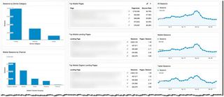
I created a Mobile Overview dashboard that owners can use to monitor their mobile website traffic. It includes the following widgets:
- All Sessions: Formerly known as 'visits' in Google Analytics, this widget provides a gauge of your site's traffic to provide some context for your mobile traffic.
- Mobile Sessions: This enables you to monitor sessions from mobile devices only (this widget doesn't include tablet users).
- Tablet Sessions: Because tablet users typically behave more like desktop users than mobile users, it's useful to be able to evaluate this traffic separately.
- Desktop Sessions: If the bulk of your site's traffic is still coming from desktop in 2015, you may want to evaluate how effective your mobile experience is.
- Mobile Pageviews: This widget combines mobile and tablet devices.
- Sessions by Device Category: This is just geek-speak for the categorisation of traffic into three buckets: desktop, mobile and tablet.
- Mobile Sessions by Marketing Channel: With this widget, we're analysing traffic from mobile and tablet devices, broken down by marketing channels (organic, social, direct, PPC and so on). What channels is most of your mobile traffic coming from?
- Sessions by Device Category and Marketing Channel: This chart slices and groups your traffic by desktop, mobile, and tablet users. Then each of the bars in the bar chart is segmented by marketing channels. You will have to hover over slices to see individual segment values. There is no legend.
- Top Mobile Pages: Which five pages have received the most total traffic from mobile devices and tablets in a given time period?
- Top Mobile Landing Pages: This table is a variation on the one listed above. It only looks at our top five landing pages from mobile devices and tablets (whereas the Top Mobile Pages report includes pages that may have been visited at any point during a session).
- Top Mobile Organic Landing Pages: This table lists your mobile MVPs in organic search. In the absence of organic keyword data from Google, you will have to turn to Google Webmaster Tools to see which keywords are driving this traffic.
- Top Mobile Social Landing Pages: Find out your MVPs in social. It's very important that you test your site on various mobile devices to see what the experience is like for your visitors. See the section on Chrome's Device Emulation for tips on how to do this from your desktop device.
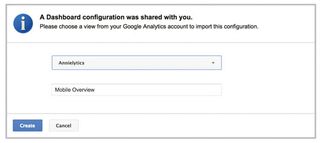
To access this custom dashboard from your Google Analytics account, go to bit.ly/mobile-dashboard and choose the view (formerly known as a profile) you want to apply it to.
Google's Mobile-Friendly Test Tool
Google's Mobile-Friendly ranking algorithm update is designed to offer a boost to pages it deems to be mobile-friendly in its search results. This update focuses more on usability than other factors that were already baked into its algorithm, such as page load time.
This update also targets smartphone users and doesn't include tablet searchers. It's still very important to analyse the performance of your site from tablet users.
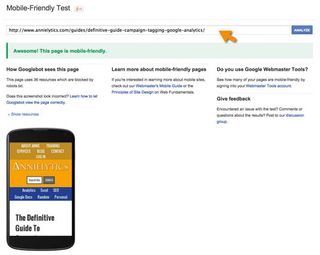
To help webmasters identify pages that lack usability for mobile users, Google released a Mobile-Friendly Test tool. You just enter a URL, and it will give the page a pass or fail depending on a number of design factors.
The results page will also show you a preview of your site, so that you can see for yourself how your page looks on a typical smartphone (see the section on mobile emulation to view your test page on a variety of mobile devices in Chrome). It will also let you know if you're blocking essential resources from Google, like your CSS and JavaScript files.

Essential Google Webmaster Tools reports
There are some reports in Google Webmaster Tools that are especially helpful to webmasters in evaluating mobile traffic. Let's take a closer look at each of these now.
Mobile usability
The Mobile Usability report is a recent report that was added to help webmasters identify issues that negatively impact mobile usability. To navigate to this report, click on Search Traffic to expand its report options.
If you haven't signed your site up for Google Webmaster Tools, go to google.com/webmasters. You will have to sign each subdomain up individually, and if your site has secure and non-secure pages, you'll need separate accounts for each.
Issues this report flags include:
- Flash usage: To the chagrin of mobile users, most mobile browsers no longer render Flash-based content.
- Viewport not configured: For all intents and purposes, the viewport is the screen real estate a website visitor has access to. Your site pages should specify a viewport using the meta viewport tag. This tag specifies how browsers should scale the page to render optimally in the visitor's device.
- Fixed-width viewport: Your viewport shouldn't be set to a fixed width. A responsive approach to building mobile sites allows the webmaster to set the viewport to match the device's width and scale accordingly.
- Content not sized to viewport: This flag identifies pages that require horizontal scrolling when viewing the page on a smartphone. Nobody wants to scroll back and forth to consume the content on your site.
- Small font size: If visitors have to zoom in to view content on your site, they then have to scroll to keep reading. Boo hiss.
- Touch elements too close: I see this flag quite a bit. I have child-size hands and rarely run into this issue, but if a 6'2" dude with giant man hands has to zoom in to avoid tapping the wrong button or link, he's not going to be a fan.
If Google identifies any of these issues on your site, they will be listed in this report. The main report will tally how many pages Google has discovered this issue on. To see the individual pages, click on the issue. This drill-through report sorts affected pages by priority.
Crawl Errors
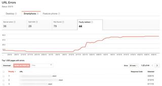
The Crawl Errors report can be found by expanding the Crawl category. To see errors specific to smartphones, click the 'Smartphone' tab under 'URL Errors'. You will be able to see a list of issues Googlebot ran into while crawling your site, namely server errors, soft 404s (misconfigured 404 pages), not founds and faulty redirects.
All of these issues are important, but faulty redirects will arguably have the greatest impact on your site's performance in organic search. Many sites make the tragic mistake of redirecting mobile visitors to their homepage.
The timeline will update with a line chart that will help you identify patterns over the past 90 days (Google Webmaster Tools only provide 90 days of historical data). If you choose a device using Chrome Developer Tools' mobile emulator tool, the user agent will update to emulate an authentic mobile visit. And when you run a search in Google, you'll see the mobile-friendly snippet Google is rewarding mobile-friendly pages with. You will also experience these faulty redirects and 404s without having to search on your mobile device. Can you tell I really, really love this tool?
Search Analytics
The Search Analytics report shows how often your site appears in Google search results. It just came out in beta in May, and replaces the Search Queries and Top Pages reports, with a number of notable improvements.
This report enables you to see the search terms your site is performing for in Google searches, as well as the pages those keywords drive traffic to. It's one of my favourites among all marketing tools, because ever since Google packed up its keywords and left the playground in a huff in 2011, marketers have been scrambling to gain insight into the keywords that drive traffic to their sites. This report is a decent – although not perfect – proxy for what we used to get from analytics.
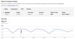
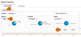
What makes this report especially useful is the ability to filter by any search query and analyse the landing pages that showed up in Google searches for that term (or all terms that include the keyword you filtered for). This is a great way to find pages that are inadequately optimised.
Let's say you have a page that you've optimised for the term 'Burberry handbags'. If you find that three different pages on your site show up for this term, you would need to do some investigation to see if you have adequately optimised your primary landing page for 'Burberry handbags'.
Say you want to zero in on searches for Burberry handbags from mobile devices. You could easily do that by filtering for mobile in the Devices drop-down, and then your keyword under Queries. With the new Search Analytics report you can build out robust filter stacks to get exactly the data you want.
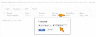
One thing I really like about the new report compared to the legacy Search Queries and Top Pages reports is that when you add a filter and then change the grouping property (let's say from Queries to Pages), your filters remain. So, going back to the Burberry handbags example, you could filter further by page, country, and/or date (I always look at the full 90 days Google gives me).
I was an alpha tester for this report and created a video walkthrough to accompany it. You can view it here. It's easily the most useful addition to Google Webmaster Tools in the past five years.
Conclusion
Google has provided a number of tools that webmasters and marketers can use to monitor and improve the performance of their websites, and help them keep pace with the ever-evolving technologies driving mobile technologies. Those who take full advantage of these tools can potentially poach traffic from their competitors who are slower to adapt to marketplace demands.
Don't miss the Generate Sydney flash sale! Save 50% on your ticket price on 21 July, and spend a day learning from the leading lights in web design and frontend development.
This article was originally published in issue 269 of net magazine.
Words: Annie Cushing

Thank you for reading 5 articles this month* Join now for unlimited access
Enjoy your first month for just £1 / $1 / €1
*Read 5 free articles per month without a subscription

Join now for unlimited access
Try first month for just £1 / $1 / €1
Get the Creative Bloq Newsletter
Daily design news, reviews, how-tos and more, as picked by the editors.
The Creative Bloq team is made up of a group of design fans, and has changed and evolved since Creative Bloq began back in 2012. The current website team consists of eight full-time members of staff: Editor Georgia Coggan, Deputy Editor Rosie Hilder, Ecommerce Editor Beren Neale, Senior News Editor Daniel Piper, Editor, Digital Art and 3D Ian Dean, Tech Reviews Editor Erlingur Einarsson and Ecommerce Writer Beth Nicholls and Staff Writer Natalie Fear, as well as a roster of freelancers from around the world. The 3D World and ImagineFX magazine teams also pitch in, ensuring that content from 3D World and ImagineFX is represented on Creative Bloq.
