How to make your app seem faster than it is
Gene Crawford takes a look at how designers and frontend devs can suggest speed by focusing on the flow of their interactions.
Speed is an important component of any website or web app. There are many things that developers can do on the programming side to make things move faster. However, there are also things we as designers – and user experience designers in particular – can do to make things seem like they are faster.
For example, we can make the buttons we design respond as quickly as possible. There is a 300ms delay built into each button used on a website or app via HTML in the browser. Simply making the button appear depressed when a user presses it or clicks on it gives them the perception that they've interacted with it and kicked off the process.
The asynchronous UI
There are also deeper, functional things to consider, like employing asynchronous UI plumbing via a framework or other form of development approach. Basic concepts of an asynchronous UI include moving the state and view rendering of a screen layout to the client side or browser, instead of relying on server-side coding, and things like preloading data onto a page and using JavaScript to manipulate it.
For frontend developers and designers there are tons of ways to make something look or react faster, without digging deep into the server-side code. We have to be smart about how we design our interactions and the other pieces of a website or app that affect the user’s sense of speed. We want to create a sense of flow or response, and keep the end user's perceptions in mind.
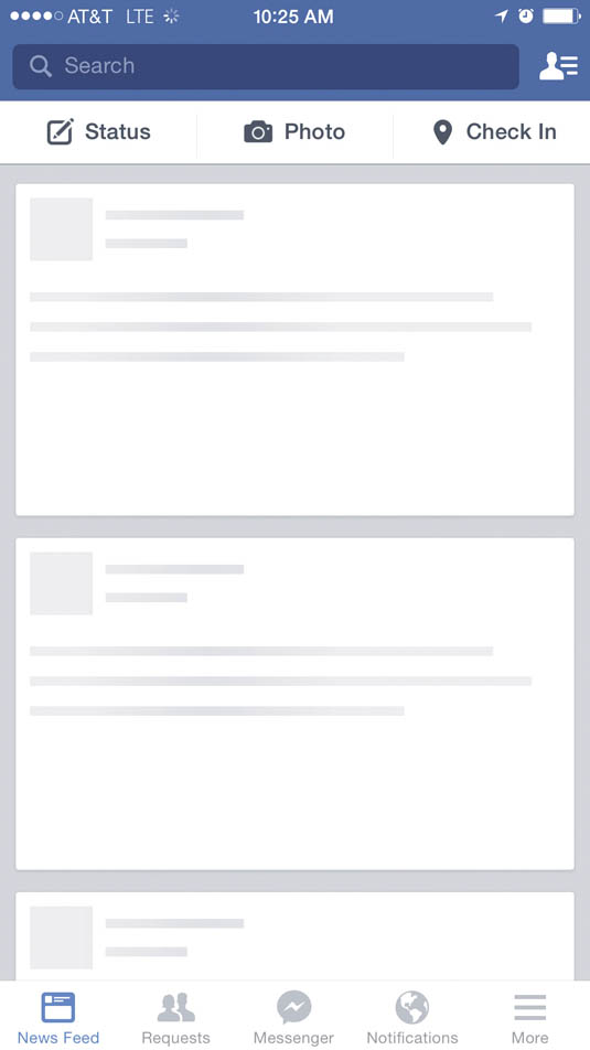
01. Facebook

When you open the Facebook app on your iPhone, temporary images load in your feed to tell users that stuff is coming and the application is working.
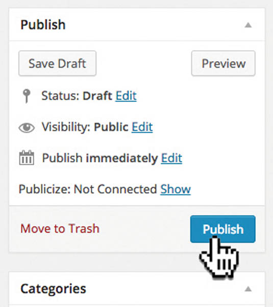
02. WordPress

An example of the 300ms button improvement: in WordPress, when you depress the 'Publish' button it changes to a darker shade of blue, giving users feedback that it has been activated.
03. Instagram

Instagram is the master of working ahead of the user, employing many techniques to make its UI appear faster. It's worth a study.
Sign up to Creative Bloq's daily newsletter, which brings you the latest news and inspiration from the worlds of art, design and technology.
Words: Gene Crawford
This article originally appeared in issue 268 of net magazine.
Liked this? Read these!
- Build faster WordPress sites with lazy loading
- Brilliant Wordpress tutorial selection
- Free tattoo fonts for designers

The Creative Bloq team is made up of a group of art and design enthusiasts, and has changed and evolved since Creative Bloq began back in 2012. The current website team consists of eight full-time members of staff: Editor Georgia Coggan, Deputy Editor Rosie Hilder, Ecommerce Editor Beren Neale, Senior News Editor Daniel Piper, Editor, Digital Art and 3D Ian Dean, Tech Reviews Editor Erlingur Einarsson, Ecommerce Writer Beth Nicholls and Staff Writer Natalie Fear, as well as a roster of freelancers from around the world. The ImagineFX magazine team also pitch in, ensuring that content from leading digital art publication ImagineFX is represented on Creative Bloq.
