5 ways to make temporal prototyping your next design skill
Discover why temporal design should become part of your prototyping toolkit.
Imagine a world where you could only describe your visual designs with words: all shapes, colours, and sizes had to be described orally. You could only tell what something should look like, never show what it would look like. That's what it is like to create designs in the temporally flat confines of a static space. We can describe how something transitions, transforms, or animates, but never show how it works.
But, we can do more than tell. We can show how these designs work, it just takes a little more effort.
In a previous article, I introduced the term temporal design to differentiate from 'visual' or static designs. Temporal prototypes, then, are ones that truly allow us to explore our designs in more than just visual appearance but allow temporal appearance as well. Creating prototypes that look and work more like the final product is where interface design is headed.
We prototype to explore 'What if…?'
Simply stated, we create prototypes to answer 'What if…?' questions, before we ask the 'How do we…' questions. This might seem counter-intuitive at first, but to be creative we need to be able to try out any idea, with an eye for what is possible rather than the other way around.

The problem with visual prototypes using programs like Photoshop, Illustrator, OmniGraffle, and Sketch is that they can never help us answer 'What if…?' questions when it comes to time, i.e. temporal design. You can describe how it works with these tools, but you cannot show how it works which is the only way to truly answer 'What if…?' questions. This helps us go beyond simply showing designs and begin to enter the more useful domain of the proof-of-concept.
Temporal prototypes enfold the visual and interactive
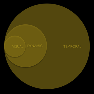
There are three levels of prototypes, each building on the capabilities of the previous. You will find that as you increase the scope of your prototype, you will also push back the base of the fidelity cliff, which is the point at which your prototype becomes more about answering 'How…?' than 'What if…?'. Temporal prototypes turn us from designers into storytellers.

- Visual: incorporates the traditional page structure and visual layers, and is what makes the first and most immediate impression on the actor. However, the visual layer is static in nature and is not enough to convey the full interface.
- Interactive: is the simplest level of the temporal arena, allowing us to show the basic interactions as 'clickable' prototype (i.e. click here, this happens). However, interactive prototypes have come to simply mean showing a clickable site schema. It is not enough.
- Temporal: goes beyond the visual and interactive allowing the user to engage with the design over time, in ways that simple interactive prototypes cannot encapsulate. By showing how the prototype works in time, we can truly say that it is an interface proof-of-concept.
The old ways of weaving the web are not working anymore
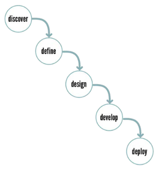
It used to be that 'web designers' would work with clients to create storyboards, wireframes, and visual comps, hand those over to the developers, stand back and wait for the magic to happen. This will always end in the best product that works exactly the way the client wanted, every single time, right?
Get the Creative Bloq Newsletter
Daily design news, reviews, how-tos and more, as picked by the editors.

Probably not. The waterfall methodology for interface development, while far from dead, has been widely discredited. The reason for this is that it relies heavily on static deliverables (sitemaps, wireframes, storyboards, and visual comps) that quickly run foul of the fidelity cliff making iteration and innovation problematic or impossible.

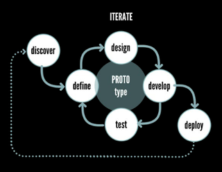
Many digital interface development workflows rely on the agile methodology, or one of its many variants. Agile promotes design iteration, rapid prototyping and constant testing. Yet designers are still yoked to the same old deliverables, based on creating static designs.

Where we need to go is into truly temporal interface prototypes that can be quickly turned into the development code. This transition is not going to be easy, but necessary if we want to keep pace with the changing nature of software.
The happy path to temporal prototyping is knowing what is possible
It's no longer enough to just show developers what you want the interface design to look like, you have to be able to show them how you intend it to work. To do that, though, you, the designer, have to know learn what is possible.
01. Learn the basics of the core technology your interface is developed in
For the Web, learn what HTML tags do, how CSS works, and the capabilities of JavaScript well enough so that you know what is simple to do and what may be a more complex temporal design task.
CSS now includes transitions, transformations, and animation, something that far too few designers are aware of, much less include in their design thinking. For native apps, learn the capabilities and possibilities of Objective C and Java and what you can do with those that you cannot do on the Web.
02. Learn a tool that helps you design with code
If you eventually learn to roll your own code, great! For most designers, though, looking at code is like trying to translate Latin into Greek. A good tool can't make a poor designer better, but a bad tool can really bring them down. Right now, there are no killer apps for temporal prototyping, but there some up-and-coming contenders, like Adobe Edge Animate, Tumult Hype, Macaw and Principal Animate.
03. Learn how to manipulate a scripting framework
Once you understand how JavaScript works, you are ready to continue learning how to manipulate a JavaScript framework. A framework extends the capabilities you will have with Web UI, but also simplify the implementation of common dynamic tasks, making it easier for non-developers to do really cool things.
AngularJS from Google is one of the most commonly used, but there is a bit of a learning curve. If you want something easy to pick up, but more limited, I highly recommend UILang which uses natural language to allow simple but common interaction.
04. Learn what others are doing with interactive and temporal design
Although you can find some really cool ideas in Dribbble, these are generally not real working examples. A better place to look for temporal design examples are at CodePen.io. CodePen not only provides working examples, it also gives you the code you need to implement.
05. Learn to think about the space between
Once you understand what is possible, it is time to apply that knowledge. Temporal design happens in the spaces between that parts you plan. Your job as a temporal designer is to sweat these details. Nothing ever changes without reason, moves without purpose, or acts without motive.
Follow these guidelines, and you will increasingly find yourself not just as a designer, but a designer/storyteller.
Words: Jason Cranford Teague
Jason Cranford Teague is a Senior Creative Director at Capital One and teaches workshops on experience design for developers, development for designs, and temporal design thinking.
Like this? Read these...
- 5 things your portfolio must have
- How to start a blog
- Download the best free fonts

Thank you for reading 5 articles this month* Join now for unlimited access
Enjoy your first month for just £1 / $1 / €1
*Read 5 free articles per month without a subscription

Join now for unlimited access
Try first month for just £1 / $1 / €1
The Creative Bloq team is made up of a group of design fans, and has changed and evolved since Creative Bloq began back in 2012. The current website team consists of eight full-time members of staff: Editor Georgia Coggan, Deputy Editor Rosie Hilder, Ecommerce Editor Beren Neale, Senior News Editor Daniel Piper, Editor, Digital Art and 3D Ian Dean, Tech Reviews Editor Erlingur Einarsson and Ecommerce Writer Beth Nicholls and Staff Writer Natalie Fear, as well as a roster of freelancers from around the world. The 3D World and ImagineFX magazine teams also pitch in, ensuring that content from 3D World and ImagineFX is represented on Creative Bloq.
